💊 Healthcare Desktop & Mobile App UX/UI Design

This project was created for a healthcare client aiming to offer a clear and accessible way for patients to book doctor appointments online. The main goal was to simplify a complex booking process while maintaining trust, clarity, and a calm visual tone appropriate for medical services.
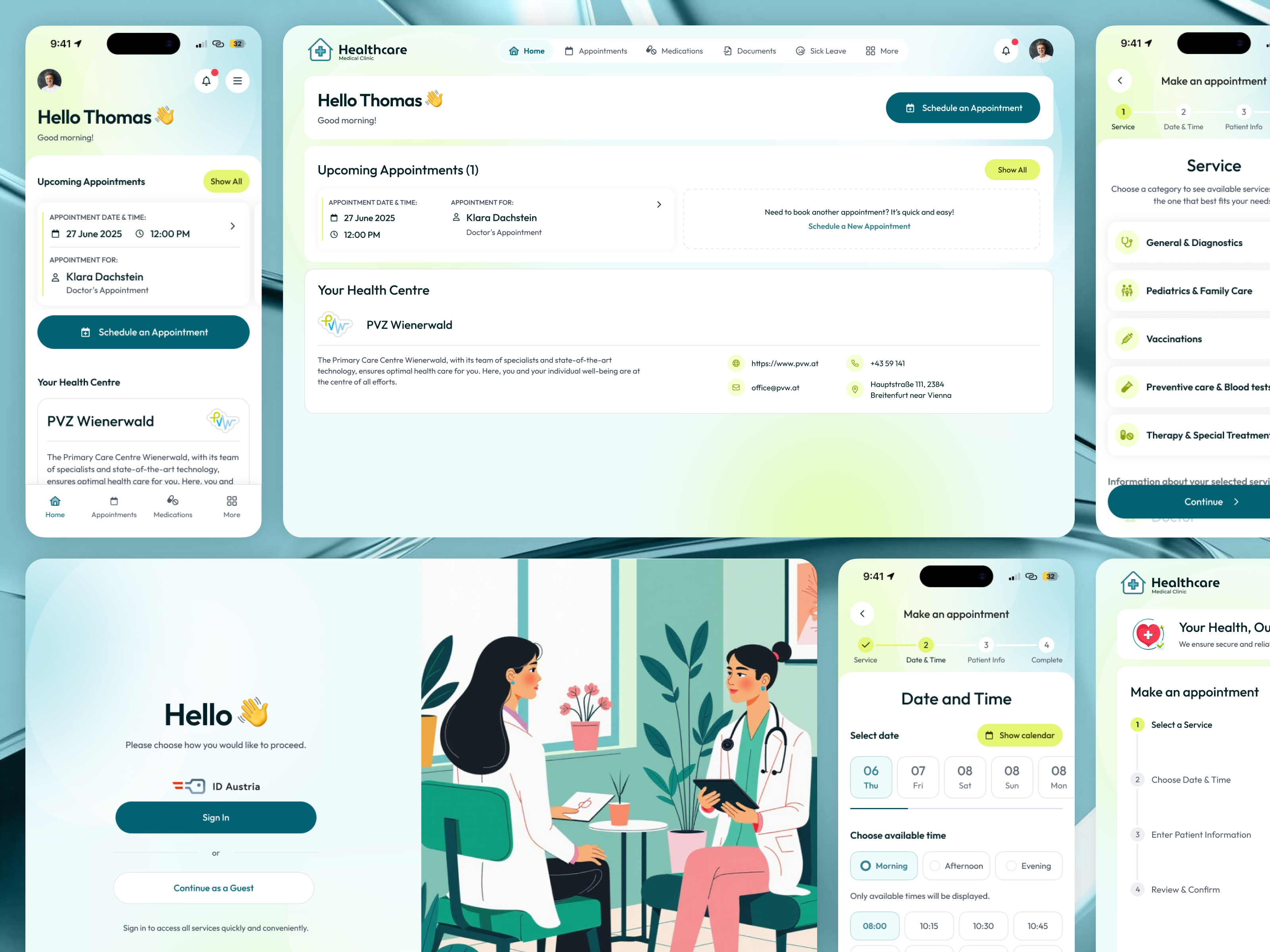
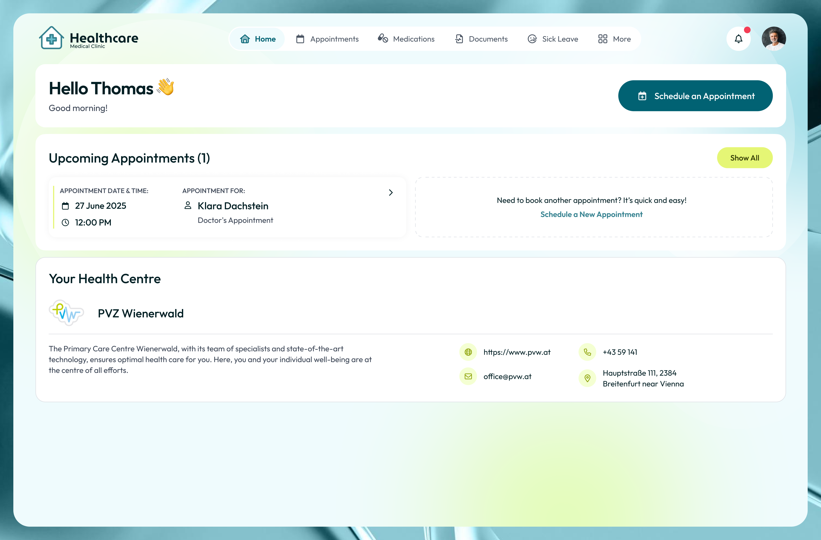
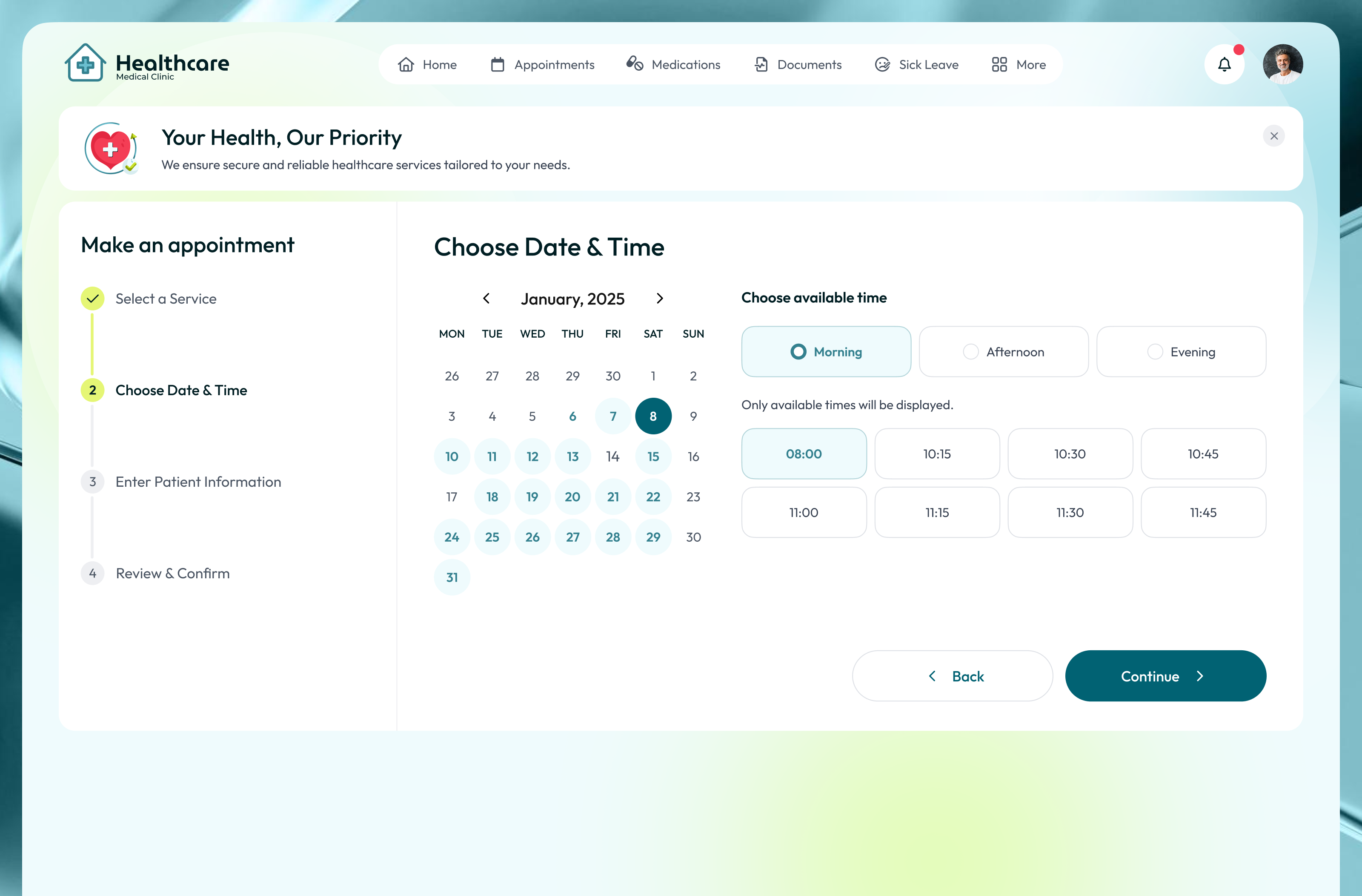
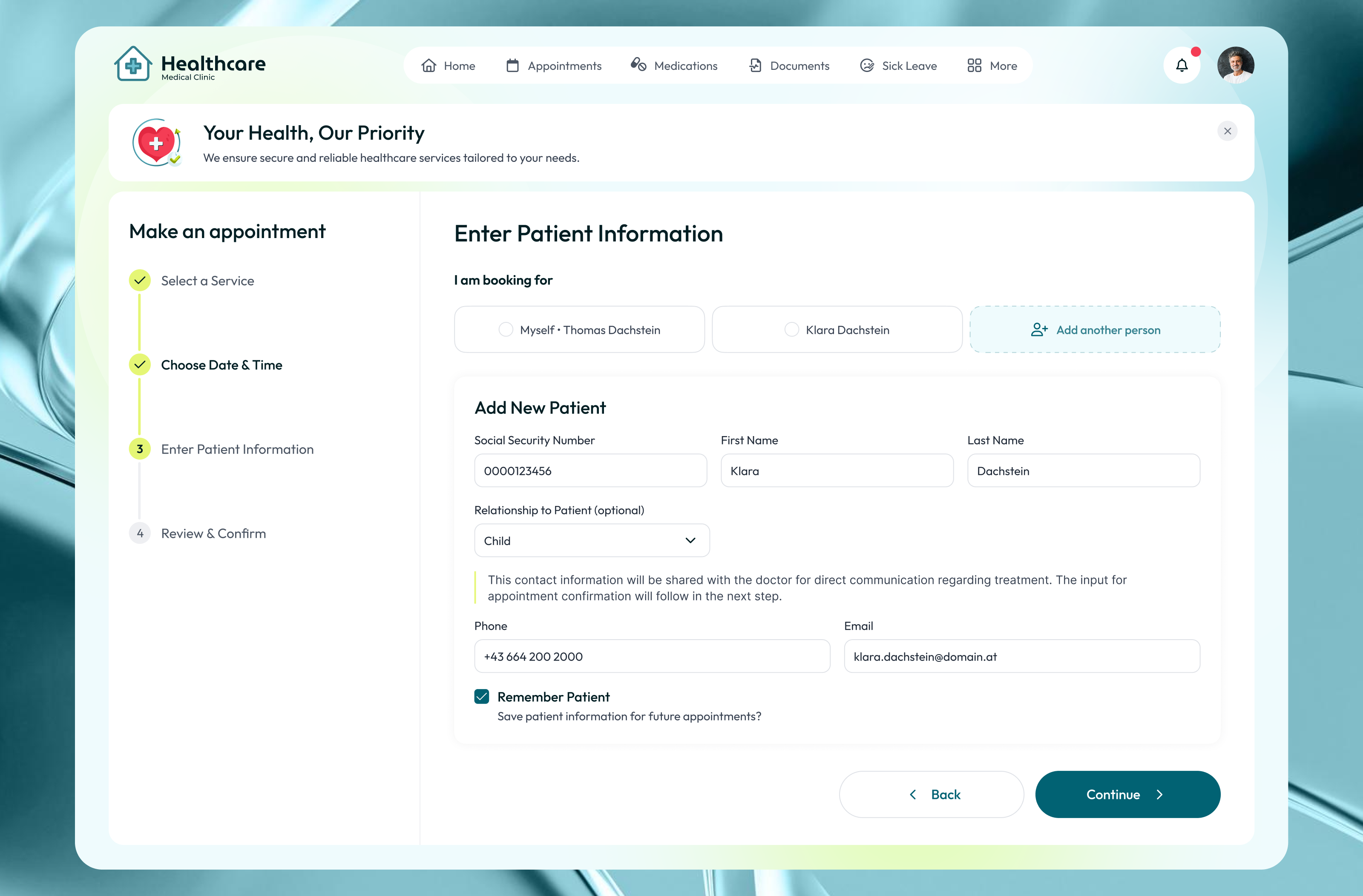
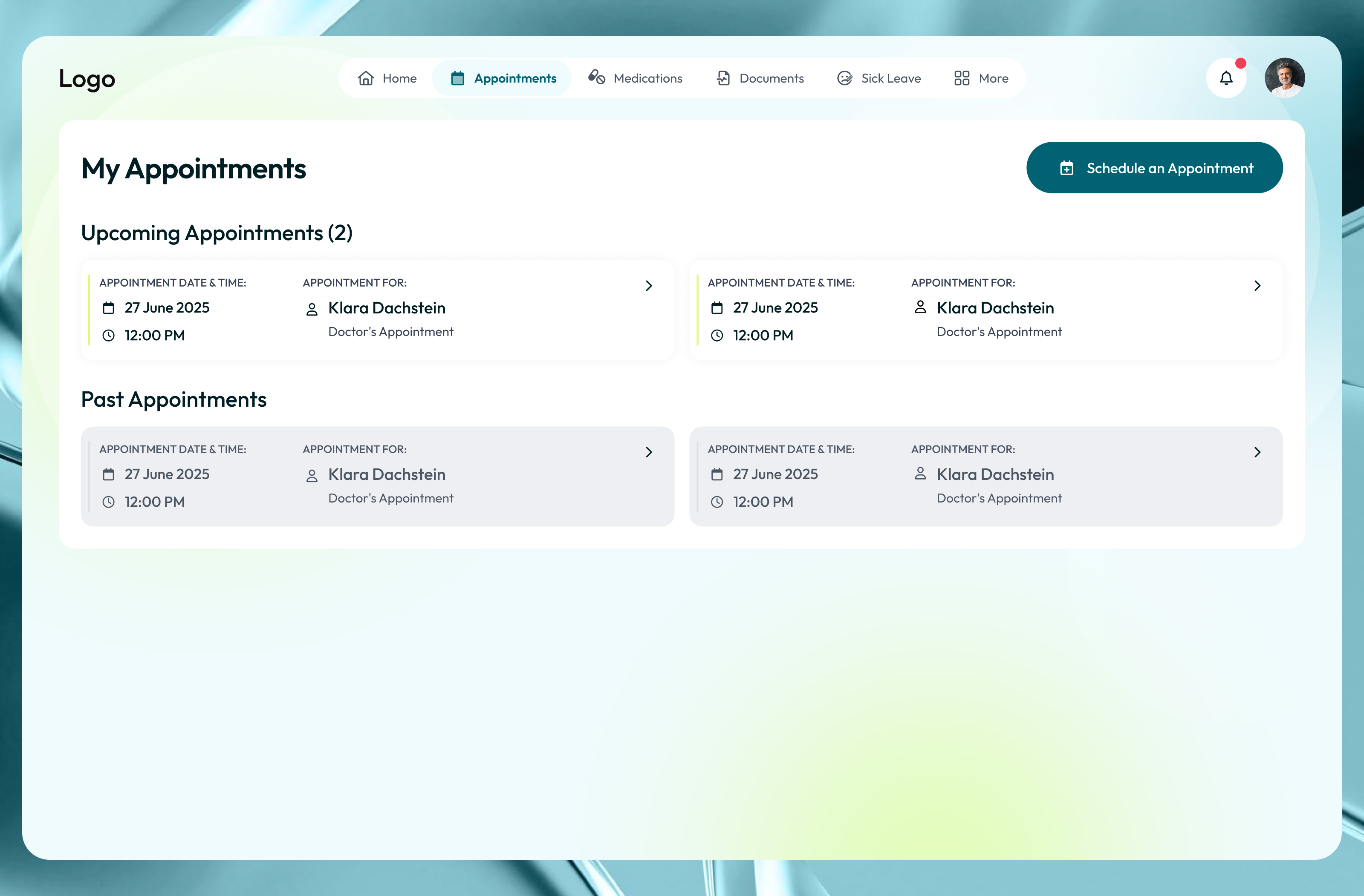
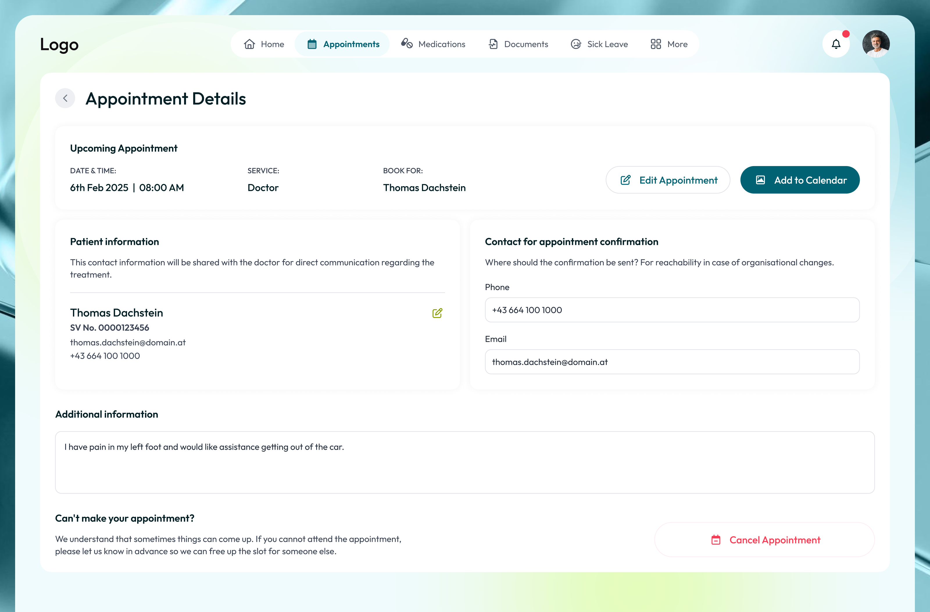
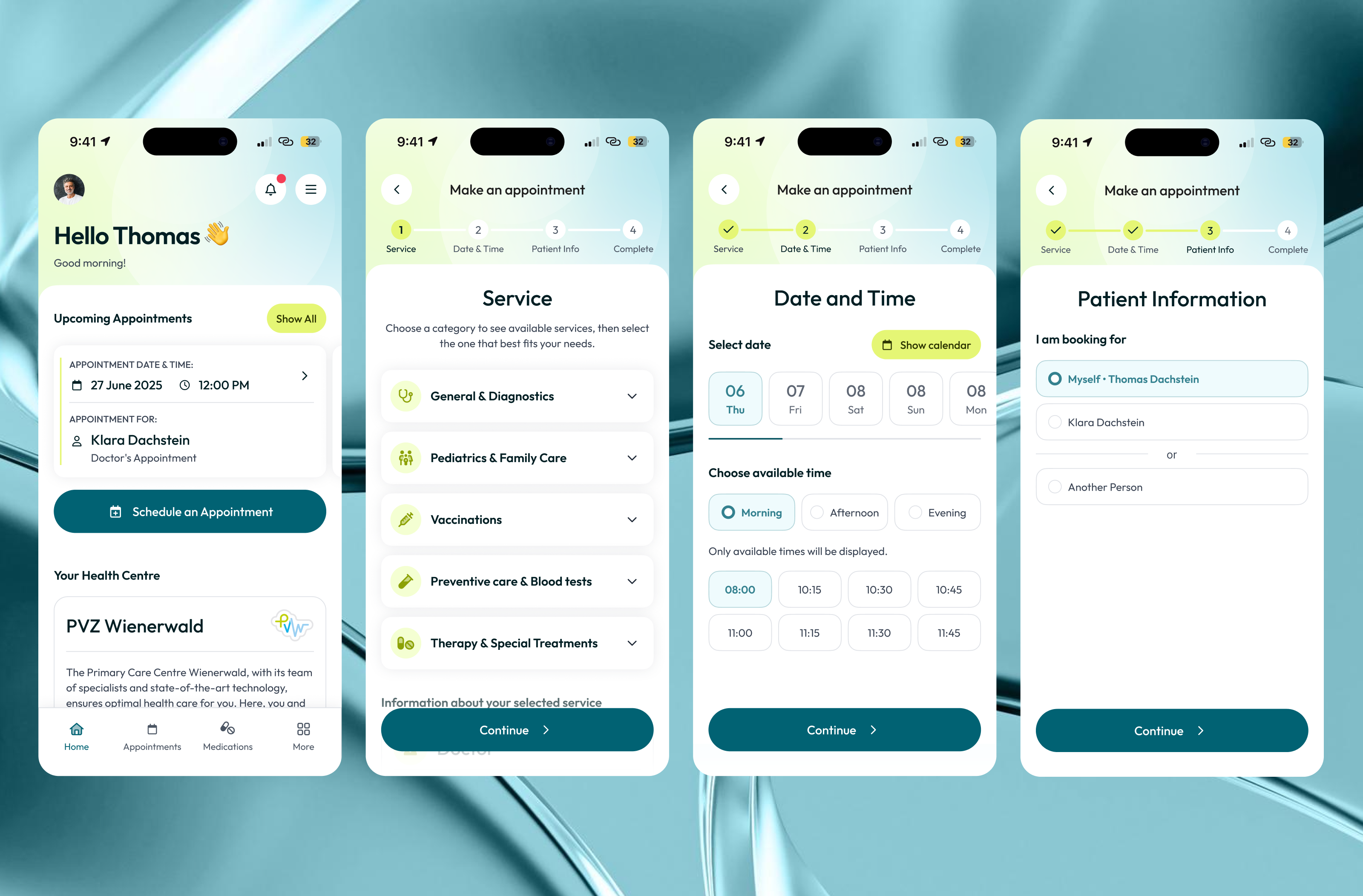
I worked on the full UX/UI design and visual style for both web and mobile. A key challenge was designing a step-by-step booking flow that works for different user scenarios, including booking for yourself, family members, or as a guest. The platform also includes appointment scheduling, patient information management, medical documents, sick leave records, and appointment history.
Special attention was given to usability, clear flow logic, and readable layouts, especially in the booking journey. The mobile experience was fully adapted to ensure easy navigation and quick decision-making on smaller screens. The result is a consistent, user-friendly healthcare platform designed to reduce friction and make appointment booking simple and reliable.
Tools used
Topics
Share
Reviews
6 reviews

Hey Lika!
I just went through your Healthcare Desktop & Mobile App project and I have to say, it feels very well thought out.
I really like how you maintained consistency between desktop and mobile while still respecting platform differences. The information hierarchy is clear, especially for something as sensitive and complex as healthcare. It feels calm, structured, and trustworthy which is exactly what users need in this context.
One thing you could push further is accessibility thinking. Since this is healthcare, considering larger touch targets, stronger contrast, and maybe elderly-user scenarios would make it even stronger. Showing how the design supports different user capabilities would elevate it from good to excellent.
Overall, this is a solid, mature UX/UI piece with strong visual consistency and clear usability focus. Great job 👏

I really like this project! The overall structure is clear, calm, and very appropriate for a healthcare context.
You did a great job separating services from doctors and breaking the booking flow into clear steps, which significantly reduces cognitive load during appointment scheduling. It’s also strong that you considered different scenarios, such as booking for yourself or others.
One nuance I’d consider improving is how the system supports users who are not fully sure what they need. Patients often fall into two opposite cases:
– they know exactly which doctor they want to see, or
– they don’t know what service or specialist they need at all.
To support both scenarios, it might be helpful to:
– add search or guidance that explains what services are included in each category,
– suggest a general practitioner for first-time appointments,
– or even start the flow from a problem-based entry point (e.g. “I feel unwell”, “I need vaccination”, “I want to repeat a visit”).
Another potential improvement could be in the Past Appointments section. Allowing users to quickly repeat a previous appointment (with only date and time changes) would make the experience more efficient, especially for recurring visits.
Overall, this is a very solid and thoughtful solution with strong UX fundamentals. With a bit more support for uncertainty and repeat behavior, it could feel even more patient-centered and intuitive.

Interesting project, Lika!
It would be really cool to see user research and feedback, especially from older users. I’m curious how the new flow compares to the old one for them and whether it actually made it easier to reach their goals.
It’s great that you designed both a mobile and a desktop version, that already shows you’re thinking about real world use cases.
I’m curious how big your type scale is, because right now it feels like there are a lot of sizes and weights competing for attention. That can make the layout feel a bit jumpy.
Good job!

Excellent work, Lika! Mature healthcare design with strong visual consistency and clear usability thinking. Tackling desktop/mobile while respecting platform differences shows maturity. Here's my feedback:
Strengths:
- Platform consistency: Visual consistency between desktop/mobile with platform respect
- Calm, trustworthy aesthetic: Clean, structured, calm. Perfect for healthcare
- Complex scenarios: Multiple booking scenarios (self, family, guests)
- Information hierarchy: Clear, scannable hierarchy for context
- Comprehensive features: Scheduling, patient info, documents, sick leave
- Mobile adaptation: Full mobile experience with quick decisions
Critical Gaps:
- Accessibility Depth — Insan flagged: touch targets, contrast, elderly scenarios. No testing evidence
- User Uncertainty — Anastasiia raised: patients know the doctor or don't know the service. Consider: problem-based entry ("I feel unwell")
- Repeat Appointment Efficiency — Anastasiia suggested: quick repeat of past appointments (date/time only). Missing quick-repeat flow
- No User Research — Petar asked for research, especially for older users. Test with actual patients? Pain points?
- Typography Scale — Petar observed: "Lots of sizes/weights competing. Layout feels jumpy." Tighten the scale. Fewer sizes
- No Before/After — Show old vs. new flow. Demonstrates impact
Strategic Questions:
- Tested with patients (different ages, literacy)?
- Pain points in the old flow? Compare to Zocdoc, Doctolib?
- Success metric (completion rate)?
- Edge cases (emergency, cancellation)?
Overall: Solid, mature UX/UI piece with strong consistency and usability. Comprehensive platform. Deepen: accessibility, user uncertainty, repeats, research, before/after, typography.
Next: Accessibility validation, problem-based entry, quick repeats, research, before/after, refinement. You're at 75% of an excellent case study.

Overall, the booking flow is clear and well-divided into steps. The stepper on the left clearly shows where the user is in the process. Combining category selection and specific service choice in one view is a good decision, it reduces the number of steps.
On the calendar screen, I'm missing information about why some days are unavailable (grayed out) - users might wonder why. 🤔 In the patient form, the "Social Security Number" field is quite prominent. It's worth considering whether we really need it this early in the flow, as it might raise privacy concerns.
The appointment card in "My Appointments" (screen 5) shows the same data for all appointments. I understand it's a placeholder, but this makes it hard to assess whether the layout will work with different text lengths. ;) On mobile, the view is consistent with desktop.
The color palette is calm and appropriate for medical services. The project makes a solid impression and shows a well-thought-out structure. With minor refinements, it will be really polished, Great job! 👏❤️

What an impeccable piece of work, Lika. Congratulations — the hierarchy and components are extremely well structured.
You might also like

Smartwatch Design for Messenger App


Bridge: UI/UX Rebrand of a Blockchain SCM Product


Pulse Music App - Light/Dark Mode


Monetization Strategy


Designing A Better Co-Working Experience Through CJM


Design a Settings Page for Mobile
Popular Courses

UX Design Foundations


Introduction to Figma

Design Terminology
