Gradient
A gradient is a gradual blend between colors that adds depth, emphasis, and visual interest to digital products while supporting hierarchy and brand identity.


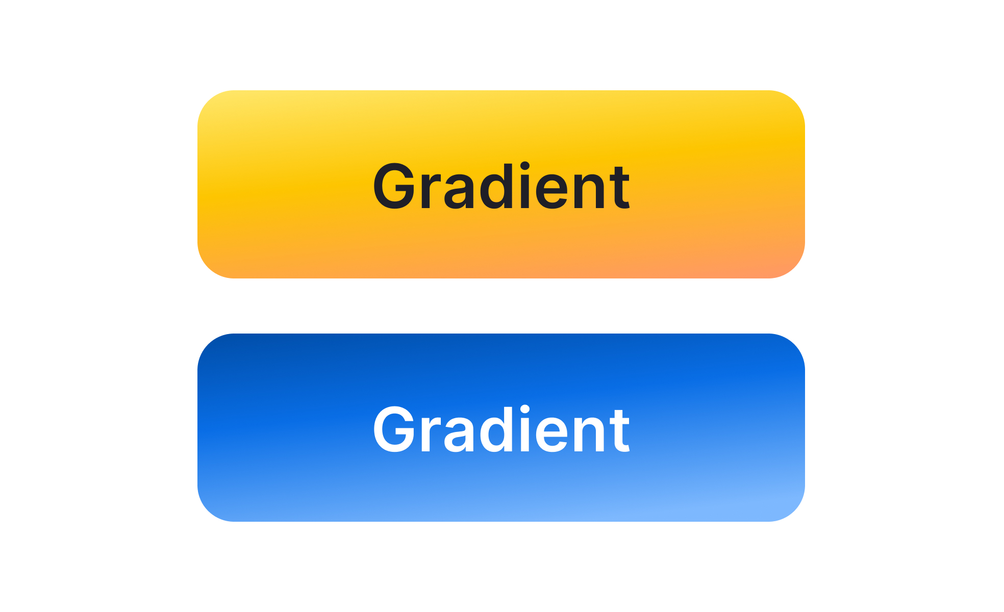
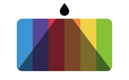
A gradient is a visual effect created by blending two or more colors seamlessly across a shape, background, or interface element. Gradients can be linear, radial, angular, or custom, and they allow designers to move beyond flat color fills by adding subtle transitions that create depth and energy. Once considered outdated in early web design, gradients have re-emerged in modern design systems as powerful tools for both function and aesthetics.
For UX designers, gradients influence hierarchy and attention. A button with a gradient fill often stands out more than a flat color, guiding users toward calls-to-action. Background gradients help create focus by transitioning from darker tones at the edges to lighter tones in the center, naturally drawing the eye. Designers also use gradients to express brand identity, combining signature colors into distinctive blends that make interfaces recognizable.
Accessibility is an important factor in gradient usage. Text placed on gradients must maintain sufficient contrast across all areas of the transition to remain legible. Poorly designed gradients can cause readability issues, especially for users with low vision or color blindness. Designers mitigate this by testing contrast ratios, using overlay techniques, or reserving gradients for decorative rather than functional contexts.
Real-world applications highlight gradients’ versatility. Instagram’s brand identity is built around its iconic multi-color gradient, creating immediate recognition across digital and physical touchpoints. Spotify uses gradients in backgrounds to create dynamic, mood-driven experiences that align with playlists. Productivity tools like Slack use subtle gradients in interface elements to add polish without overwhelming functionality.
Gradients also add depth in flat design systems. When digital interfaces shifted away from skeuomorphism, gradients offered a middle ground—keeping interfaces clean while reintroducing depth through color. This balance evolved into “flat 2.0” or “semi-flat” design, where gradients give life to otherwise minimalistic layouts. Motion design further extends their impact by animating gradient transitions, producing dynamic, engaging effects.
Learn more about this in the Gradient Exercise, taken from the Color Terminology Lesson, a part of the Design Terminology Course.
Key Takeaways
- Gradients are smooth color transitions used in UI and branding.
- Designers use gradients to emphasize hierarchy and guide attention.
- Accessibility requires maintaining contrast for readability.
- Examples include Instagram, Spotify, and Slack.
- Modern design uses gradients to add depth in minimal systems.
Gradients returned as a way to balance simplicity with visual richness. Flat design, while clear, sometimes felt sterile or overly minimal. Gradients reintroduced depth and energy without reverting to heavy skeuomorphism. By using smooth color transitions, designers add vibrancy while maintaining clean layouts.
The popularity of vivid gradients in branding also fueled the trend. Companies like Instagram demonstrated how gradients could create strong, recognizable identities, sparking widespread adoption across industries.
Gradients can improve usability by drawing attention to key elements, such as call-to-action buttons or navigation areas. However, if gradients are too busy or inconsistent, they may distract users or reduce readability. Designers must strike a balance, using gradients as subtle enhancements rather than overwhelming visuals.
Legibility is the main concern. Text placed over gradients requires careful testing to ensure sufficient contrast across the full range of colors. Without this, gradients risk making products less inclusive and harder to navigate.
Effective gradients are purposeful, consistent, and tested for accessibility. Designers often limit gradients to two or three colors to avoid clutter. Using gradients sparingly, for backgrounds, accents, or highlights, ensures they enhance rather than overpower content. Motion can add dimension, but must be subtle to avoid distraction.
Testing gradients under different conditions is essential. Accessibility tools, color-blind simulations, and responsive previews confirm that gradients remain functional across audiences. When applied with intention, gradients reinforce brand identity while improving visual clarity and appeal.
Recommended resources
Courses

UX Design Foundations


Core UI Components


Design Terminology

Lessons

Color Properties

Paints & Gradients

Elevation & Shadows in Design Systems
Projects

HireHarbour Allies: UX/UI Case Study for Inclusive Landing Page

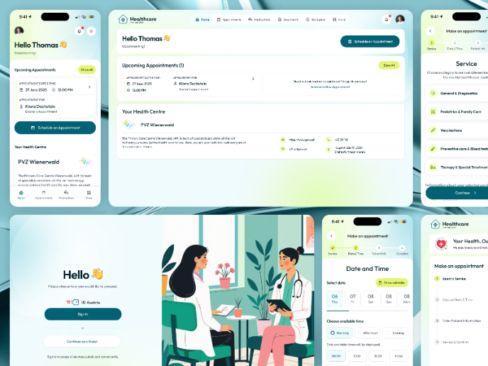
💊 Healthcare Desktop & Mobile App UX/UI Design


Free Gradient Asset Pack