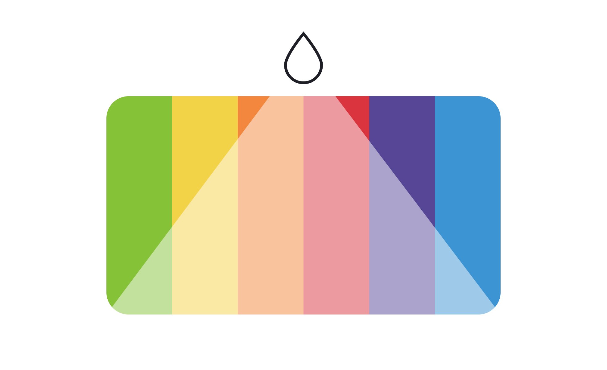
Tint
Tint is the degree to which white is added to a color, creating lighter variations of the original hue that influence tone, mood, and visual hierarchy in design


TL;DR
- Created by adding white to a base hue.
- Produces lighter color variations.
- Used for hierarchy, depth, and emphasis.
- Impacts accessibility and brand expression.
Definition
A tint is a color variation produced by mixing a pure hue with white, resulting in a lighter version that designers use for emphasis, contrast, or visual clarity.
Detailed Overview
Tint is a fundamental concept in color theory and design practice. By adding white to a base hue, designers create lighter variations that expand a color palette while keeping it consistent. This technique allows a single hue to serve multiple roles in an interface, from background accents to key highlights. Tints bring nuance to a design without requiring an entirely new color.
A frequent question is how tints differ from shades or tones. A tint is created by adding white, which makes the hue lighter. A shade is created by adding black, which darkens the hue. A tone adds gray, producing a muted variation. Each plays a role in building cohesive palettes, but tints are most often used to soften intensity and create balance.
Another common query relates to hierarchy. Designers apply tints to distinguish primary and secondary elements. For example, a dark brand color may serve as a headline, while its lighter tint is used for subheaders or backgrounds. This helps guide the eye and maintain focus without overwhelming the user. The ability to signal emphasis through lighter variations is essential in interface design.
Teams often ask about tints in accessibility. Lighter colors can reduce contrast, which impacts legibility for users with vision impairments. Designers must test tints against accessibility standards such as WCAG contrast ratios to ensure text and interactive elements remain readable. Overuse of tints without contrast checks can result in beautiful but unusable designs.
Tints also play a role in brand identity. They provide flexibility in maintaining consistency across contexts. A brand’s main hue might appear too strong for backgrounds or illustrations, but tints extend its usability while preserving recognition.
Finally, tints affect the emotional tone of a design. A saturated blue may feel bold or corporate, while a tinted blue feels calm and approachable. Designers use this subtle control to align visual language with brand values, product goals, or user expectations.
Learn more about this in the Tint Exercise, taken from the Color Properties Lesson, a part of the UX Design Foundations Course.
A tint adds white to a base hue, making it lighter, while a shade adds black, making it darker. Both extend the range of a palette but serve different purposes.
Tints soften intensity and often work in backgrounds or highlights, while shades add depth and weight.
Tints create hierarchy by distinguishing between primary and secondary elements. For example, a bold button may use the main hue, while secondary actions use its tint.
This improves scannability and keeps interfaces visually balanced.
Yes. Overly light tints can reduce contrast, making text or icons hard to read. Designers must test against accessibility standards to ensure legibility.
Balancing aesthetic choices with usability keeps experiences inclusive.
Brands often define multiple tints of their main colors to extend flexibility. Tints allow consistent use of brand identity across backgrounds, illustrations, and interfaces.
This versatility maintains recognition while adapting to different design needs.
Yes. Tints change the emotional impact of colors. A tinted red may feel soft and friendly, while pure red appears bold and urgent.
Designers use tints strategically to align with brand values and audience expectations.
Recommended resources
Courses

UX Design Foundations


Core UI Components


Design Terminology

Lessons

Intro to Color Theory

Color Properties