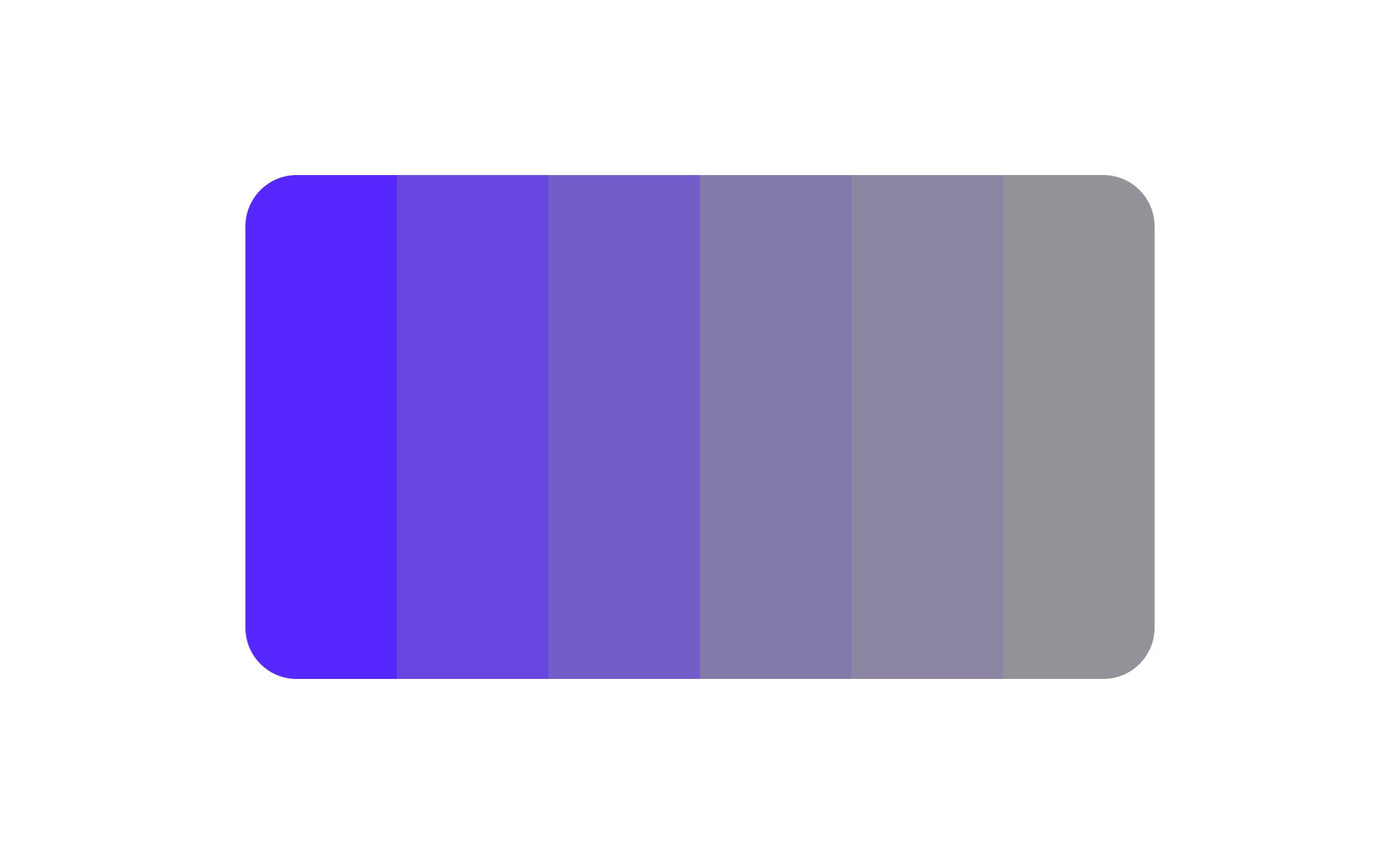
<?xml version="1.0" encoding="utf-8"?>

TL;DR

  • Defines the intensity of a color.
  • High saturation = vivid, strong hues.
  • Low saturation = muted, grayish tones.
  • Affects mood, emphasis, and readability.

Definition

Saturation is the measure of a color’s intensity or purity, describing how vivid or dull it appears, and is a core property in color theory for design and visual communication.

Detailed Overview

Saturation is one of the three key attributes of color, alongside hue and brightness. It defines how strong, vivid, or pure a color appears. A highly saturated red appears bold and striking, while a desaturated red shifts toward gray, feeling softer and less dominant. Designers manipulate saturation to balance emphasis, contrast, and harmony in visual compositions.

A frequent question is how saturation impacts user perception. High-saturation colors attract attention and convey energy or urgency, making them effective for calls-to-action such as buttons or alerts. Low-saturation colors, by contrast, create subtlety, calmness, and background balance, often used for secondary elements. Understanding this dynamic allows designers to guide user focus deliberately.

Another common query relates to accessibility. Overly saturated color schemes can cause visual strain, especially when combined with poor contrast. Similarly, very low saturation without sufficient distinction may reduce readability. Designers must balance saturation with contrast ratios to ensure inclusivity and usability for all audiences.

Teams also ask how saturation fits into brand identity. A brand might rely on bold, saturated colors to project confidence and energy, while another may prefer muted tones for elegance or professionalism. Maintaining consistent saturation levels across touchpoints strengthens recognition and communicates the brand personality effectively.

Another important aspect is saturation in digital displays. Because screen technologies vary, the same color may appear more or less saturated across devices. Designers often test colors across multiple screens to ensure consistency. Tools that simulate different environments or color-blind views help ensure that saturation choices work universally.

Finally, saturation plays a role in emotional design. Designers strategically adjust saturation to evoke feelings: bright, saturated palettes suggest playfulness and excitement, while muted, desaturated tones communicate calmness or seriousness. This emotional layer reinforces product goals, whether driving engagement, focus, or trust.

Learn more about this in the Saturation Exercise, taken from the Color Properties Lesson, a part of the UX Design Foundations Course.

Recommended resources

Courses

UX Design Foundations Course
Popular
Course

UX Design Foundations

Gene Kamenez
Gene Kamenez
Learn the essentials of UX design to build a strong foundation in core principles. Gain practical skills to support product development and create better user experiences.
Design Terminology Course
Course

Design Terminology

Alesya Dzenga
Alesya Dzenga
Learn UX terminology and key UX/UI terms that boost collaboration between designers, developers, and stakeholders for smoother, clearer communication.
UI Components I Course
Course

UI Components I

Colin Michael Pace
Colin Michael Pace
Learn to create user-friendly interfaces using core UI components, building a solid foundation for designing intuitive and efficient digital products.
Color Psychology Course
Course

Color Psychology

Cameron Chapman
Cameron Chapman
Learn how color influences perception, emotion, and behavior. Discover how to apply color psychology to design more impactful and engaging experiences.
Common Design Patterns Course
Course

Common Design Patterns

Gene Kamenez
Gene Kamenez
Learn design patterns most valued in product development to create intuitive, visually compelling experiences that seamlessly blend form and function.
Accessibility Foundations Course
Course

Accessibility Foundations

Ljubisa Kukulj
Ljubisa Kukulj
Learn the fundamentals of digital accessibility and how to create inclusive experiences for all users. Explore key principles, tools, and best practices.
Wireframing Course
Course

Wireframing

Colin Michael Pace
Colin Michael Pace
Learn to create effective wireframes that seamlessly integrate into your design workflows, improving communication and driving better design outcomes.
UI Components II Course
Course

UI Components II

Colin Michael Pace
Colin Michael Pace
Learn advanced techniques to design dynamic, scalable interfaces using optimized UI components and streamlined navigation for better user experiences.
UX Writing Course
Course

UX Writing

Alesya Dzenga
Alesya Dzenga
Learn to write microcopy that communicates clearly and concisely to improve user experience, build trust, and boost conversions across digital products.
Design Composition Course
Course

Design Composition

Gene Kamenez
Gene Kamenez
Learn the fundamental principles of visual layout, balance, and structure to create compelling and effective design compositions that engage and intrigue users.
Mobile Design Course
Course

Mobile Design

Denis Jeliazkov
Denis Jeliazkov
Learn mobile UI/UX patterns, workflows, and platform-specific strategies to create exceptional, user-friendly mobile experiences across different devices.
Typography Course
Course

Typography

Cameron Chapman
Cameron Chapman
Learn typography fundamentals, from typeface and font selection to layout and spatial arrangement, to create captivating designs that communicate powerfully.
UX Design Patterns with Checklist Design Course
Course

UX Design Patterns with Checklist Design

George Hatzis
George Hatzis
Learn common UX design patterns and how to apply them with practical checklists, ensuring the creation of intuitive, user-friendly, and exceptional interfaces.
HTML Foundations Course
Course

HTML Foundations

Yan Sokalau
Yan Sokalau
Learn the fundamentals of HTML, from basic formatting and structure to advanced elements and best practices, to create accessible and responsive web pages.
Enhancing UX Workflow with AI Course
Course

Enhancing UX Workflow with AI

Colin Michael Pace
Colin Michael Pace
Learn how to integrate AI into UX design to create smarter, more personalized user experiences. Explore tools, trends, and best practices in AI-driven design.
CSS Foundations Course
Course

CSS Foundations

Yan Sokalau
Yan Sokalau
Learn the basics of CSS, including the box model, element style, and content positioning, to improve communication, design handoff, and web decision-making.
Introduction to Figma Course
Course

Introduction to Figma

Gene Kamenez
Gene Kamenez
Learn essential Figma tools like layers, styling, typography, and images. Master the basics to create clean, user-friendly designs
3D Design Foundations Course
Course

3D Design Foundations

Learn essential 3D design principles, from spatial thinking and dimensional relationships to form, lighting, and texture, for a solid foundation in the field.
Information Architecture Course
Course

Information Architecture

Colin Michael Pace
Colin Michael Pace
Learn the basics of organizing, structuring, and labeling content to design clear, user-friendly information systems that enhance usability and navigation.
Apple Human Interface Guidelines Course
Course

Apple Human Interface Guidelines

Denis Jeliazkov
Denis Jeliazkov
Learn Apple’s Human Interface Guidelines to design modern, high-performing apps, focusing on UI principles and best practices for creating effective interfaces.
Introduction to Design Audits Course
Course

Introduction to Design Audits

Romina Kavcic
Romina Kavcic
Learn the art of systematic design evaluation to improve consistency, effectiveness, and create more user-centered products that meet user expectations.
Improve your UX & Product skills with interactive courses that actually work

FAQs

How is saturation different from brightness or hue?

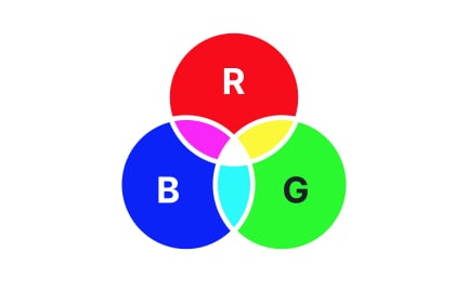
Hue defines the base color, such as red, blue, or green. Brightness describes how light or dark the color appears. Saturation, however, describes the intensity or purity of that hue. A red can remain the same hue while appearing vivid at high saturation or muted at low saturation.

Understanding this distinction allows designers to manipulate visual emphasis with precision.


When should high-saturation colors be used in design?

High-saturation colors are best for attracting attention, such as highlighting calls-to-action, urgent alerts, or key features. Their vividness makes them stand out immediately within an interface.

That said, overusing saturated colors can overwhelm users. They work best in moderation, balanced by more neutral tones.


How does low saturation contribute to usability?

Low-saturation colors help create calm, balanced environments. They are often used for backgrounds, secondary content, or subtle visual hierarchy. This prevents interfaces from feeling overwhelming or distracting.

Muting colors also helps focus attention on key, more saturated elements that require action.


How does saturation affect accessibility?

Accessibility requires careful control of saturation to ensure visibility and comfort. Overly saturated palettes can cause eye strain, while undersaturated colors may blend into backgrounds. Designers must check contrast ratios and test color choices under different conditions.

Accessible use of saturation ensures clarity for users with vision impairments and creates universally usable interfaces.


Why does saturation vary across devices?

Different screens display colors differently based on calibration, brightness settings, and technology. A highly saturated color on one monitor may appear muted on another.

Testing across devices and using standardized design systems helps maintain visual consistency, ensuring intended experiences reach all users.