Intro to Color Theory
Understand the science and art of color theory for impactful and emotionally engaging UX designs.
Color theory is arguably the most important visual element in UX design. It has the power to influence emotions, and the right color palette on a product can increase conversions and overall user satisfaction.
Understanding color theory concepts like the color wheel, color space, and how different kinds of colors evoke particular emotions is an important basis of product design. Color theory is a blend of science and art. Keep in mind that creating great color combinations involves both knowledge and intuition gained through practice.
The
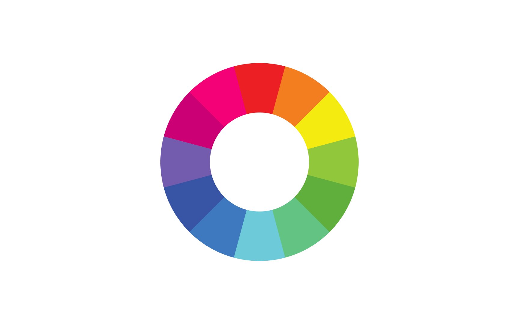
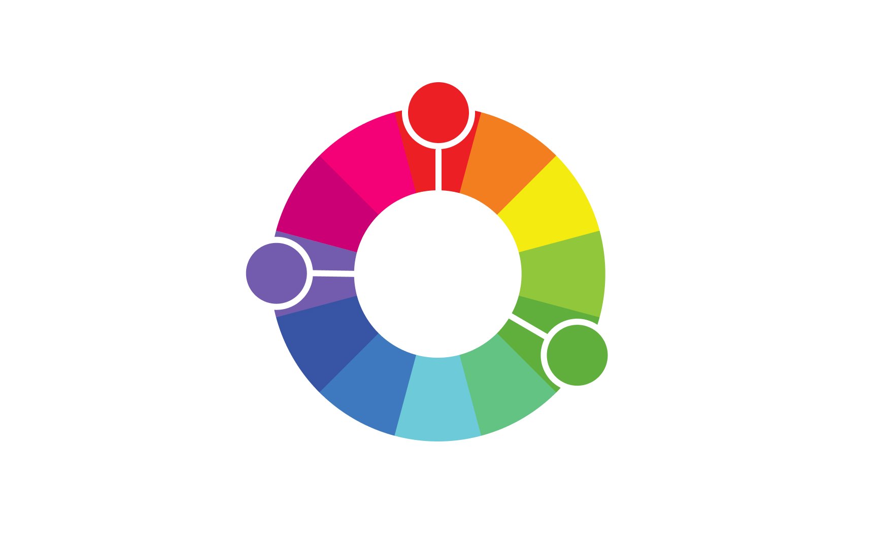
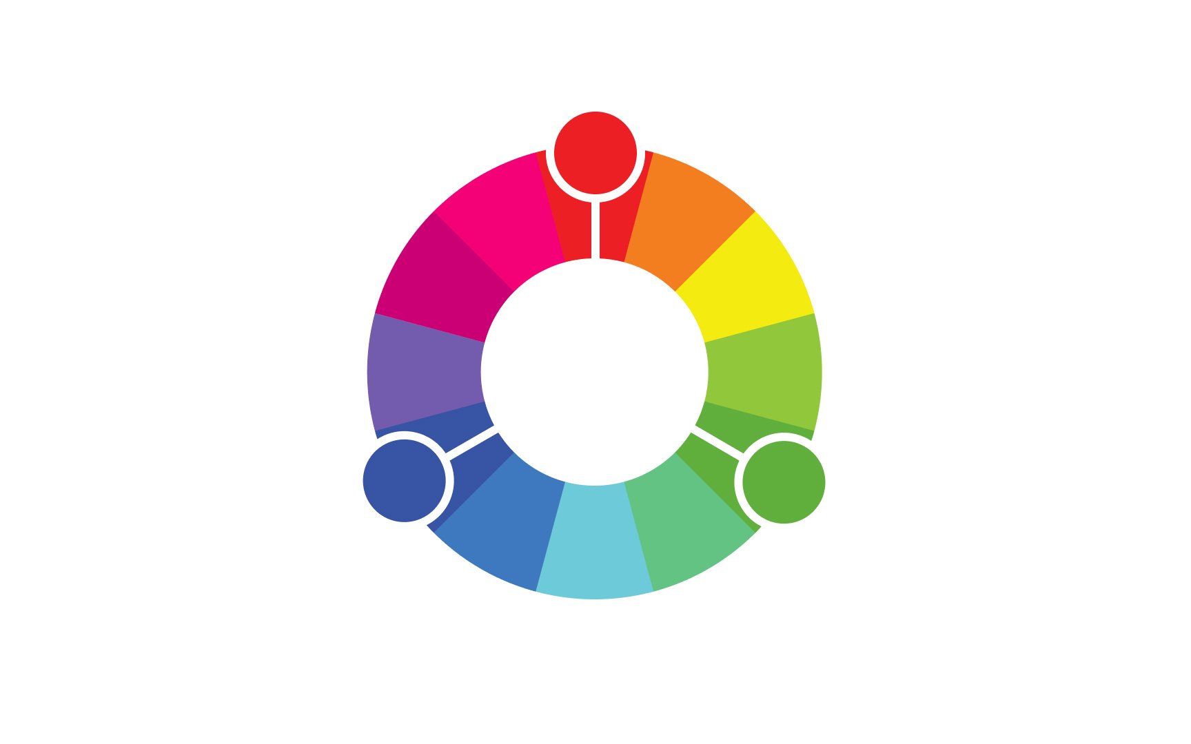
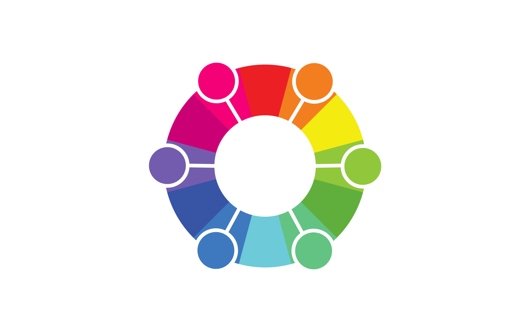
The color wheel is a valuable resource when creating color schemes and palettes. It serves as a visual tool for understanding how different hues relate to each other and can help designers create harmonious, balanced color schemes. Traditionally, it contains 12 hues — 3 primary colors, 3 secondary colors, and 6 tertiary colors.
There are two types of color wheels — subtractive and additive. Physical printing typically uses the subtractive color model, which is based on cyan, magenta, and yellow as primary colors. The model that is usually used online is the additive color wheel with red, green, and blue as primary colors.
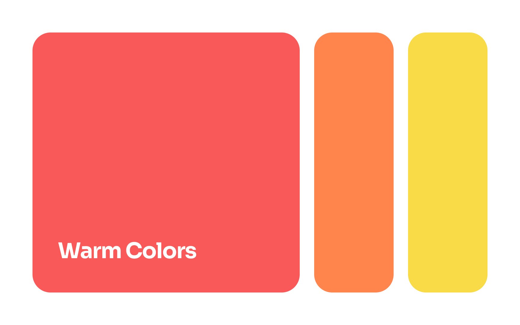
Warm
Warm colors can be intense, especially when they’re used in their pure condition. Used as accent colors they can add life and excitement to a design. When used in large amounts, they can be overpowering if not balanced with other colors. In either case, they have a powerful impact on any design.
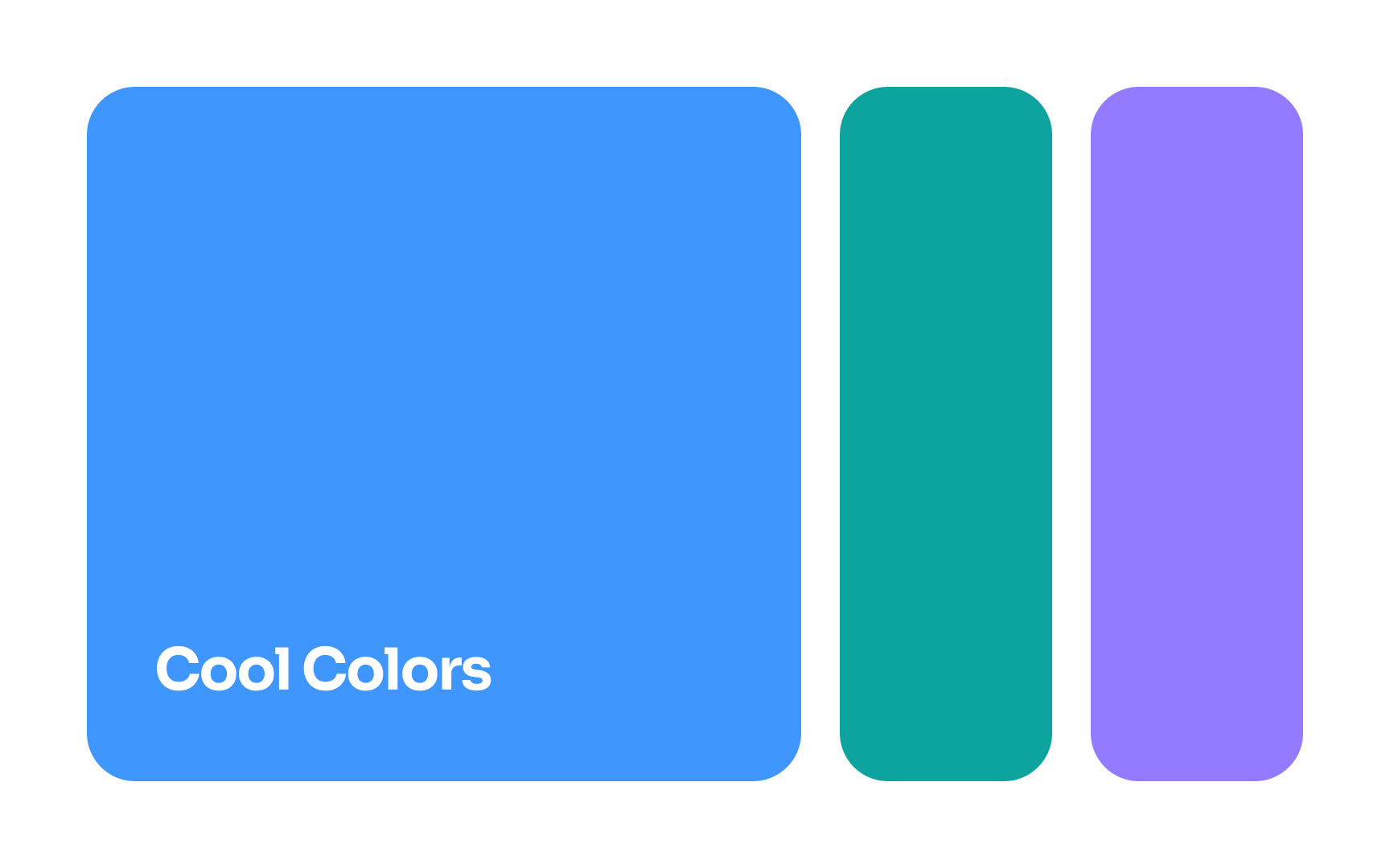
Cool colors are popular choices for branding. Blue is the most popular cool
Cool colors are commonly seen in nature — in water, the sky, and plants. These colors evoke feelings of calmness and relaxation, as well as loyalty and trust (another reason they’re so popular in branding). Blue is also widely associated with text links in
It's tough to create an aesthetically pleasing design using only warm and cool
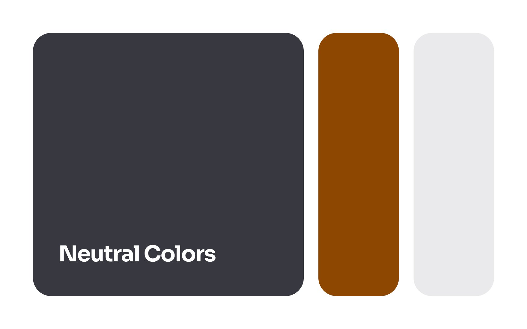
Neutral colors are popularly used for typography, backgrounds, and wireframing. They can also be used to make accent colors stand out in your design but can be overpowered if not used properly.
Pro Tip: Use neutral colors to make your product look more sophisticated.
In digital design, a
Using a consistent color palette not only adds a cohesive look but also infuses your product with a distinct personality. This helps in unifying diverse products under a single
Designers don't always need to create a palette from scratch. If a product or service has been around for a while, chances are there's already a brand book in place to kickstart the design process.
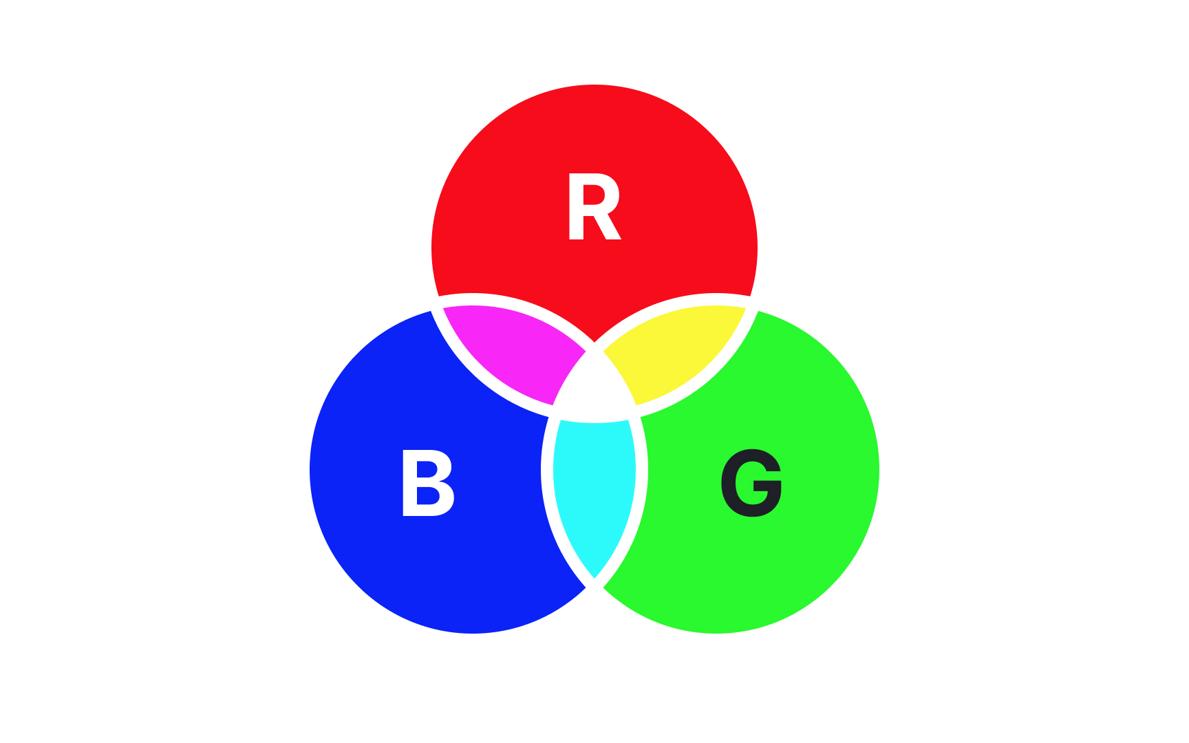
In the design world, the additive
The term "additive" refers to the fact that as you add colors to the mix, the result gets progressively lighter, all the way to white when all colors are combined. James Clerk Maxwell is largely credited as the father of additive color for his experimental work regarding light and the color spectrum. In 1861, he presented the very first color photograph at the Royal Institution.[3]
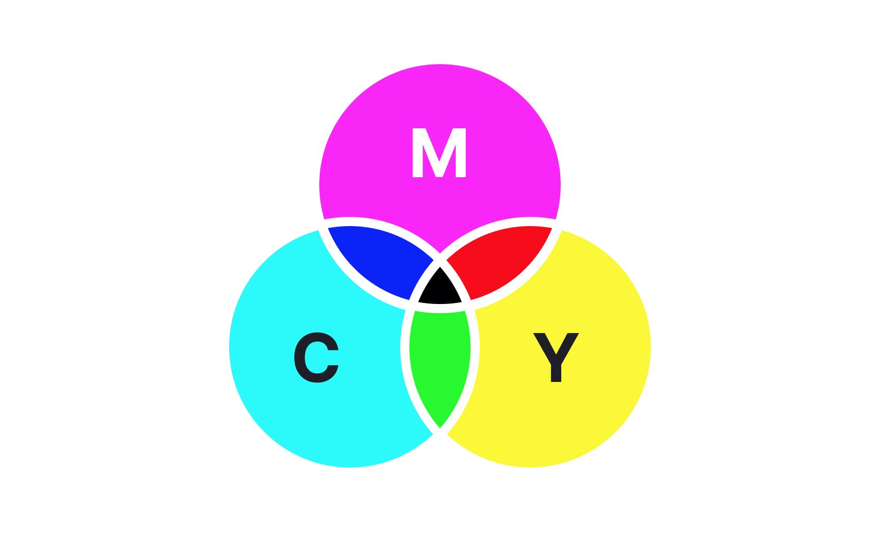
The subtractive
In art, the subtractive color model is based on the primary colors most of us learned as children — red, yellow, and blue. In printing and design, the subtractive color model is based on cyan, magenta, and yellow. More colors can be accurately reproduced by combining these 3 hues along with a key color such as black.
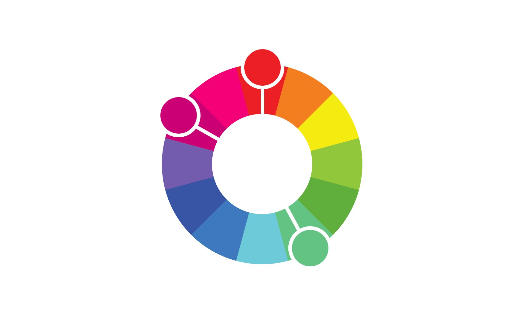
Primary colors are the root of every other
In design, primary colors have a powerful visual and psychological impact. They're often used as accent colors in their pure forms so they're not overpowering. However, leaning more heavily on primary colors would be the way to go when you want to make an impact.
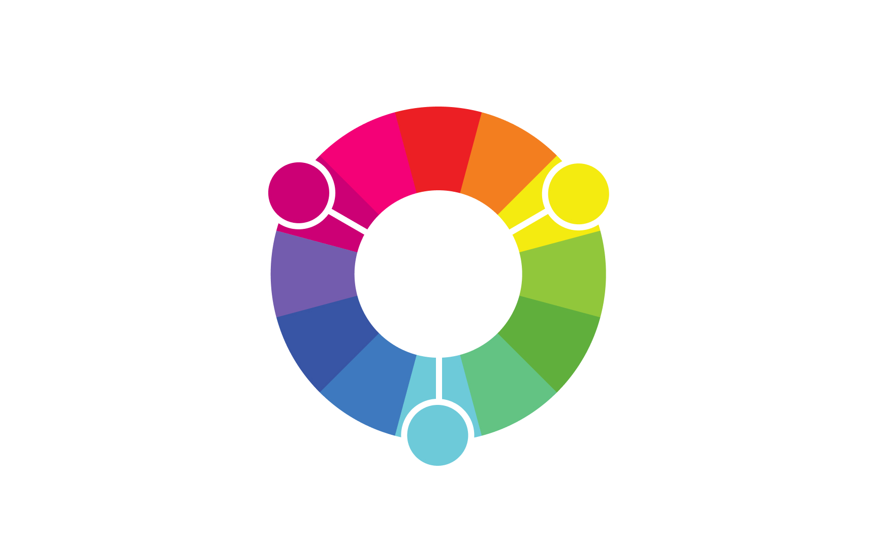
Secondary colors are created when combining two primary hues. In the subtractive
Notice that the subtractive primary colors (cyan, magenta, yellow) become secondary colors in the additive model. Likewise, red, blue, and green are primary colors in the additive model and secondary colors in the subtractive model. Even though these color models work in opposite ways, they're intricately related to one another.
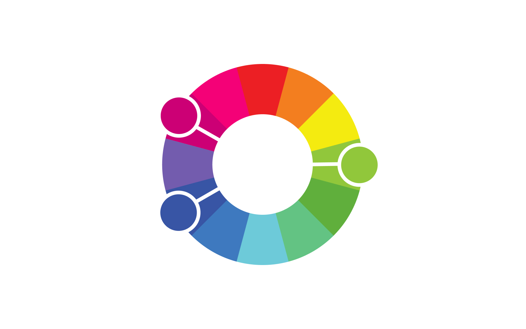
Tertiary colors are created when combining a primary and secondary hue in equal measure. In both additive and subtractive
Combining tertiary colors with primary or secondary colors creates yet another level of colors called quaternary colors.
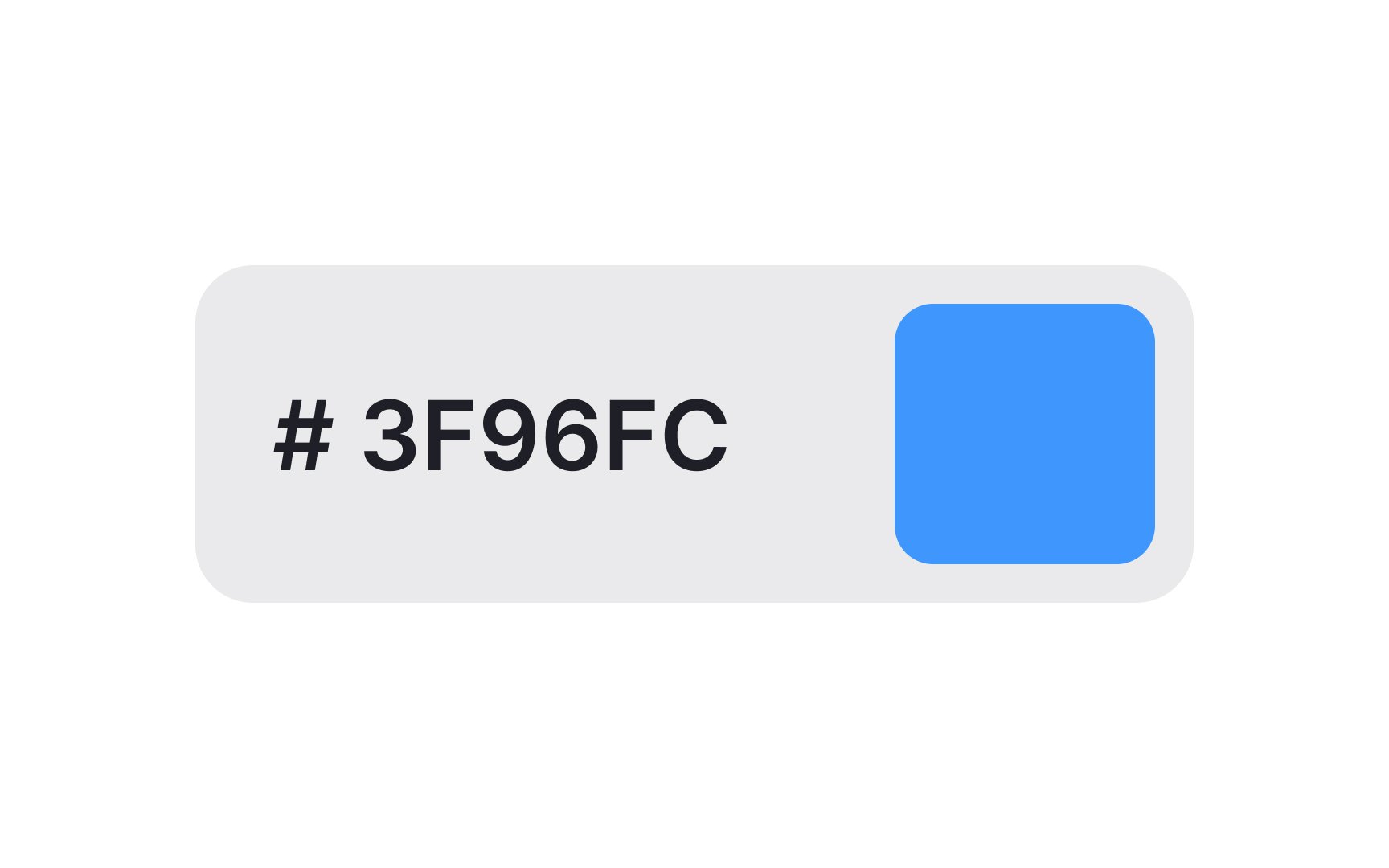
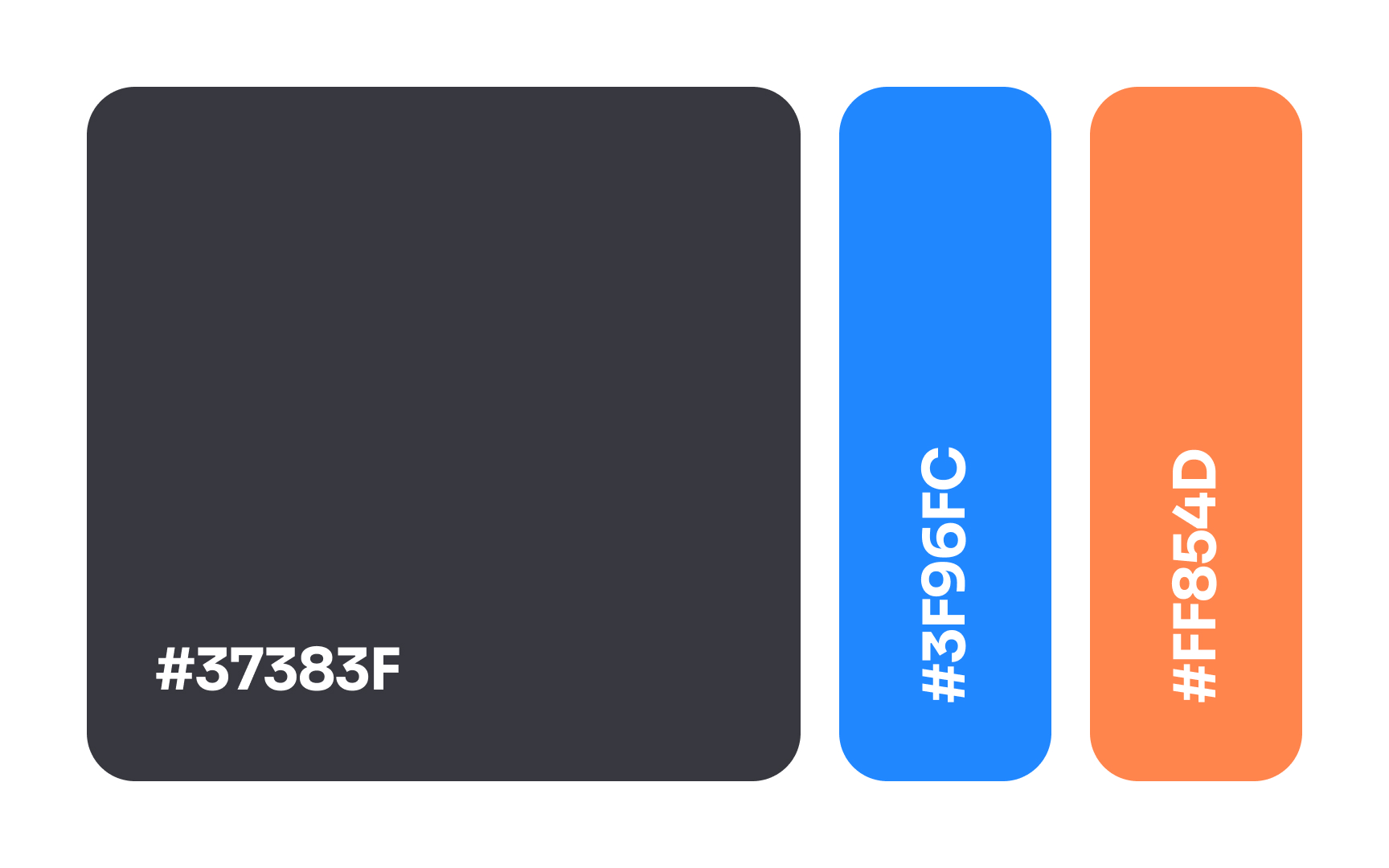
Hex triplets are one way to represent RGB colors and are commonly used to specify colors in CSS. Hex colors are prefixed with a “#” and typically include 6 hexadecimal digits (numbers 0–9 and letters A–F).[4] Each pair of digits in the code represents the intensity of the colors red, green, and blue (RGB).
The format is #RRGGBB:
- RR: Red component (00 to FF)
- GG: Green component (00 to FF)
- BB: Blue component (00 to FF)
Here are some examples of hex
- Black: #000000
- White: #FFFFFF
- Red: #FF0000
- Green: #00FF00
- Blue: #0000FF
- Yellow: #FFFF00
In some cases, they may include a fourth pair of digits, which represent the color’s opacity or alpha. Sometimes, you may see 3-digit hex colors, with only one digit representing each RGB value.
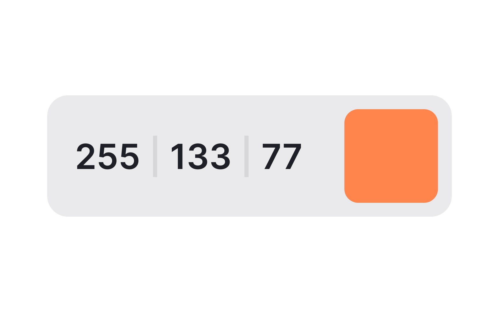
The RGB
RGB is represented using a combination of 3 numerical values that indicate the intensity of each primary color. Each value typically ranges from 0 to 255, where 0 indicates no intensity of that color and 255 indicates the maximum intensity. The 3 values are often written in the format (R, G, B), such as (255, 0, 0) for pure red, (0, 255, 0) for pure green, and (0, 0, 255) for pure blue.


Similar lessons

Color Properties

How Color Affects Mood & Emotion
