How Color Affects Mood & Emotion
Understand the common connotations of colors and how they generally affect people's moods
There's a reason why healthy ecological products mostly use green packaging. Or why athletes in red uniforms appear more confident and win more often. Or why you become more relaxed and serene among lush green in a park after a long, hard day. Why does it happen, and how does color work?
Color is a powerful tool people use for communicating, stimulating action, influencing mood, and even modifying behavior. It can affect our performance and consumer behavior, increase appetite, cause anxiety, or, oppositely, soothe emotions. However, while some colors evoke universal associations, people may still react differently due to their memories, culture, and current environment.
Understanding different color connotations will help you be more careful while selecting colors for your next design project, marketing campaign, living room paint colors, or even a new car.
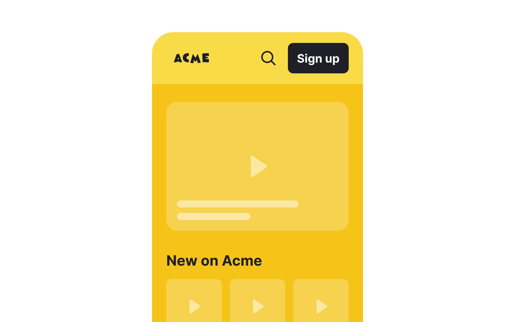
Yellow is commonly linked to feelings of happiness and joy. It is often used to create cheerful and positive environments. It is also known to evoke feelings of:
- Warmth: Yellow is associated with the warmth of the sun and can create a welcoming and inviting atmosphere.
- Optimism: The bright and light nature of yellow often symbolizes optimism and positivity.
- Energy: Yellow is perceived as energetic and lively. It can stimulate mental activity and generate a sense of excitement.
- Attention-grabbing: Due to its brightness, yellow can quickly catch the eye, which is why it's used in warning signs and advertisements.
On the flip side, very intense or saturated yellow can be overwhelming and cause visual fatigue. It can also be associated with caution or warning, potentially creating a sense of unease.
In design, avoid using bright yellow for backgrounds as it can cause severe eyestrain and hurt readability. Use it sparingly and only to attract attention to important elements.

Thinking of an orange fruit often brings to mind its bright, shiny skin and refreshing taste. For many, the
Orange is also associated with warmth and coziness, often reminding people of autumn, Halloween, and foods like pumpkin pie and sweet potatoes. These connections make it a comforting and nostalgic color in Western cultures. In Eastern cultures, orange is often associated with auspiciousness and good fortune.
Due to its brightness, orange is used in advertisements and signs to draw attention. It’s a color that stands out and is hard to ignore, which makes it effective in
The phrase "feeling blue" means feeling sad or depressed. This idea comes from old sailing traditions where blue flags were used when someone died during a voyage.
Artists, like Pablo Picasso, used blue to show sorrow and hardship. During his Blue Period, Picasso painted mostly in blue shades, depicting themes of poverty and loneliness. His works, such as The Old Guitarist, are examples of how blue can express deep sadness.
Since blue is a cool
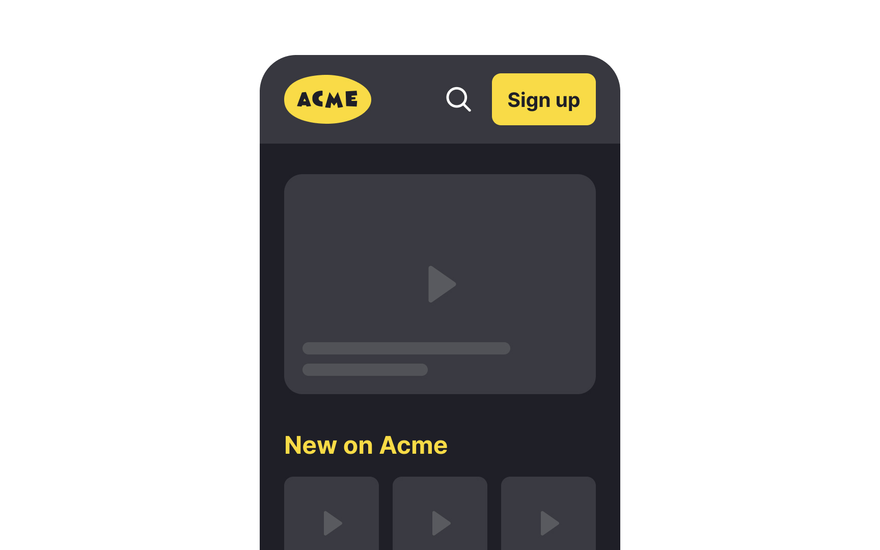
Gray is another color linked to gloominess and a lack of energy. It can evoke feelings of dullness and depression, especially when used in large amounts.
Pro Tip: Avoid using pale, low-saturated blue or gray for CTA buttons.
Looking at certain blue
Green is another calming
White is also known for its calming effects in Western cultures. It creates a sense of cleanliness and simplicity, often making spaces feel more open and peaceful.[3] On the other hand, keep in mind that it also symbolizes death and sadness in many Eastern cultures.[4]
Navy blue is widely used to convey trust, reliability, and professionalism. It is a popular choice for financial institutions and tech companies because it instills confidence and security.[1]
Like blue, green is a
White represents purity, simplicity, and clarity. It is frequently used in healthcare and technology to suggest cleanliness and straightforwardness.
Gray is seen as neutral and balanced, often representing professionalism and formality. Many corporate brands use gray to convey stability and maturity, which translates to trustworthiness.
Red is often considered a
Although some scientists are skeptical about these findings, the stimulating power of red is undeniable. Being exposed to red can increase blood pressure, heart rate, and respiration rate. More importantly, red enhances metabolism and appetite.[6]
Other colors like yellow, orange, bright green, and bright pink also evoke motivation and enthusiasm for life and action.
Greens and blues symbolize nature and tend to make people feel serene, peaceful, and relaxed. Notably, several studies have revealed how having access to blue spaces might improve health and well-being.[8]
Pro Tip: Light blues and greens can be the right base color for health institution websites or apps.
You rarely find purple in nature, so it's commonly associated with mysterious, spiritual, and divine substances. The binary properties of purple — the combination of intense, stimulating red and calming, tranquil blue — encourage imagination and boost creativity. Notably, purple dye was very rare and extremely expensive in ancient times. Because only rich individuals could afford such costly goods, this
Other colors that boost creativity include yellow for its cheerful energy, orange for enthusiasm, green for its calming and renewing qualities, blue for promoting peace and reducing stress, and pink for its playful and nurturing vibes.
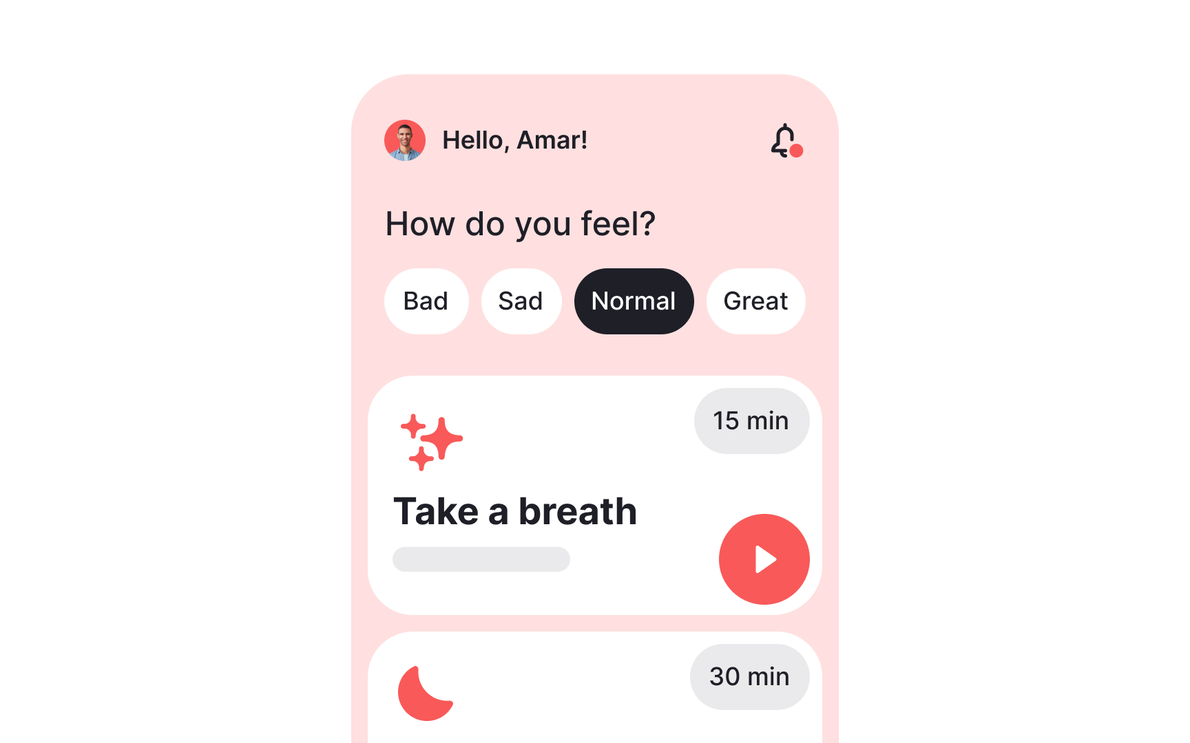
In Western cultures, pink is traditionally associated with feminine traits like softness, kindness, nurturing, and compassion. However, with shifting gender roles, designers should be cautious when applying these associations. Pink is also often connected with love, and romance, and has relaxing and rejuvenating qualities, making it suitable for caring or nurturing purposes.
The phenomenon of Drunk-Tank Pink, also known as Baker-Miller Pink or Schauss Pink, claims that this particular tone of pink helps lower the heart rate, pulse, and respiration.
According to studies, prisoners placed in cells with pink-painted walls at the Naval correctional facility demonstrated a reduction of hostile, violent, or aggressive behavior.[10] Other experiments, though, like the one at the Santa Clara County Jail, proved the opposite. The positive effect took place during only the first month of exposure to the


All colors have different meanings under different contexts but
Being one of the most visible colors in the
Orange, on the other hand, is often described as bright, happy, and uplifting. However, a by-product of red and yellow, highly saturated orange can appear fierce, and aggressive.
Grounded
Brown represents the earth and nature, conveying reliability, stability, and comfort. Companies like UPS, Hershey's, Cotton, Edy's, J.P. Morgan, and M&M use brown in their


If asked to name the first
Red is fantastic for warnings and drawing attention but use this color thoughtfully only for critical information to avoid alarming users unnecessarily.
Pro Tip: Responses to colors like red often depend on past experiences and cultural influences. Take a moment to consider how your experiences shape your reaction to this color.
References
- How Does Orange Influence Your Moods? | Verywell Mind
- How White Impact Moods, Feelings, and Behaviors | Verywell Mind
- How White Impact Moods, Feelings, and Behaviors | Verywell Mind
- (PDF) Psychology: Red enhances human performance in contests | ResearchGate
- How Does the Color Red Impact Your Mood and Behavior? | Verywell Mind
- Effects of the Color Purple on Mood and Behavior | Verywell Mind
- How Does the Color Brown Affect Your Mood? | Verywell Mind
- Anger as “seeing red”: Evidence for a perceptual association | Taylor & Francis
Top contributors


Topics
From Course

Share


Similar lessons

Intro to Color Theory

Color Properties
