<?xml version="1.0" encoding="utf-8"?>

TL;DR

  • Darker variation of a base hue.
  • Created by mixing a color with black.
  • Adds depth and weight in design.
  • Useful for emphasis and hierarchy.

Definition

Shade is a color modification produced by adding black to a base hue, darkening it while maintaining the core identity of the original color.

Detailed Overview

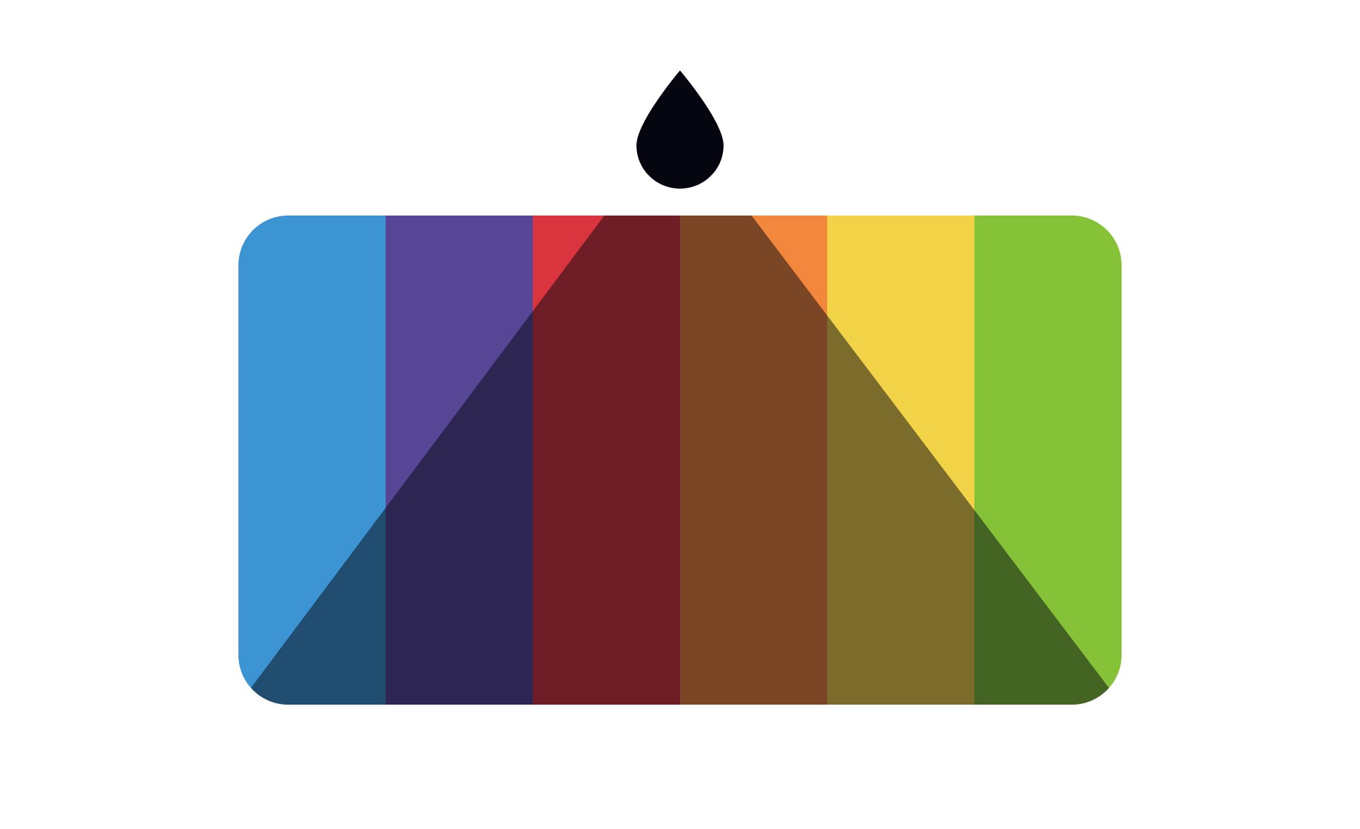
Shade is a concept from color theory that helps designers and artists manipulate the depth and intensity of colors. By adding black to a hue, the color takes on a darker appearance while still preserving its underlying identity. For example, red becomes burgundy when shaded, and blue shifts into navy. Shades are widely used in visual design to create depth, hierarchy, and contrast.

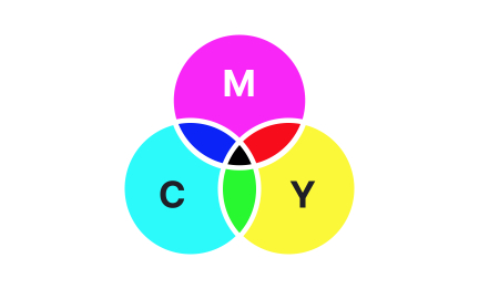
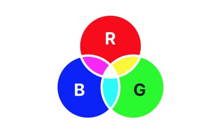
A frequent question is how shades differ from tints and tones. Tints are created by adding white, making colors lighter, while tones are produced by adding gray, softening their vibrancy. Shades, by contrast, deepen colors, giving them weight and strength. Understanding the distinction helps designers apply the right variation for the right context.

Another common query relates to visual hierarchy. Designers often use shades to emphasize or de-emphasize elements. A shaded color may represent inactive states, background elements, or supporting content, allowing brighter versions of the same hue to signal calls-to-action or primary content. This system creates clarity without requiring an entirely new palette.

Shades also contribute to mood and emotion in design. Darker versions of colors often convey seriousness, sophistication, or authority. For example, a financial brand may use shades of blue to project trust and stability, while lighter tints of the same hue might suggest friendliness or openness. Strategic use of shades allows products to communicate their personality effectively.

Teams often ask about accessibility and contrast. Shades can improve readability by increasing contrast between text and background. However, designers must test carefully, as overly dark shades without sufficient contrast against surrounding elements can reduce legibility. Tools for contrast checking help ensure compliance with accessibility standards.

Shades are also crucial in branding. A single brand hue may appear in multiple forms: the pure color for logo applications, a shaded variant for accents, and lighter tints for backgrounds. Using a consistent system of shades strengthens brand identity while providing flexibility across media.

Learn more about this in the Shade Exercise, taken from the Color Properties Lesson, a part of the UX Design Foundations Course.

Recommended resources

Courses

UX Design Foundations Course
Popular
Course

UX Design Foundations

Gene Kamenez
Gene Kamenez
Learn the essentials of UX design to build a strong foundation in core principles. Gain practical skills to support product development and create better user experiences.
Design Terminology Course
Course

Design Terminology

Alesya Dzenga
Alesya Dzenga
Learn UX terminology and key UX/UI terms that boost collaboration between designers, developers, and stakeholders for smoother, clearer communication.
UI Components I Course
Course

UI Components I

Colin Michael Pace
Colin Michael Pace
Learn to create user-friendly interfaces using core UI components, building a solid foundation for designing intuitive and efficient digital products.
Color Psychology Course
Course

Color Psychology

Cameron Chapman
Cameron Chapman
Learn how color influences perception, emotion, and behavior. Discover how to apply color psychology to design more impactful and engaging experiences.
Common Design Patterns Course
Course

Common Design Patterns

Gene Kamenez
Gene Kamenez
Learn design patterns most valued in product development to create intuitive, visually compelling experiences that seamlessly blend form and function.
Accessibility Foundations Course
Course

Accessibility Foundations

Ljubisa Kukulj
Ljubisa Kukulj
Learn the fundamentals of digital accessibility and how to create inclusive experiences for all users. Explore key principles, tools, and best practices.
Wireframing Course
Course

Wireframing

Colin Michael Pace
Colin Michael Pace
Learn to create effective wireframes that seamlessly integrate into your design workflows, improving communication and driving better design outcomes.
UI Components II Course
Course

UI Components II

Colin Michael Pace
Colin Michael Pace
Learn advanced techniques to design dynamic, scalable interfaces using optimized UI components and streamlined navigation for better user experiences.
Design Composition Course
Course

Design Composition

Gene Kamenez
Gene Kamenez
Learn the fundamental principles of visual layout, balance, and structure to create compelling and effective design compositions that engage and intrigue users.
Mobile Design Course
Course

Mobile Design

Denis Jeliazkov
Denis Jeliazkov
Learn mobile UI/UX patterns, workflows, and platform-specific strategies to create exceptional, user-friendly mobile experiences across different devices.
Typography Course
Course

Typography

Cameron Chapman
Cameron Chapman
Learn typography fundamentals, from typeface and font selection to layout and spatial arrangement, to create captivating designs that communicate powerfully.
UX Design Patterns with Checklist Design Course
Course

UX Design Patterns with Checklist Design

George Hatzis
George Hatzis
Learn common UX design patterns and how to apply them with practical checklists, ensuring the creation of intuitive, user-friendly, and exceptional interfaces.
HTML Foundations Course
Course

HTML Foundations

Yan Sokalau
Yan Sokalau
Learn the fundamentals of HTML, from basic formatting and structure to advanced elements and best practices, to create accessible and responsive web pages.
Enhancing UX Workflow with AI Course
Course

Enhancing UX Workflow with AI

Colin Michael Pace
Colin Michael Pace
Learn how to integrate AI into UX design to create smarter, more personalized user experiences. Explore tools, trends, and best practices in AI-driven design.
CSS Foundations Course
Course

CSS Foundations

Yan Sokalau
Yan Sokalau
Learn the basics of CSS, including the box model, element style, and content positioning, to improve communication, design handoff, and web decision-making.
Introduction to Figma Course
Course

Introduction to Figma

Gene Kamenez
Gene Kamenez
Learn essential Figma tools like layers, styling, typography, and images. Master the basics to create clean, user-friendly designs
3D Design Foundations Course
Course

3D Design Foundations

Learn essential 3D design principles, from spatial thinking and dimensional relationships to form, lighting, and texture, for a solid foundation in the field.
Information Architecture Course
Course

Information Architecture

Colin Michael Pace
Colin Michael Pace
Learn the basics of organizing, structuring, and labeling content to design clear, user-friendly information systems that enhance usability and navigation.
Apple Human Interface Guidelines Course
Course

Apple Human Interface Guidelines

Denis Jeliazkov
Denis Jeliazkov
Learn Apple’s Human Interface Guidelines to design modern, high-performing apps, focusing on UI principles and best practices for creating effective interfaces.
Introduction to Design Audits Course
Course

Introduction to Design Audits

Romina Kavcic
Romina Kavcic
Learn the art of systematic design evaluation to improve consistency, effectiveness, and create more user-centered products that meet user expectations.
Improve your UX & Product skills with interactive courses that actually work

FAQs

How does a shade differ from a tint or a tone?

A shade is created by adding black to a color, making it darker. A tint is created by adding white, making the color lighter, while a tone involves mixing gray. These differences matter because they produce distinct visual effects.

By understanding how shades compare to tints and tones, designers can build flexible, nuanced color palettes.


How are shades used to create hierarchy in design?

Shades help de-emphasize secondary elements, making primary elements stand out more clearly. For example, a shaded button might indicate a disabled state, while the base color signals an active option.

This technique creates clarity without overwhelming the interface with entirely different colors.


What emotional effects do shades convey?

Shades often evoke seriousness, stability, and sophistication. Darker blues communicate professionalism, while shaded reds can suggest richness or authority. These associations help align visual design with brand personality.

By contrast, lighter tints might convey approachability or playfulness, showing how color depth changes perception.


How do shades support accessibility?

Shades can increase contrast, improving legibility of text and interactive elements. Designers must test combinations carefully, as overly dark shades on dark backgrounds reduce readability.

Following accessibility guidelines ensures that shaded colors remain usable for all audiences.


How are shades applied in branding?

Brands often build entire palettes from a single hue, using shades for accents, depth, or variation. For example, a company might use pure red for its logo but darker red shades for navigation or emphasis.

This consistency creates cohesion while providing enough flexibility for different design contexts.