<?xml version="1.0" encoding="utf-8"?>

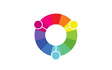
Hue refers to the fundamental property of color that distinguishes one shade family from another. When people describe a color as red, blue, green, or yellow, they are referring to its hue. In digital design, hue is one of the three main components of the HSL (Hue, Saturation, Lightness) model, which helps designers define and manipulate colors more systematically. By adjusting hue, designers can shift colors around the spectrum while keeping brightness and saturation levels consistent.

For UX and UI designers, hue plays a vital role in building accessible and aesthetically pleasing products. Choosing the right hues influences how users perceive and interact with interfaces. A blue hue might suggest trust and professionalism, while a red hue often conveys urgency or alertness.

Accessibility is closely tied to hue. Some users have color vision deficiencies that make it difficult to distinguish certain hues, such as red and green. If designers rely solely on hue to communicate meaning, critical information may be missed. Accessible products use hue in combination with other indicators, such as icons, text labels, or patterns, ensuring that meaning does not depend solely on color perception.

Real-world examples illustrate how hue functions across digital products. Google uses distinct hues across its suite of products, blue for Gmail, red for YouTube, green for Sheets, to create visual recognition. Traffic light systems rely on hue to communicate action states, though digital versions often pair colors with icons to improve accessibility. SaaS dashboards might use different hues to separate categories of data, helping users distinguish between information types at a glance.

Hue also connects directly to cultural associations. In Western contexts, white often symbolizes purity, while in some Asian cultures it is associated with mourning. Red may signify danger in one region but prosperity in another. This means designers and product managers must consider not just the hue itself but how cultural context shapes its interpretation, especially for global products.

Learn more about this in the Hue Exercise, taken from the Color Terminology Lesson, a part of the Design Terminology Course.

Key Takeaways

  • Hue defines a color’s position on the spectrum, such as red or blue.
  • Designers use hues for branding, hierarchy, and emotional impact.
  • Accessibility requires pairing hues with other indicators for clarity.
  • Real-world uses include product branding and data visualization.
  • Cultural interpretations of hues vary across regions.

Recommended resources

Courses

UX Design Foundations Course
Popular
Course

UX Design Foundations

Gene Kamenez
Gene Kamenez
Learn the essentials of UX design to build a strong foundation in core principles. Gain practical skills to support product development and create better user experiences.
Design Terminology Course
Course

Design Terminology

Alesya Dzenga
Alesya Dzenga
Learn UX terminology and key UX/UI terms that boost collaboration between designers, developers, and stakeholders for smoother, clearer communication.
UI Components I Course
Course

UI Components I

Colin Michael Pace
Colin Michael Pace
Learn to create user-friendly interfaces using core UI components, building a solid foundation for designing intuitive and efficient digital products.
Color Psychology Course
Course

Color Psychology

Cameron Chapman
Cameron Chapman
Learn how color influences perception, emotion, and behavior. Discover how to apply color psychology to design more impactful and engaging experiences.
Common Design Patterns Course
Course

Common Design Patterns

Gene Kamenez
Gene Kamenez
Learn design patterns most valued in product development to create intuitive, visually compelling experiences that seamlessly blend form and function.
Accessibility Foundations Course
Course

Accessibility Foundations

Ljubisa Kukulj
Ljubisa Kukulj
Learn the fundamentals of digital accessibility and how to create inclusive experiences for all users. Explore key principles, tools, and best practices.
Wireframing Course
Course

Wireframing

Colin Michael Pace
Colin Michael Pace
Learn to create effective wireframes that seamlessly integrate into your design workflows, improving communication and driving better design outcomes.
UI Components II Course
Course

UI Components II

Colin Michael Pace
Colin Michael Pace
Learn advanced techniques to design dynamic, scalable interfaces using optimized UI components and streamlined navigation for better user experiences.
UX Writing Course
Course

UX Writing

Alesya Dzenga
Alesya Dzenga
Learn to write microcopy that communicates clearly and concisely to improve user experience, build trust, and boost conversions across digital products.
Design Composition Course
Course

Design Composition

Gene Kamenez
Gene Kamenez
Learn the fundamental principles of visual layout, balance, and structure to create compelling and effective design compositions that engage and intrigue users.
Mobile Design Course
Course

Mobile Design

Denis Jeliazkov
Denis Jeliazkov
Learn mobile UI/UX patterns, workflows, and platform-specific strategies to create exceptional, user-friendly mobile experiences across different devices.
Typography Course
Course

Typography

Cameron Chapman
Cameron Chapman
Learn typography fundamentals, from typeface and font selection to layout and spatial arrangement, to create captivating designs that communicate powerfully.
UX Design Patterns with Checklist Design Course
Course

UX Design Patterns with Checklist Design

George Hatzis
George Hatzis
Learn common UX design patterns and how to apply them with practical checklists, ensuring the creation of intuitive, user-friendly, and exceptional interfaces.
HTML Foundations Course
Course

HTML Foundations

Yan Sokalau
Yan Sokalau
Learn the fundamentals of HTML, from basic formatting and structure to advanced elements and best practices, to create accessible and responsive web pages.
Enhancing UX Workflow with AI Course
Course

Enhancing UX Workflow with AI

Colin Michael Pace
Colin Michael Pace
Learn how to integrate AI into UX design to create smarter, more personalized user experiences. Explore tools, trends, and best practices in AI-driven design.
CSS Foundations Course
Course

CSS Foundations

Yan Sokalau
Yan Sokalau
Learn the basics of CSS, including the box model, element style, and content positioning, to improve communication, design handoff, and web decision-making.
Introduction to Figma Course
Course

Introduction to Figma

Gene Kamenez
Gene Kamenez
Learn essential Figma tools like layers, styling, typography, and images. Master the basics to create clean, user-friendly designs
3D Design Foundations Course
Course

3D Design Foundations

Learn essential 3D design principles, from spatial thinking and dimensional relationships to form, lighting, and texture, for a solid foundation in the field.
Information Architecture Course
Course

Information Architecture

Colin Michael Pace
Colin Michael Pace
Learn the basics of organizing, structuring, and labeling content to design clear, user-friendly information systems that enhance usability and navigation.
Apple Human Interface Guidelines Course
Course

Apple Human Interface Guidelines

Denis Jeliazkov
Denis Jeliazkov
Learn Apple’s Human Interface Guidelines to design modern, high-performing apps, focusing on UI principles and best practices for creating effective interfaces.
Introduction to Design Audits Course
Course

Introduction to Design Audits

Romina Kavcic
Romina Kavcic
Learn the art of systematic design evaluation to improve consistency, effectiveness, and create more user-centered products that meet user expectations.
Improve your UX & Product skills with interactive courses that actually work

FAQs

How is hue different from saturation and lightness?

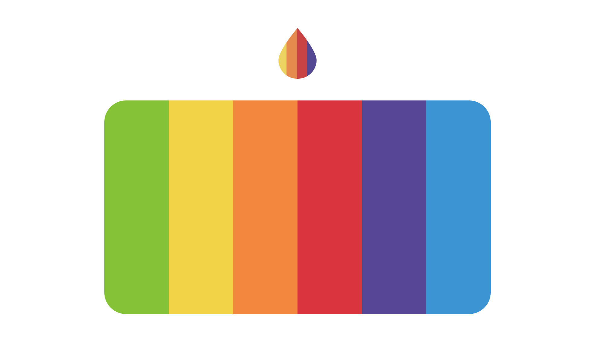
Hue defines the base color, such as red or green. Saturation controls how intense or muted that hue appears, while lightness adjusts how bright or dark it looks. Together, these three attributes, hue, saturation, and lightness, form the HSL model.

This distinction allows designers to create palettes with a consistent structure. By holding saturation and lightness constant while changing hue, they can produce balanced, harmonious color variations.


Why does hue matter for accessibility in design?

Many users have color vision deficiencies, meaning they cannot distinguish between certain hues. For example, red-green color blindness makes it difficult to rely on those hues for error and success states. If products communicate solely through hue, they exclude these users.

Designers solve this by pairing hue with text labels, shapes, or icons. This ensures that meaning is preserved regardless of how colors are perceived. Accessibility testing validates that hues work in practice for diverse users.


How do cultural differences affect the use of hue in products?

Hue carries symbolic meanings that shift across cultures. Red may be seen as danger in some regions but prosperity in others. White may symbolize purity in one culture and mourning in another. These associations affect how users interpret interfaces and branding.

Product teams working globally must research cultural color meanings before finalizing palettes. By adjusting hues for different regions, or choosing more neutral alternatives, they avoid confusion and build trust with international audiences.