Color Terminology
Understand the different aspects and properties of color
Color is arguably the most powerful tool a designer can use. A strong color palette can elevate even the most basic design into something special. The wrong colors, on the other hand, can turn off users and send them elsewhere.
But color theory is about more than just picking pretty colors. There's both an art and a science to it. Understanding the science behind how color is perceived and how it influences user behavior is vital to using it effectively to design.
This isn't merely about aesthetic appeal; it's about using color to shape user behavior and convey the desired message. For designers, mastering color theory isn't just a skill, it's a strategic tool for communication. By using color thoughtfully, designers can create experiences that resonate with users on multiple levels.
RGB is an additive

CMYK is the subtractive
The CMYK color model is used in four-color process printing. You can produce virtually any color in the visible spectrum by adding these four colors together in varying ratios.
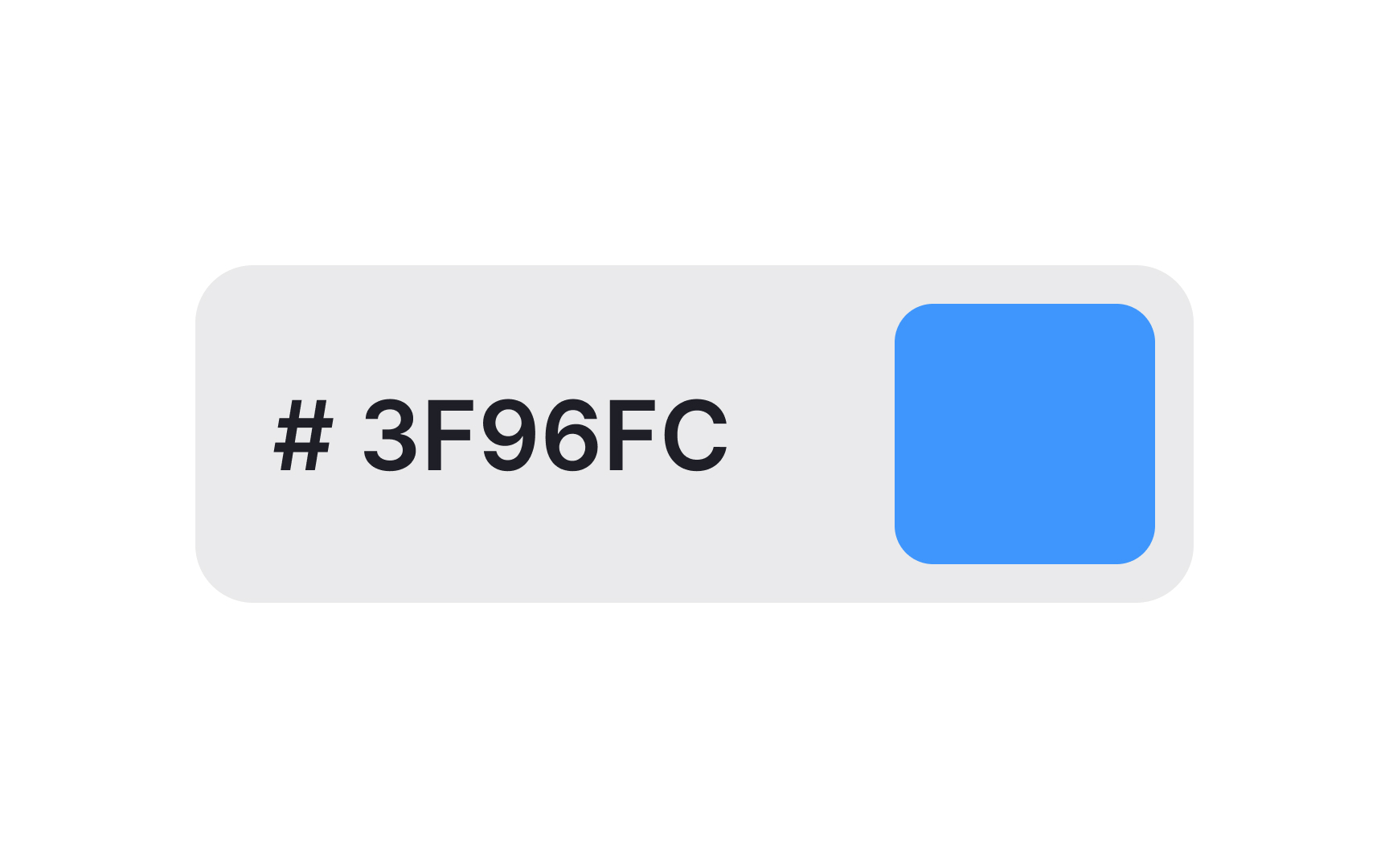
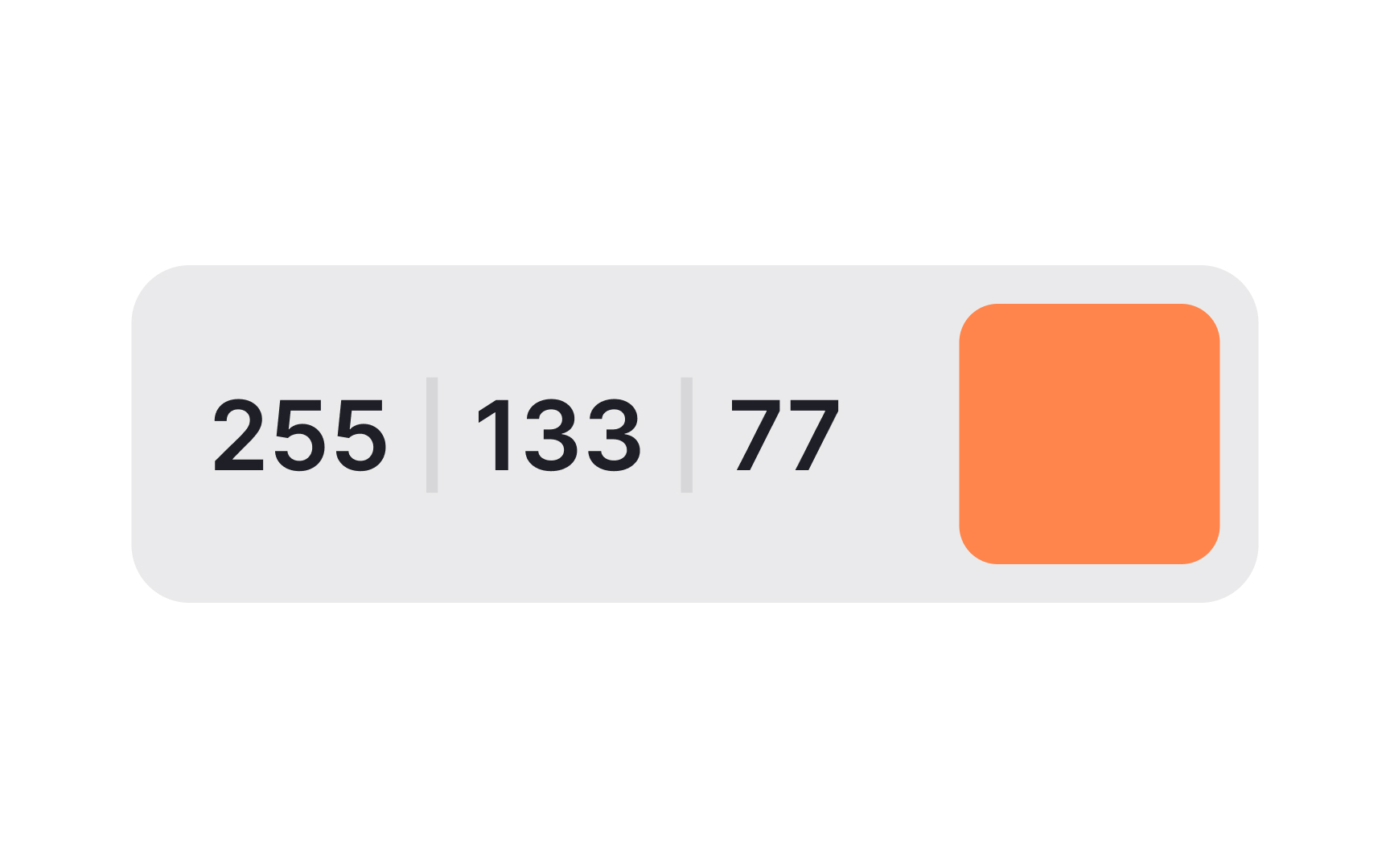
A hex code is a representation of how much red, green, and blue exist in a
Pro Tip: You don’t need to know exactly how hex codes are calculated — there are plenty of tools to convert colors into their hex values for you.
A
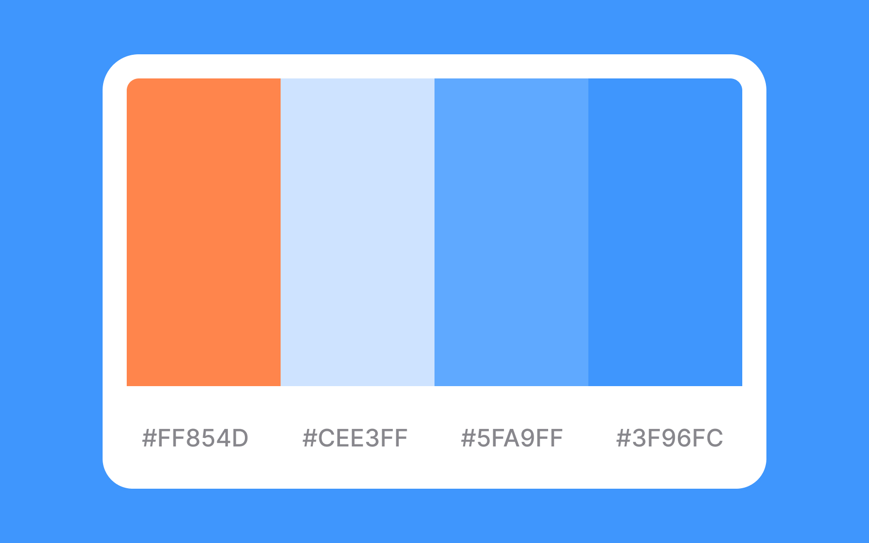
More complex palettes may even involve gradients or tints and shades of a base
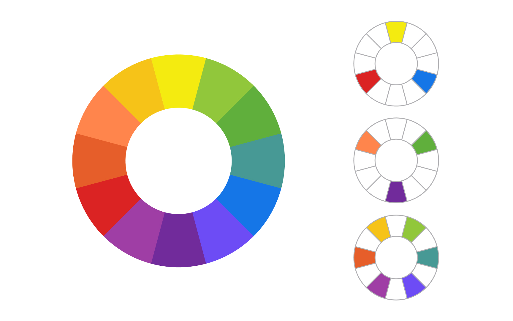
Hue refers to the purest form of a
The words “color” and “hue” are often used interchangeably in everyday use. In design, there’s a distinction: color can refer not only to hues but also to

Gradients can happen within a single color (such as light green to forest green) or between different colors (red to yellow, for example). In the transitional space, many other colors are present.

Contrast is also an important consideration for creating accessible designs. The contrast between text and background colors should be at least 4.5:1 for small text and 3:1 for larger text.

Opacity refers to how see-through a
When a color has reduced opacity over a white background, it will appear lighter. Over a black background, it will appear darker. Opacity changes can also be used to create gradients against a background color.

A shadow, also known as a drop shadow, is a visual effect that simulates the presence of a light source to create the illusion of depth on a flat surface. By adding shadows to elements, designers can emphasize hierarchy, improve readability, and guide user focus. In the context of digital design, shadows aren't just an aesthetic choice; they serve a functional purpose by making elements appear elevated or distinct from the background, thereby enhancing user interaction and engagement.
References
Top contributors


Topics
From Course

Share


Similar lessons

Intro to Color Theory

Color Properties
