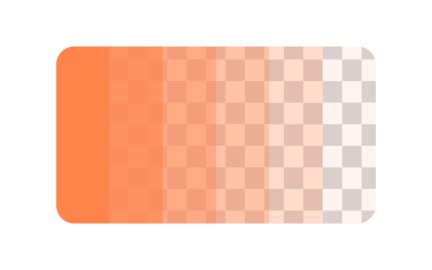
Opacity
Opacity in design refers to the degree of transparency of an element, controlling how much background content is visible through it and influencing emphasis.

TL;DR
- Defines transparency of design elements.
- Ranges from fully opaque to fully transparent.
- Used to create layering, depth, and focus.
- Balances clarity with aesthetic intent.
Definition
Opacity is a visual property that determines how transparent or solid an element appears, ranging from 0% (completely transparent) to 100% (completely opaque), shaping visibility, layering, and emphasis within a design.
Detailed Overview
Opacity is a fundamental concept in digital design because it governs how elements are perceived in relation to one another. By adjusting opacity, designers control visibility, emphasize key features, and create layers of depth that add structure to interfaces. A fully opaque element commands attention, while a transparent one blends into the background, allowing hierarchy to emerge naturally.
A frequent question is why opacity matters for hierarchy. In user interfaces, visual attention must be directed toward primary actions while secondary elements remain less prominent. Reducing opacity on background images or secondary controls helps ensure that primary buttons or calls to action stand out clearly. This selective use of transparency organizes attention without overwhelming the user.
Another common query concerns opacity’s role in layering. Interfaces often display overlapping content, such as modals, tooltips, or background patterns. By using opacity, designers control how much of the underlying layer remains visible, preserving context while introducing new elements. For instance, dimming a page to 40% opacity when a modal appears keeps users grounded without distracting from the task at hand.
Design teams also ask how opacity impacts accessibility. Poor contrast created by excessive transparency can make text hard to read, especially for users with vision impairments. Designers must balance aesthetics with functional clarity, ensuring that content remains legible under different opacity levels. Testing for readability is essential when opacity is applied to interactive elements.
Opacity also carries meaning in terms of feedback. Hover effects, button states, and disabled controls often rely on opacity changes to signal interactivity. A button that shifts from 50% to 100% opacity communicates availability, while one that remains semi-transparent signals inactivity. These cues reduce uncertainty and guide behavior.
Learn more about this in the Opacity Exercise, taken from the Color Properties Lesson, a part of the UX Design Foundations Course.
Opacity helps separate primary and secondary elements. By lowering opacity on less critical items, designers direct focus toward important actions or content. This prevents visual clutter and guides user attention naturally.
Used strategically, opacity creates emphasis without adding extra design elements.
Opacity manages the visibility of overlapping elements. For example, when a modal appears, background content may dim to reduced opacity, keeping context while highlighting the modal. This layering helps users stay oriented within the interface.
It ensures that focus shifts appropriately without losing the sense of the surrounding structure.
Overusing transparency can reduce contrast, making text or controls harder to read. This is especially challenging for users with low vision or color blindness. Designers must test opacity levels to ensure legibility and usability remain intact.
Accessibility requires balancing style with function so that all users can interpret content comfortably.
Opacity changes often signal interactivity. A button may appear lighter when disabled and become fully opaque once active. Hover or press states may also use transparency shifts to confirm that the system is responding.
These cues create an intuitive connection between visual change and system behavior.
Yes. Opacity is not only functional but expressive. Brands that want to convey minimalism may use transparency extensively, while those emphasizing boldness rely on full opacity for impact.
When applied consistently, opacity reinforces brand personality while supporting clear user experiences.
Recommended resources
Courses

UX Design Foundations

Core UI Components


