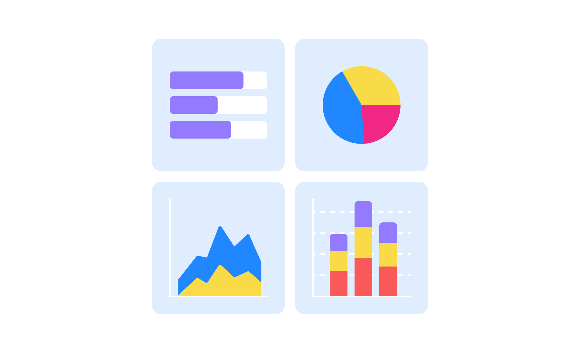
Data Visualization
Data visualization is the practice of translating data into visual formats like charts, graphs, and maps to enhance comprehension and insight.


What is Data Visualization?
Data visualization transforms complex datasets into visual representations like charts, graphs, maps, and interactive dashboards that make information easier to understand, analyze, and communicate across different audiences. It combines statistical analysis with graphic design principles to reveal patterns, trends, and insights that remain hidden in raw data, enabling better decision-making and more persuasive communication.
This field encompasses chart design, interactive dashboards, statistical graphics, information design, and data storytelling techniques that serve various business and analytical purposes.
Data Visualization in Product Development
Product managers use data visualization to understand user behavior, communicate product performance, and make evidence-based decisions about feature development and resource allocation.
User behavior analysis and insight discovery
Visualize user journey data, feature adoption patterns, and engagement metrics to identify optimization opportunities and understand how customers actually use products versus intended usage patterns.
Product performance communication
Create dashboards and reports that communicate product success metrics, business impact, and user satisfaction trends to stakeholders including executives, engineers, and marketing teams.
A/B testing and experimentation results
Visualize experiment data showing statistical significance, confidence intervals, and business impact helping teams make decisions about feature launches and product improvements.
Roadmap planning and resource allocation
Use data visualization to show development effort, user impact, and business value trade-offs helping prioritize features and communicate product strategy decisions.
Data Visualization Best Practices
Clear communication principles:
- Start with the most important insight ensuring key message is immediately obvious
- Use descriptive titles and labels that explain what viewers should understand
- Choose color schemes that support rather than distract from data interpretation
- Maintain consistent formatting and styling across related visualizations
Accuracy and integrity standards:
- Always start axes at zero unless showing detailed variation in narrow ranges
- Use appropriate scales and avoid misleading proportional representations
- Include error bars and confidence intervals when showing statistical data
- Provide data sources and methodology information enabling verification and context
Accessibility and inclusive design:
- Use color schemes that work for colorblind viewers including alternative visual cues
- Provide alt text descriptions for screen readers and accessibility tools
- Ensure sufficient contrast for readability in various lighting conditions
- Include data tables or text alternatives for complex visualizations
Interactive design considerations:
- Enable exploration without overwhelming users with too many options
- Provide clear instructions and help text for interactive features
- Maintain performance and responsiveness across different devices and browsers
- Include reset and home options allowing users to return to default views
Data Visualization Tools and Platforms
Business intelligence and dashboard platforms:
- Tableau: Professional data visualization with extensive chart types and interactivity
- Power BI: Microsoft's business intelligence platform with Office integration
- Looker: Google's modern BI platform with SQL-based modeling
- Qlik Sense: Self-service visualization with associative data model
Programming and custom visualization:
- D3.js: JavaScript library for custom, interactive web-based visualizations
- Python (Matplotlib, Seaborn): Statistical visualization libraries for analysis and reporting
- R (ggplot2): Statistical computing with publication-quality graphics
- Observable: Collaborative computational notebooks with JavaScript visualizations
Data visualization refers to the representation of data and information in a visual format, such as charts, graphs, maps, or infographics. It aims to present complex data sets in a visual and accessible manner, allowing users to quickly grasp patterns, trends, and insights that might be challenging to understand through raw data alone. Data visualization enables effective communication and storytelling with data, facilitating decision-making and understanding.
Data visualization has various applications in design across different fields and industries. Here are some common applications:
- User interface (UI) design: Data visualization techniques can be used to present complex data or analytics within user interfaces. Visualizing data in the form of charts, graphs, or dashboards can help users understand information quickly, make informed decisions, and navigate through large datasets more effectively.
- Information design: Data visualization plays a crucial role in presenting information in a clear and engaging way. It can be used to visually represent statistics, trends, or comparisons, making the information more accessible and memorable. Infographics, data-driven illustrations, or interactive visualizations are examples of how data visualization can enhance information design.
- Data-driven decision-making: Designers often rely on data to inform their design decisions. Data visualization helps designers analyze and interpret data more effectively, identifying patterns, outliers, and insights that guide the design process. Visualizations can aid in understanding user behavior, user testing results, market research data, or performance metrics, leading to data-driven design decisions.
- Data storytelling: Data visualization is a powerful tool for storytelling. Designers can create compelling narratives by visualizing data in a way that engages the audience and conveys a clear message. Data-driven stories can be presented through interactive visualizations, data-driven animations, or data-driven illustrations, allowing designers to communicate complex information in a more accessible and engaging manner.
- Data analysis and reporting: Data visualization is instrumental in analyzing and reporting data. Designers can create visual representations of data that highlight key insights, trends, or anomalies, enabling stakeholders to understand the data at a glance. Data visualization can facilitate effective data communication, making reports or presentations more impactful and understandable.
First and foremost is clarity and simplicity. Visualizations should be clear and easy to understand, avoiding clutter and unnecessary complexity. It's important to choose appropriate visual representations that best represent the data and facilitate comprehension. Another consideration is accuracy and integrity. Visualizations should accurately represent the data without distorting or misrepresenting information. Designers should also consider the target audience and their knowledge and familiarity with data visualization techniques to ensure the visualizations resonate with the intended users. Lastly, aesthetics play a role in data visualization. Thoughtful use of color, typography, layout, and interactivity can enhance the visual appeal and user experience, making the data more engaging and memorable.
Recommended resources
Courses

KPIs & OKRs for Products


UX Design Foundations


Core UI Components

Lessons

Types of Charts & When to Use Them

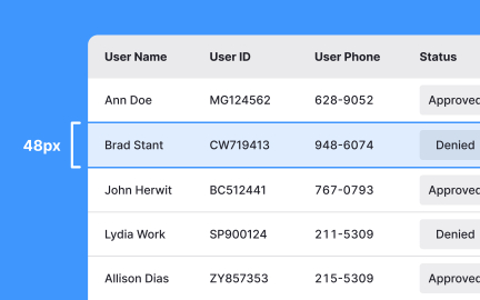
When & How to Use Tables in UIs

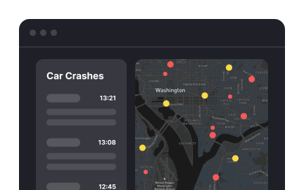
How to Design Dashboards for Better Analytics
Exercises
Briefs

Design an Analytical Dashboard for Mobile

Design an Analytical Dashboard

Projects

Deeply - Your Mindful Companion


Health Tracker - Mobile - Dashboard


#Simple.URL-Shortener (WebApp)