When & How to Use Tables in UIs
Structure data in tables that users can scan, sort, and interact with efficiently
Tables have a specific purpose: displaying structured data in rows and columns. They're ideal when users need to compare values, scan for patterns, or look up specific information across multiple attributes. A list of transactions, a product comparison, a schedule of events. These are table territory.
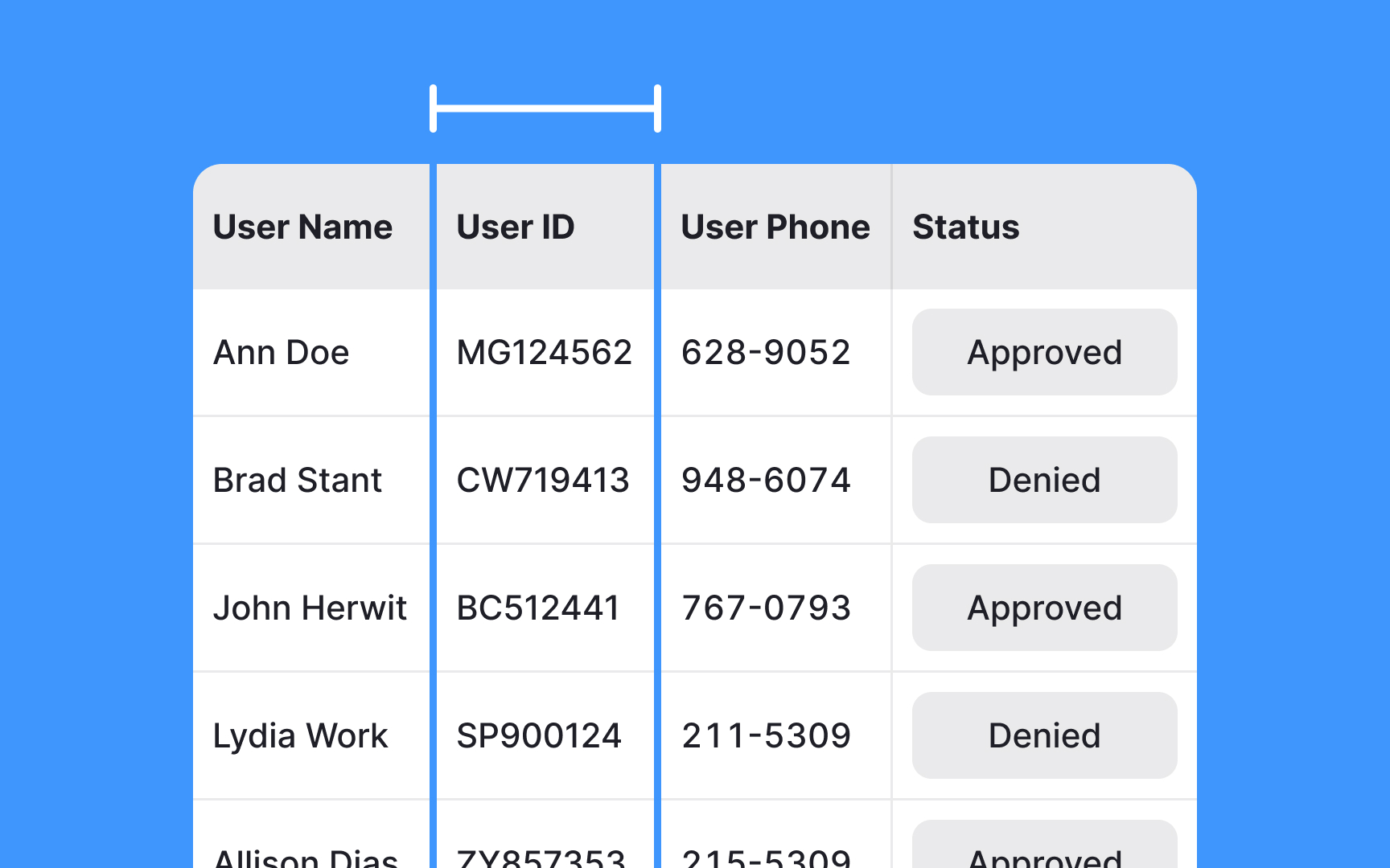
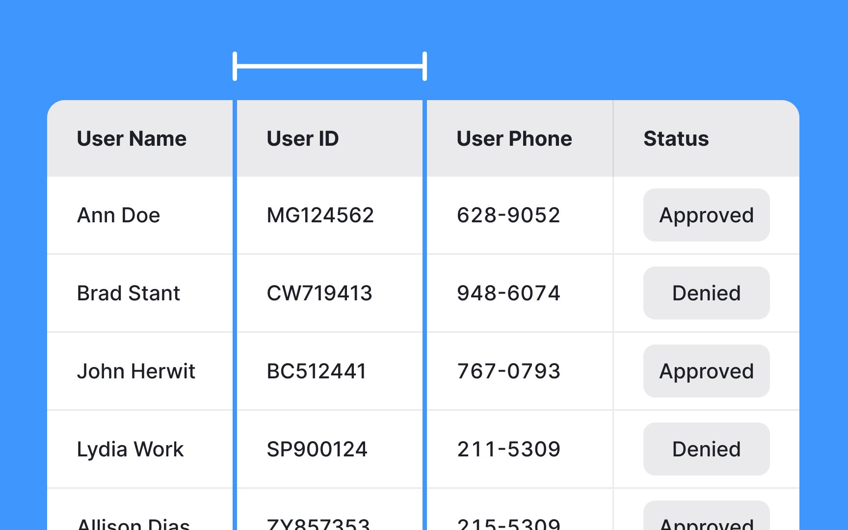
But tables are easily misused. Dense data crammed into tight rows becomes unreadable. Columns too narrow for their content force awkward wrapping or truncation. Headers that blend into the data leave users guessing what they're looking at. A table that fails at legibility fails at its core function. Interactivity adds another layer. Users often need to sort columns, select rows, or take actions on specific items. Pagination and scrolling strategies determine how users navigate larger datasets. Hover and selection states provide feedback during interactions.
The anatomy of a table, including row height, column width, header styling, and interaction patterns, all contribute to whether users can efficiently extract the information they need or struggle to make sense of what's in front of them.
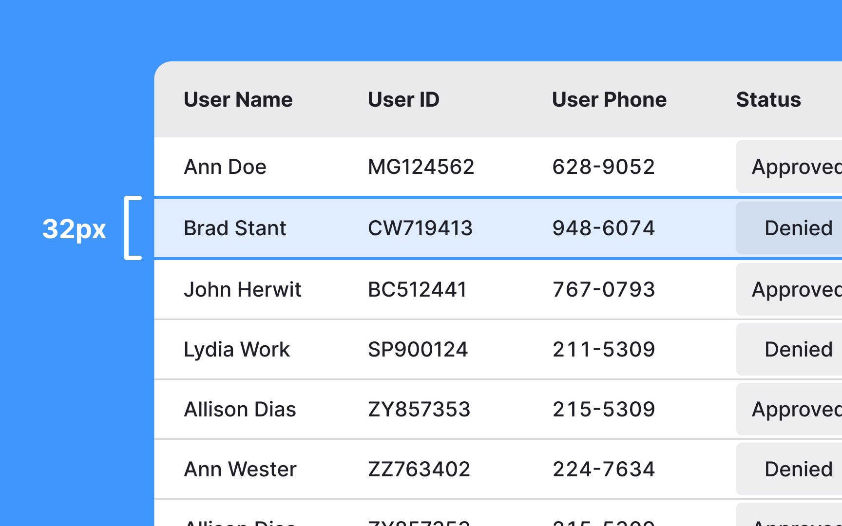
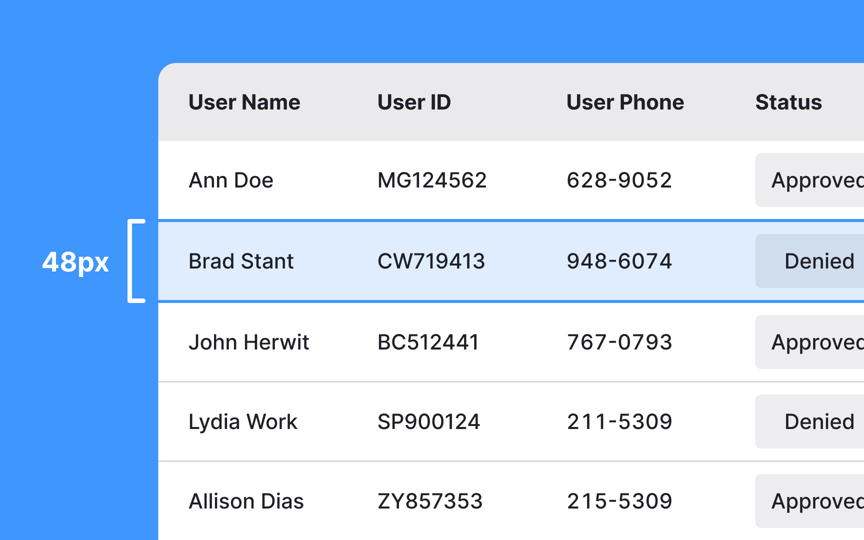
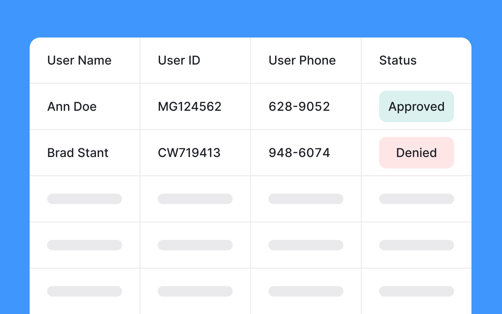
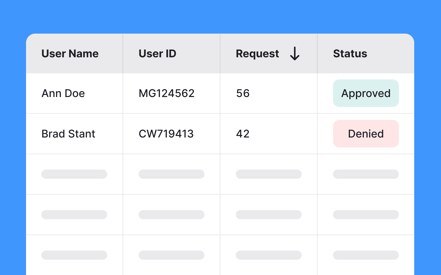
The row height of your
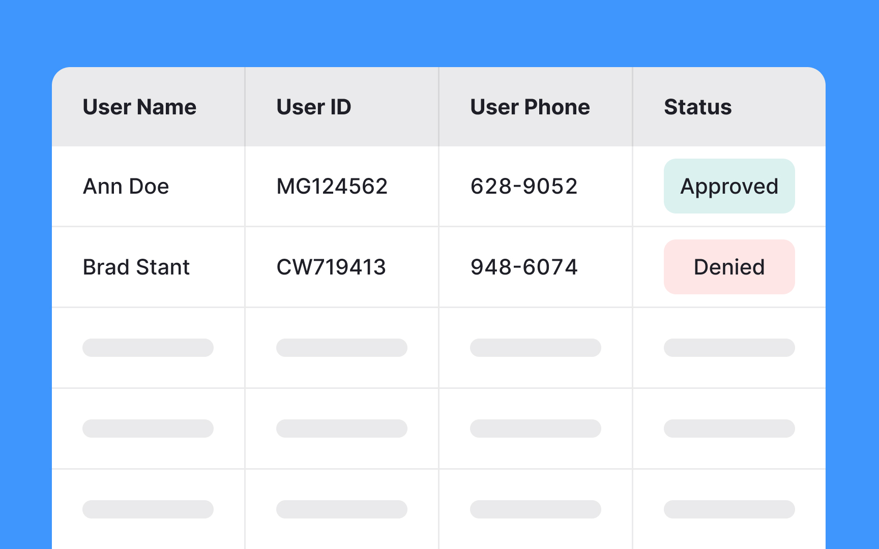
Condensed
After
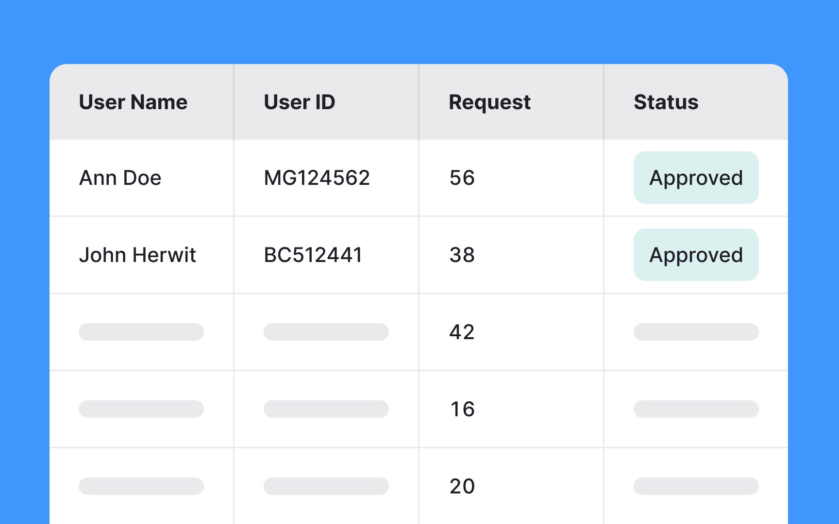
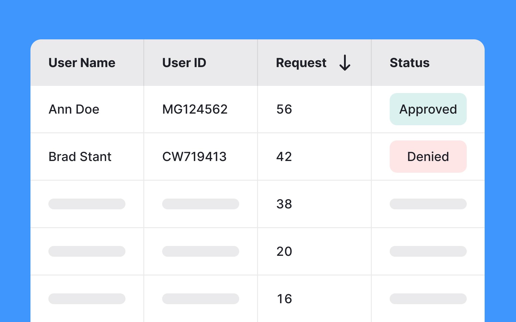
Sorting functionality is crucial in any large
Allow users to sort
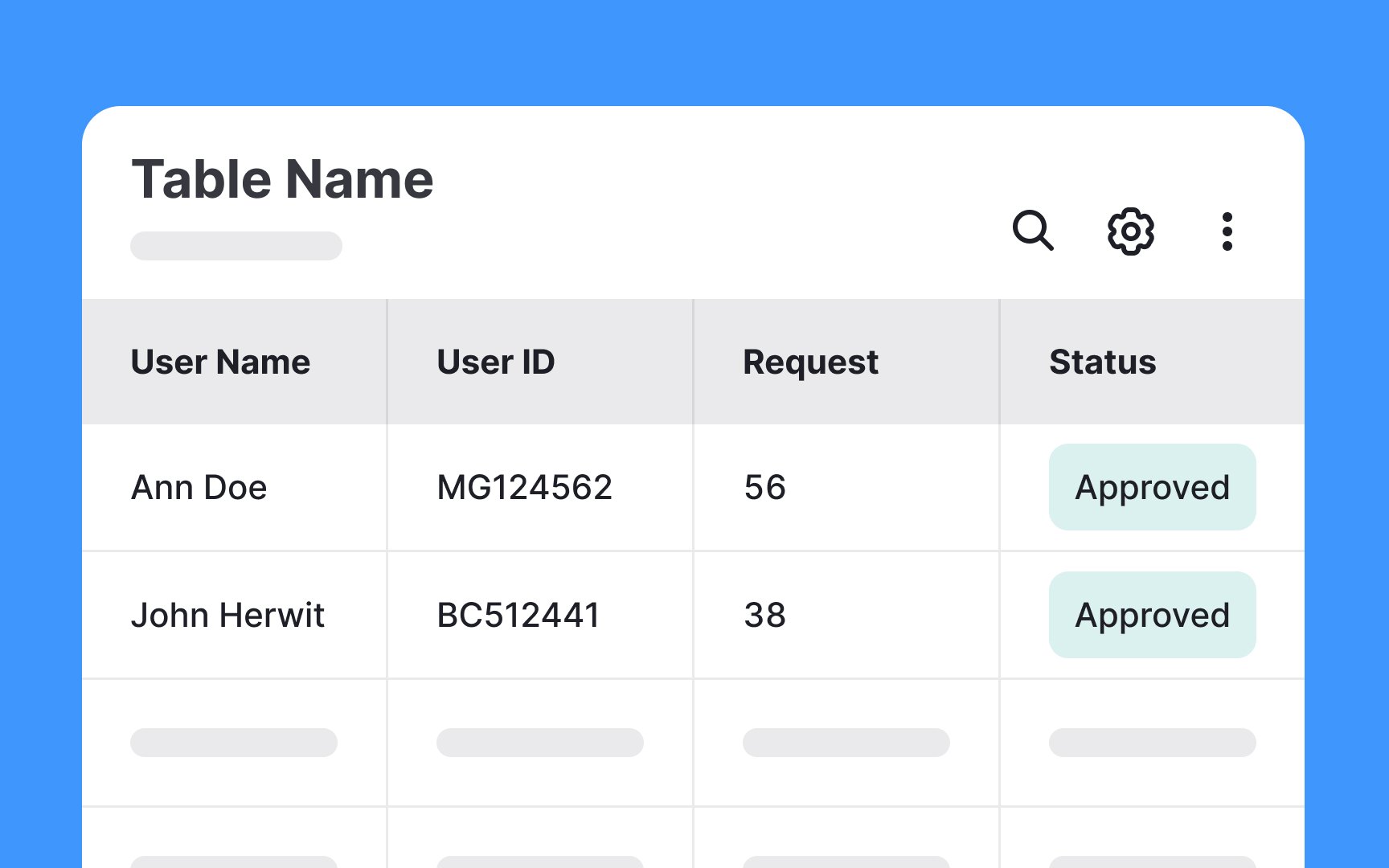
Toolbars positioned above your
They typically include features such as:
- Search functionality to quickly locate specific data
- Export functions to save or share data in various formats
- Print options for physical copies
- Filters to refine the data displayed
Sorting capabilities to organize data by different criteria
These tools not only increase the usability of the table but also make the data more accessible and user-friendly.
Here’s how to do this:
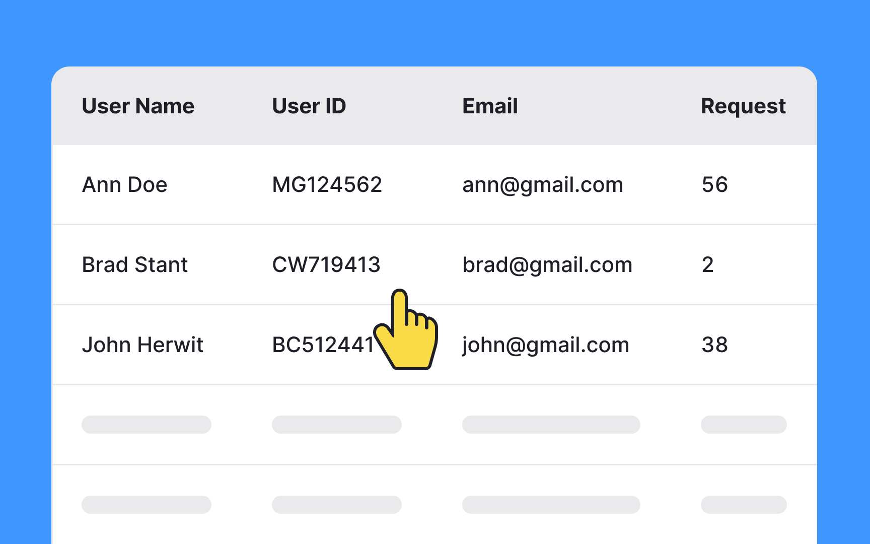
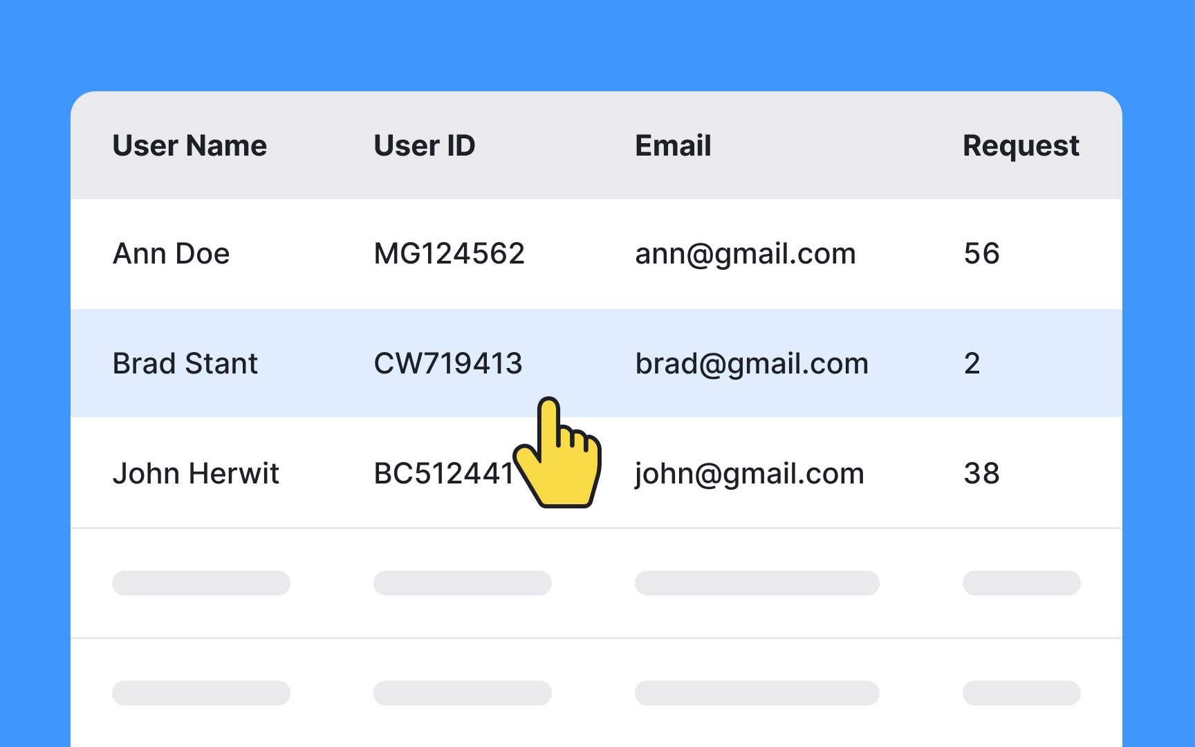
- Add a hover state to a row when the cursor is over it. You can do this by changing the row's background
color or adding a highlight effect when the cursor hovers over it. This makes it much easier for users to keep track of where they are in the table, especially when they need to interact with specific rows or compare data across a row. This becomes even more important in situations where rows are interactive or contain actionable items. - In situations where users need to select multiple table rows for bulk actions, make the selected rows stand out visually. Rather than relying on a small checkmark, which can be easily overlooked, opt for a more noticeable approach — change the background color of the selected rows to a distinct hue or shade.
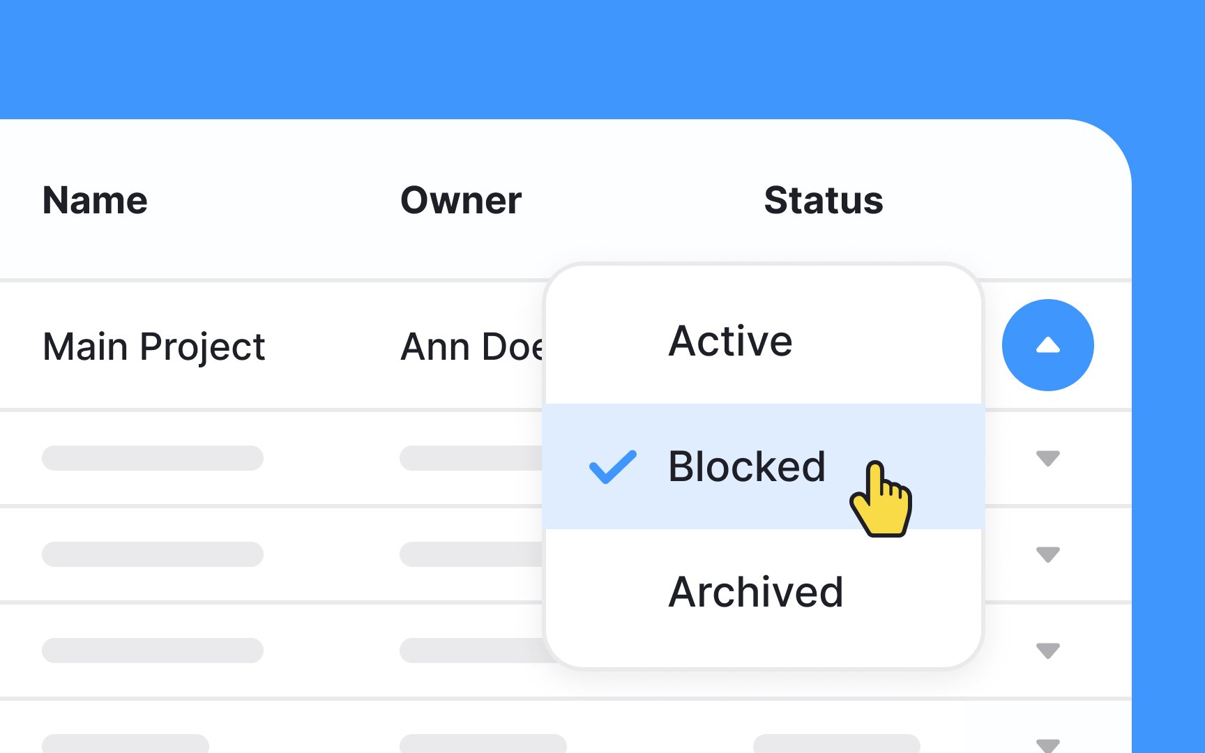
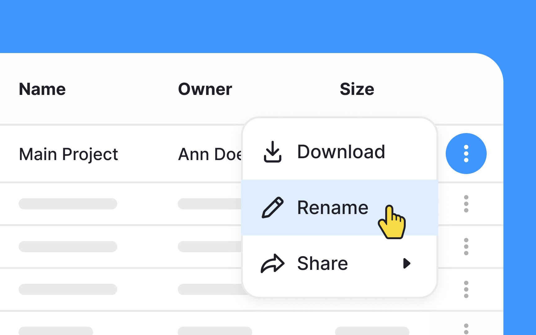
When you want users to be able to interact within each
Hiding these actions behind a kebab (three-dot) menu saves space, reduces visual clutter, and makes it easier for the
Just be aware that users likely won’t be aware of the options in the inline menu until they start interacting with the table.
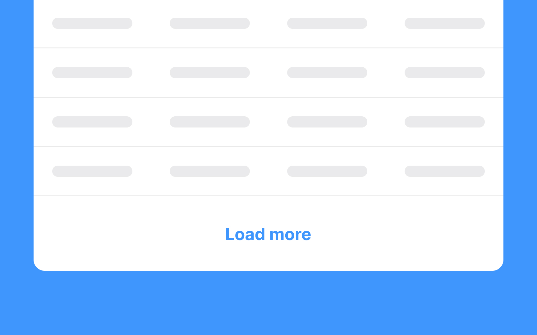
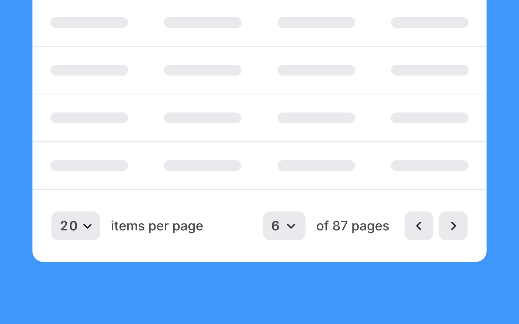
To reduce server load and make it easy for users to flip through the
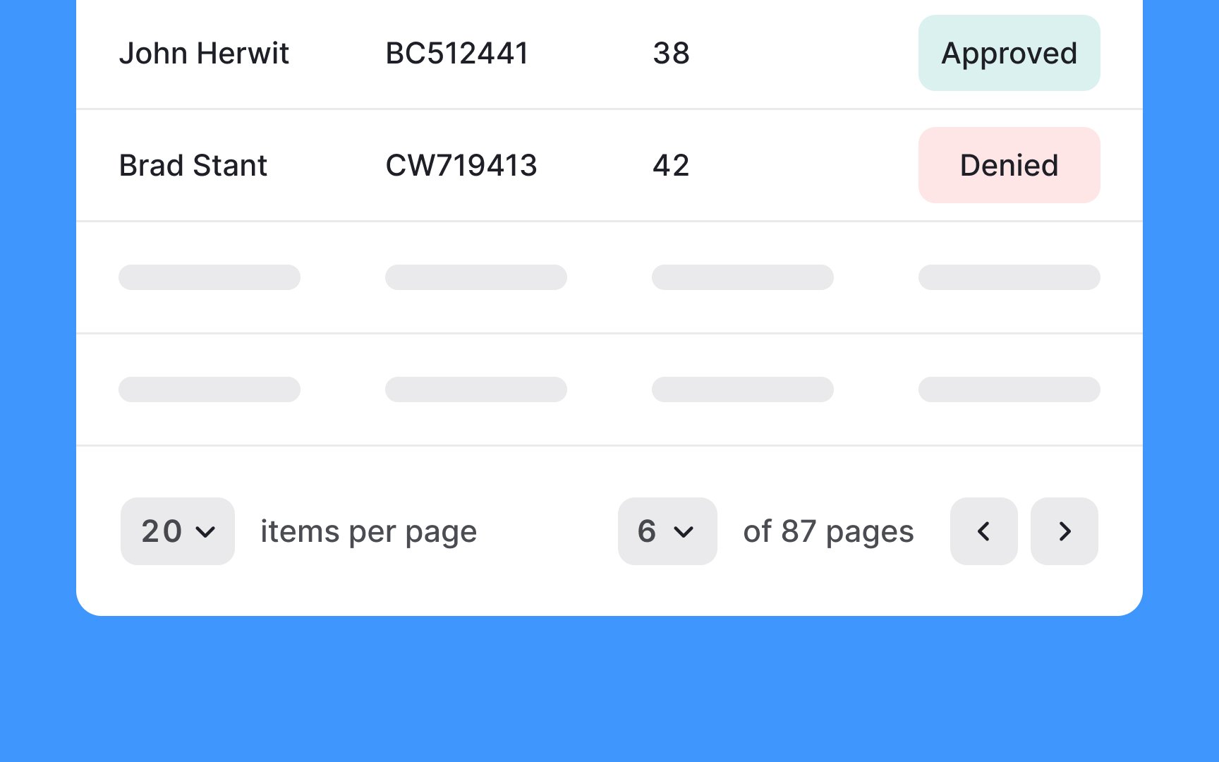
As an alternative to
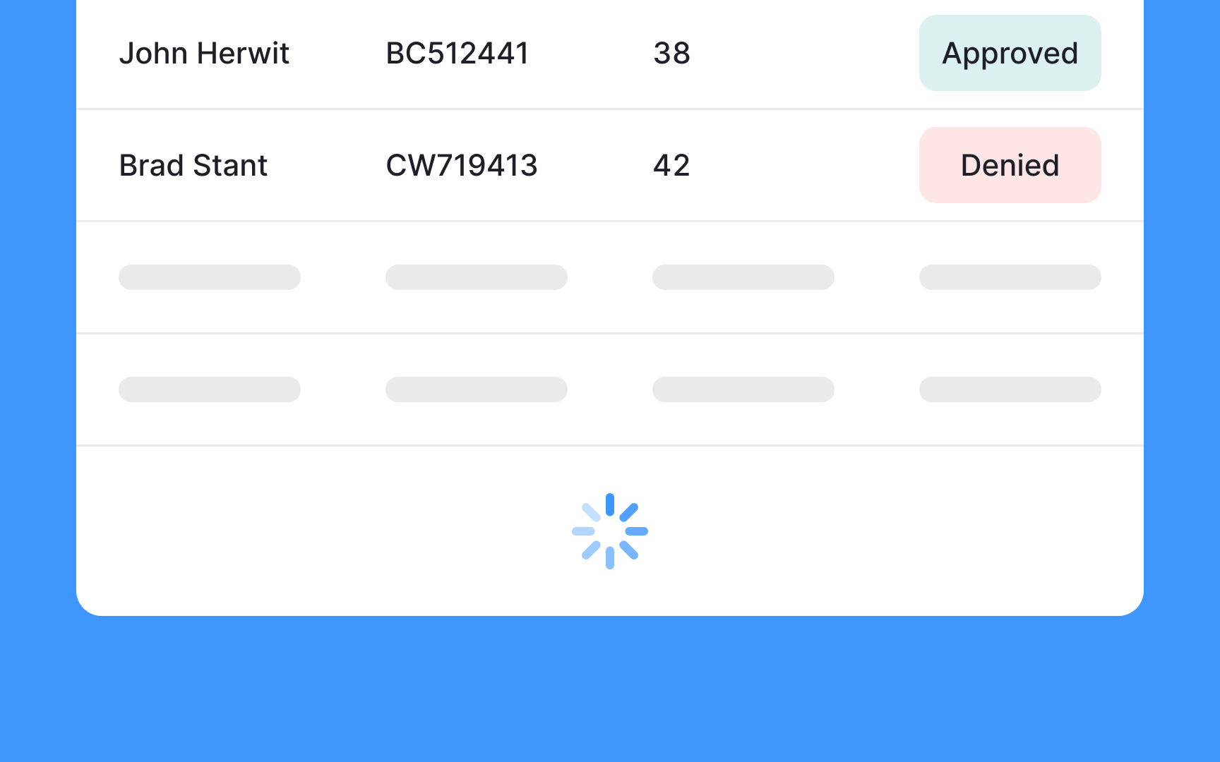
However, infinite scrolling has its drawbacks. It doesn't keep track of pages, making it challenging for users to refer back to previously viewed data. Additionally, it doesn't indicate the total amount of data in the table, which can lead to user frustration.
Use infinite scrolling in
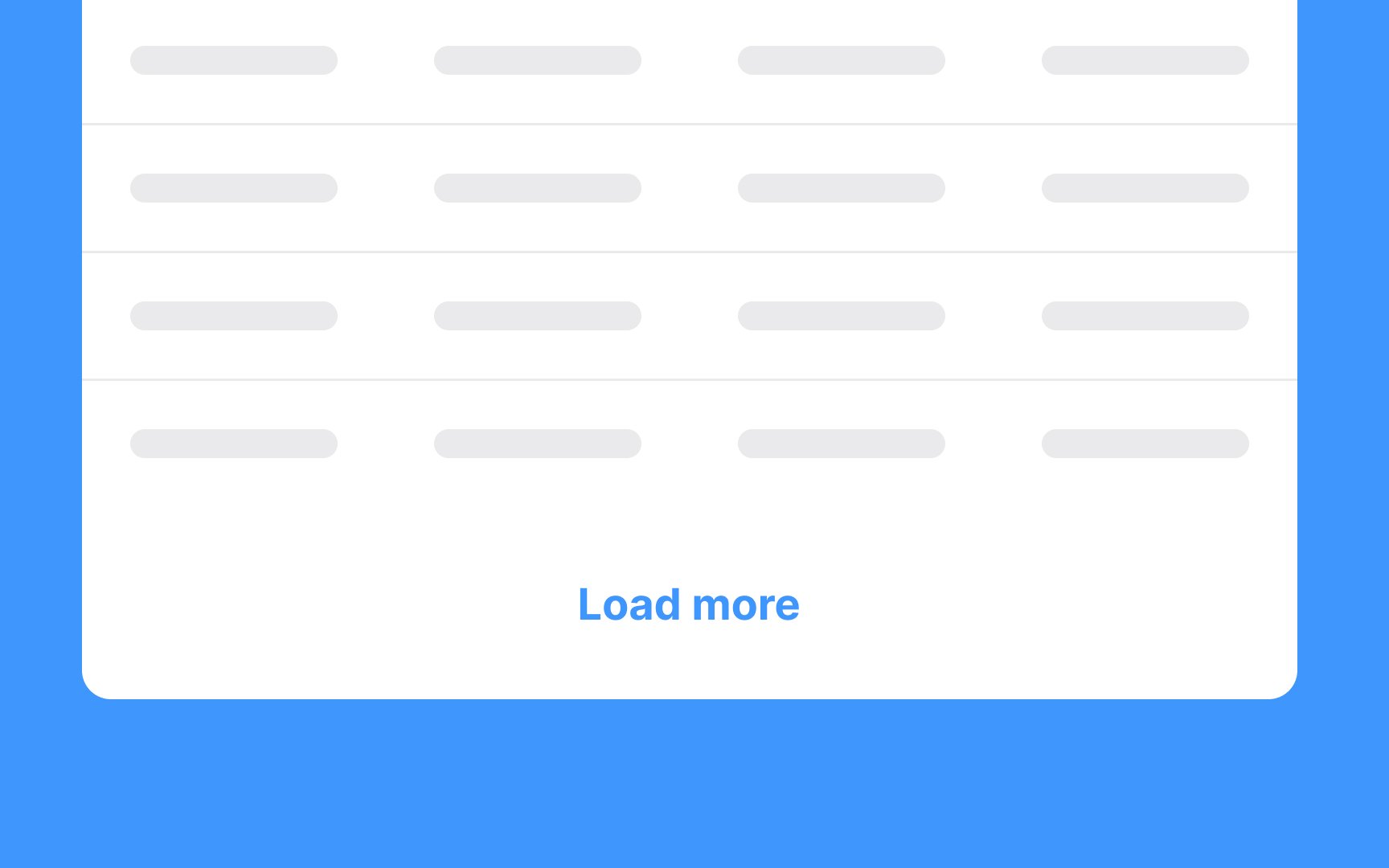
Manual infinite scrolling combines the ideas of
With manual infinite scrolling,
Use manual infinite scrolling in contexts like a job listing
Pro Tip: Make sure that the Load More button is clearly visible to engage users to continue exploring the data.
References
Top contributors


Topics
From Course

Share


Similar lessons

Dashboards

Best Practices for Designing Charts
