Cursors
Cursors guide user interaction by signaling position, state, and possible actions on digital interfaces, playing a vital role in usability and accessibility.


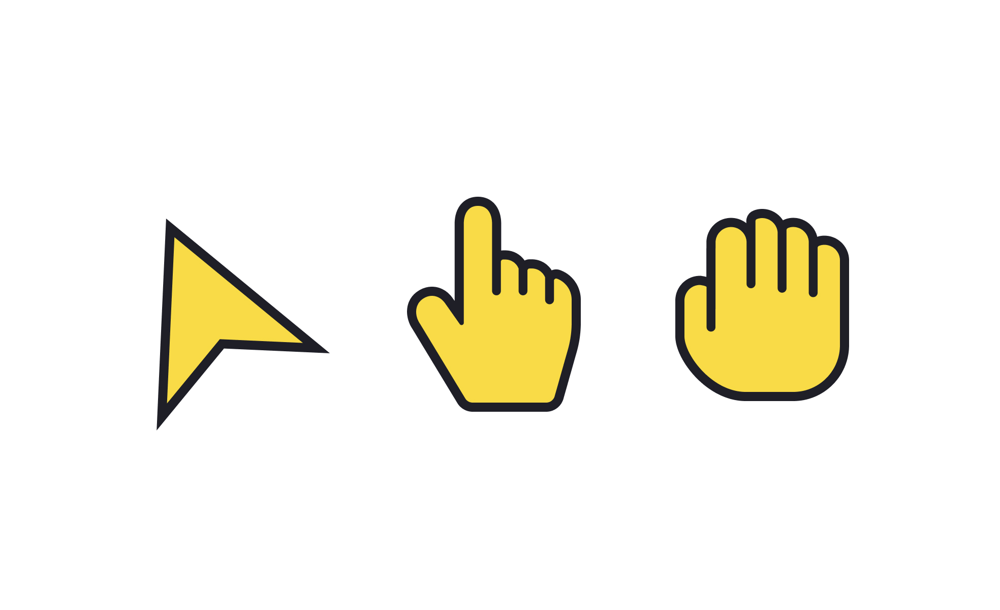
Cursors are small but critical visual elements in digital environments. They indicate where the user’s input will be applied, often changing shape or style depending on the context. A blinking text cursor in a form field, an arrow pointer for general navigation, or a hand icon for clickable links are all examples of how cursors set expectations and reduce confusion. These subtle visual cues provide instant feedback and help users stay oriented in their tasks.
In UX and UI design, cursors contribute directly to usability. Designers carefully choose cursor states to ensure users immediately understand what is possible in a given interaction. For example, a resizing cursor signals that a window or panel can be adjusted, while a loading spinner indicates that the system is busy. This immediate feedback prevents uncertainty and reassures the user that the system is responding to their actions.
Product managers also have a stake in cursor behavior, even if they are not designing it directly. Cursor choices influence how intuitive an interface feels, which in turn impacts customer satisfaction and adoption. A poorly chosen cursor state may leave users unsure whether a feature works as intended. Clear cursor behavior reduces friction and ensures users feel confident navigating complex products.
Cursors play a key role in accessibility as well. They can be designed with increased visibility for people with visual impairments, or paired with accessibility settings that allow customization of size, color, and movement speed. These adjustments make interfaces usable for a wider range of people and ensure compliance with accessibility standards. In inclusive design, cursors must be adaptable, not one-size-fits-all.
Real-world examples show how cursor decisions shape experiences. In design tools like Figma or Adobe XD, the cursor dynamically changes depending on the selected tool, giving instant clarity about what action will occur. On the other hand, web products that rely solely on default cursors may miss opportunities to guide user understanding in more nuanced interactions.
Learn more about this in the Intro to UI Cursors Lesson, a part of the UI Components I Course.
Key Takeaways
- Cursors provide visual feedback for user actions and system states.
- Thoughtful cursor design improves usability and reduces confusion.
- Cursor behavior impacts both UX design and product management outcomes.
- Accessibility features allow users to customize cursor visibility and movement.
- Cursors can also support branding and aesthetics when used carefully.
- Real-world tools like Figma demonstrate the value of dynamic cursor states.
Cursor states tell users what they can do without requiring extra explanation. For example, the difference between an arrow cursor and a text input cursor communicates a change in interaction instantly. This speeds up task completion and reduces errors.
In UX design, each cursor state helps establish clarity and predictability. When users know what to expect, they feel more confident using the product. This sense of control enhances overall satisfaction and trust in the interface.
Cursors impact accessibility by giving users clear, immediate feedback about interaction possibilities. They can be customized in size, color, or animation speed to suit users with visual or motor challenges. This ensures a broader range of people can navigate digital environments without unnecessary strain.
Products that prioritize accessibility often include settings that let users define cursor visibility based on personal needs. These adjustments not only support compliance but also demonstrate inclusivity in product design.
Custom cursors can improve digital products when applied with restraint. They may reinforce brand identity or add personality to specialized environments like games or creative tools. In these contexts, unique cursors become part of the immersive experience.
Yet, custom cursors can also harm usability if they confuse users or obscure standard functionality. The best approach is to ensure any customization enhances understanding rather than distracts. Designers must prioritize clarity and functionality before aesthetics.
Recommended resources
Courses

UX Design Foundations


UI Components I


Design Terminology