Best Practices for Designing Charts
Discover the best practices for designing charts that are helpful for scanning, comparing, and analyzing information
Effective data visualization relies on presenting data thoughtfully. Common mistakes in data visualization include selecting the wrong chart, neglecting color contrast, cluttering visuals, using illegible fonts, adding unnecessary decorations, and sacrificing usability for aesthetics.
Always prioritize understanding how users will interact with the chart to ensure it meets their needs. By adhering to established best practices, you can create charts that are both visually pleasing and functional.
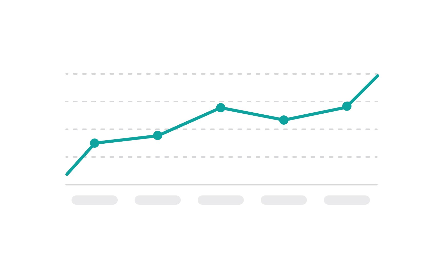
Choosing the right chart type is crucial for effectively conveying your data. Start by considering your data's nature and what you want to communicate.[1]
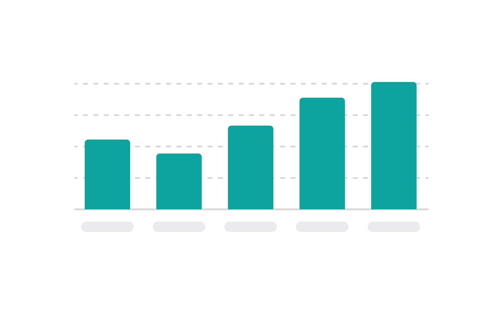
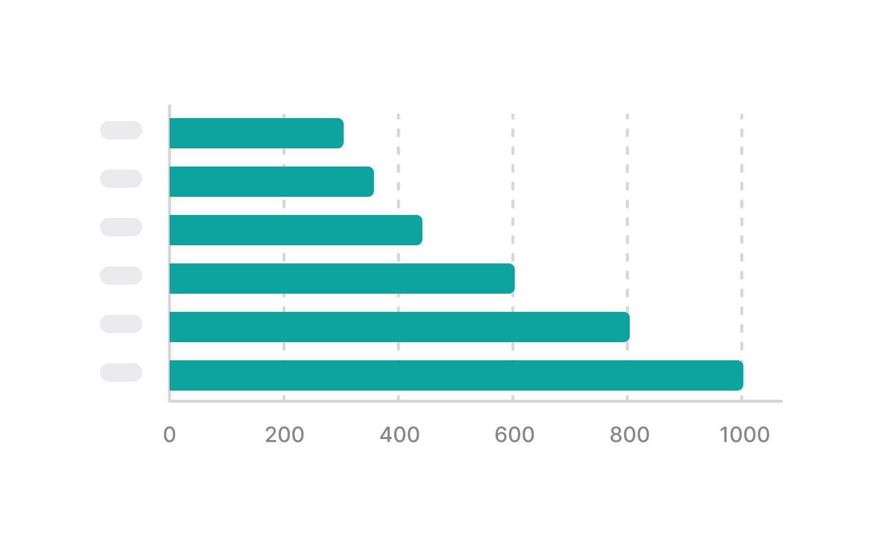
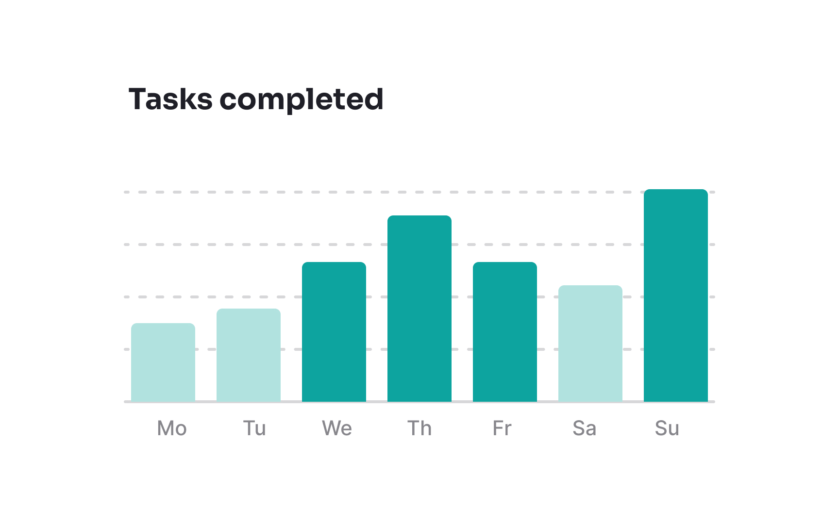
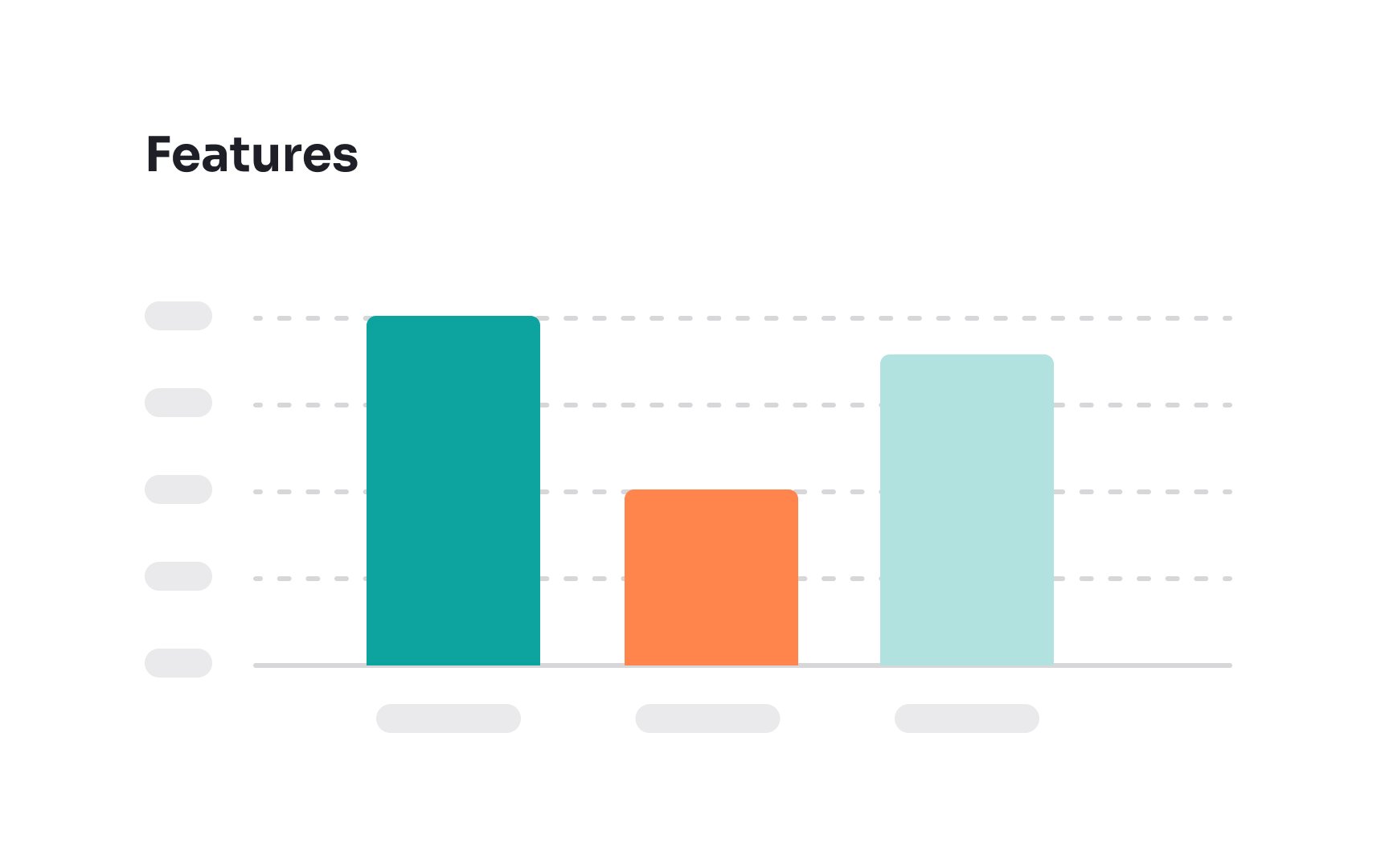
Use bar
Always prioritize clarity — the chart should make the data easier to understand, not more complicated. Keep it simple and direct to ensure your message is effectively communicated.

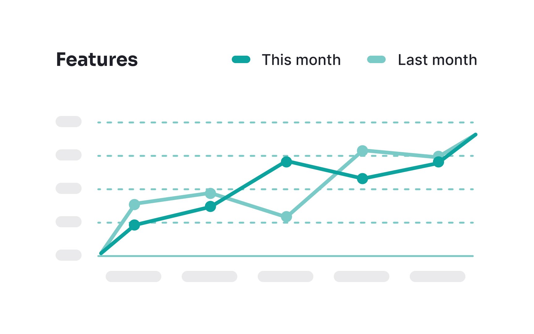
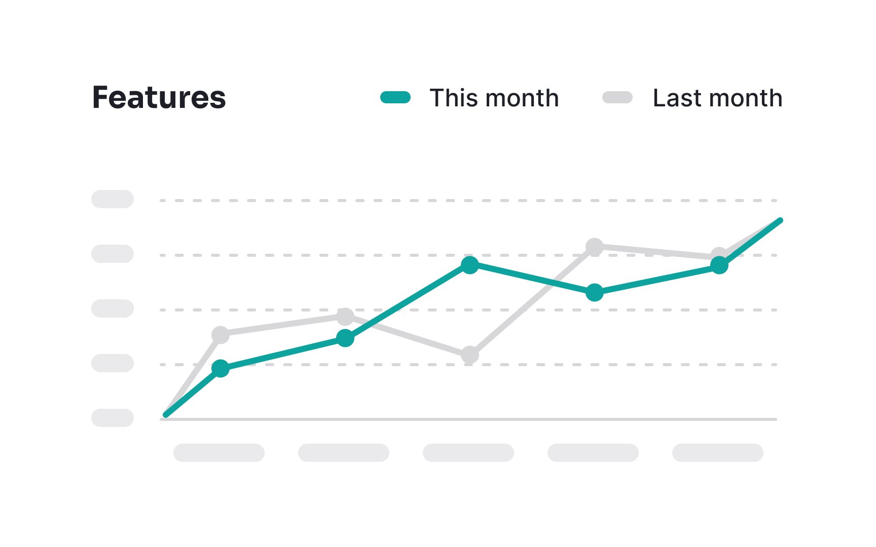
To maintain consistency in charts, which is crucial for readability, consider these tips:
- Establish a
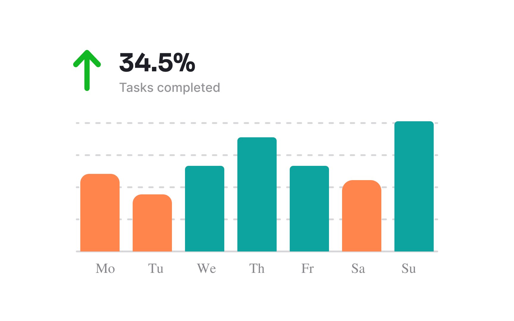
color scheme and stick to it across all elements, using colors to represent the same type of data consistently. - Choose a clear, legible
font , and use it throughout. For text and data labels, maintain a uniform font size and style. - Apply a consistent style for all your data markers, lines, and bars. If you use a dashed line for projections in one
chart , do the same in all others. - Keep your axis labels and legends clear and consistently positioned. If you place the legend at the top of one chart, continue this throughout.
White space helps distinguish between the chart elements: the
If you have multiple charts on a dashboard, add enough space between them and even place them each within a container so that users can easily distinguish different groups.
Make sure to use white space wisely. Adding too much space between elements of one group can mislead users and make them believe they're unrelated. That's one of the fundamental Gestalt principles of proximity.[2]
These include:
- Data
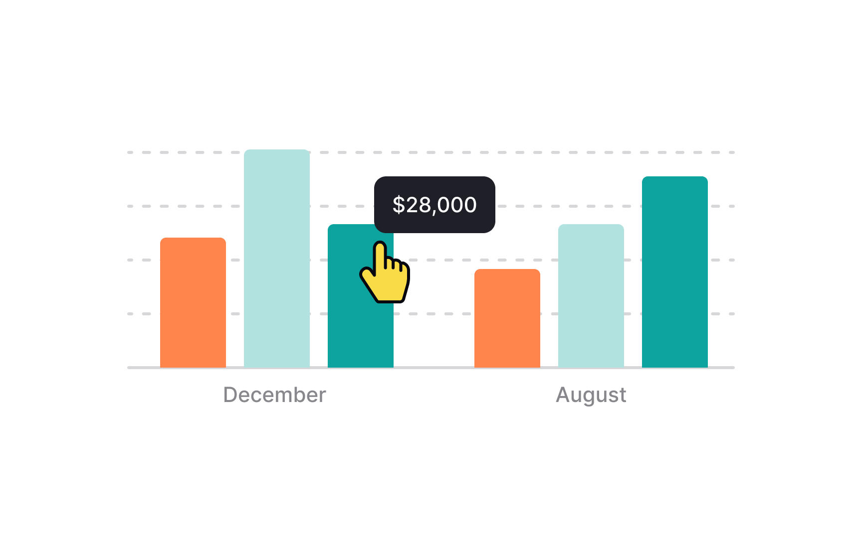
labels that provide precise values for data points - Callouts with arrows or lines that highlight and explain significant data
- Reference lines marking important thresholds or averages
- Text annotations offering additional context
- Legend annotations explaining the meaning of symbols,
colors , or patterns.
To ensure these annotations remain readable and effective in your UI, position annotations so they don't overlap with data points or each other, maintaining a clean and organized appearance. Also, keep the language concise to avoid overwhelming users.
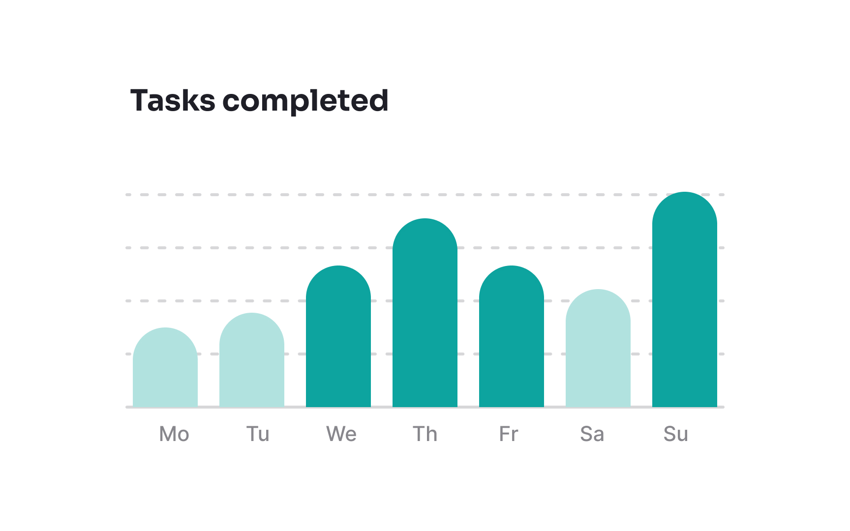
Sticking to standard sharp-cornered bar shapes ensures clarity and precision, making it easier for viewers to accurately compare data. Sharp corners provide a clear endpoint for each bar, minimizing visual ambiguity.
However, the exception to this rule is when you're aiming for a specific aesthetic or thematic effect. For example, rounded corners might be used to soften the visual impact of the
To create information
By avoiding the use of many bright colors for all lines, you prevent unnecessary distractions, making it easier for users to analyze and interpret the data effectively and accurately.
To make analyzing a
However, it's important not to rely solely on
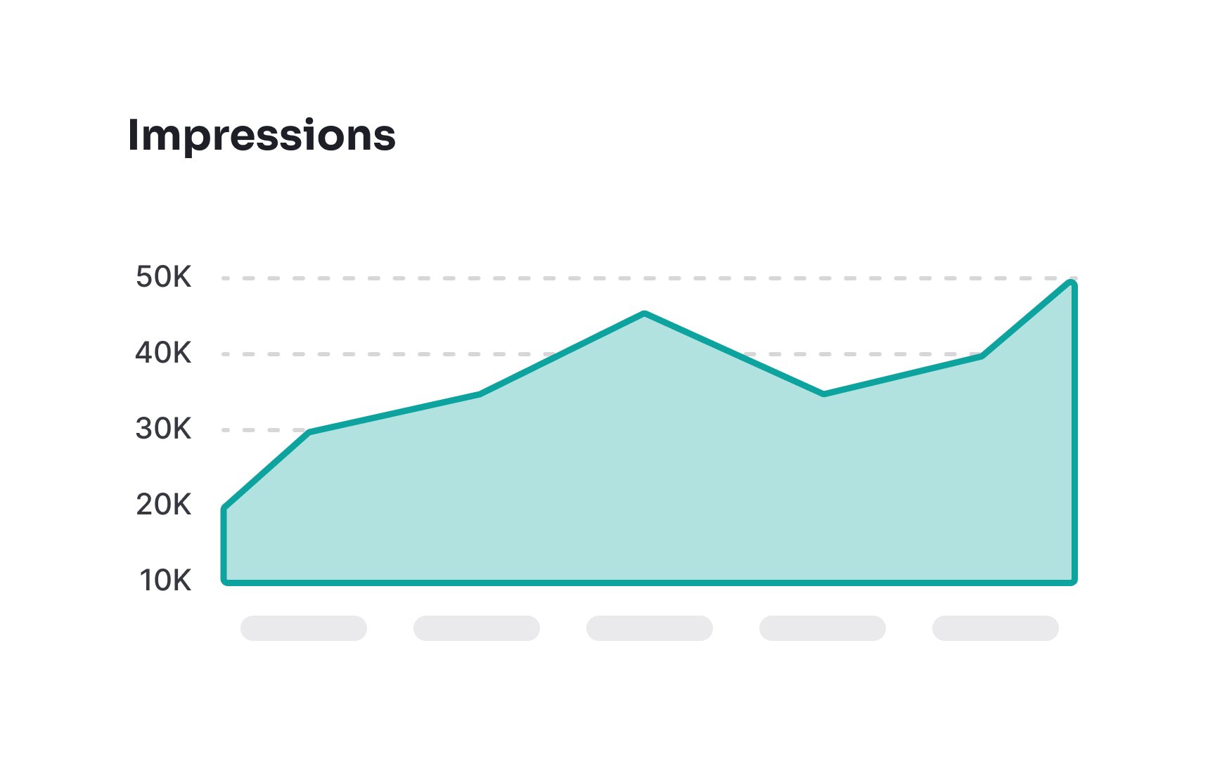
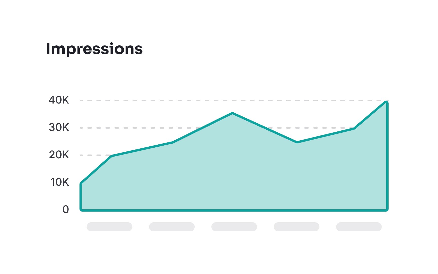
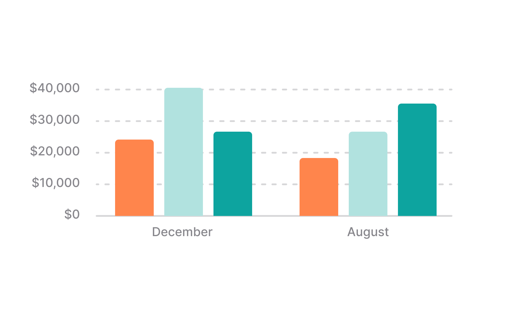
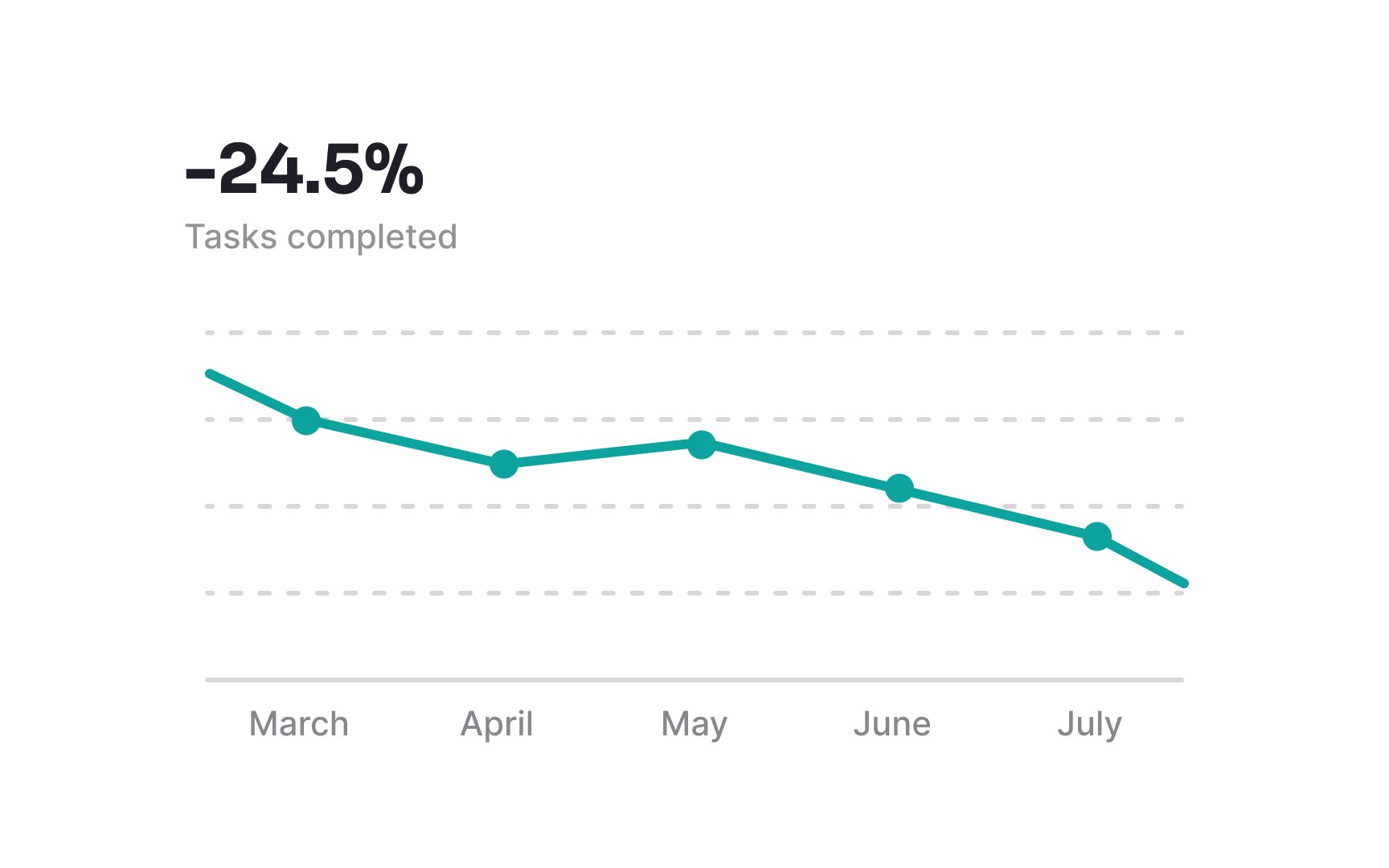
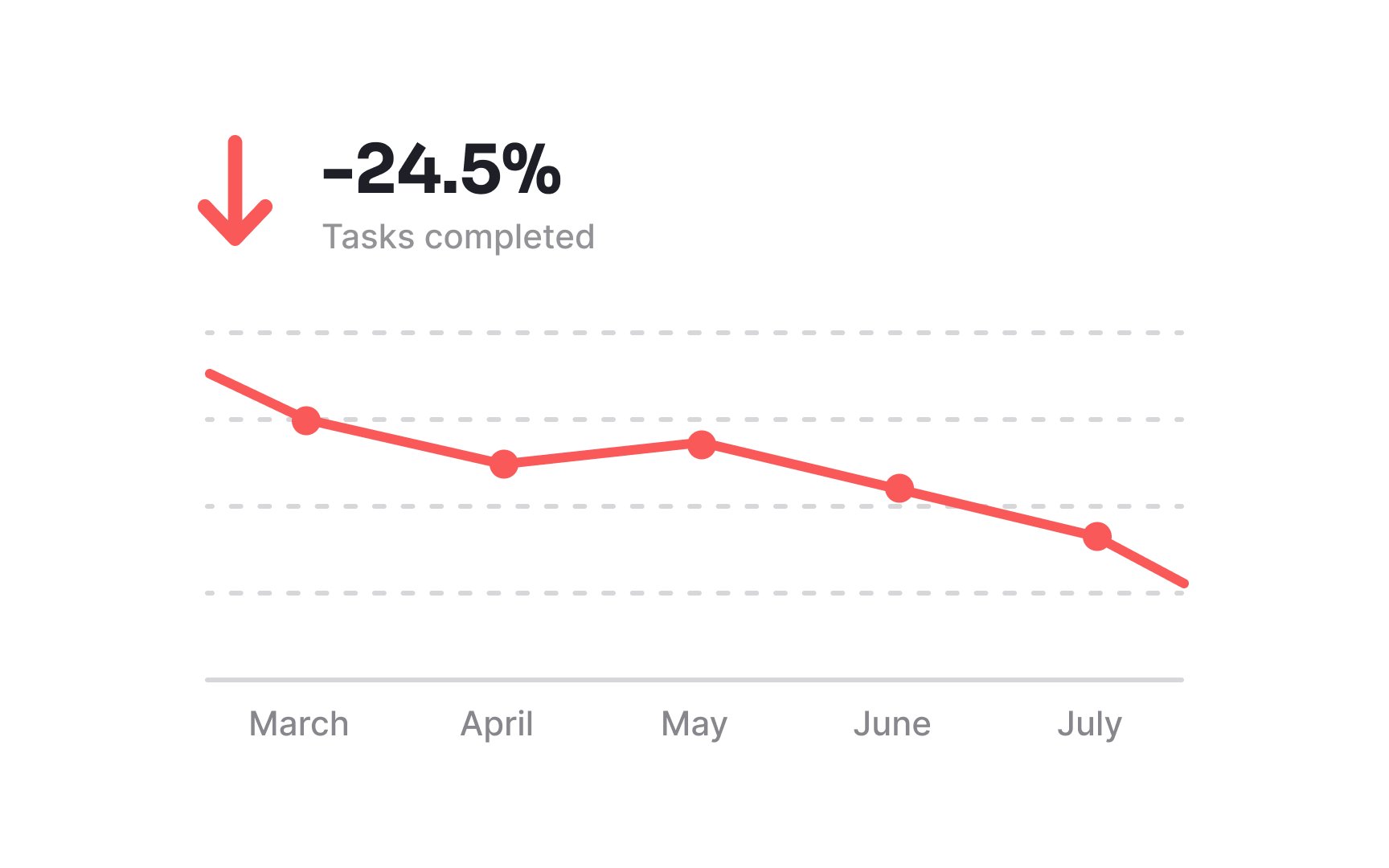
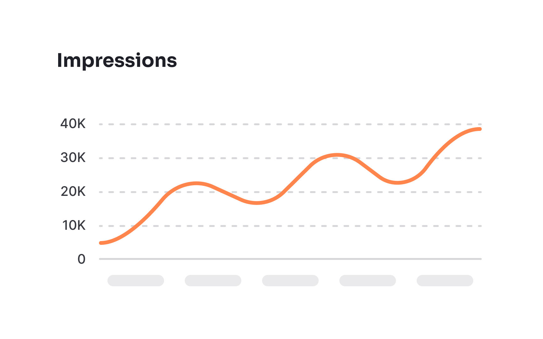
When designing a chart, always keep in mind zero values. Not starting the y-axis (or x-axis for horizontal bar
However, you don’t always need to start at zero. For line charts or scatter plots showing frequency distributions like stock prices or temperature trends, the important part is the change over time, not the absolute value. Starting the axis closer to the data range makes small changes easier to see.
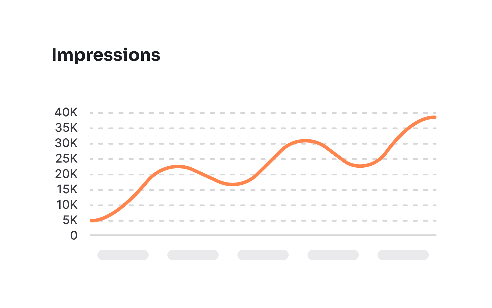
Selecting the right measurement intervals is essential for line and area
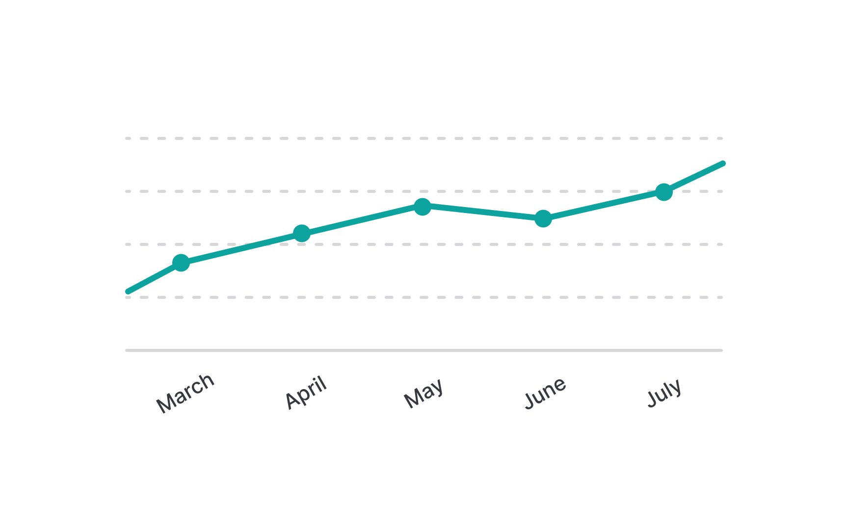
Using vertical or diagonal text
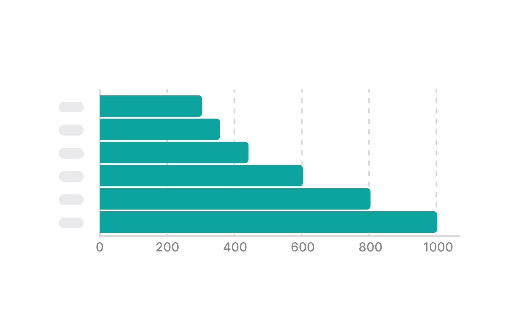
If you're dealing with long labels that make horizontal alignment challenging, consider opting for horizontal bar charts instead. These types of charts provide ample space to place long labels horizontally on the left side, ensuring that your chart remains both informative and accessible, without compromising on readability.
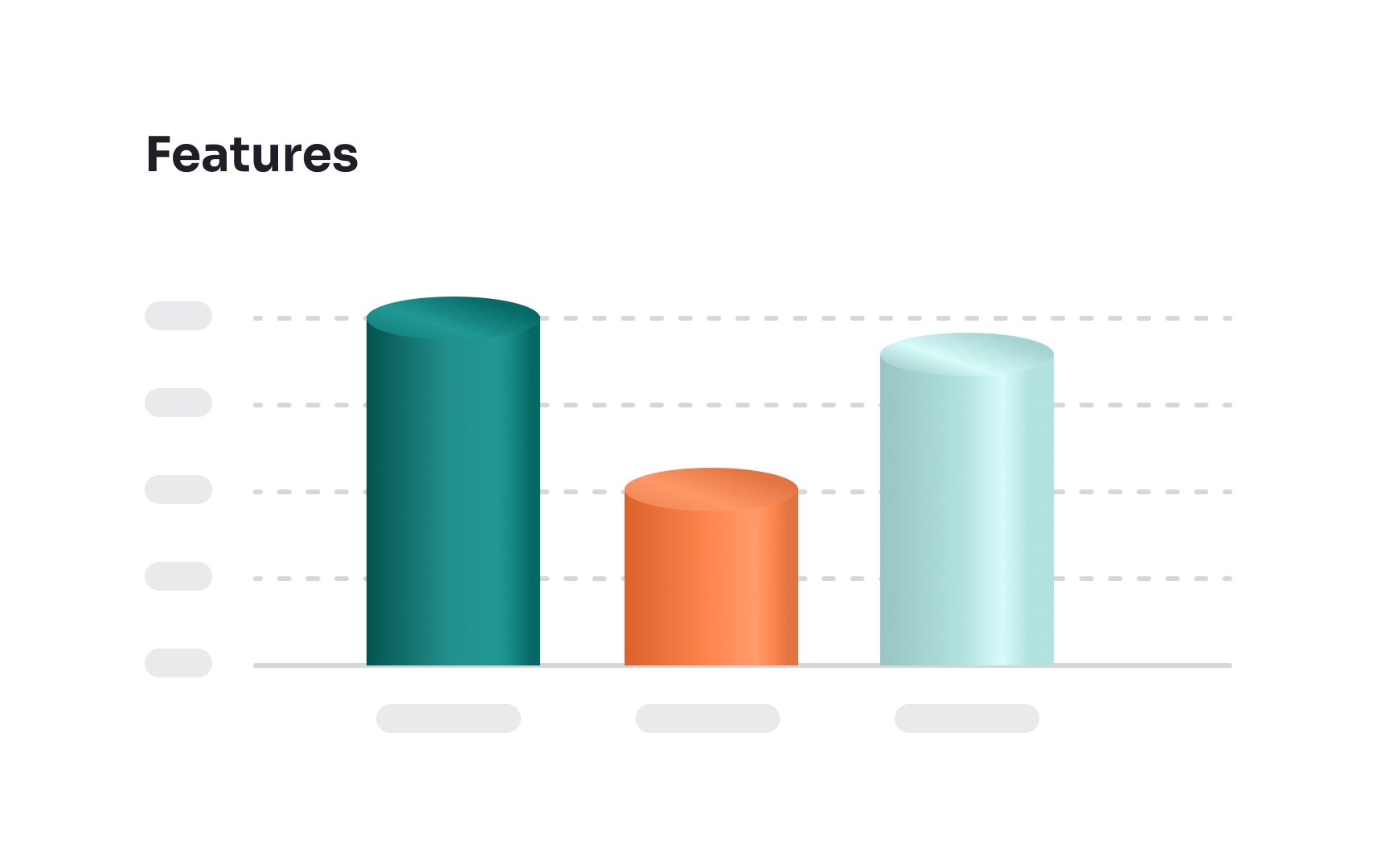
3D elements might enhance the visual appeal in video games and animations, but they're less effective in
For clarity and ease of analysis, it's better to use two-dimensional shapes in charts. These provide a straightforward view of the data, ensuring that the focus remains on accurate interpretation and understanding, without unnecessary distractions or distortions.
References
- The Principle of Common Region: Containers Create Groupings | Nielsen Norman Group
Top contributors


Topics
From Course

Share


Similar lessons

Dashboards

Intro to Tables in UI
