Fonts
Fonts are digital files that define how typefaces appear, shaping readability, hierarchy, branding, and accessibility across digital and physical products.


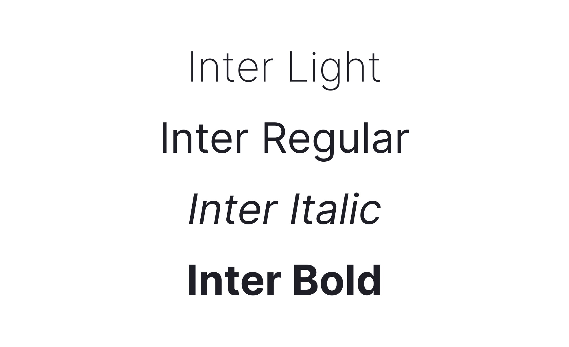
A font is the digital or physical implementation of a typeface, determining how letters, numbers, and symbols appear in text. While the term “typeface” refers to the design family (such as Helvetica or Roboto), a font is the specific file or instance that allows that design to be used on screen or in print. Fonts are among the most critical design assets in product development, influencing readability, tone, and brand recognition.
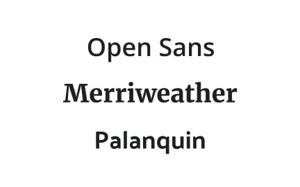
For UX designers, fonts are fundamental to clarity and usability. A well-chosen font ensures that text is legible at various sizes and across different devices. Fonts also help establish hierarchy by differentiating headings, body text, and captions. Clean sans-serif fonts like Arial, Helvetica, or Inter are common choices for interfaces, where legibility is essential, while serif fonts often appear in editorial or professional contexts that prioritize tradition and formality.
Accessibility adds another dimension to font decisions. Fonts must be clear, avoid overly decorative features, and work well with screen readers. Dyslexia-friendly fonts such as OpenDyslexic reduce confusion for certain users, while scalable font technologies allow people with low vision to adjust sizes without breaking layouts.
Real-world examples show the broad influence of fonts. Google Fonts provides hundreds of free, open-source fonts optimized for the web, making professional typography accessible to everyone. Apple’s San Francisco font was designed specifically for clarity on digital displays, integrating weight, spacing, and legibility into its design system. These examples demonstrate how fonts are not just visual choices but technical and strategic assets.
Fonts also carry psychological and cultural weight. A bold, geometric font may convey modernity and innovation, while a script font suggests elegance or tradition. Cultural considerations also matter; some scripts, such as Chinese or Arabic, require different spacing and sizing to remain legible. Global products often adapt fonts across languages, ensuring consistent quality and meaning across diverse markets.
Learn more about this in Font Exercise, taken from the Intro to Typography Lesson, a part of the UX Design Foundations Course.
Key Takeaways
- Fonts are the implementations of typefaces used in products.
- UX designers prioritize clarity, hierarchy, and usability.
- Accessibility requires inclusive font choices and scaling.
- Real-world platforms like Google and Apple use fonts strategically.
- Cultural and system-level considerations ensure global consistency.
A typeface refers to the design family, such as Helvetica, which includes multiple styles and weights. A font is the specific file or instance, like Helvetica Bold 14pt, that implements the typeface. This distinction matters when managing design systems and licensing, since fonts are what teams actually use in digital and print environments.
By understanding the difference, teams avoid confusion when selecting and applying typography. Fonts operationalize the creative vision of typefaces.
Fonts communicate personality. Clean sans-serifs may signal modernity and efficiency, while decorative or script fonts evoke tradition or elegance. Many brands invest in custom fonts to establish a unique identity. Airbnb’s Cereal and Netflix Sans are strong examples. These custom fonts also reduce licensing costs across global campaigns.
Consistent use of fonts across touchpoints reinforces recognition. When users encounter a product or campaign, typography acts as a silent but powerful marker of identity and trust.
Fonts designed with clarity in mind reduce barriers for users with visual or cognitive challenges. Overly thin weights, decorative elements, or poor scaling create accessibility issues. Inclusive choices like high-contrast fonts, scalable units, and dyslexia-friendly alternatives expand usability.
Accessibility in fonts benefits everyone. Clearer, better-structured typography improves readability across devices and conditions, ensuring products remain welcoming to all users.
Recommended resources
Courses

UX Design Foundations


UI Components I


Design Terminology

Lessons


Projects

UX/UI Case Study for Inclusive Landing Page for Parliament of Georgia


Raydario - Online Radio App


Type System for a Coding Community