Apex
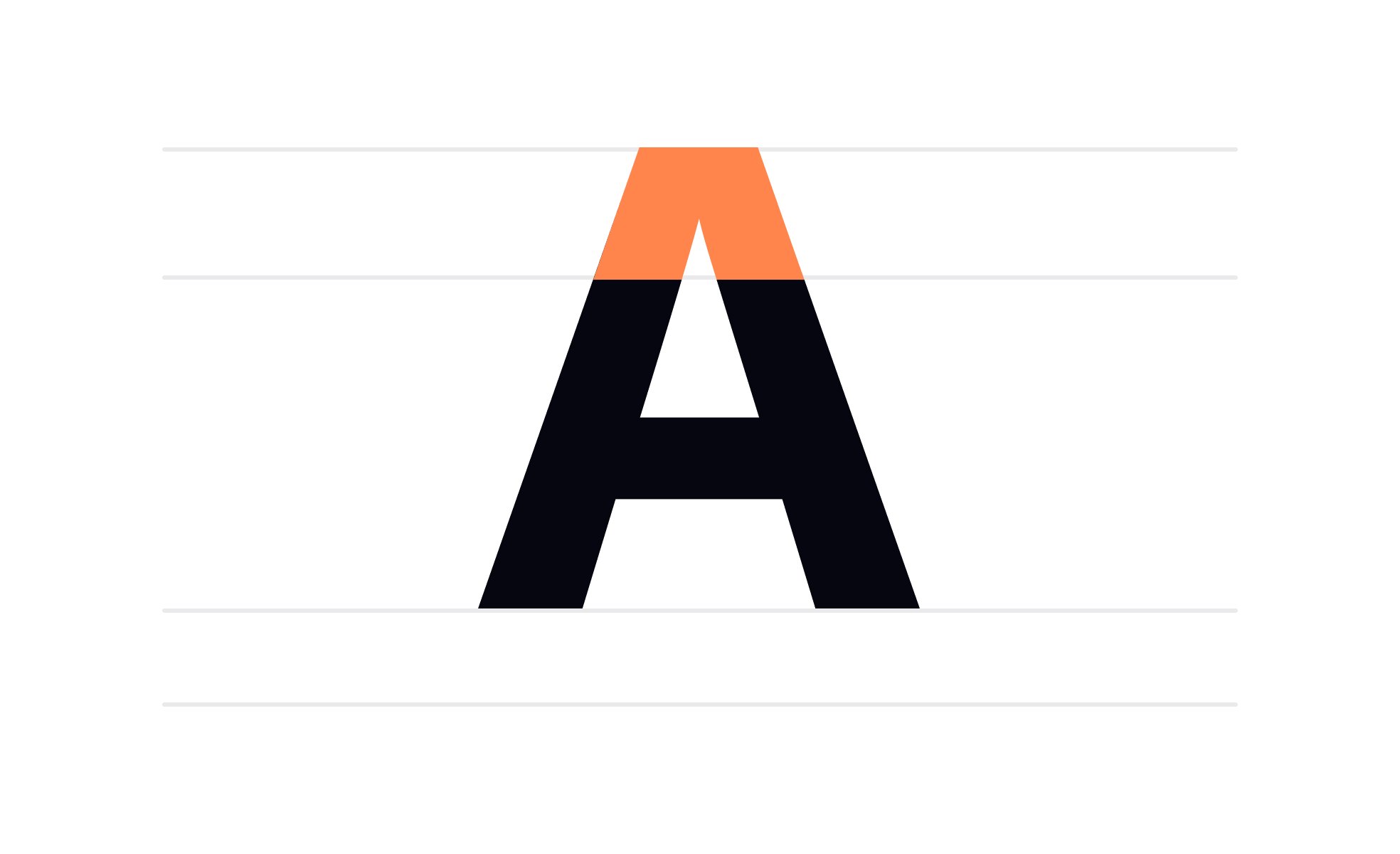
In typography, an apex is the pointed end of a character that extends above the height of the other characters in a font, such as the top of a lowercase "h".

In typography, the apex refers to the uppermost point where two strokes of a letterform converge. It is a structural feature found in letters such as “A,” where the left and right strokes meet at a peak. Depending on the typeface, this meeting point can be sharp, rounded, flat, or curved, each choice influencing the overall character of the design.
For type designers, the apex is not just a technical detail; it affects legibility and aesthetic tone. A sharp, pointed apex communicates precision and authority, while a softer, rounded apex conveys warmth and approachability. These subtle design differences contribute to the personality of a typeface and shape how text is perceived.
From a UX/UI perspective, typography details like the apex influence readability in digital environments. On small screens or at reduced sizes, an exaggerated or overly sharp apex might blur, reducing clarity. Designers working on interfaces must choose fonts with balanced anatomical details to ensure smooth reading across different resolutions.
In print, apex variations can add visual character. For example, traditional serif fonts often feature more complex apex forms compared to geometric sans-serifs. This adds richness to headings or editorial layouts, giving designers more expressive tools to differentiate content.
Modern digital brands often lean toward simplified apex structures to improve screen rendering. Flat or blunt apexes, seen in fonts like Helvetica or Roboto, support legibility on multiple devices. These functional considerations tie directly into product design, where clarity is often valued over ornamental detail.
Real-world examples illustrate how apex choices reflect brand identity. A financial institution may choose a typeface with sharp, angular apexes to project strength and professionalism, while a children’s brand might use a rounded apex typeface to convey friendliness and ease. These details build subtle but powerful associations.
Ultimately, the apex in typography is more than a meeting of strokes. It is a design decision that affects legibility, brand voice, and user comfort. Recognizing its role gives designers and product teams an appreciation for how small features create meaningful differences.
Learn more about this in the Characters in Typography Lesson, a part of the Typography Course.
Key Takeaways
- The apex is the point where two strokes meet at the top of a letter.
- Shapes can be sharp, flat, or rounded, influencing tone and readability.
- Impacts both aesthetic style and legibility in digital contexts.
- Plays a role in brand personality through font selection.
- Requires balance for usability across print and digital formats.
The most common example is the uppercase “A,” where two diagonal strokes meet at the top. Other letterforms like “M” and certain stylized characters may also feature apex-like structures, depending on the typeface design. The presence and shape of the apex vary widely across serif, sans-serif, and decorative fonts.
In custom typefaces, designers sometimes exaggerate or minimize the apex to create a signature look. These creative variations can set a brand apart, but they must be balanced with functional legibility. When applied thoughtfully, they enhance both character and usability.
Apex design influences how easily a font can be read, especially at small sizes. Sharp or exaggerated apexes can appear jagged or pixelated on low-resolution screens, while flat or rounded apexes render more consistently. For digital products, fonts with simpler apex structures often perform better.
This does not mean decorative apexes should be avoided entirely. They can work well in large-format uses like headlines, posters, or logos. The challenge is ensuring that they don’t compromise clarity when applied to body text or functional interfaces.
Yes, apex design contributes to a typeface’s emotional tone. Angular apexes suggest professionalism, seriousness, or authority, while rounded apexes imply friendliness and approachability. These subtle differences affect how users perceive a brand at a subconscious level.
For example, a healthcare product may choose a typeface with softened apexes to reduce intimidation and build trust. Meanwhile, a tech startup aiming for sharpness and precision might select a typeface with crisp, pointed apexes. In both cases, the apex reinforces the brand’s intended personality.
Recommended resources
Courses

UX Design Foundations

UI Components I

Design Terminology
Projects

E-Comerce


