Descender
A descender is the part of a lowercase letter that extends below the baseline in typography, influencing readability, balance, and overall visual harmony.

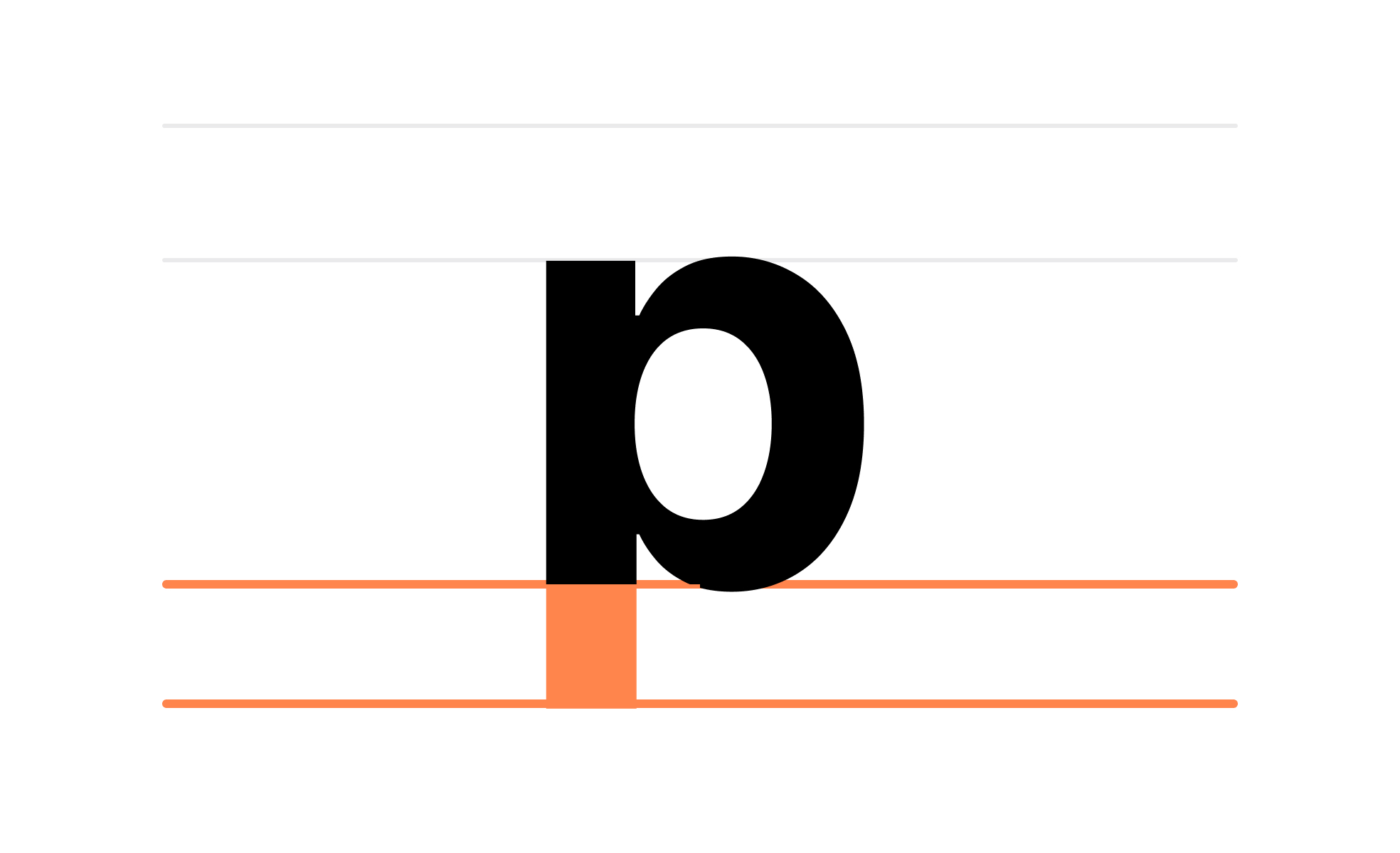
In typography, a descender refers to the portion of a lowercase letter that extends beneath the writing baseline. Examples include the tails of letters like "g," "j," "p," "q," and "y." While subtle, descenders play a vital role in shaping how text is perceived and read, contributing to rhythm and legibility.
For designers, understanding descenders is essential when choosing or designing typefaces. Too long descenders can make lines of text appear crowded, particularly with tight line spacing. Conversely, shorter descenders may compromise the elegance and character of a font. Striking the right balance helps maintain visual harmony.
Descenders also impact alignment in digital design. When designing buttons, menus, or labels, text containing descenders requires enough vertical space to avoid clipping. Overlooking this detail can lead to awkward truncation, diminishing polish and readability.
In branding, descenders contribute to recognition. Logos or wordmarks that include descender-heavy characters must be carefully crafted so they appear consistent across contexts. For example, fashion brands often stylize descenders for elegance, while tech brands might prioritize clarity.
Typography choices with prominent descenders can also influence mood. Fonts with sweeping, decorative descenders feel expressive and artistic, while geometric fonts with restrained descenders convey precision and modernity. Product teams should consider these nuances when aligning typography with brand voice.
Ultimately, descenders are a small but influential element in type design. By paying attention to their form and function, designers ensure both readability and aesthetic alignment with the overall product.
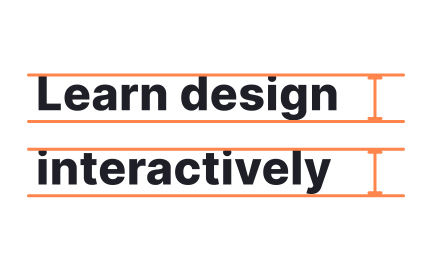
Learn more about this in the Descender Exercise, taken from the Characters in Typography Lesson, a part of the Typography Course.
Key Takeaways
- Descenders extend below the baseline in lowercase letters.
- Influence readability and spacing in typography.
- Require careful handling in UI to prevent clipping.
- Play a role in brand identity and mood.
- Affect alignment and overall balance of text.
- Small detail, big impact on design quality.
Descenders can affect how text fits into confined spaces like buttons or menus. Without proper spacing, letters with descenders may appear cut off, reducing clarity.
Designers account for this by adjusting line height or padding, ensuring the text looks clean across all devices and interfaces.
Yes. Long descenders can make lines feel crowded if line spacing is too tight. On the other hand, well-proportioned descenders contribute to the natural rhythm of reading.
Thoughtful typography balances descender length with spacing, ensuring text remains comfortable to read across contexts like apps, eBooks, or websites.
Descenders can add character to typography, reinforcing a brand’s personality. Elegant, flowing descenders may fit luxury branding, while simpler forms align with modern, minimalist identities.
By customizing descenders, brands subtly shape how their messaging is perceived, aligning even small details with their values.
Recommended resources
Courses

UX Design Foundations


UI Components I


Design Terminology