Characters in Typography
Understand the anatomy of different typefaces to comprehend the factors contributing to their quality, legibility, and distinctive style
No matter how unique typefaces can be, they all share some features. Like a human body, a typeface can be dissected into anatomic parts with a specific name and function. Whether you're a typeface designer or just a general typography enthusiast, learning type's anatomy helps you better understand what makes a good or bad typeface, what influences its legibility, or what creates a specific style.
Plus, you'll feel more confident about selecting a typeface that will meet your needs and fit your design project. Does the x-height define the height of a lowercase "x"? In what cases does tracking fail to help, so you need to apply kerning? Do you need a specific typeface for numbers? You'll know how to answer these questions and feel more confident to discuss type in more detail with other designers.
X-height defines the height of all lowercase letters of a given
The larger the x-height, the more white space the typeface leverages, and the more legible the typeface is, even at small font sizes. For example, Helvetica set at 8pt remains clear and distinct.
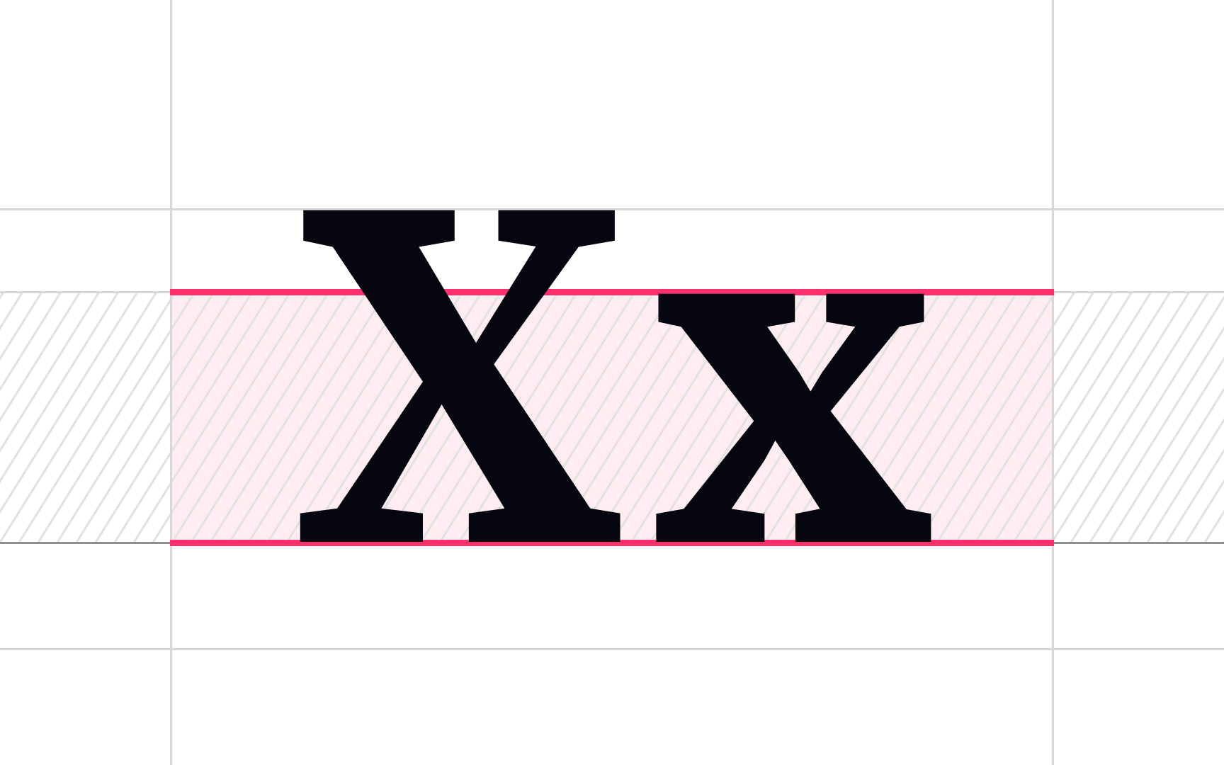
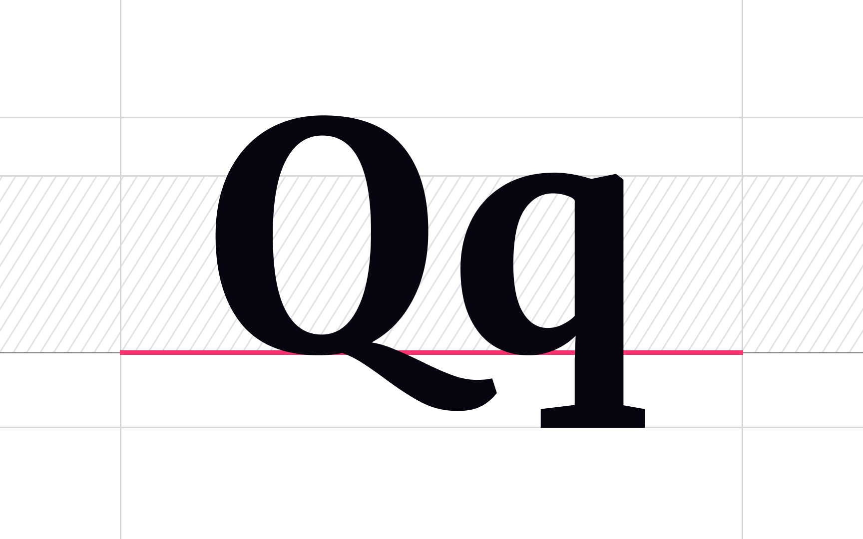
Cap height measures the height of capital letters of a given
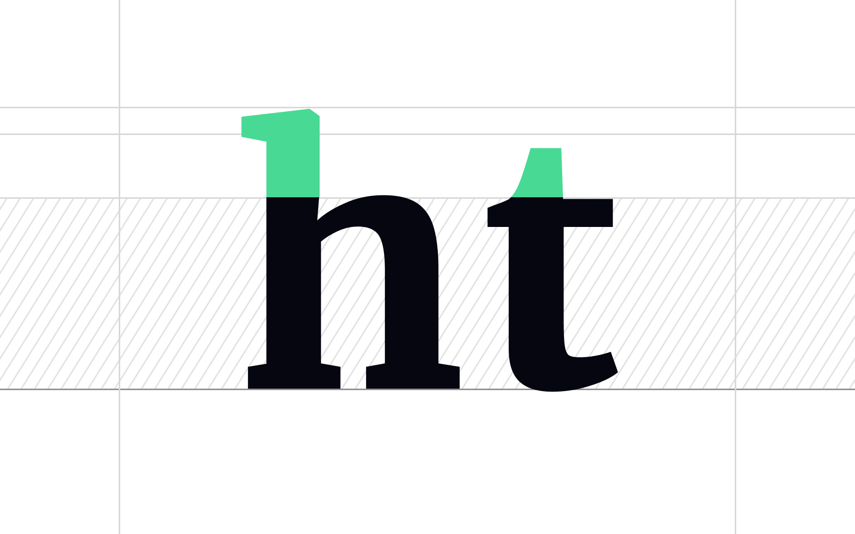
A stroke is a line or a curve that helps form letters. In some letters like "w," "k," and "l," these lines are straight. In others like "c," "o," and "s," the lines curve. These lines are the main parts of any letter we write or type.[1]
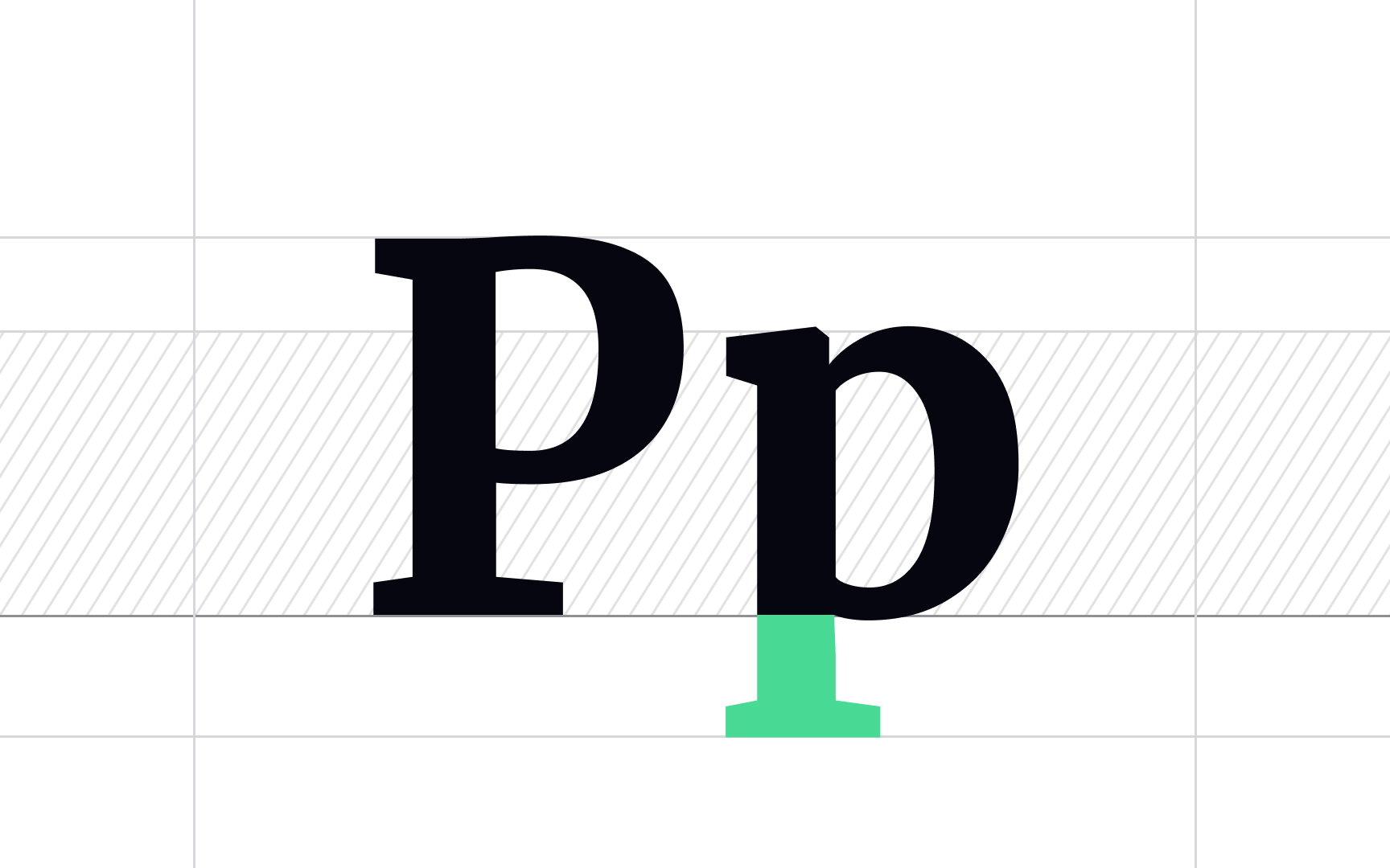
The descender is the part of a lowercase letter that extends below the baseline.[3] Letters g, j, q, p, y, and sometimes f have such "tails," and the lowest parts are marked by an invisible line — the descender line.
Pro Tip: If descenders are too long they can intersect with the ascenders of letters on the next line. Fix this by either finding synonyms that don't possess ascenders or descenders or adjusting line spacing.
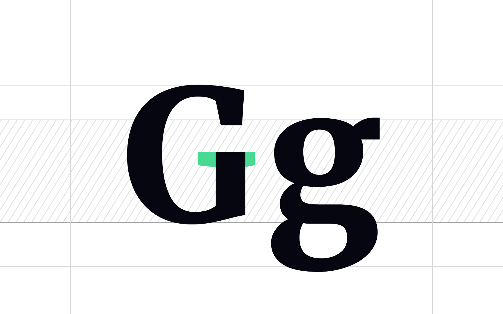
Serifs are small decorative extensions at the beginning or end of a stroke on a letter. They are the hallmarks of serif
Serif typefaces create a feeling of sophistication, trust, and world-class quality. The New York Times, Huffington Post, Dior, and Burberry use serif typefaces for their brands.
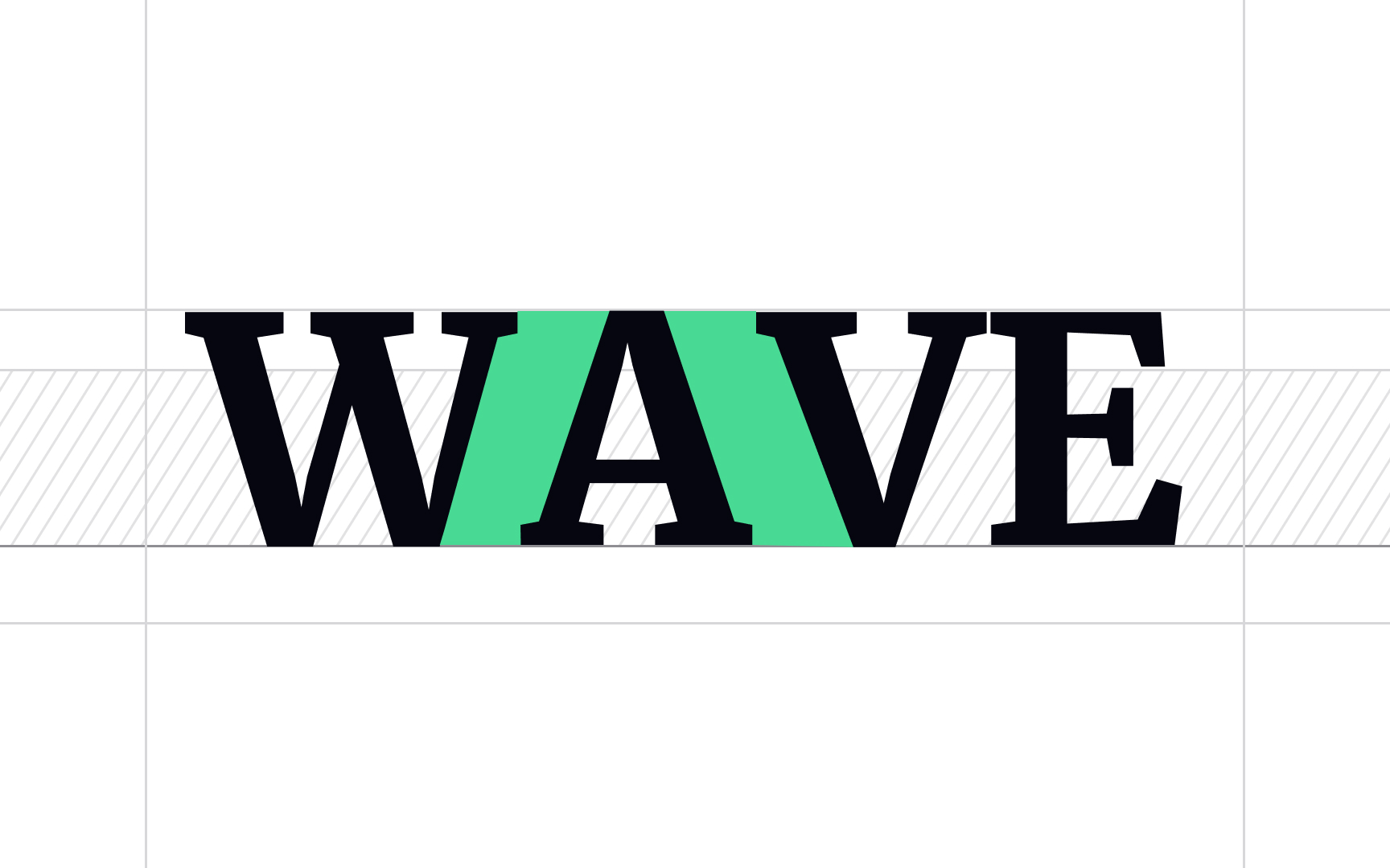
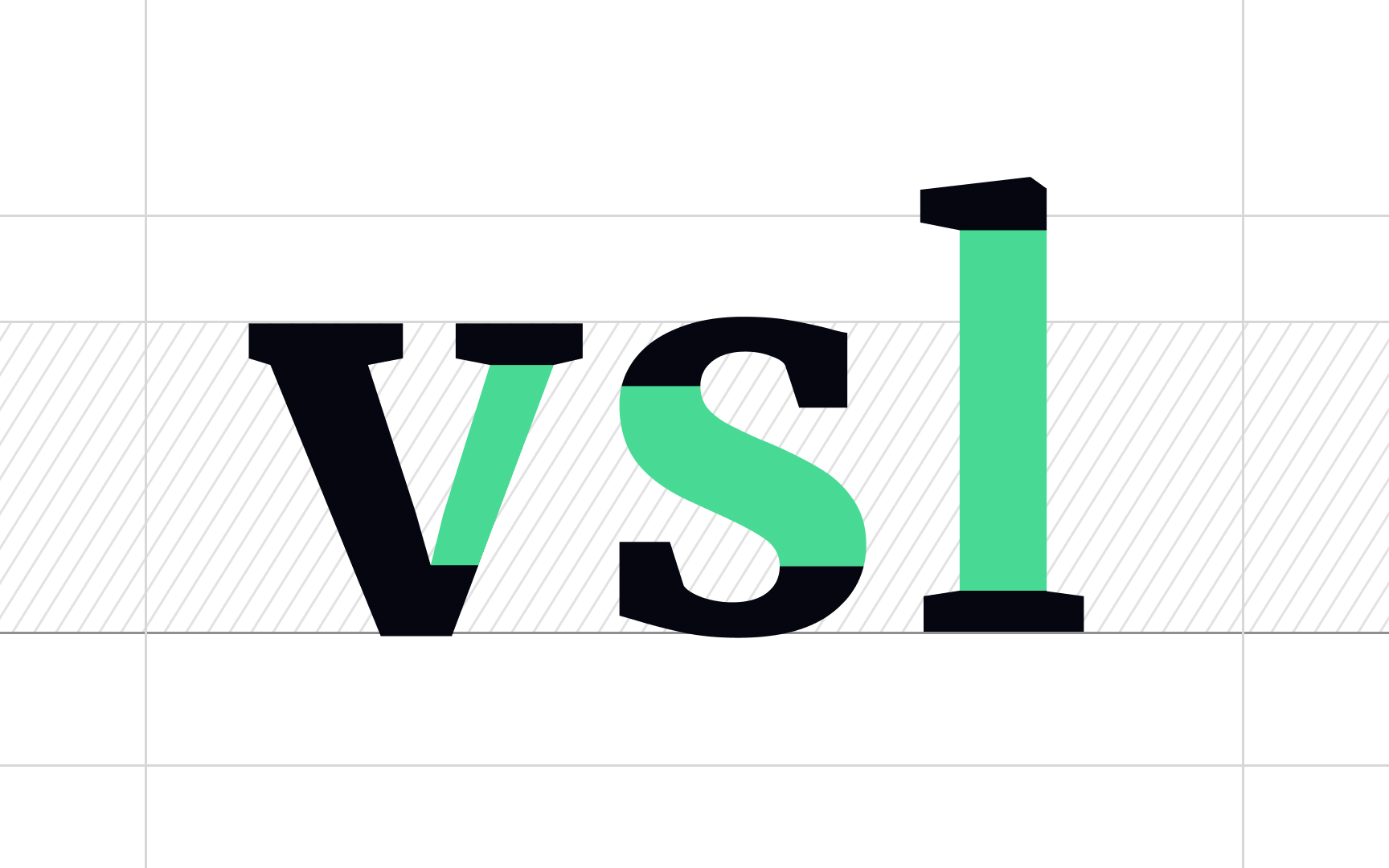
Kerning is the adjustment of spacing between individual characters, usually to achieve a visually appealing result. Certain letter combinations (usually involving outward angles or large open spaces like W, Y, V, or T) have large gaps and look awkward.[4]
Some
Pro Tip: You can experiment with kerning to create unique logo variations.
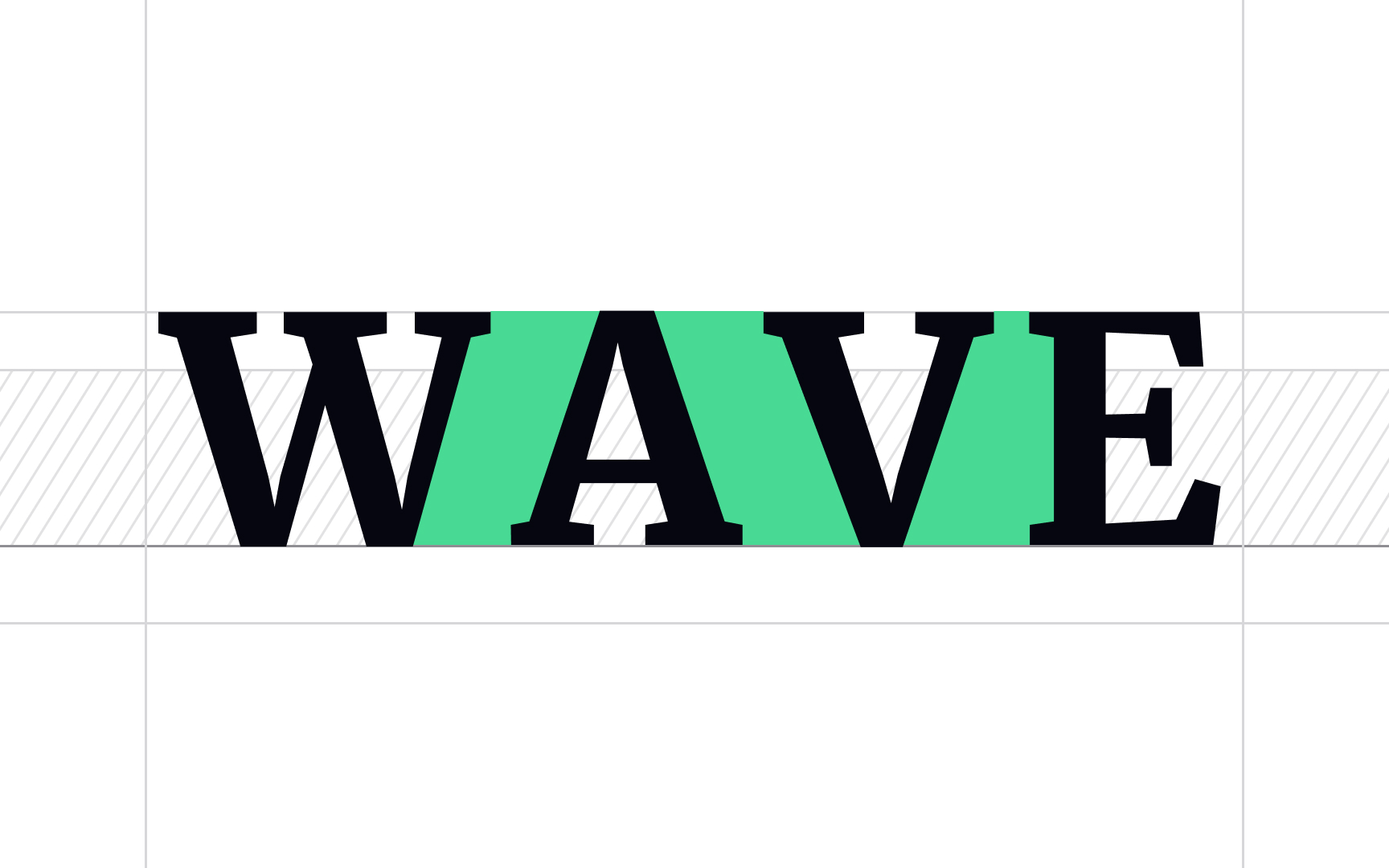
Tracking adjusts the overall spacing between letters. Increased tracking makes the text feel more spacious and sometimes can be used to emphasize a word, especially in tandem with caps or small caps. Like kerning, tracking is commonly applied to headlines and logos to diminish weird gaps in large-scale text.
White text on a black background is usually perceived as more legible when it has increased tracking applied.
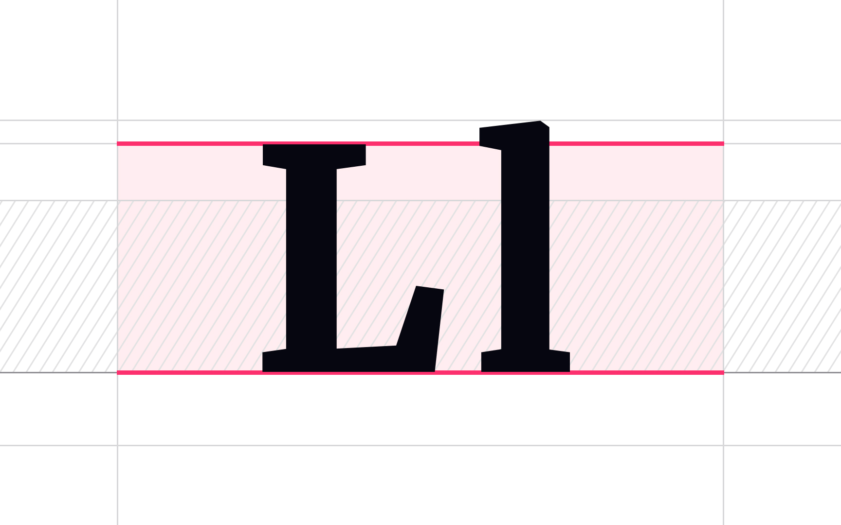
The invisible horizontal line that all letters sit on is called the baseline. Everything below the baseline is a
The baseline defines the bottom of each letter's x-height and plays an important role in measuring the vertical distance between text and an element.[5]
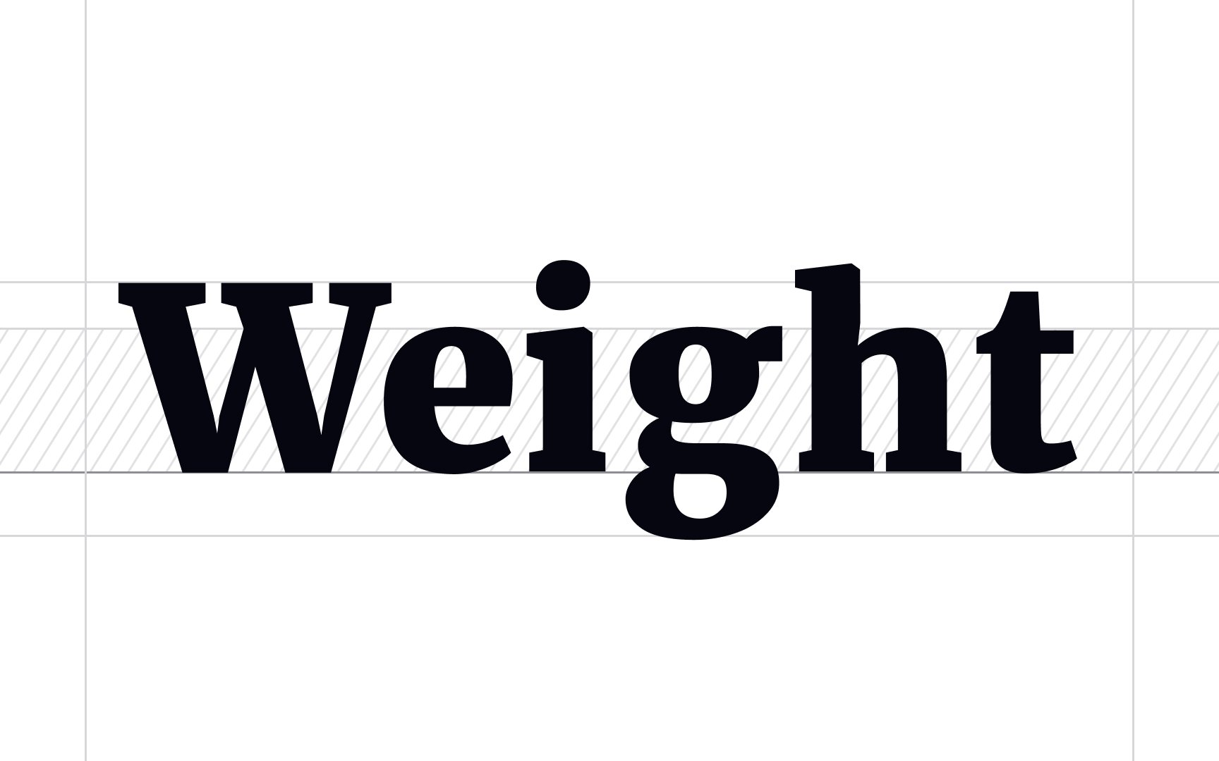
Weight refers to the overall visual heaviness or lightness of a
A common typeface may have 3 to 6 weights and include variations such as light, regular, medium, and bold.
In CSS, web designers use numerical values to define the font-weight property: 100 — thin, 400 — normal or regular, 700 — bold, and 900 — black or heavy.
Pro Tip: When using very light (like 100 or 200) or very heavy weights (800 or 900), use larger font sizes. Otherwise, the text won't be legible.
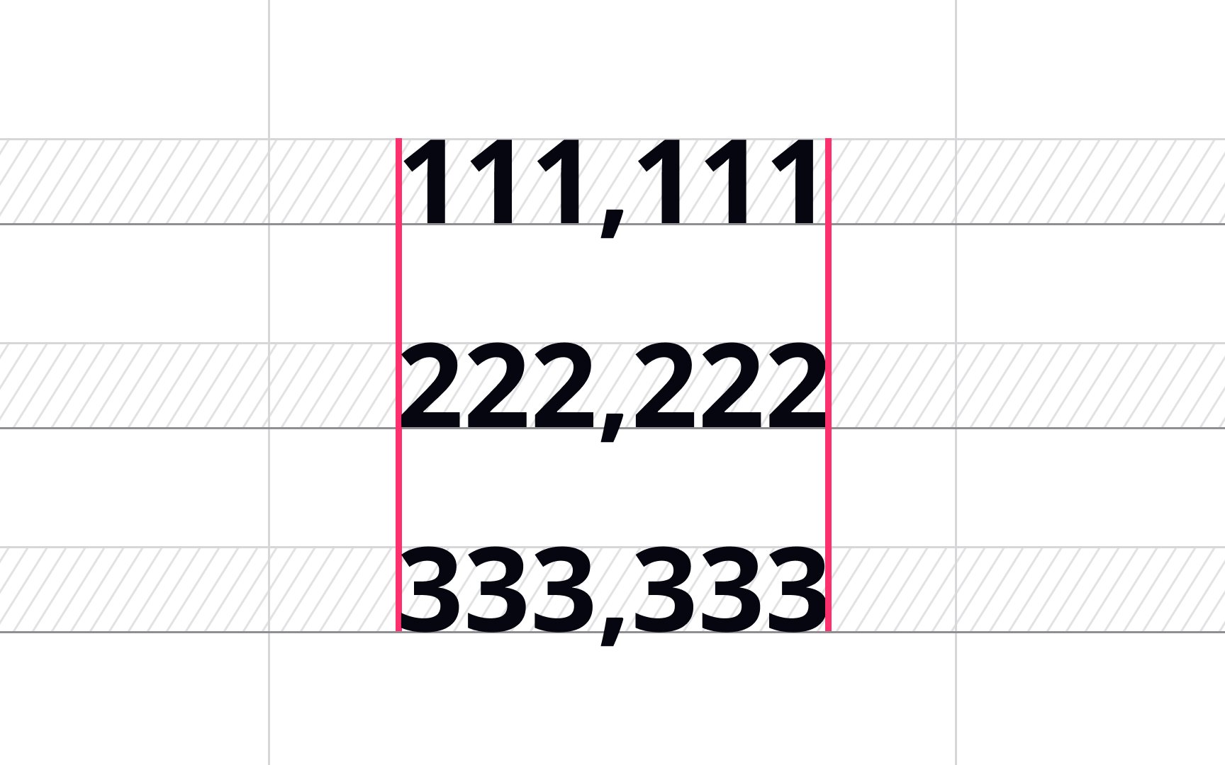
Tabular figures, aka monospaced numbers, refer to the spacing of figures where they all take up the same horizontal space. As a result, the numeral "1111" takes up as much space as "9999."
Designers should use tabular figures in tables within annual reports, price lists, financial statements, invoices, and other columns of figures where values change constantly and may look offset.[6] With tabular figures, users can scan and compare numerical data easily.
Pro Tip: Select a typeface with tabular figures in the first place.
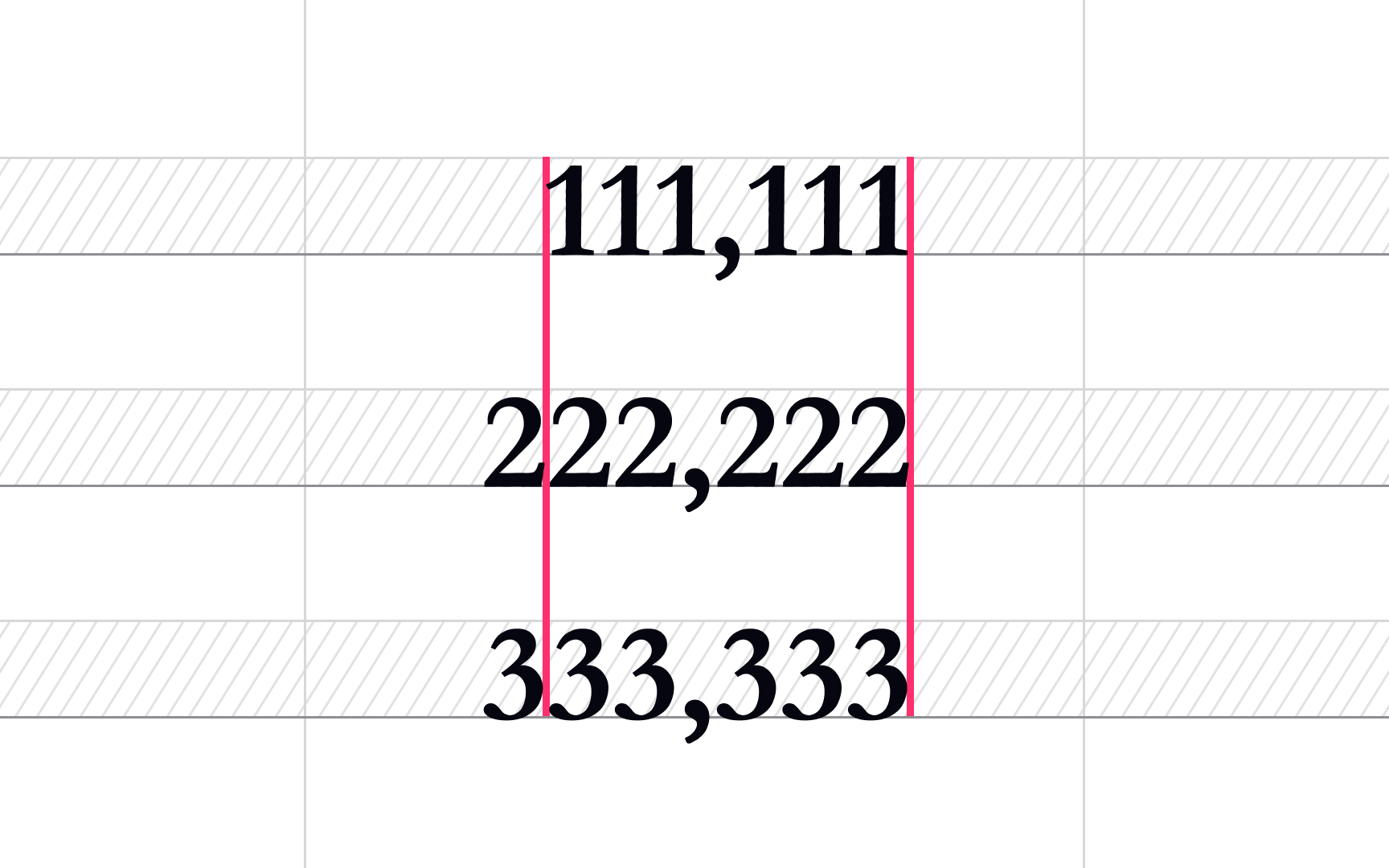
Proportional or non-lining figures have varying widths, which results in more even, balanced spacing. Designers should use proportional figures for numbers inside of headlines, subheads, or any other copy where it should blend into text context and doesn't need to be vertically aligned with other numbers.
In
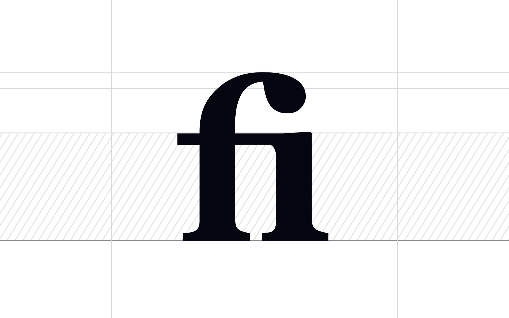
Depending on their role in the text, ligatures can be broken down into 4 types:
- Standard: Ligatures like fi, fl, ff, ffi, ffl, and ft exist in order to increase
legibility and make this collision of letters more attractive. - Discretionary: Those ligatures may include ct, fs, st, sp and serve a decorative function, creating a more old-fashioned look.
- Unusual or Uncommon: May include standard and discretionary ligatures that are rarely encountered in text, like fj, fk, or ij.
- Long s: These are usually discretionary ligatures involving a long s combined with h, l, i, or t.[7]
References
- Material Design | Material Design
- Material Design | Material Design
- TypeTalk: Know Your Figures | CreativePro Network | CreativePro Network
- Basics of Ligature in Typography and Publishing | ThoughtCo
Top contributors


Topics
From Course

Share


