Font Size
Font size refers to the height of text characters, typically measured in points or pixels, and directly affects readability, visual hierarchy, and design.


What is Font Size?
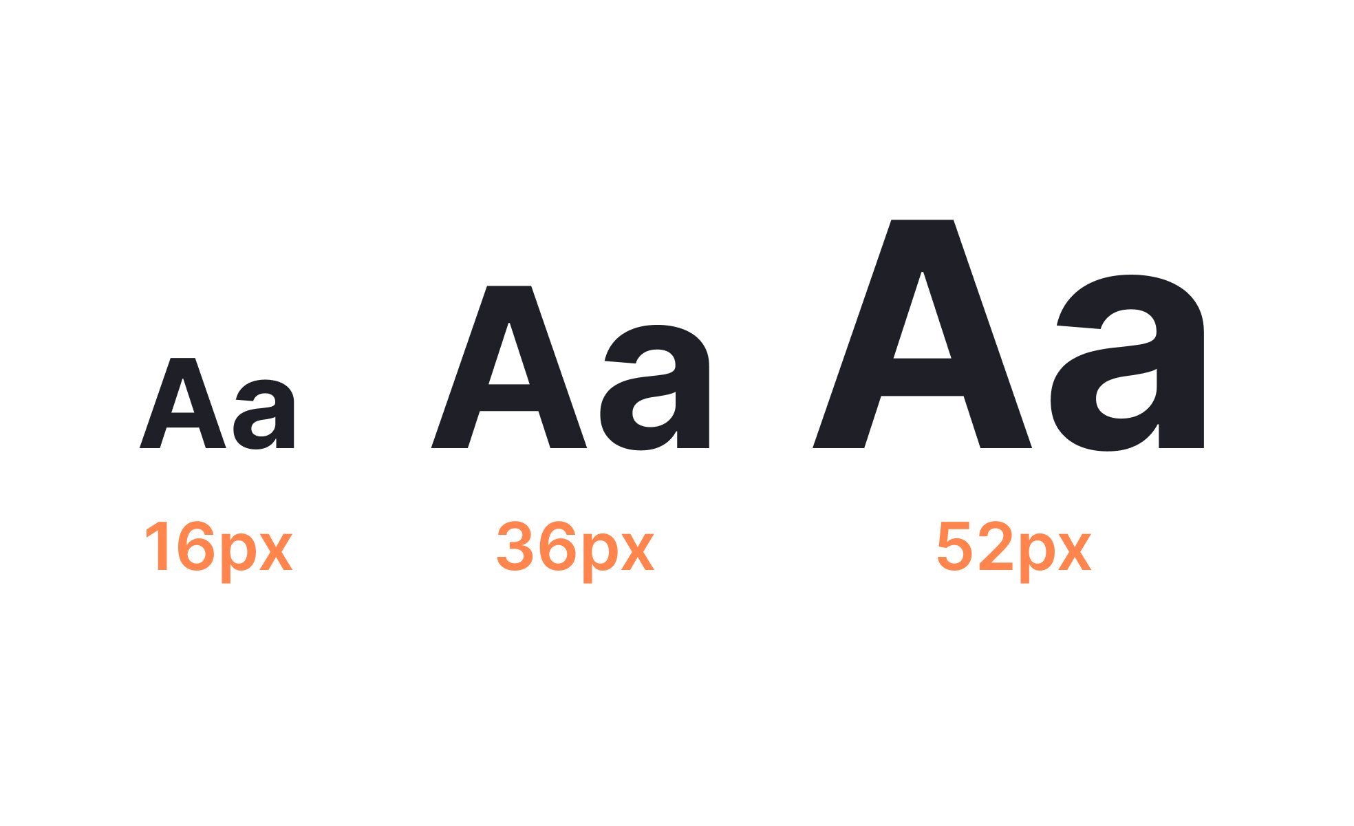
Font size refers to the height of characters in a typeface, usually measured in points, pixels, or relative units. It is one of the most fundamental aspects of typography, shaping not only how text looks but how easily it can be read and understood. Getting font size right is essential for digital products, where clarity, hierarchy, and accessibility all depend on it.
For UX designers, font size is a primary tool for establishing hierarchy. Large headings guide attention, medium subheadings structure content, and smaller body text delivers detail. If sizes are inconsistent or too similar, users struggle to scan pages and identify what matters most. A thoughtful scale creates visual rhythm, ensuring that information is consumed in the intended order.
Accessibility standards emphasize font size as a crucial factor. WCAG guidelines recommend minimum body text sizes and support for user scaling. Responsive design ensures that font sizes adapt seamlessly across desktop, tablet, and mobile. Features like “dynamic type” on iOS allow users to increase text size according to their needs, demonstrating how inclusivity can be built into typography choices.
Real-world use cases demonstrate the impact of font size. Apple’s Human Interface Guidelines recommend at least 17 points for body text on mobile to ensure readability at arm’s length. Google’s Material Design provides a typographic scale that defines font sizes across headings, subtitles, and captions, ensuring consistency in complex systems. By following these standards, organizations ensure clarity across multiple platforms and devices.
Font size also plays a role in branding and perception. Large, bold typography conveys strength and confidence, while smaller, subtler text suggests refinement or precision. A fintech app might use larger fonts to inspire trust and clarity, while an editorial site balances sizes to support readability and tone. These choices communicate personality as much as words themselves.
Font size must also be considered in cultural and linguistic contexts. Some languages require more vertical space or larger characters for legibility, while others can remain legible at smaller sizes. Multilingual products often adapt size scales to ensure parity across scripts, ensuring that accessibility and usability are consistent globally.
Learn more about typography and fonts in our Typography course.
Key Takeaways
- Font size establishes readability and hierarchy.
- Designers use scales to structure information flow.
- PMs value font size for usability and compliance.
- Accessibility requires scalable and adaptable sizes.
- Standards from Apple and Google guide best practices.
- Branding and cultural context influence size decisions.
Font size determines how easily users can read and scan content. If text is too small, it creates strain and slows comprehension. If sizes lack clear hierarchy, users cannot distinguish importance. This leads to confusion and frustration, even if the rest of the design is strong.
By applying a typographic scale, designers guide attention effectively.
Headings, subheadings, and body text form a visual roadmap that makes content both usable and aesthetically balanced. Without thoughtful font sizing, products risk losing clarity and accessibility.
Accessibility guidelines recommend minimum body text sizes, often around 16 pixels for web, to ensure readability for most users. They also emphasize relative units like em or rem, which allow text to scale when users adjust system settings. This ensures products remain usable by people with low vision or other impairments.
Supporting accessibility through font size benefits all users. Adjustable, scalable fonts improve comfort across devices and screen conditions, enhancing the experience for everyone. Compliance with standards also reduces legal and ethical risks.
Typography communicates personality. Large, bold fonts may convey modernity, strength, or accessibility, while smaller fonts may suggest subtlety, elegance, or tradition. Brands choose font sizes strategically to align visual communication with identity.
Cultural differences also influence legibility. For example, scripts like Chinese or Japanese require careful scaling because characters carry more detail, while Latin-based scripts remain legible at smaller sizes. Adapting font size across languages ensures inclusivity and consistent quality in global products.
Recommended resources
Courses

Typography


UX Design Foundations


UI Components I

Lessons


Projects

Raydario - Online Radio App


Desktop UI Button Design Kit


Type System for a Coding Community