Typographic Terms
Decode the components and anatomy of type
Well-designed typography can keep users reading your content for longer. Poor typography can quickly hinder readers and send them looking for information elsewhere. To create better typographic designs, you must first understand the basic typographic terminology.
When visual hierarchy is applied to text, it’s called typographic hierarchy. Typographic hierarchy is influenced by factors like size, font, style, color, and position.
Text is generally grouped into 3 levels of importance: primary, secondary, and tertiary. Good typographic hierarchy makes the text flow naturally and guides users through information coherently.
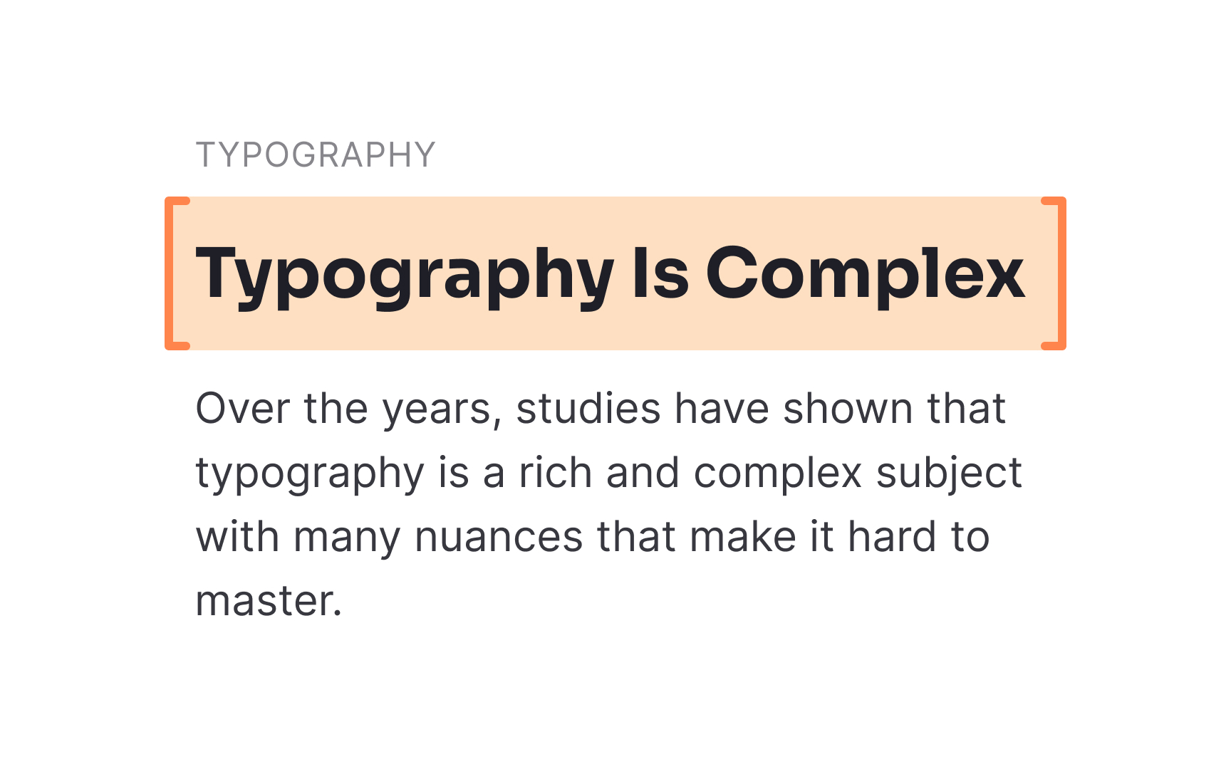
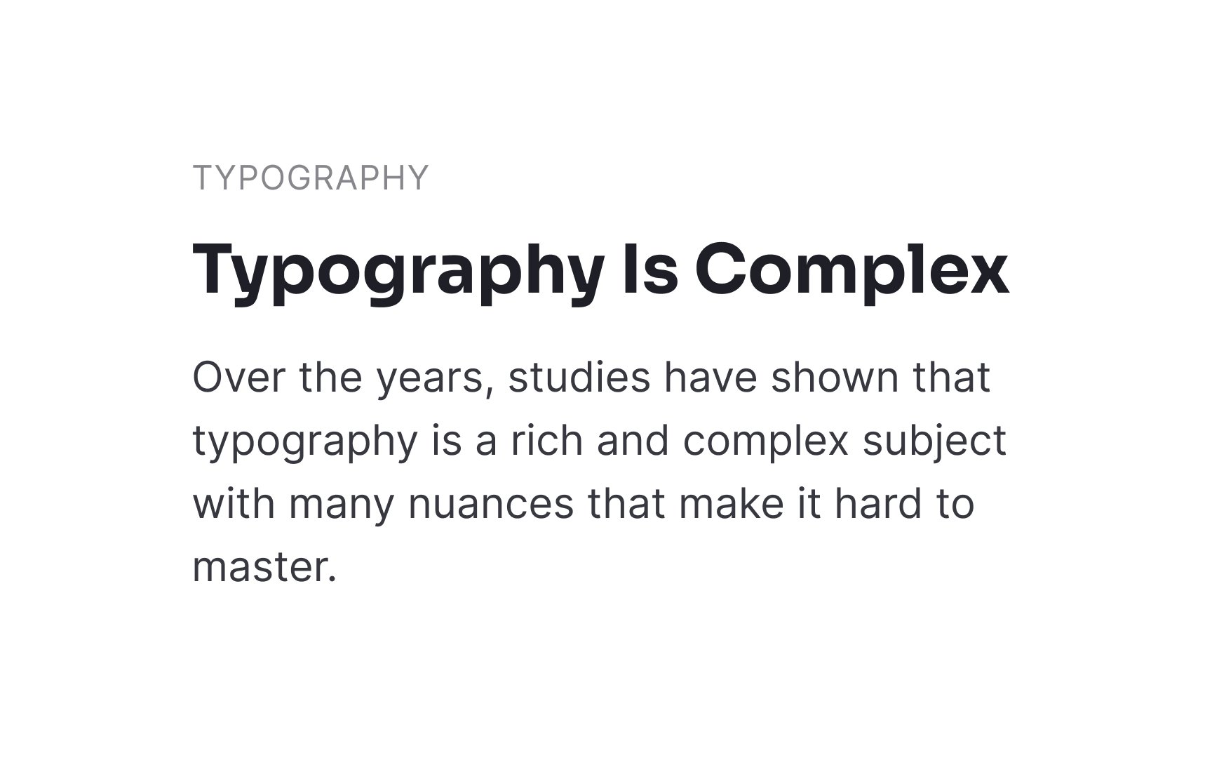
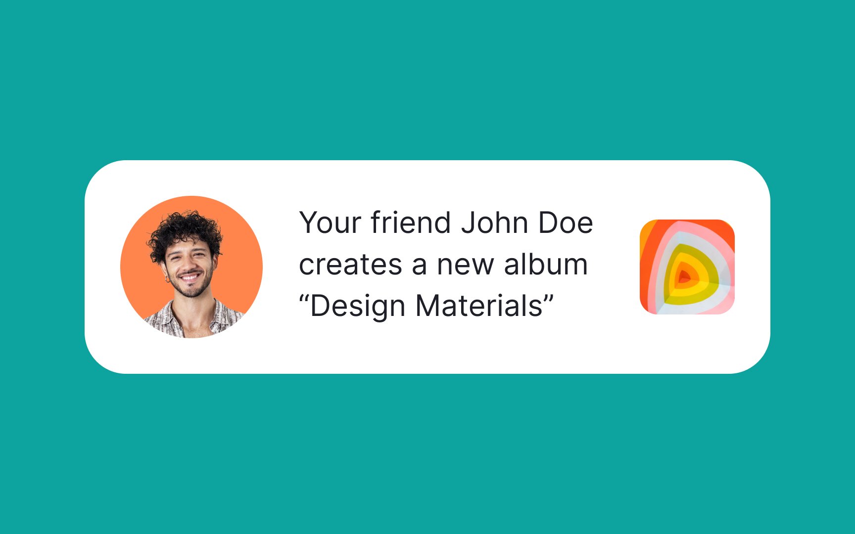
Headlines are used to indicate primary text such as the title of an article or blog. The goal of any headline is to catch people’s attention and entice them to read more. To that end, they should be short and descriptive. However, you can have fun with the way you style headlines. They're an excellent opportunity to use display or script typefaces, bold or italic
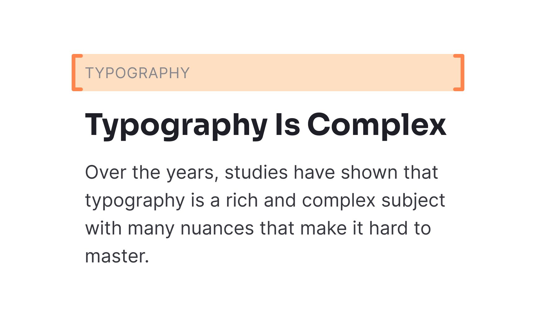
An eyebrow headline comes second in the typographic hierarchy and sits above the main headline (like your eyebrow sits above your eye). These eyebrow headlines are usually labels or keywords that help users understand the theme of the
They are most effective when used in groups, like a list of cards. Sometimes, they are also used on individual articles or pieces of content to denote that they’re part of an ongoing series.
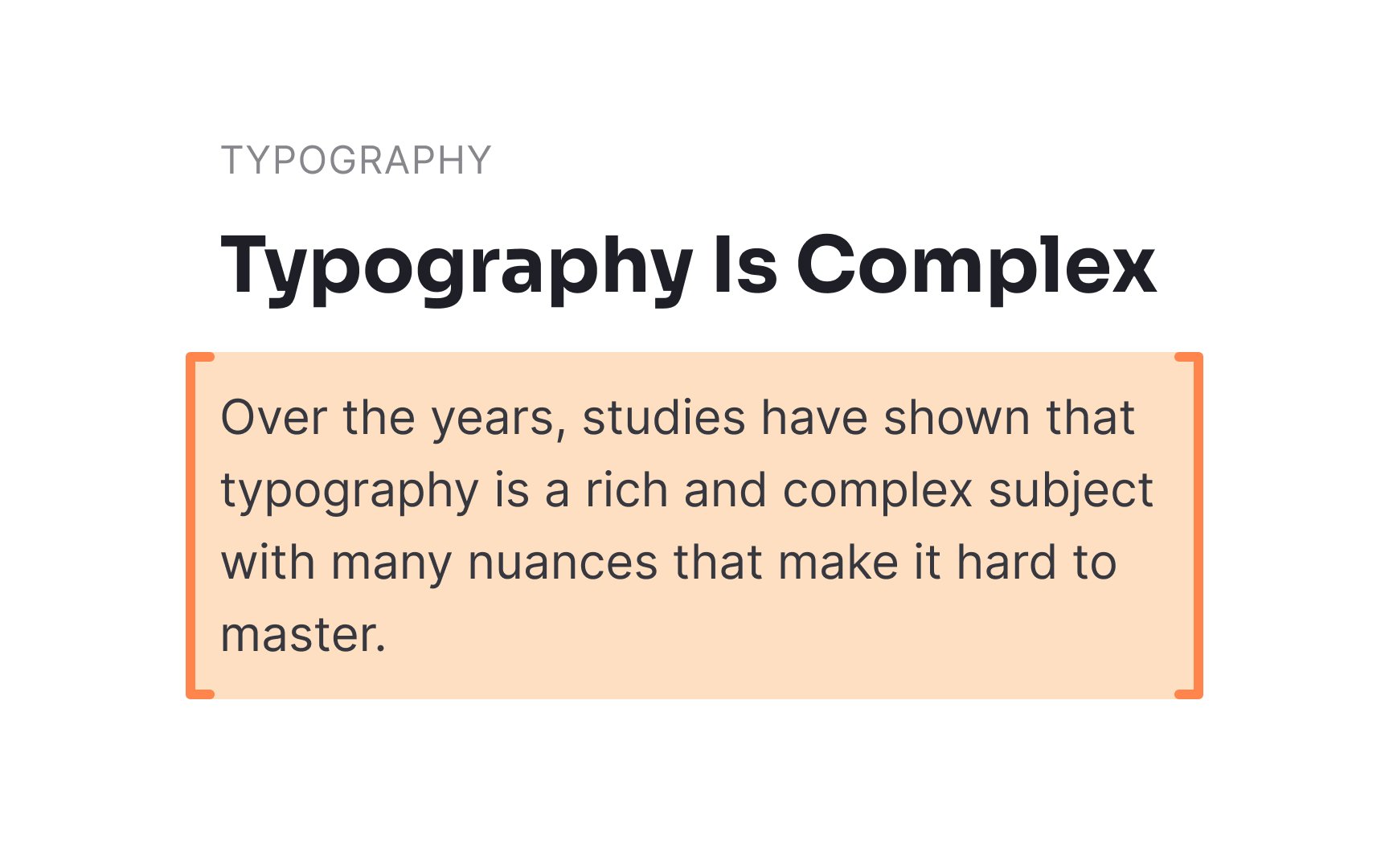
The body text of a piece of
Pro Tip: Use typefaces with multiple fonts — they are more versatile for various use cases, including body text.
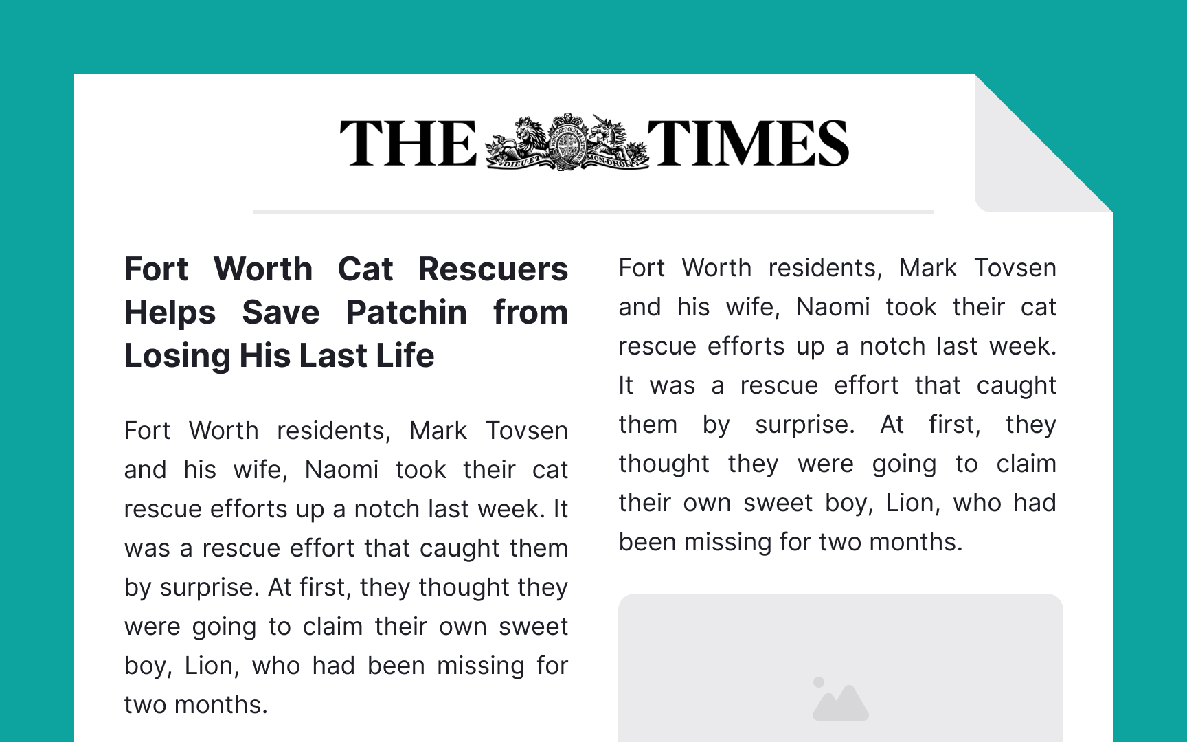
Flush left text is aligned along the left-hand side of the margin or gutter. It’s the most common form of alignment since it follows the natural reading order of left-to-right languages. In most cases, you’ll want to use flush left alignment for
Note that you’ll want to avoid this type of alignment in languages that read from right to left such as Arabic and Hebrew.
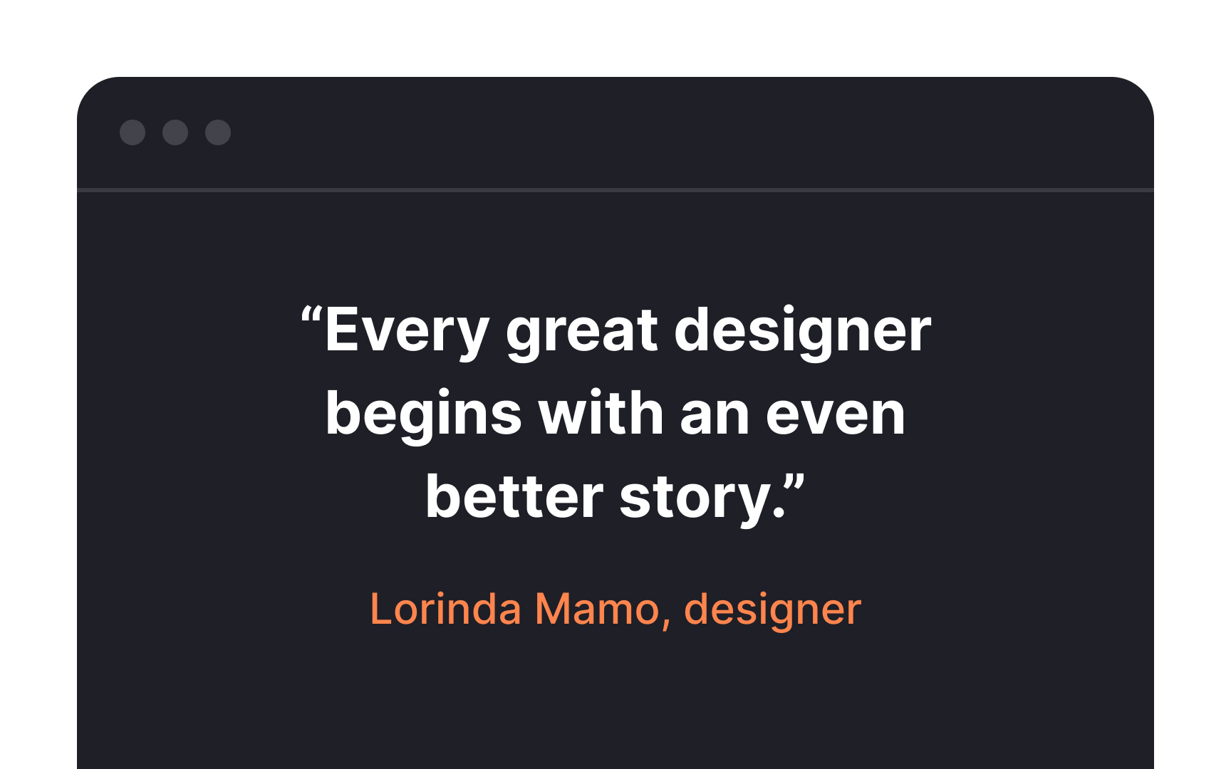
Centered text is aligned along an invisible central axis, in the middle of the left and right
Center alignment is useful for headlines and titles, or for short blocks of text like pull quotes. Don’t use more than three lines of center-aligned text at a time, or it becomes difficult to read.[1]
Flush right text is aligned along the right-hand side of the
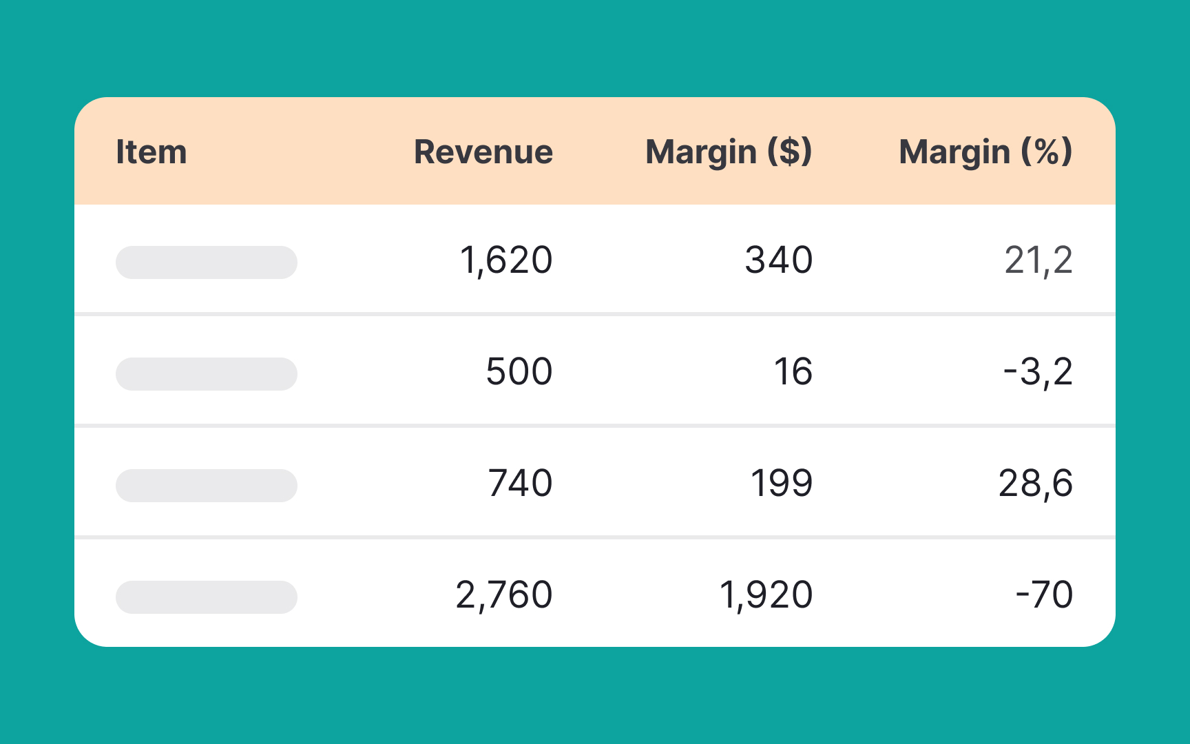
Justified text forces each line (except the last in a paragraph) to span the full width of its container, commonly seen in printed materials like books or legal documents. However, in digital
Kerning is the adjustment of space between individual characters in a line of text. It's an essential element in
Kerning matters because it:
- Enhances readability: Proper kerning makes text easier to read
- Improves aesthetics: Well-kerned text looks visually balanced
- Highlights importance: It can be used to emphasize certain words or sections
Designers usually apply kerning in headlines, logos, and other areas where text size is large. Subtle changes can have a significant impact, so it's crucial to pay attention to kerning when working on any design project involving text.[3]
Tracking is the space between all the letters throughout your text. Adjusting tracking to style titles and headlines can make them stand out, but it’s unnecessary in larger blocks of text since most
Positive tracking can create more contrast and increase legibility when done properly. You can also use negative tracking, making letters closer together. Small adjustments can add a stylized effect (and allow you to fit more text on a single line), but it’s easy to overdo it and make text harder to read.
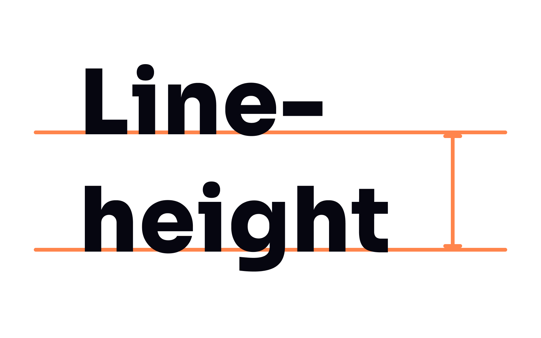
Line height, also called leading or line spacing, is the vertical distance between two lines of adjacent text. It is measured from the baseline of one line of text to the baseline of the next. It’s usually defined in points (pt) or as a multiple of the font size (e.g., 1.5x).
Proper line height is vital to making text more readable. Too little space makes text look crowded and cluttered. Too much space can make it hard for the reader’s eye to travel smoothly from one line to the next.
References
- Why You Should Never Center Align Paragraph Text | UX Movement
- Design Dictionary from Figma | Figma
Top contributors


Topics
From Course

Share


Similar lessons

Intro to Typography

Elements of Typography
