Desktop UI Button Design Kit
Tech Platform and Device Type:
This button system is engineered for a desktop-centric web application on the Adobe XD platform. It focuses on a user-friendly interface for Windows and macOS users on high-resolution screens.
Button System with Varying Priorities and States:
This system delineates button priorities through distinct visual treatments: 'Accent Fill' for primary actions, 'Negative' for potentially destructive actions, 'Primary Fill' for standard actions, and 'Secondary Fill' for choices. Each button category is illustrated with states that include Default, Hover, Active, Focus, and Disabled to guide users through their interactions.
Clearly Outlined Button Parameters:
The standard button is designed to be 32 pixels in height and 72 pixels in width, ensuring a uniform and balanced presentation across the interface. This dimension allows the buttons to comfortably accommodate the typeface Roboto 14 Bold, making them easily legible and providing a consistent experience. The padding around the text is optimized for clarity and aesthetics.
Accessibility Color Contrast Requirements:
Colors are selected with an eye for accessibility. The 'Accent Fill' buttons with a #0265DC blue background against white text exceed the minimum contrast ratio required by WCAG 2.1 AA, ensuring that users with visual impairments can easily navigate the application. Similarly, the 'Negative,' 'Primary Fill,' and 'Secondary Fill' buttons also comply with these standards, thus supporting a wide range of users.
Explanation for Design Choices:
Choosing a 32x72 pixel button size deliberately balanced clickability with aesthetic appeal. The Roboto 14 Bold font was selected for its modern look and readability, enhancing the user interface's overall usability. The color palette was carefully curated not only to meet accessibility standards but also to invoke the appropriate user emotions and actions, reflecting the application's ethos. Each button is crafted to stand out according to its function, ensuring users can navigate intuitively and confidently.
Reviews
6 reviews
the button system is so clean with describe
Very detail
great!
Very Clean and the buttons are very well designed
Very Detailed and Variety
You might also like
Pulse — Music Streaming App with Accessible Light & Dark Mode
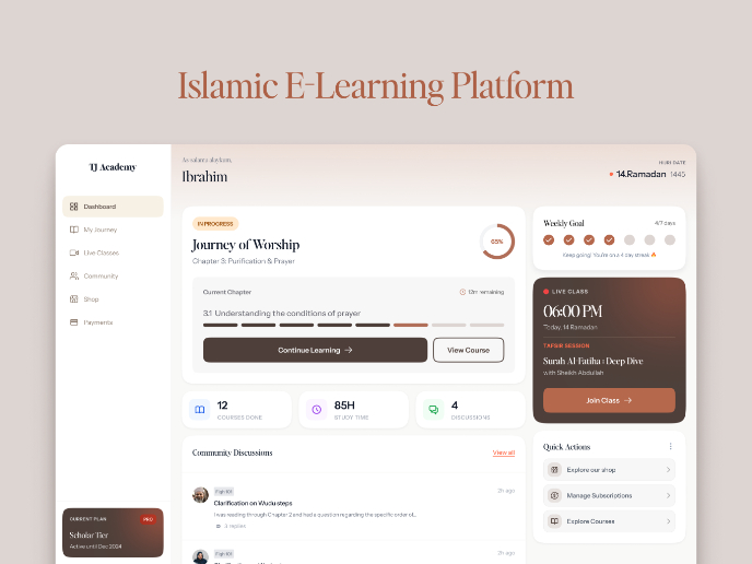
Islamic E-Learning Platfrom Dashboard
SiteScope - Progress Tracking App

Mobile Button System

FlexPay
CJM for Co-Working Space - WeWork
Visual Design Courses

UX Design Foundations

Introduction to Figma


