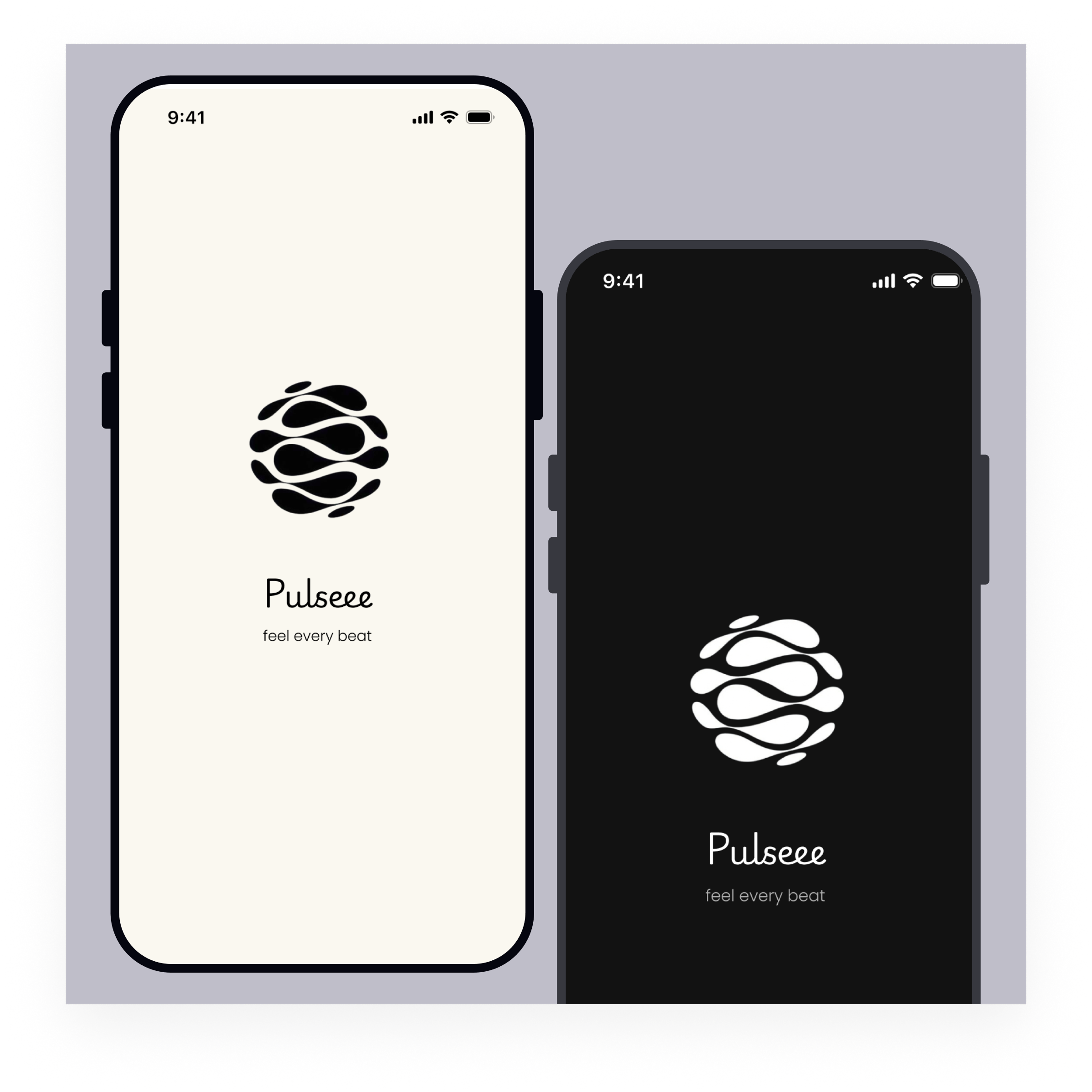
Pulse — Music Streaming App with Accessible Light & Dark Mode

Platform & Device
For this project, I designed Pulse, a mobile music streaming application for iOS devices (using the provided mobile template).
The goal was to create a clean, immersive listening experience while ensuring accessibility and WCAG-compliant dark mode support.
🌞 Light Mode — Major User Flow Screens
The following primary screens were designed in light mode:
- Splash Screen
- Home
- Playlist Detail
- Now Playing
- Settings
The light mode uses a soft beige background to create a warmer and more relaxed atmosphere compared to pure white interfaces. White surface cards are layered on top to maintain structure and visual hierarchy.
Design priorities in light mode:
- Clear section grouping (Recently Played, Top Albums, Made for You)
- Album artwork as the visual focal point
- Minimal text to improve scannability
- Bottom navigation for thumb-friendly interaction
🌙 Dark Mode — WCAG-Compliant Color System
Dark mode was not created by simply inverting colors. Instead, I developed a dedicated dark color palette designed to meet WCAG AA contrast standards (4.5:1 ratio for normal text).
Dark Mode Palette:
- Background: #121212
- Surface: #1E1E1E
- Elevated Surface: #242424
- Primary Text: #FFFFFF
- Secondary Text: #B3B3B3
Accessibility considerations:
- High contrast between text and background
- Clear distinction between primary and secondary text
- Large touch targets in the player and navigation
- Consistent typography hierarchy
Mode Switch Placement
The theme toggle was placed inside the Settings screen under “Dark Mode” to avoid cluttering the Home interface while remaining discoverable.
This follows established user mental models, where appearance preferences are typically found within profile or settings areas.
The prototype includes interactive switching between light and dark mode using Smart Animate.
Accessibility & Inclusivity
The design prioritizes inclusivity by:
- Ensuring WCAG-compliant contrast ratios
- Using clear typography hierarchy
- Providing large interactive controls in the player
- Avoiding reliance on color alone to communicate meaning
The interface remains readable and usable across lighting environments and user contexts.
Scannability & Visual Hierarchy
The layout was designed for quick scanning:
- Section titles clearly separated
- Album artwork prioritized visually
- Minimal text blocks
- Consistent spacing system
- Bottom navigation for predictable access
Users can locate content without needing to read dense text.
Visual Design Approach
Pulse follows a minimal, content-first design philosophy.
- Neutral UI allows artwork to stand out.
- Soft beige creates warmth in light mode.
- Layered charcoal surfaces enhance immersion in dark mode.
- Accent color used sparingly for key actions (Play, active states).
The result is a cohesive system across both themes.
Interactive Light ↔ Dark mode available here:
https://www.figma.com/proto/v68gp8Ec8Ti5nH7ILnOmsg/Music-App?node-id=29-139&p=f&t=YHHACCoTtl0ATbld-1&scaling=scale-down&content-scaling=fixed&page-id=0%3A1&starting-point-node-id=1%3A2&show-proto-sidebar=1

Reviews
4 reviews
Hello Oluwatomi, your design looks really solid!
The dark mode color palette is well thought out — the contrast ratios meet WCAG AA standards, and the splash screens look beautiful and polished. Great job on the accessibility-first approach, it's clear you put real thought into making the experience inclusive for all users!
One small thing to address: when switching to light mode, the play button icon becomes grey and low-visibility, blending into the background. Consider using a stronger accent color to improve contrast and make it more tappable and noticeable for users. A small fix that will make a big difference!
Overall, really impressive work!

Awesome project that absolutely nails the brief! I love how clearly you explain your design choices, and the colour palette you've chosen works perfectly throughout.
Since this brief was focused on implementing dark mode, you've done a great job delivering exactly what was asked. That said, if you'd like to push the design a little further, here are a couple of suggestions to consider:
- Introducing more pronounced visual hierarchy in the titles would give the design an extra layer of polish and help guide the user's eye more naturally.
- In the settings menu, grouping related items together — such as "Rate App" and "Feedback" — would make the navigation feel more intuitive.
Overall though, this is a really great project, amazing job!

The project makes a quite good first impression. Dark mode is well thought out, the color palette is consistent, and the contrast genuinely looks WCAG AA compliant. The splash screen is clean and builds brand identity effectively. Bottom navigation is a solid thumb-friendly UX choice (Nielsen: recognition over recall, match with real world).
But... The play button in light mode disappears. The green button on the white mini-player background loses visibility, which directly undermines the primary user action. That's a priority fix.
The Settings menu lacks grouping "Rate App" and "Feedback" sit next to "Privacy Policy" with no logical separation. Gestalt principles and the consistency heuristic say: group what belongs together.
Visual hierarchy on Home is decent, but section titles could be more prominent. Right now they tend to get lost next to the album artwork.
This is good, work for this brief. Tightening the play button contrast and grouping the Settings items will push this project to the next level. Keep going, the foundation here is genuinely strong.

This is a very polished, great presentation of the dark and light modes by including a small prototype that allows you to go into settings and toggle on dark and light mode. Looks like a clean design, clear visual hierarchy, and attention to detail.
The only thing I'd suggest is including some of the mockups / screenshots in the case study itself and maybe some more of the process (research, lofi wireframes, etc.)
Great job!
You might also like

Bridge: UI/UX Rebrand of a Blockchain SCM Product


Pulse Music App - Light/Dark Mode


Monetization Strategy


Designing A Better Co-Working Experience Through CJM


Design a Settings Page for Mobile


Zoom Sign in Screen

Visual Design Courses

UX Design Foundations


Introduction to Figma

Design Terminology
