FlexPay

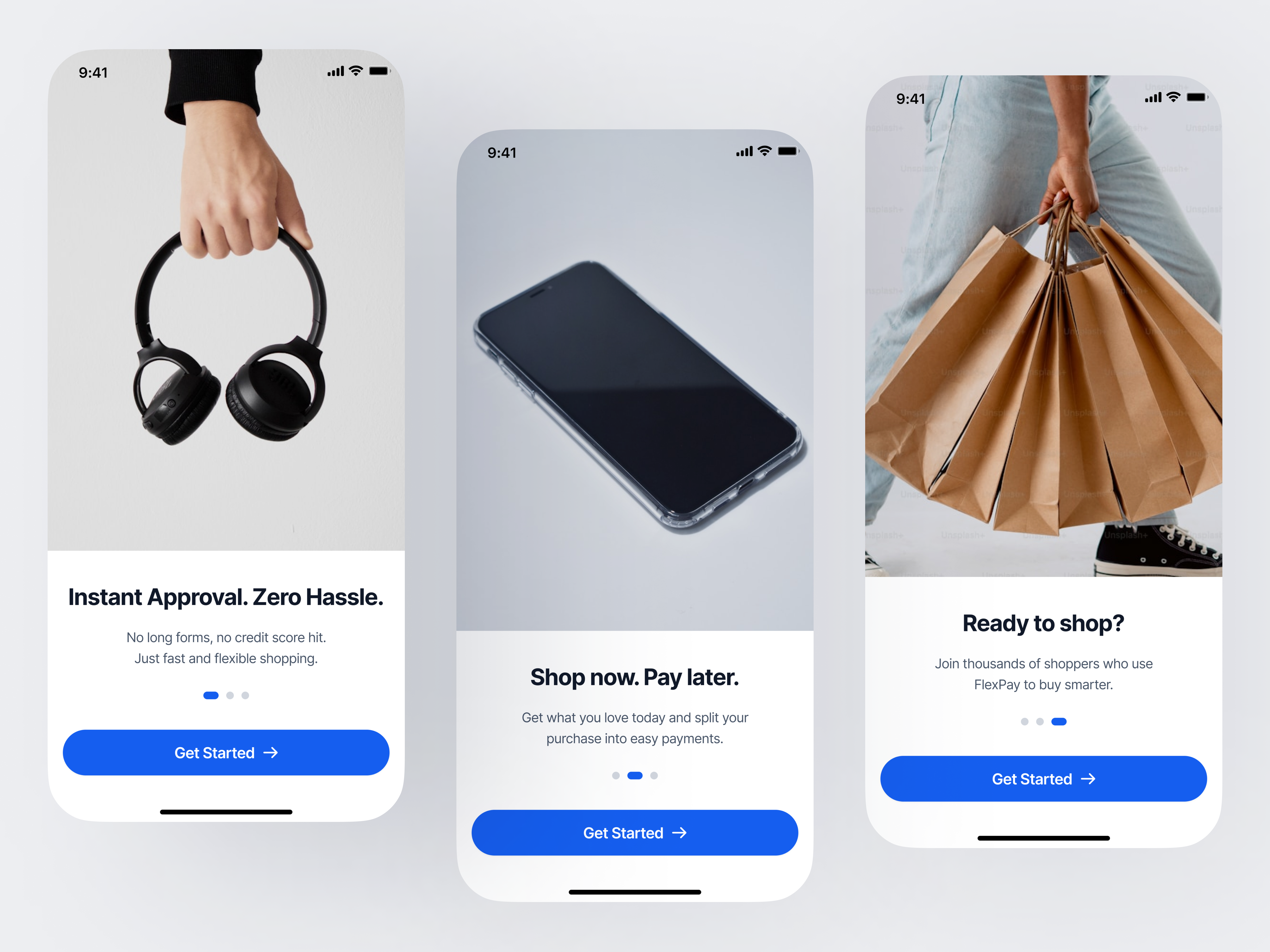
The onboarding was designed to reduce financial anxiety, create a sense of instant reward, and encourage early action. Instead of overwhelming users with detailed features, I focused on clarity, simplicity, and reassurance. By emphasizing ease, speed, and accessibility from the start, I positioned FlexPay as friendly and stress-free. This approach builds confidence quickly and increases first-time user conversion while guiding users smoothly into the product.
Tools used
From brief

Topics
Share
Reviews
4 reviews

Hi Seun,
Good start on this!
A couple of thoughts:
- I think we could be a bit clearer with users about what the app is actually helping them achieve — it feels a little vague at the moment. I wasn't quite sure if it's a loan app or something more like Klarna. With payment apps especially, the more transparent we can be the better, so users feel safe and know exactly what they're getting into.
- Because we're leading users through a flow, the "Get Started" CTA on its own can be a little confusing. Users might expect it to take them straight to sign up rather than the next onboarding screen. Adding a next option alongside it would really help here.
Overall a lovely, clean onboarding. Tightening up the clarity and adding the next option would help a lot!

Hello Seun, your design is clean, confident, and communicates the core value of FlexPay really well! The visual hierarchy is strong, the copy is concise, and the overall aesthetic feels modern and trustworthy. Great job on keeping the onboarding focused and stress-free — it really reflects your design intent.
One thing I'd suggest looking at: the animation speed between the three screens feels a bit fast. Not everyone will have time to read and absorb each screen before it transitions to the next — and that actually creates cognitive load rather than reducing it, which works against your core goal.
A few ideas to consider:
- Add a swipe gesture so users can navigate at their own pace
- Allow a tap/hold to pause the carousel
- Extend the display time for each screen — each slide deserves its moment to breathe
Overall, this is a solid and promising start — I'd love to see how the rest of the flow develops! Keep going 🙌

Hi Seun,
I like that you aimed for simplicity. The layout feels clear and easy to follow.
The images you’re using are good but they feel slightly generic, almost like they’re missing a stronger sense of branding.
Maybe adding a more distinctive visual style or elements that tie them closer to your brand identity would make the whole experience feel more unique and memorable.

Great work. But i think, "Get Started" in all the 3 screens is a bit redundant. The first two buttons arent actually helping users to get started. They take them to the next onboarding screen. So "Continue" - "Continue" - "Get Started" would have been a much clearer button hierarchy. Adding a "Skip" option can also be beneficial to the users who really want to jump on straight to the business.
I like the clean and minimal style overall. Keep this up!
You might also like

Smartwatch Design for Messenger App


Bridge: UI/UX Rebrand of a Blockchain SCM Product


Pulse Music App - Light/Dark Mode


Monetization Strategy


Designing A Better Co-Working Experience Through CJM


Design a Settings Page for Mobile
Interaction Design Courses

UX Design Foundations


Introduction to Figma

Design Terminology
