Loginino

The primary goal of this login page was to create a clean, intuitive, and accessible user experience that minimizes friction and guides users seamlessly through the input process.
1. Clarity & Hierarchy
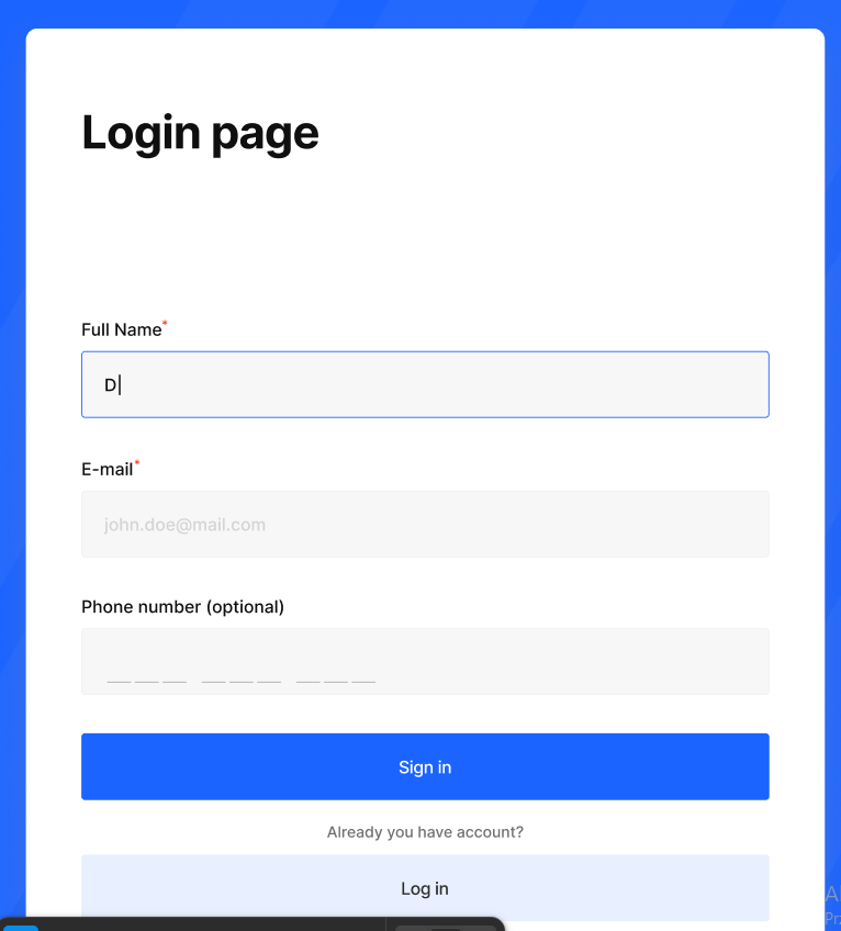
The layout is structured with a strong visual hierarchy to ensure users can quickly understand the flow. Labels are clearly positioned above inputs, improving readability and reducing cognitive load. Required fields are marked with an asterisk, providing immediate clarity without overwhelming the interface.
2. Input Design & Accessibility
Input fields were designed with high-contrast borders and clear focus states, ensuring accessibility and usability across different user groups. The active field is highlighted with a distinct border color, giving users immediate feedback and improving interaction confidence.
3. Spacing & Layout
Consistent spacing is used throughout the form to create a sense of rhythm and structure. Adequate vertical spacing between elements enhances readability and prevents the interface from feeling cluttered, contributing to a more comfortable user experience.
4. Visual Simplicity
The design follows a minimal and distraction-free approach, allowing users to focus solely on completing the form. Neutral background tones combined with a strong primary color for the CTA help guide attention without overwhelming the user.
5. Call to Action
The primary action button (“Sign in”) is visually emphasized through color contrast and size, making it immediately identifiable. Secondary actions are visually subdued to maintain focus on the main goal.
6. Usability Considerations
Optional fields are clearly labeled to reduce hesitation, and placeholder text provides additional guidance where necessary. The overall design aims to reduce friction and support fast, error-free completion.
From brief

Share
Reviews
4 reviews

Hi Dawid,
You wrote a really nice description, but without a link to the project or at least a few more screens showing the flow, it’s hard to fully understand what you’ve built and how everything connects.
If you can, try to include a prototype link or a clearer walkthrough of the key screens. That would make it much easier to give you more meaningful and detailed feedback.

You’ve created a clean, well-structured form with strong spacing and clear labels. The visible focus states and minimal layout support usability and reduce distraction. Good foundation. 👍
That said, a few important areas need refinement:
1. Flow Clarity (Login vs Sign Up)
The page is titled “Login page,” but it includes Full Name and Phone Number fields, which are typically part of a sign up flow. This creates a mismatch in user expectations. Clarify whether this page is for new users or returning users, and ensure the title, fields, and primary CTA align with that goal.
2. CTA Hierarchy & Terminology
“Sign in” and “Log in” mean the same thing. Using both can cause confusion. If this is a sign up flow, the primary CTA should be “Sign up” or “Create account.” The most visually dominant button should clearly reflect the main user task.
3. Microcopy Accuracy & Placement
The sentence “Already you have account?” is grammatically incorrect and should be revised to “Already have an account?” or “Do you already have an account?”
Additionally, placing this line between two CTAs disrupts hierarchy and flow. Supporting actions like switching to login should be visually secondary and positioned clearly beneath the primary CTA as a text link, not interrupting the main action.
4. Accessibility Depth
You’ve addressed visual clarity, which is a good start. To fully meet the WCAG brief, demonstrate error states, keyboard navigation, strong focus visibility, and how labels are programmatically associated with inputs. Accessibility extends beyond visual design.
Hope this helps!

Hi Dawid! One cropped screenshot is definitely not enough to properly evaluate the whole project. Without a prototype or the remaining screens, it's really hard to give you meaningful, well-rounded feedback.
Based on what I can see... The visual hierarchy is clear, labels placed above inputs is a good practice aligned with Nielsen's heuristics. The focus state on the "Full Name" field works correctly and gives the user a clear signal of where they are. Marking required fields with an asterisk is a standard that works well here.
But "Already you have account?" is a grammatical error that should read "Already have an account?" (I know, it's a detail, but good design is a collection of many details).
Also, having two action buttons stacked directly below each other ("Sign in" and "Log in") without a clear distinction can confuse users. It's not obvious what the difference between these actions is. That's definitely worth clarifying.
It's clear you approached this task with intention, and the brief shows you understand the reasoning behind your design decisions. That's a solid foundation. Refine the copy, show more states and screens, and the feedback you receive will be much more specific and useful. Keep it up! 💪

Maksai Mihály
Hello Dawid,
Your design is clean and very scannable. However, I would suggest improving the contrast ratio for the placeholder text and being consistent in your use of colors.
You might also like

Smartwatch Design for Messenger App


Bridge: UI/UX Rebrand of a Blockchain SCM Product


Pulse Music App - Light/Dark Mode


Monetization Strategy


Designing A Better Co-Working Experience Through CJM


Design a Settings Page for Mobile
Visual Design Courses

UX Design Foundations


Introduction to Figma

Design Terminology
