Font Weight
Font weight defines the thickness of characters in typography, shaping hierarchy, emphasis, readability, and consistency across user interfaces and products.


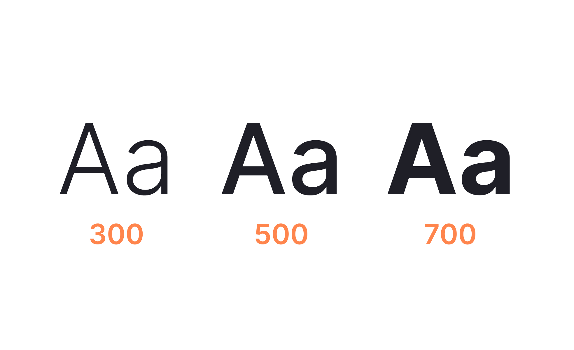
Font weight refers to how thick or thin the strokes of characters in a typeface appear. Most modern fonts come in a wide range of weights, typically ranging from thin and light to bold and black. These variations allow designers to create hierarchy, emphasize important elements, and provide balance between text styles within a product. By leveraging font weight strategically, teams create clear and consistent experiences that guide users naturally through content.
For UX designers, font weight is a primary tool for establishing hierarchy and scannability. Bold weights are often used for headings or calls to action, while regular weights support body text. Lighter weights may be applied for captions or secondary elements. This variation reduces cognitive load by helping users quickly distinguish between primary, secondary, and tertiary information. Without proper weight variation, interfaces risk looking flat and overwhelming.
Accessibility is directly tied to font weight choices. Extremely light weights can fail contrast requirements, especially when paired with low-contrast colors. This creates readability barriers for users with visual impairments or those viewing content in poor lighting. Following WCAG guidelines and testing across devices ensures that font weight decisions remain inclusive and functional.
Real-world examples highlight its role. Google’s Material Design specifies a clear typographic scale that pairs font weights with roles, ensuring clarity across mobile and web platforms. Apple’s San Francisco typeface was designed with weight variations optimized for digital screens, balancing aesthetics with readability at small sizes. These examples illustrate how font weight strengthens usability when treated as part of a broader system.
Font weight also carries psychological and branding implications. Bold, heavy text conveys authority and urgency, while lighter text may suggest sophistication or subtlety. Brands often leverage these associations to align tone with visual presentation. A financial app might use heavier weights to inspire confidence and reliability, while a fashion brand might favor lighter weights for elegance.
Learn more about this in the Font Weight Exercise, taken from the Intro to Typography Lesson, a part of the UX Design Foundations Course.
Key Takeaways
- Font weight defines text thickness, from thin to bold.
- Designers use weights to establish hierarchy and scannability.
- Accessibility requires avoiding overly light weights with poor contrast.
- Real-world systems like Material Design enforce clear rules.
- Weights carry branding and psychological meaning.
Font weight creates visual hierarchy, signaling which elements matter most. Bold weights draw attention to headings, labels, or buttons, while regular weights support body text. This hierarchy allows users to scan pages quickly, reducing effort and improving comprehension. Without variation, interfaces feel monotonous and harder to navigate.
Good font weight decisions also create rhythm and balance. By combining weights thoughtfully, designers guide attention naturally rather than overwhelming users with excessive bolding or indistinguishable text styles.
Thin or ultra-light font weights often fail contrast standards, particularly on small screens or in low-light environments. This makes text difficult to read for users with low vision or dyslexia. To address this, designers combine proper weights with sufficient color contrast, ensuring compliance with WCAG guidelines.
Accessibility testing across devices is essential. A weight that looks legible on a high-resolution display may blur or disappear on older screens. Inclusive font weight choices protect usability for all audiences.
Design systems define font weight usage across components. For example, body copy may always use regular weight, buttons may use medium, and headlines may use bold. This consistency prevents arbitrary decisions that confuse users or dilute branding.
By standardizing weight, design systems also streamline collaboration. Developers know exactly which styles to implement, PMs can trust that design intent will be preserved, and stakeholders see consistent branding across all touchpoints.
Recommended resources
Courses

UX Design Foundations


Core UI Components


Design Terminology

Lessons

Intro to Typography

Elements of Typography

Typography in Design Systems

Projects

Raydario - Online Radio App


Typography System @BandLab


Typography System - SM Entertainment Company