Cap height
Cap height in typography is the height of capital letters from the baseline to the top, shaping readability, alignment, and overall visual balance in design.


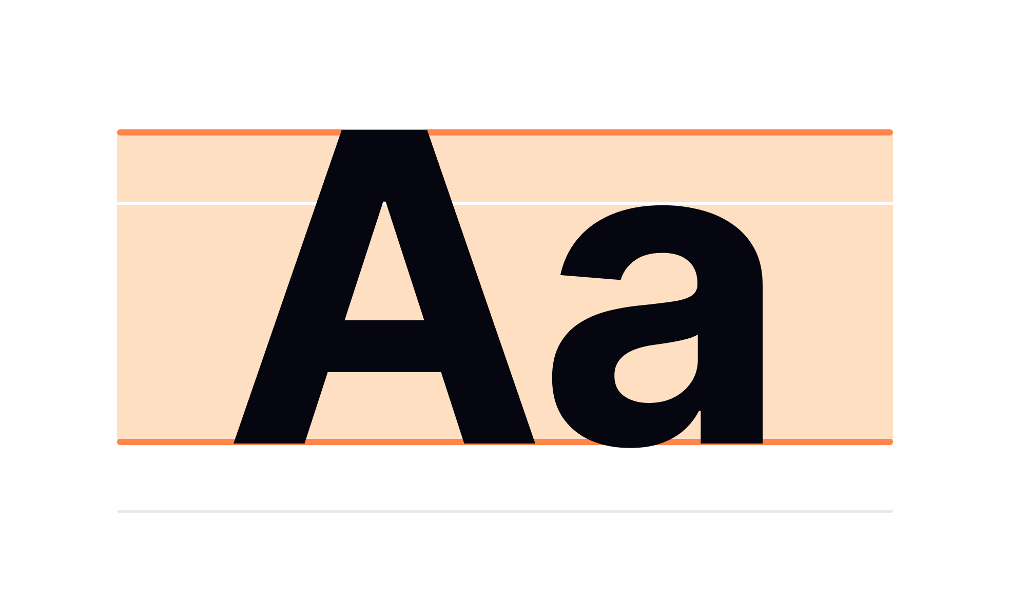
Cap height is one of the core measurements in typography, referring to the distance between the baseline and the top of a flat capital letter such as “H” or “I.” It does not include accents or curved elements that might extend slightly above, such as in “O” or “Q.” This measurement defines how tall uppercase letters appear in relation to lowercase characters and plays a key role in legibility and consistency across typefaces.
For UX and UI designers, understanding cap height is essential when working with digital interfaces. Text must remain readable across a range of screen sizes, devices, and resolutions. By accounting for cap height, designers can ensure that text blocks align properly, maintain visual harmony, and support accessibility. A mismatch between typefaces with different cap heights can disrupt balance in layouts, even if the point sizes are identical.
One real-world example is the difference between Helvetica and Times New Roman. While both may be set at the same point size, Helvetica’s cap height appears taller, making its uppercase characters stand out more prominently. This subtle variation influences both the hierarchy in design and the way users visually scan content, highlighting how typography impacts user flow and comprehension.
Cap height also matters in vertical alignment. In user interfaces, elements such as buttons or navigation tabs often rely on consistent text alignment. If different fonts with varied cap heights are mixed, visual inconsistencies arise, making the design feel unpolished. Designers use grid systems and typographic scales that account for cap height to maintain consistency.
From a print perspective, cap height contributes to readability in signage, packaging, and editorial layouts. Road signs, for instance, rely on carefully calculated cap heights to ensure quick legibility at distances and high speeds. This shows how typography decisions, even at the technical level, can have real-world safety and usability consequences.
Learn more about this in the Cap height Exercise within Characters in Typography Lesson, a part of the Typography Course.
Key Takeaways
- Cap height measures the height of capital letters from baseline to top.
- It influences readability, alignment, and overall visual balance.
- Differences in cap height affect typeface consistency at equal sizes.
- Designers rely on cap height for logos, headings, and UI elements.
- Tools like Figma and Adobe XD help account for cap height in layouts.
Cap height defines the proportion and visual impact of uppercase letters. It helps ensure that text maintains consistent hierarchy and readability across different typefaces. Designers use it to balance text alignment in headings, body copy, and navigation elements.
Without proper attention to cap height, even well-designed layouts can appear uneven or hard to read, reducing the overall user experience.
In digital products, cap height influences button text, navigation bars, and headings. Different typefaces with varying cap heights may look mismatched even at the same point size. By accounting for cap height, designers achieve alignment consistency, which improves visual clarity and user flow.
This is particularly important in responsive design, where text must scale gracefully across multiple screen sizes without disrupting readability or balance.
Yes, and this is a common source of confusion. Point size is a general measurement that includes space above ascenders and below descenders, but cap height refers only to uppercase letter height. As a result, two fonts at 12pt can look very different in scale.
Designers often compare cap heights when pairing typefaces to maintain harmony. If mismatched, one font may appear larger or smaller than intended, disrupting consistency in the design.
Recommended resources
Courses

UX Design Foundations


UI Components I


Design Terminology