Ascender
In typography, an ascender is the upward stroke of lowercase letters like b, d, h, extending above the x-height and shaping both legibility and visual balance.


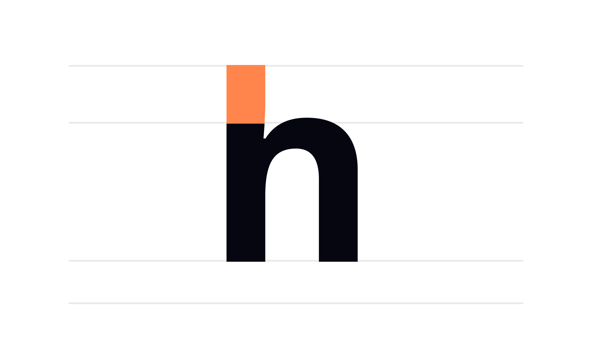
An ascender is the vertical stroke that rises above the main body of a lowercase letter. It appears in characters such as “b,” “d,” “h,” “k,” “l,” and “t.” These strokes extend above the x-height, which is the height of lowercase letters like “x” or “a,” and are key elements of type anatomy. Their presence affects the rhythm, readability, and overall feel of a typeface.
For type designers, ascenders provide contrast and vertical structure. Longer ascenders give a font an elegant, airy look, while shorter ascenders produce a compact, modern tone. The decision to make ascenders tall or restrained is not simply aesthetic; it determines how text looks in blocks, how easily it can be read, and whether it conveys openness or density.
In UX/UI design, ascenders play a role in screen legibility. Fonts with exaggerated ascenders may appear cluttered or hard to read at smaller sizes, particularly on low-resolution devices. By contrast, well-proportioned ascenders create enough distinction between letterforms, reducing eye strain and helping users recognize words quickly.
Real-world examples illustrate this point. In print, fonts like Times New Roman use tall ascenders that give the text a classic, traditional look, while sans-serif fonts like Helvetica have shorter ascenders for a more balanced, neutral tone. Digital products often lean toward fonts with restrained ascenders, such as Roboto or Inter, because they maintain clarity on screens of varying densities.
Accessibility is also tied to ascender design. Users with dyslexia or other reading difficulties benefit from fonts with clear ascender differentiation. This helps distinguish letters like “h” from “n” or “d” from “a.” Inclusive design requires accounting for such typographic details to support a broader range of users.
Cross-functional collaboration ensures typography decisions reflect both brand personality and usability needs. Designers evaluate ascender proportions visually, while product teams assess whether the chosen font aligns with brand tone. Together, they create experiences that are both consistent and functional.
Ultimately, ascenders are small details with big consequences. They influence rhythm, legibility, accessibility, and the overall impression of text. Recognizing their role allows teams to make informed typographic choices that strengthen both usability and brand identity.
Learn more about this in the Characters in Typography Lesson, a part of the Typography Course.
Key Takeaways
- Ascenders extend above the x-height in lowercase letters.
- Proportions affect readability, tone, and text density.
- Digital products benefit from balanced ascender design.
- Influence accessibility by helping distinguish similar letters.
- Shape the overall rhythm and brand perception of typefaces.
Ascenders help distinguish one letter from another by adding vertical contrast. Without them, words could appear as indistinct shapes, reducing clarity. For example, “hill” would look much less legible if the “h” and “l” did not rise above the x-height. This distinction is crucial in continuous reading environments such as books, websites, or applications.
Beyond clarity, ascenders provide rhythm to text. When viewed in paragraphs, the up-and-down motion of ascenders and descenders creates a visual flow that guides the eye. This rhythm keeps text engaging and makes reading less fatiguing over time. In short, ascenders improve both the micro-level recognition of individual letters and the macro-level readability of full passages.
In user interfaces, this matters greatly. A font with poorly designed ascenders may look acceptable in a headline but become harder to read in body copy, undermining usability and slowing comprehension.
No, ascender height varies across typefaces. Traditional serif fonts tend to have longer ascenders, lending a more formal and classical tone. Modern sans-serifs often shorten ascenders to achieve a cleaner, more neutral appearance, which is useful for minimalistic interfaces or dense text layouts. The choice of ascender length is intentional, reflecting both aesthetics and usability.
Designers often adjust ascender proportions to fit specific contexts. In print, longer ascenders create elegance, while in digital design, shorter ones enhance clarity on screens. Even within a type family, variations may exist between display and text cuts, each optimized for different use cases.
This diversity gives teams flexibility in aligning typography with brand identity, tone, and function. Selecting the right ascender proportions is part of tailoring the visual system to a product’s goals.
Accessibility often relies on clear letter differentiation, and ascenders play a major role in this. Users with dyslexia, for example, may struggle to distinguish between certain characters. Fonts with tall, distinct ascenders reduce confusion by making shapes more recognizable.
Research shows that dyslexia-friendly fonts emphasize ascender and descender differentiation to support easier reading. This is why inclusive products often use fonts designed with these needs in mind, balancing aesthetics with functionality.
Beyond specific conditions, all users benefit from accessibility-aware typography. Well-proportioned ascenders ensure text is legible across devices, lighting conditions, and screen resolutions. In practice, this creates more inclusive experiences and builds trust in a product’s design quality.
Recommended resources
Courses

UX Design Foundations


UI Components I


Design Terminology