UX/UI Case Study for Inclusive Landing Page for Parliament of Georgia

Due to its length, the full study cannot be displayed right now. Please read the complete study 👉 here
Check the final redesign Vol 1 👉 here
❗Check the final redesign Vol 2 👉 here
Introduction
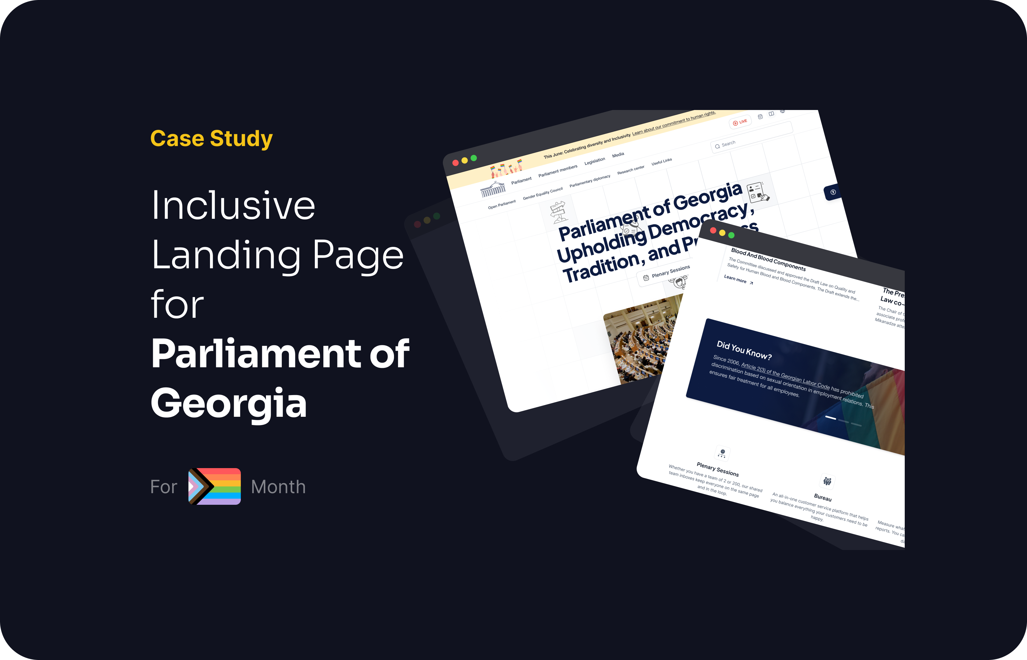
In the context of ongoing political changes and public demonstrations in Georgia, the need to balance tradition and inclusivity has become more critical. As a UX designer, I took on the challenge of redesigning the landing page of the Parliament of Georgia's website to honor Pride Month. This project aimed to raise awareness about Pride Month and the importance of inclusivity in a balanced, respectful, and educational manner. The design needed to respect the traditional values of the majority while subtly introducing elements that celebrate diversity and inclusivity.
In this case study, my aim is not to completely redesign the landing page of the Parliament of Georgia's website. Instead, my focus is on incorporating new sections and features that raise awareness about human rights and inclusivity. As a UX designer, I believe that achieving this goal is crucial, especially in a context as serious and impactful as governmental communication. The objective is to educate and engage users through thoughtful design enhancements rather than creating an aesthetically pleasing UI that may not suit the formal and authoritative nature of a governmental website. By implementing subtle yet effective design elements, my intention is to foster understanding and respect for diversity within the existing framework of the website.
Second Iteration 25th of June
After receiving valuable feedback on the original version of the Georgian Parliament's website, we identified several key areas needing improvement. Users indicated that the initial design lacked engagement, a modern appeal, and appeared too plain, which did not meet their expectations for a dynamic and informative government website.
To address these concerns, we embarked on a redesign to create a more engaging, visually appealing, and interactive user experience. This second iteration aims to balance tradition with modernity, ensuring the site remains professional and trustworthy while effectively promoting inclusivity and human rights awareness. The enhancements include a more detailed headline, improved visual hierarchy, and additional interactive elements, making the website more informative and user-friendly.

Reviews
14 reviews
Great work, Elene! Nothing to add in terms of the design process and deliverables. The only thing is the case study presentation in Figma — small scrollable area & fixed elements made it a bit hard to go through all the details.
Gamarjoba Elena. The Figma file looks stunning 😍 Really appreciate your project. Looks awesome.
Your research and work are very thorough. I admire your choice, especially given the context of LGBTQ+ rights in Georgia and the new law against the propaganda of LGBTQ+ topics.
I appreciate how you've considered the interests of the majority population, who may be hostile due to a lack of knowledge. Your solution to educate the population through educational material on the parliament website is thoughtful. The visual assets honoring Pride Month are delicate, visually appealing, and carefully balanced.
Good luck with this impressive and detailed project!

I was very impressed by your design process and it was easy to follow along. Great job especially on the research part! I also like the design improvements suggested for the landing page. We still tend to not keep all users in mind when creating designs. Something else I had in mind is to perhaps assess the chosen colors and whether or not they are compliant with WACG. Another option for further inclusivity and accessibility could be to allow to switch between light and dark mode and font size perhaps. I also suggest to start with a mobile-first approach since most users these days are looking things up on their phone. Other than that, well done!

Wow! The difference between version 1 and version 2 is tremendous. Great job! Your hard work is clearly paying off.
Here are a few actionable tips to make your design even better, based on UX/UI best practices:
- For the section featuring members of parliament, consider visually distinguishing male from female members. This can help users quickly grasp the gender distribution and get a better big-picture understanding. You might use different icons, colors, or labels to achieve this.
- Use of White Space: Ensure there's adequate white space between sections and elements. This helps the design "breathe" and makes the content more readable. It also prevents the page from feeling too cluttered.
You did a fantastic job on the case study as well! Your detailed analysis and improvements show a deep understanding of UX/UI principles. Keep up the excellent work, and continue pushing your designs to new heights!
This is incredibly thorough! Depending on who you're sharing with, this is probably too dense for a hiring manager to go through FYI.
I also wish the chapters on the left would animate as you scrolled through the figma file to understand better where you are.
I'm also intrigued about your color palette reasoning and would have loved to see more of the georgian identity red represented there? As an accent color. Just a thought.
Overall very thorough!

Your commitment to balancing tradition with inclusivity is truly admirable. I'm impressed by your proactive approach to integrating new sections and features, all aimed at educating and engaging users on vital human rights and inclusivity matters.
Just as a note, addressing typos and inconsistencies in lowercase usage would enhance the presentation. Adjusting the presentation size for better readability and checking out duplicate typography sections would improve the project.
Keep up the great work!

Hey Elene, don’t get discouraged with baseless comments. Keep up the great work 👏

It may not be visually aesthetic personally for me, but I believe official websites like this shouldn't be overwhelming for users. Therefore, the subtle introduction of LGBTQ+ sections works well, as it ensures that the information is accessible without being intrusive. This approach allows the website to remain user-friendly and welcoming to all visitors while still providing essential resources and support for the LGBTQ+ community. The understated design maintains the site's professionalism and navigability, making it easier for users to find and engage with the new inclusivity features without feeling overwhelmed.

Really informative and thoughtful approach, well executed!
You might also like

Improving Dating App Onboarding: A/B Test Design

FORM Checkout Flow - Mobile


A/B Test for Hinge's Onboarding Flow


Accessibility Asse


The Fitness Growth Engine


The Relational Workspace

Content Strategy Courses

UX Writing


Common UX/UI Design Patterns & Flows


Building Content Design Systems
