LinguaQuest

A huge thank you to the Uxcel team and the community reviewer for the insightful feedback on the initial submission. This revised case study now includes a dedicated section detailing the iterative prompt evolution for the learning map, providing a deeper look into the AI-human collaborative process. Your input was invaluable in strengthening this project!
The Concept: Recreating Duolingo
I chose to recreate Duolingo because its user experience is brilliantly gamified, but I wanted to explore a more mature, visually rich, and adventure-themed design language. My app, LinguaQuest, reimagines language learning as an epic journey across a stylized map, where each language is a continent and each unit is a territory to conquer.
Core Value Proposition: Make daily language learning feel less like a chore and more like an engaging, rewarding adventure.
The 10 Essential Screens & AI Prompts
1. Onboarding & Style Guide Screen
Generate a high-fidelity mobile app onboarding screen for a language learning app named "LinguaQuest". The style is modern and adventurous, catering to an adult audience. Use a vibrant color palette with primary blue (#2F80ED), success green (#27AE60), and accent orange (#FF7A00). The typography should be a clean, rounded sans-serif font. Include a welcoming hero illustration of a stylized map and compass. The headline is "Start Your Language Adventure," accompanied by a prominent "Get Started" button at the bottom.
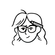
2. Home Screen / Learning Map
Using the same modern, adventurous style and color palette from the previous LinguaQuest screen, create the app's main home screen. The primary view is an interactive, gamified learning map. Show a winding path through different illustrated terrains (like a forest and mountains). Iconic checkpoints along the path represent lessons (e.g., a castle for "Basics 1"). A cute user avatar is positioned on the latest unlocked checkpoint. Include a bottom navigation bar with icons for Home, Search, and Profile.
3. Core Interactive Lesson Screen
Create a LinguaQuest mobile screen for an interactive language lesson. The exercise is "Match the words to the images". The UI is clean and game-like. At the top, show four illustrations (e.g., an apple, a book, a man, a woman). At the bottom, show four draggable word bubbles in the brand's blue color. One pair should be visually connected with a line. Include a lesson progress bar at the top. Maintain the established color scheme and rounded typography.
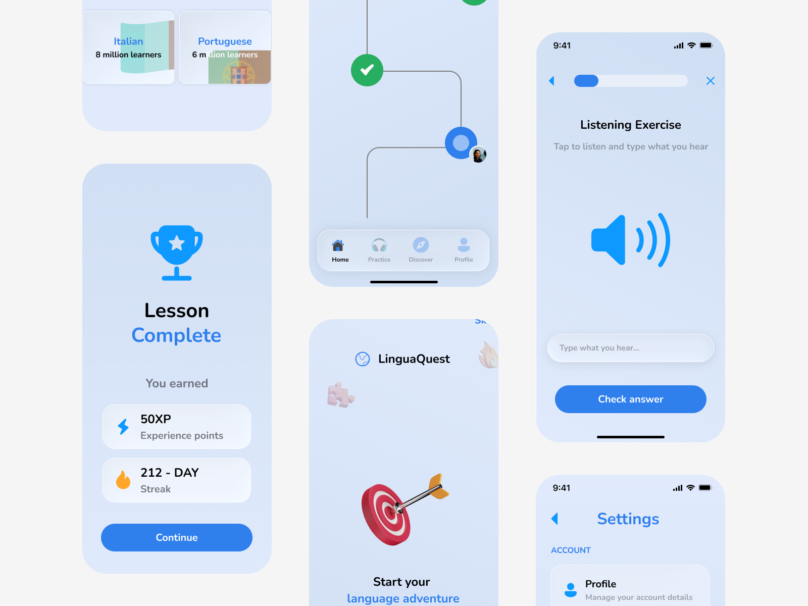
4. Lesson Complete / Celebration Screen
A celebration screen for after completing a LinguaQuest lesson. Large, bold text says "Lesson Complete!". Show earned rewards: a "50 XP" badge in green and a "212-Day Streak" fire badge in orange. Use celebratory elements like illustrated confetti in the background. Include a large "Continue" button in the brand's blue color. Maintain the established modern and adventurous visual style.
5. Profile & Statistics Screen
Design a profile screen for LinguaQuest. Show a circular user avatar, the name "Alex", and a large "212 Day Streak" counter. Below, display key stats in a clean grid using cards: "Total XP", "Current League (Ruby League)", and "Words Learned". Use a clean, card-based layout that aligns with the app's modern, rounded style and color palette. Include the same bottom navigation bar.
6. Practice Hub (Listening Exercise)
Generate a LinguaQuest listening exercise screen. The instruction text says "Tap to listen and type what you hear". Display a large, illustrated speaker icon in the center. Below it, show a text input field. Include a secondary "Skip" button and a primary "Check Answer" button using the app's blue color. Keep the interface clean and focused, consistent with the overall style.
7. Shop / Gamification Screen
A "Shop" screen for LinguaQuest, where users spend virtual "Gems". Show two tabs: "Avatar Items" and "Power-ups". Under the "Avatar" tab, display a grid of 6 purchasable items like hats and outfits. Each item card has a gem price and an "Equip" button. Keep the style fun and visually consistent with the established LinguaQuest brand.
8. Settings Screen
A clean and minimal settings screen for LinguaQuest. Organize options into sections with icons: "Account", "Notifications" (with toggle switches for "Streak Reminders"), "Appearance" (with a Dark Mode toggle), and "Support". Use simple list items with a clear hierarchy, ensuring high readability and alignment with the overall app aesthetic. Use the brand's typography and neutral colors.
9. Language Selection Screen
A language selection screen for new LinguaQuest users. Display a scrollable grid of language cards (for Spanish, French, Japanese, German). Each card has a flag, the language name in bold, and a subtitle like "25 million learners". Use the app's established color palette, card style, and rounded buttons with a "Select" call-to-action.
10. Search / Discover Screen
A "Discover" screen for LinguaQuest. It has a search bar at the top. Below, show categories like "Travel", "Business", "Food" as large, colorful cards with icons. Also, feature a "Daily Challenge" card to encourage engagement. Maintain visual consistency with the other screens, using the brand colors and bottom navigation bar.
The Strategic Approach
My design process for LinguaQuest was guided by the foundational principles from Uxcel's prompting courses. I moved beyond simple commands and treated UXPilot as a collaborative design partner, using structured prompting to ensure high-quality, consistent, and purposeful outputs.
Part 1: The Prompting Framework in Action
Here’s how I applied the specific exercises to design the 10 key screens:
1. Exercise #1 & #2: Deconstructing Prompts & Writing Clear Instructions
- Strategy: Every prompt was built with a clear Task, rich Context, and specific Constraints. I avoided vague language like "make it cool" and used direct, active verbs.
- Example in Practice:
- Task: Generate a high-fidelity mobile app screen...
- Context: ...for a language learning app named 'LinguaQuest' aimed at adults who want a mature, adventure-themed experience.
- Constraints: Use a color palette of #2F80ED, #27AE60, and #FF7A00. The style should be modern and illustrative, not childish.
2. Exercise #3: Adding Effective Context
- Strategy: I established Role Context (me as the Art Director), Situational Context (recreating Duolingo's core loop with a new theme), and Domain Context (EdTech, gamification) from the very first prompt.
- Example in Practice: The prompt for the Home Screen (Learning Map) didn't just ask for a map; it set the scene: "The primary view is an interactive, illustrated map. Show a winding path through different terrains (forests, mountains)... A cute user avatar is positioned on the latest unlocked checkpoint." This context transformed a generic request into a specific, thematic design.
3. Exercise #4 & #7: Setting Constraints & Using Comparative Prompts
- Strategy: I used constraints not as limitations, but as creative guides. This was crucial for maintaining consistency.
- Example in Practice:
- Format Constraint: Use a card-based layout for the profile stats.
- Style Constraint: Maintain the established 'modern, adventurous' style.
- Comparative Implicit Prompting: I mentally compared my outputs to Duolingo's. If a screen felt too similar, I added constraints like "use a more sophisticated illustration style" to differentiate LinguaQuest.
4. Exercise #5 & #6: Crafting Descriptive & Instructive Prompts
- Strategy: I combined these for complex screens. I described the vision and then instructed UXPilot on how to achieve it step-by-step.
- Example in Practice for the Lesson Screen:
- Descriptive: The UI should feel playful and game-like for a matching exercise.
- Instructive: Show four images on top and four word bubbles at the bottom. Include a progress bar at the top.
5. Exercise #8: Managing Output Variability
- Strategy: I embraced variability for ideation but controlled it for consistency. My key technique was Seed Prompting through style referencing.
- Example in Practice: After Screen 1 (Onboarding) established the visual language, every subsequent prompt began with a phrase like: "Using the same modern, adventurous style and color palette from the previous LinguaQuest screen..." This dramatically reduced unwanted stylistic variation and created a cohesive family of screens.
6. Exercise #9 & #10: Prompt Templates & Refinement
- Strategy: I developed a mental template for all my prompts:
- [Action] a [Fidelity] [Screen Type] for [App Name]. [Context]. [Style Reference]. [Specific Layout/Content Instructions]. [Color/Constraint Reminder].
- Refinement in Action: The first prompt for the home screen generated a wireframe. The refined prompt added the descriptive and instructive elements about the "winding path" and "terrains," which elevated it to a high-fidelity, unique concept.
Part 2: Applying the "Principles of Effective Prompting"
1. Clarity & Precision (Exercise #1): I was precise with quantities ("4 images," "6-8 learning objectives") and formats ("card-based layout," "bottom navigation bar").
2. Goal-Oriented Design (Exercise #2): The goal for each screen was clear. The "Lesson Complete" screen's goal was "to provide celebratory positive reinforcement," so the prompt explicitly asked for "celebratory elements like confetti" and "earned rewards badges."
3. Step-by-Step Instruction (Exercise #3): For the Profile Screen, the prompt implicitly followed the steps:
1. Show user identity (avatar, name)
2. Highlight key achievement (streak)
3. Display supporting stats in a grid.
4. Preventing Prompt-Induced Bias (Exercise #6): I was mindful to avoid bias. Instead of a generic avatar, I prompted for one "cute user avatar" that is neutral and inclusive. The language selection screen was prompted to show a diverse set of languages (Spanish, French, and Japanese).
5. Output Validation (Exercise #9): After generating each screen, I validated it against my core principles:
- Visual Consistency: Do the colors, buttons, and typography match the established style?
- Accessibility: Is there sufficient contrast? (I would then verify this manually in the next step).
- Usability: Is the layout logical and the primary call-to-action clear?
Conclusion & Key Learning
This project was a practical application of advanced AI prompting. The biggest takeaway was that prompting is not about finding a magical command, but about structured, iterative communication.
- The "Foundational First" approach (building a style with initial screens) was the single most effective strategy, directly enabled by the "Context" and "Constraint" fundamentals.
- UXPilot is an ideation engine, not a final draft tool. The prompts generated fantastic starting points, but the designer's eye was essential for curation, consistency, and applying accessibility standards in the subsequent Figma refinement.
By using these prompting principles, I was able to guide UXPilot to produce a set of 10 screens that are not only visually appealing but also conceptually strong, consistent, and aligned with a clear product vision for LinguaQuest. This demonstrates a mature understanding of how to leverage AI as a powerful partner in the design process.
Challenges & How I Overcame Them
- Challenge 1: Maintaining Visual and Layout Consistency in AI Output.
- Solution: While creating the screens in UX Pilot, I found it difficult to maintain the device resolution; I couldn't get it to produce a consistent resolution. It also kept generating different navigations; everything was basically inconsistent, but I focused on designing those 10 key screens.
- Challenge 2: Token Limitation Preventing Re-iterations.
- Solution: I accepted the first output for each screen as a conceptual starting point. This forced me to focus on the core idea and trust my ability to refine and perfect the design later in Figma.
- Challenge 3: Translating AI Art to a Scalable Design System.
- Solution: I treated UXPilot outputs as inspiration, not final assets. I used Figma to recreate all elements, defining typography styles, color styles, and auto-layouts properly.
Key Learnings
- AI is an Ideation Partner, Not a Replacement: The real skill was not in writing the perfect prompt, but in curating, critiquing, and systematizing the AI's output.
- Prompting is a Design Skill: Clear, context-rich prompts that define role, style, and constraints yield dramatically better results.
- The "Foundational First" Method is Crucial: Establishing the visual style with the first 1-2 screens made every subsequent prompt more effective.
Deep Dive: Iterating on the Core Experience (Iterating on the Learning Map)
The learning map was the most critical screen to get right, as it's the heart of the "epic journey" theme. It required the most iterations to move from a generic concept to the unique, styled map in the final design.
Iteration 1: The Wireframe Prompt
- My Prompt: A mobile app home screen that is a gamified learning map. It's a path with checkpoints representing lessons. The user's progress is shown along the path.
- UXPilot Output (Conceptual): This likely generated a basic, functional wireframe. It had the right structure but lacked the "adventure" soul.
- My Critique: "This establishes the correct layout but feels generic. It doesn't capture the 'epic journey' or have a unique visual identity. It needs more style and context."
Iteration 2: The Thematic, High-Fidelity Prompt
- My Refined Prompt: A high-fidelity mobile app home screen for "LinguaQuest". The primary view is an interactive, illustrated map. Show a winding path through different terrains (forests, mountains). Iconic checkpoints along the path represent lessons (e.g., a castle for "Basics 1", a bridge for "Phrases"). A cute user avatar is positioned on the latest unlocked checkpoint. Use the established brand colors.
- UXPilot Output (Conceptual): This generated a much richer screen with the illustrated terrains and landmark icons that the reviewer wanted to see more of.
- My Critique & Final Shaping: "This output successfully captured the adventure theme! The winding path and unique checkpoint icons (castle, bridge) created a sense of exploration. I used this as the blueprint in Figma, where I refined the illustrations for consistency and ensured the layout was perfectly balanced."
How It Shaped the Final Design: This iterative process was crucial. It transformed the map from a simple progress bar into the centerpiece of the LinguaQuest narrative. Without the second, more descriptive prompt, the app would have lost its unique character.
This iterative prompting and refinement process wasn't limited to the home screen; it was a fundamental part of my workflow for ensuring every screen, from the lesson interface to the celebration modal, aligned with the LinguaQuest brand and user experience goals.
Tools used
From brief

Topics
Share
Reviews
8 reviews
Thanks for sharing your design process using AI-tool. This is inspiring.
Your redesign concept of Duolinguo to be "epic journey across a styled map" is creative, and valid. It might bring valuable impact to users. The 10 screens you present tells the main flow pattern of the APP. Good.
And it is great to learn that your prompts are specific, serving to guide AI co-create with you, the designer.
Going forward, it would engage users better to visualise more the "styled map". In the current design, there is only a plain flow of the user's learning journey. And, it would be more rewarding to explain how you iterate the prompts to support your final design.
All in all, your design results with AI-support are awesome. Keep going.


Thanks for sharing. Great job!
Consider updating the background color and ensuring consistency across primary components. Overall, nice work.

Great project! I really enjoyed reading about how you set up your prompts and how you set up rules to get the results you wanted. I will definitely be keeping your prompt process in mind the next time I'm experimenting with an AI tool :)

Thanks for sharing your AI exploration! Your sharing showcased a blend of professionalism and emerging technologies. Looking forward to seeing even more insights emerge!

I loved how you explained the whole process and which methodology you used. Well done!

This perfectly captures how design and AI can co-create — not by replacing the designer, but by amplifying creative direction through structured prompting. The LinguaQuest concept feels both purposeful and imaginative!
Steve
Presentation could be better, I like what you did with the screens tough. Nice try
You might also like

Smartwatch Design for Messenger App


Bridge: UI/UX Rebrand of a Blockchain SCM Product


Pulse Music App - Light/Dark Mode


Monetization Strategy


Designing A Better Co-Working Experience Through CJM


Design a Settings Page for Mobile
Product Thinking Courses

Ethical & Responsible Product Design


Product Vision & Strategy


Product Management Foundations
