404 for Personal Website
Hey Friend or Acquaintance,
Happy Sunday Night, let's get back on that grind tonight and support our growth with a small movement of building our portfolio know-how, craft a better experience with small improvements to our web pages.
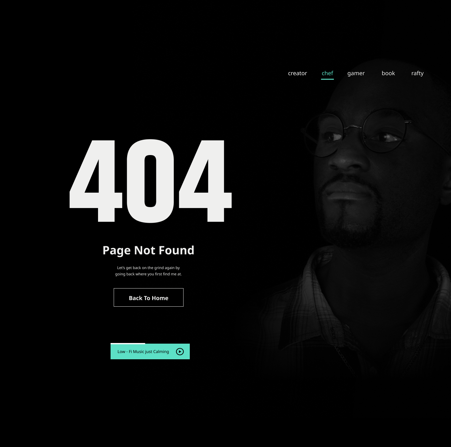
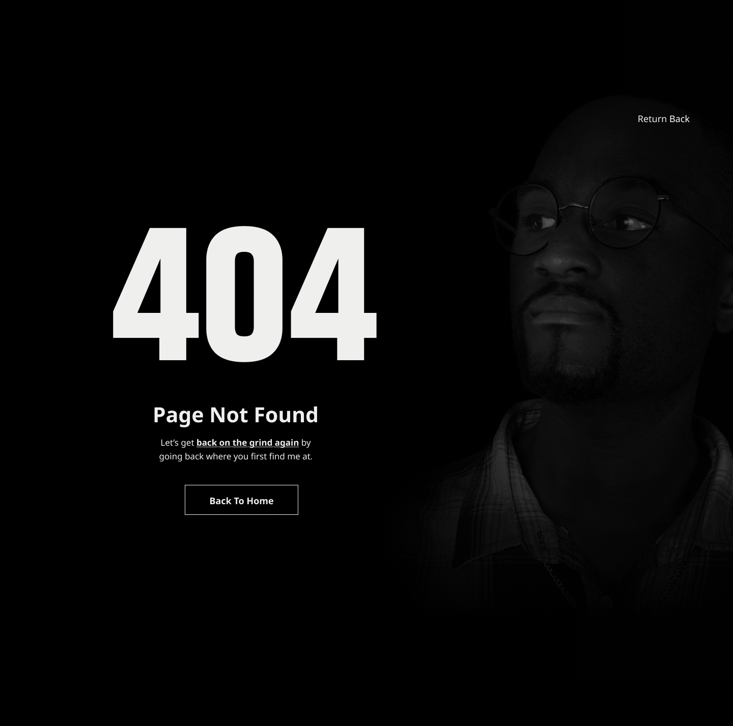
When the user gets to the wrong page of my website, they will be welcomed with a message "get back on the grind," letting them know they are on the wrong page and need to get back on the right page.
I'm a teacher, fail first before I become better, let my students fail, and allow my students to become the best analyzer.
So this design might be the best, but it's a teaching moment, so what do you see that needs improvement, and how can you make it look better?
Second Changes:
Happy Sunday Night,
Brandon Powell
Reviews
9 reviews
Hello!
I like the overall direction of your project and the way you explain your decisions, for example removing the music. That context helps the reader understand your thinking.
I’d simplify the copy so users immediately understand what to do next. Right now it takes a bit too long to decode the intent.
I’d also refine the UI hierarchy. The 404 is a bit too large in comparison to the header and body text, competing with each other, which makes the layout feel flatter than it should.
About the image choice: the subject’s facial expression comes across as slightly suspicious, almost judgmental. I see the playful intent, and the humor almost lands, but the static expression may create the wrong emotional tone. You could explore a video, a loop, a GIF, or even a light animation with an avatar to keep the humor without the unintended side effects.
If you do keep this image, think about how it behaves on mobile and tablet. The cropping might create even more emphasis on the facial expression, so consistency across breakpoints will matter.
*bombastic side eye*
*criminal offensive side eye*
Is that you, Brandon, side-eyeing the user (me) because I got 404'd? 🤨
So it is my fault, huh? I mean, I was just following a link, a broken link, that's how I got here in the first place.
That's only one user scenario, and technically it isn't side-eye, but you get the idea. I also really like the personalization, it's a personal site after all, but then again what are you trying to communicate here?
- 404, “oh no page not found, what did I do?” I'm lost and you ask me to get back on the grind, yet you provide me with this comfy music that needs an interaction. Do you want me to stay and enjoy this 404 or should I go back home?
- and look at this good lookin fella here, uh, why is he here? To accompany me in my 404 moment? Is that a menu or a crown? That he's many of those things, creator, chef, gamer, booker, rafter? *I haven't updated my lingo, am not sure if I get it correctly or not.
From an outsider perspective this could be something I'd classify similarly to an internal joke. There are too many visual cues and interactions that feel like they were supposed to be companion or aesthetic elements, but the music card is just too striking.
Also my questions are more like something you can take into account and think about retrospectively rather than literal answers 😄 thanks for the 404, I'll continue grinding.
Beautiful page! I really like the style and the picture! I have a few suggestions for improvement:
- Message clarity: The phrase “get back on the grind” may be a bit confusing for users, especially if it’s not used consistently across the page. Consider clarifying it or using it sparingly so users immediately understand they are on the wrong page.
- Button consistency: The font sizes on the buttons are different. I’d recommend using the same font for all buttons. For the music controls, you could show the third button without fill or borders, where only the play button is active for pausing, and add a separate mute button. This would make the interactions clearer for users.
- Context explanation: Providing clearer context for users would be helpful. I assume you’ve considered this already, but making it explicit on the page ensures users understand the purpose and flow right away.
Overall, the page has a strong visual style and engaging concept. These small adjustments would make it even more user-friendly and intuitive, enhancing the overall experience.
Okay, so I see the idea with the skateboard aesthetic and that "back on the grind" it has potential because a 404 doesn't have to be boring. But there are a few things that don't work for me.
The biggest issue is text contrast. That gray on black is barely readable, especially the description under the heading. The white "404" works, but the rest disappears. Plus that font in "404" seems a bit random - bold, wide, but without character that fits the rest.
The background photo is an interesting direction, but it takes too much attention. The person on the right competes with the content instead of supporting it. Maybe some subtle darkening or more blur?
The underlined "back on the grind again" text is okay, but the whole sentence is a bit convoluted. Could be simpler: Let's get back on track - head to the homepage.
The "Back To Home" button is okay, but could have more life. Some color accent, hover state, something that pulls the eye.
And that "Return Back" in the top right corner. Why? If it's meant to be navigation, it should be more visible and consistent with the rest.
The idea is fresh and has personality, it just needs work on hierarchy, readability, and a more confident hand in the details. This could become a really cool 404!
Hey Brandon.
I am glad to see you openly asking for feedback and being willing to iterate on your design.
Here are a few things I noticed. In your first version, I actually like that you included a header navigation, but it is missing a logo. Navigation supports users ability to find the content and features they need. In the second version, you removed the navigation altogether, and I am not sure why. It would help to clarify the reasoning behind that change.
I also think it was a good decision to remove the music from the first version. Even though it is an interesting idea, it is hard to see the real benefit of having music on a 404 page. The main goal is to get users back on track as quickly as possible, not give them reasons to stay on an error screen longer than necessary.
My general message would be to keep things simple. The sentence “Let’s get back on the grind by going back where you find me at first” feels quite complex and confusing. I would suggest moving toward something clearer and more direct, for example:
“Let’s get you back to where you started.” or “Let’s take you back to the right place.”
This is a good start Brandon. I see how this could work with a specific audience but it's not something that would please and feel welcoming to everyone.
Good work on removing the music thing. If we want people to get back to the main page, we should not add things here to make them stay.
The copy is a bit confusing. Make what you want people to do extremely clear. If you want to motivate them while keeping that same vibe, maybe add a motivational quote instead. Something on not giving up? If you do, think of the hierarchy to create a balanced design.
The navigation in the first image is indeed confusing, who is this for? But in the second you removed it all and added a "Return Back" button that isn't needed, after all, that is the job of the main CTA bellow the 404.
The image isn't helping much here. In fact, because it's hard to see while the text on the left is clear to see, it makes your design looks imbalanced.
The look is also almost judgmental. Think of something to create the feeling you desire without potential misunderstandings.
You are almost there Brandon, a few changes and you'll have something great.
Hi Brandon 👋
thanks for sharing your 404 page and the progress! From a UX perspective, here’s what stands out:
The main issue is your information hierarchy. Currently, the large "404" takes up most of the visual space, while the CTA and copy are too small and difficult to see. When users hit an error page, they need clear next steps immediately, not a decorative status code.
Your copy could be more concise, too. "Get back on the grind" might not resonate with everyone, especially international visitors. Something straightforward, like "Go to Homepage" or "Return Home," would work better. The explanatory text about teaching moments is nice, but it doesn't help users solve their problem quickly.
The photo adds personality, which is fitting for a personal portfolio. However, the current expression reads as more confrontational than helpful, as other reviews already mentioned. To maintain a personal touch, consider displaying an open hand or another welcoming gesture. Alternatively, you could remove the photo and let the text explain.
Some quick wins are to increase the size and contrast of your primary CTA, shorten the copy to one clear sentence explaining what happened.
Overall, it feels like it leans too heavily on personality at the expense of usability. Error pages should help users get back on track with minimal friction.
Lovely work on this 404 page! 👏 You’ve created a clean, bold layout with a strong visual voice, and the motivational tone adds personality to a space that’s usually overlooked. The large 404 header, minimal aesthetic, and clear call to action all help users understand what happened and how to get back on track.
A few areas to refine:
- The portrait is visually interesting, but it slightly competes with the main message. Softening its contrast would help strengthen hierarchy.
- The body text is a bit small and tight. Increasing readability will improve the overall flow.
- Make sure header elements and navigation stay consistent across versions for a smoother experience.
- The music feature feels out of place on a 404 page. Since users land here by mistake, keeping the experience quick and distraction free usually works best.
Overall, this is a strong foundation with clear intention behind it. With a few small adjustments in hierarchy, consistency, and focus, the page will feel even more polished and user friendly. Nice job, keep exploring and refining! 🌟
Hello brandon, good ti see your intitative in sharing work with all, As a mentor surely I can help you with Improvements here.
Whats did i like:
Using an actual face and eyes pointing to 404 is lvely.
Loving the LOFI music intitative - good for profiles.
What needs improvments.
People hate rejections and something they searched and clicked - its a disspointment. Better make alternative ready on what to DO NEXT.
That means:
- Imrove the Menu structure - not able to understand at all
- think like a buiness not as a portfolio site
- Make 404 error small and like amazon does product is unablave just next shows whats product to buy instead of that.
- show quick link here itself - homepage clicking is also 1 click away from what its wants. the dropoff rate will be high. Better make every click and page count
👉An if you want a 1 to 1 mentorship - check out the institute and whatsapp from uxcel profile pae and will will surely guide you more about your career next step in free 30 min call.🎉
You might also like
SiteScope - Progress Tracking App
Ubani Design System

CJM for Co-Working Space - WeWork
Accessible Signup Form for SaaS Platform
Loginino
Notification microcopy - Project
Content Strategy Courses

UX Writing

Common Design Patterns

