Pawtify - Responsive Landing Page Brief
Description
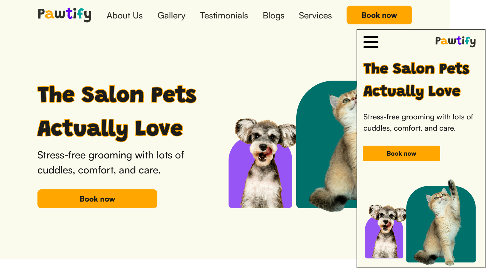
This is a landing page for a fictional pet salon called Pawtify, a modern, friendly pet salon brand designed to make grooming enjoyable for pets and their owners. The landing page is aimed to introduce Pawtify as a trustworthy and playful service by combining warm tones, clean typography, and a simple structure that highlights what makes the salon unique which are its personalised care and loyalty-driven service experience.
Typography
Grandstand is chosen as headings because its rounded and bold style represents playfulness which fits what the brand is trying to achieve. While Satoshi provides clean and modern letterform which are suitable for body texts.
Color Palette
light cream (#FAFAED) and dark gray (#31312C) are chosen to provides warm feelings while navigating the website. While the accent colors of orange (#FFA600), teal (#00A8A0), and purple (#9855F6) gives off energetic feelings yet with a slight premium touch to the site.
All images are sourced from unsplash (https://unsplash.com/) and SVGRepo (https://www.svgrepo.com/)
Tools used
From brief

Topics
Share
Reviews
5 reviews

Your concept is strong. The hero headline, photos, and repeated “Book now” CTA make the purpose of the page very clear. The sections are in a good order, and you kept the same story on desktop and mobile, which matches the brief well. The brand feels friendly and trustworthy for a pet salon.
The main thing you can improve is visual breathing room and rhythm. On desktop, try using more consistent spacing between sections and keep headings a bit closer to their content. On mobile, add a little extra space between the colored cards so the layout feels lighter. You could also consider a more accessible “Book now” placement on mobile (for example, a sticky CTA or one that appears right after the services list).
Typography and colour are on the right track, but can be simplified. Use a clear, small set of text styles: one for section titles, one for card titles, and one for body. Make sure body text is big enough and has strong contrast, especially white text on bright colours. Your copy is good, but some cards are quite wordy-try cutting each to one main idea in one or two short sentences, written from the user’s benefit point of view.
For polish, check the testimonials and footer. Darken the overlay behind testimonial text a bit so the text is always easy to read, and keep card corners, shadows, and spacing consistent across all sections. On mobile, consider stacking the footer links in a simpler column layout. These tweaks are small individually, but together they’ll make the page feel more professional and production-ready.

Hey Ahmad,
There’s a lot to love here! The overall vibe is bold, friendly and perfect for a dog salon. I really like your hero section too. It’s clear straight away who Pawtify are, what they do, and what makes them different.
A few things to improve:
Text hierarchy
The size difference between your headers and body text is quite small, so everything blends together. Increasing that contrast will help guide the eye.
Spacing
Adding a bit more bottom padding inside your text boxes will make them feel more balanced. You could also reduce the spacing between the “services we provide” cards to help that section feel more connected.
I’d also recommend checking out some of Gestalt’s key design principles. They’re great for understanding how people visually interpret information.
Good job overall!

Beautiful work Ahmad! Both the web and mobile version are very well designed making this project truly feel like a responsive landing page, well done.
It's interesting that for the mobile version you added the menu on the left side, people usually expect them on the right side because of current mental models but that does make it easier to reach.
One small note I would make is on the dark grey color choice; I think you could make the whole experience even friendlier with a a different choice. Still, fonts and the other colors work well.

Beautiful, so cute !

Hey Ahmed- Seems a good start for you - good work. I am a mentor & I would suggest some mprovement you can do:
- Fonts is not Trustworthy - if you are a business and trying to sell something, people should feel the trust in paying you. The phones and the images are not making trust.
- Photos - tell me, are you selling dogs and cat, or are you selling grooming service? - so use some past client photos or how you are growing. Show the process of how an owner can come here and get their dog serviced. Will trust with reality rather than fake.
- In the menu, - service should be the priority rather than about us as that you are selling. - activities like cad sorting, actually help you to find that only.
- There is no UX law applied nor colour scheme I am seeing. Micro changes you can do is use real photos – build trust – give offers on the homepage – show trust by showing doctors and so much more.
⭐️If you really want to learn, check my profile and visit my website ⚡️ I can definitely help you - see the Institute & have a look. Hope to see you there.
You might also like

Loginino


Notification microcopy - Project


El Mandoub-GovTech App


MalishaEdu Counselor Workspace


Goal Creation Flow


Portfolio website

Visual Design Courses

UX Design Foundations


Introduction to Figma

Design Terminology
