Mobile Design
Mobile design is the practice of creating user interfaces and experiences tailored to smartphones and tablets, balancing usability and performance.


TL;DR
- Creates interfaces for phones and tablets.
- Focuses on usability in small-screen contexts.
- Relies on touch gestures and adaptive layouts.
- Ensures accessibility and high performance.
Definition
Mobile design is the process of designing user interfaces and experiences for smartphones and tablets, optimizing layouts, interactions, and accessibility to meet the constraints and opportunities of mobile contexts.
Detailed Overview
Mobile design focuses on creating intuitive and efficient experiences for handheld devices. Unlike desktop design, it must account for smaller screens, varied resolutions, and touch input. The aim is to simplify tasks and ensure usability in on-the-go contexts where attention and time are limited.
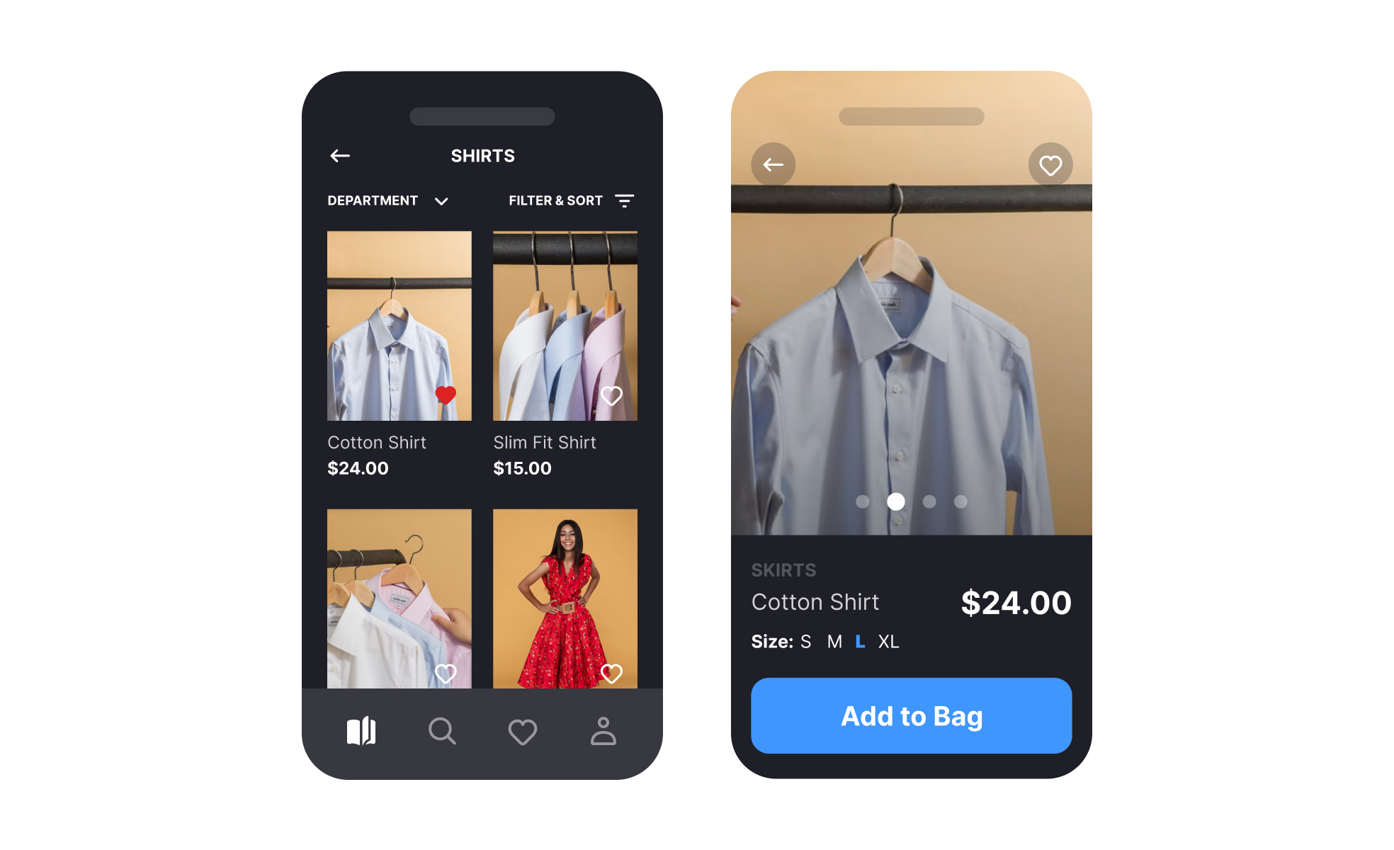
A frequent question is what principles guide mobile design. Common practices include prioritizing content, minimizing clutter, and ensuring large, tappable targets. Designers also consider thumb zones, where most users naturally interact, to reduce strain and improve navigation speed.
Another recurring question is about navigation. Mobile interfaces cannot accommodate complex menu structures found on desktops. Patterns like tab bars, hamburger menus, and swipe navigation are used to streamline access. Each choice involves trade-offs between visibility, discoverability, and efficiency.
Performance is another critical concern in mobile design. Slow-loading interfaces or heavy assets can drive abandonment. Optimized images, lean code, and careful use of animations help maintain responsiveness. Performance design is as much a user experience issue as a technical one.
Accessibility also plays a central role. Mobile products must meet the needs of users with visual, auditory, or motor impairments. Features such as screen reader support, text scaling, and voice commands extend usability and inclusion across audiences.
Finally, mobile design reflects the realities of usage context. People interact with phones in short bursts, often distracted or multitasking. Designs that reduce friction and emphasize speed of completion, such as autofill in forms or predictive text, align with these patterns and improve satisfaction.
Learn more about this in the Mobile Design Course.
Principles include prioritizing content, simplifying layouts, and ensuring large tap targets. Designers also account for thumb-friendly areas to make interaction more natural.
These practices reduce friction and improve usability in constrained spaces.
Mobile products rely on simplified patterns like tab bars, hamburger menus, or gestures. Each balances discoverability with screen space efficiency. Choosing the right approach depends on feature complexity and frequency of use.
Well-structured navigation is essential to avoid overwhelming users.
Performance impacts user retention directly. Long load times or heavy visuals can drive users away. Optimizing assets and interactions ensures products feel responsive in limited mobile environments.
Fast performance reinforces trust and usability.
Mobile accessibility includes readable text, strong color contrast, and compatibility with screen readers. Designers also ensure touch targets are large enough for users with motor challenges.
Accessible design expands reach and compliance, while improving experience for all users.
Mobile use often occurs in brief, distracted moments. Interfaces must support quick tasks, reduce effort, and limit complexity. Features like autofill, predictive inputs, and minimal steps align with real-world contexts.
Designing for this reality improves adoption and satisfaction.
Recommended resources
Courses

Design Terminology


Mobile Design


Introduction to Figma
Lessons

Designing for Mobile Interfaces

Visual Design Principles in Practice

Devices & Screen Sizes
Briefs

Design a Responsive Landing Page

Design a Password Reset Page

Design a Settings Page for Mobile
Tutorials

Responsive Type Scales: Part 1


11 tips on how to design mobile buttons
Projects

Reset Password - Mobile App Flow


Accessible Signup Form


Hulu Through My Eyes - A Cinematic UI Exploration (unofficial)