Devices & Screen Sizes
Discover the various devices and screen sizes you may have to design for
As designers, we have to master designing interfaces for a variety of devices and screen sizes. Twenty years ago, the only screens designers really needed to consider were laptops or desktops. Today, screens range in size from tiny smartwatches to huge smart TVs.
Simply scaling your designs up or down isn’t an option for optimal user experience. Instead, you’ll need to deeply consider both the device sizes and usage patterns.
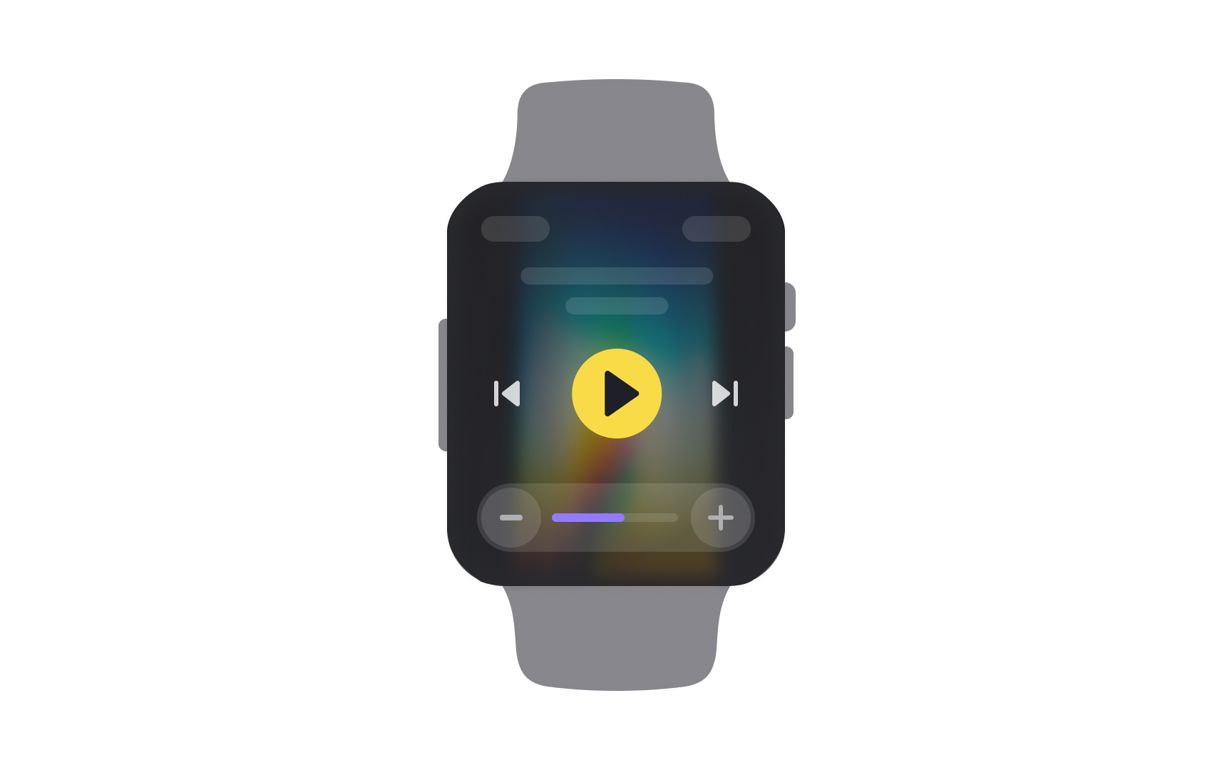
People use smartwatches for getting instant information. They’re not likely to be reading long-form content or watching videos on these small-screened devices. They are more likely looking for bite-size pieces of information like stats about their workout or who just texted them.
Keep in mind that
Additionally, take time to investigate the specifics of voice UI design which is an essential aspect of smartwatches. A major challenge is to think through all the various conversation paths that users should be able to follow intuitively and benefit from.
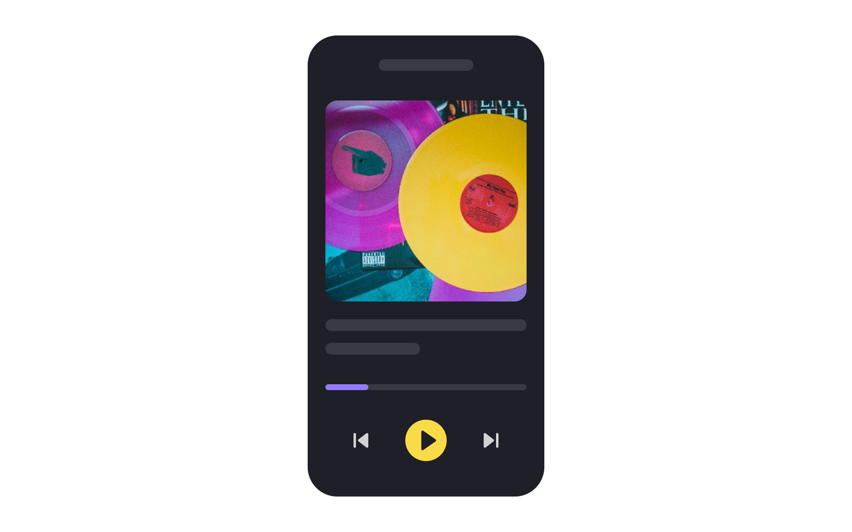
Did you know that over half of all internet users access it exclusively through their phones? The number is expected to increase to nearly 75% by 2025.[1] This makes it the most important screen you design for.
Phones are generally used for everyday activities, including networking, communication, and browsing the web.
Keep these points in mind when designing for smartphones:
- Make it easy for smartphone users to immediately find the information they’re looking for within your product
- Assume that users are often accessing your interface on the go, which means they don’t want to waste time
- Consider that most users are viewing their smartphones from roughly 30cm (12in) away
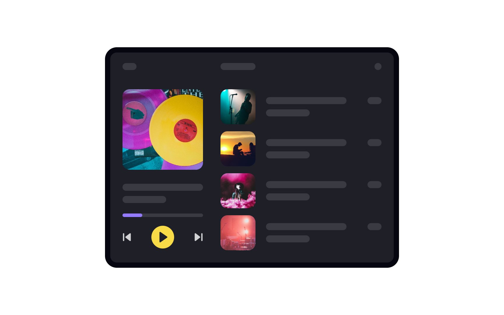
Tablets are commonly used for three main categories: entertainment, communication, and productivity. Depending on what your app is designed for, you’ll either want to focus on efficiency or engagement.
Because of the variation in how people use their tablets, design for a viewing distance of 30-50cm (12-20in). When designing for mobile (tablets, phones, etc.), be sure to consider the following:
Content placement: People hold their devices in multiple ways, but the most important content should be at the center of the screen.- Touch targets: The touch target areas of all interactive elements should be at least 7-10mm.
- Progressive disclosure: The real estate of mobile devices is usually strictly limited. The progressive disclosure technique allows designers to arrange content thoughtfully and not overwhelm newcomers.
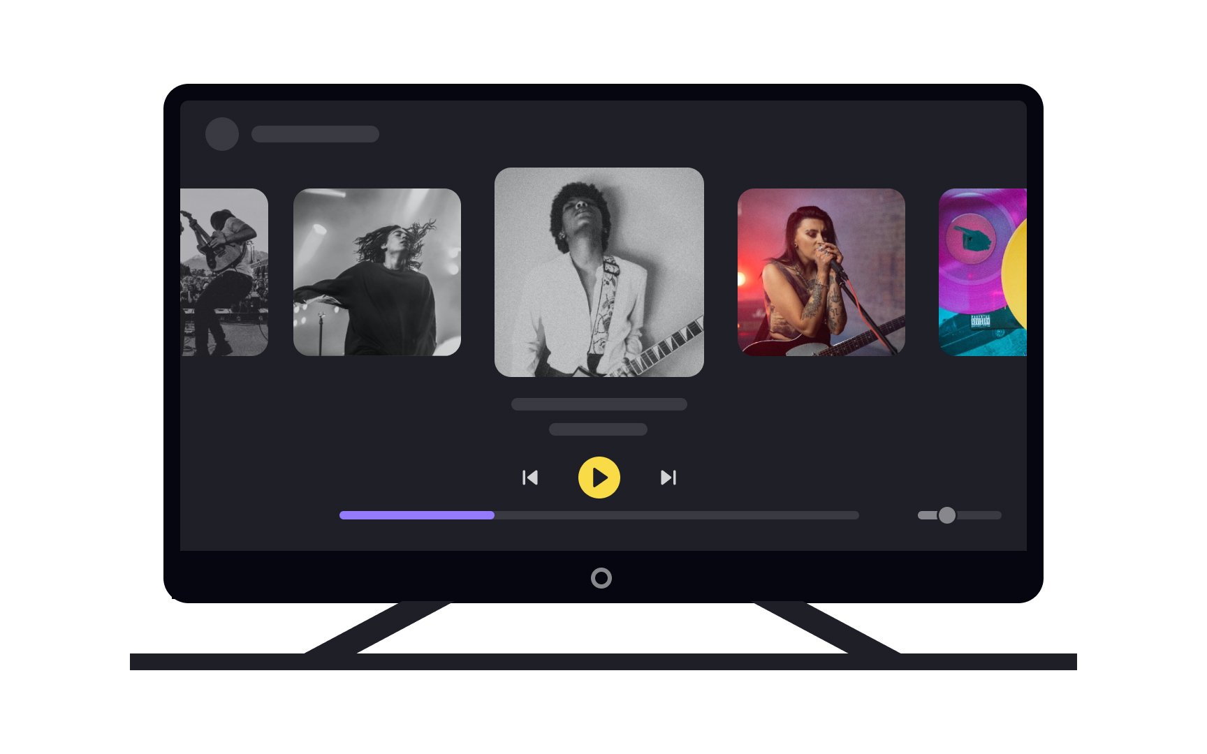
Designing for Smart TVs offers unique challenges, given their primary focus on entertainment and their larger screen sizes. Here are some tips to keep in mind:
- Viewing distance: Design with a typical viewing distance of about 3m (10ft) in mind, as users are usually seated on a couch.
- Simplicity: Keep interfaces simple and intuitive. Less is more when it comes to TV screens, so avoid clutter.
- Visibility: Use large, legible fonts and high-contrast colors to ensure readability from a distance.
- Navigation: Optimize for remote controls or voice commands, as users won't have a mouse or touchscreen.
- User interaction: Limit the number of steps needed to complete actions. The quicker users can get to their
content , the better.
When designing for laptops, remember that these are the go-to devices for more serious tasks. Users often choose laptops over mobile devices for significant work because they offer a less distracting environment and are perceived as more reliable for complex tasks.[2]
Key design considerations:
- Extreme usability: With laptops being portable, design with various environments in mind. You can't always count on optimal lighting or seating.
- Viewing distance: Generally, users are about 50-100cm (20-40in) away from their laptop screens. Make sure text and elements are easily readable and accessible at this distance.
- Work-centric: Laptops are workhorses. Prioritize features that enhance productivity, like easy
navigation and efficient layouts.
Designing for desktop PCs offers the advantage of larger screen real estate, making them versatile for both work and leisure. Here are some key considerations:
- Viewing distance: Like laptops, users typically view desktop screens from 50-100cm (20-40in). Ensure that elements are clearly visible and interactive at this distance.
- Clean design: A spacious screen is no excuse for clutter. Keep the interface clean, focused, and intuitive to guide users toward their goals.
- Versatility: Desktops serve multiple purposes, from professional tasks to entertainment. Your design should be adaptable to a variety of user needs.
- Performance: Desktops generally have more processing power than other devices. However, don't overload the
UI with unnecessary elements just because you can.
Remember, a well-designed desktop interface provides a seamless transition between work and play, maximizing the user's
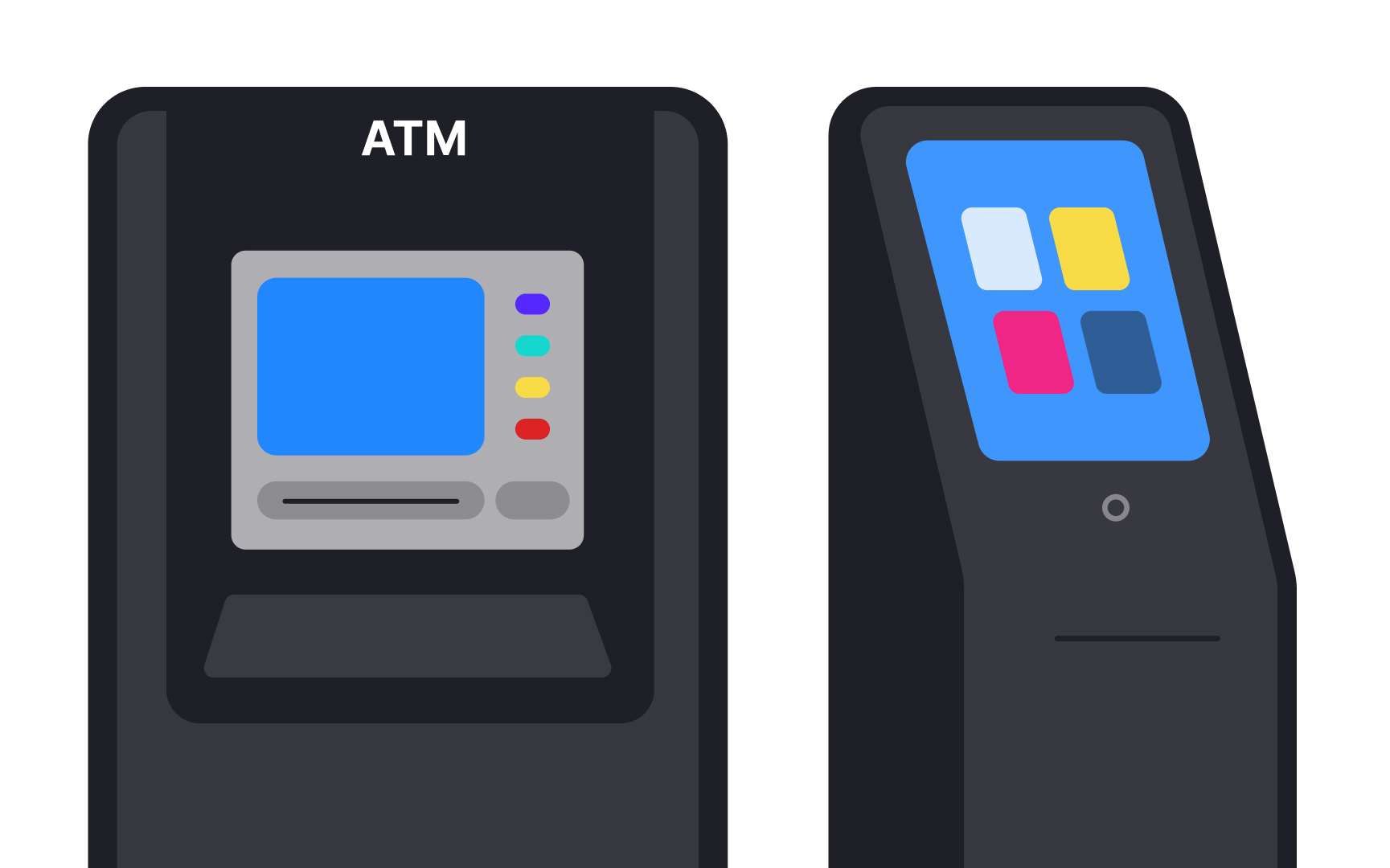
Self-service kiosks are large
When designing touchscreen kiosk interfaces, consider the following aspects:
- Simplicity
- Large touch target areas
- Minimum typing
- Consider the environment
- Add simple animations
- Accessibility
- Auto log-out[3]
Pro Tip: Respect user privacy when they type by ensuring the keyboard is large enough for tapping, but not so large that text can be read by strangers behind the user.
References
- Topic: Mobile internet usage worldwide | Statista
- Large Devices Preferred for Important Tasks | Nielsen Norman Group
- A Few Mobile UX Design Skills Help With Very Large Touchscreen UX Design | Nielsen Norman Group
Top contributors


Topics
From Course

Share


