Platform Adaptivity & Scaling
Design interfaces that adapt naturally to each platform's unique capabilities and constraints.
Apps need to work well across all Apple devices, adapting their look and behavior to match each platform. Every device has its own way of showing content and handling user actions. From small iPhone screens to large Mac displays, from iPad's touch controls to Vision Pro's hand gestures — apps should feel natural on each device. Good adaptation means more than just making things bigger or smaller — it means understanding how people use each device differently.
These platform differences shape every part of app design. Menus and buttons need different sizes and positions based on screen space and how users interact. Text must stay readable whether it's on a smartwatch or computer screen. Content layout changes to match how precisely users can tap or click. Some features might work differently or change priority depending on the device, from quick mobile tasks to detailed desktop work. Understanding these needs helps create apps that feel right at home on any device.
Each Apple platform needs its own approach to interface design. Understanding core principles helps create experiences that feel native on every device.
Key platform characteristics:
- iPhone: Optimized for quick tasks and one-handed use. Interface elements stay within thumb reach, with clear touch targets and focused navigation.
- iPad: Balances touch control with productivity features. Supports complex tasks through split views and drag-and-drop while maintaining touch-friendly interactions.
- Mac: Built for precision and multitasking. Windows, menus, and controls adapt to pointer input and keyboard shortcuts.
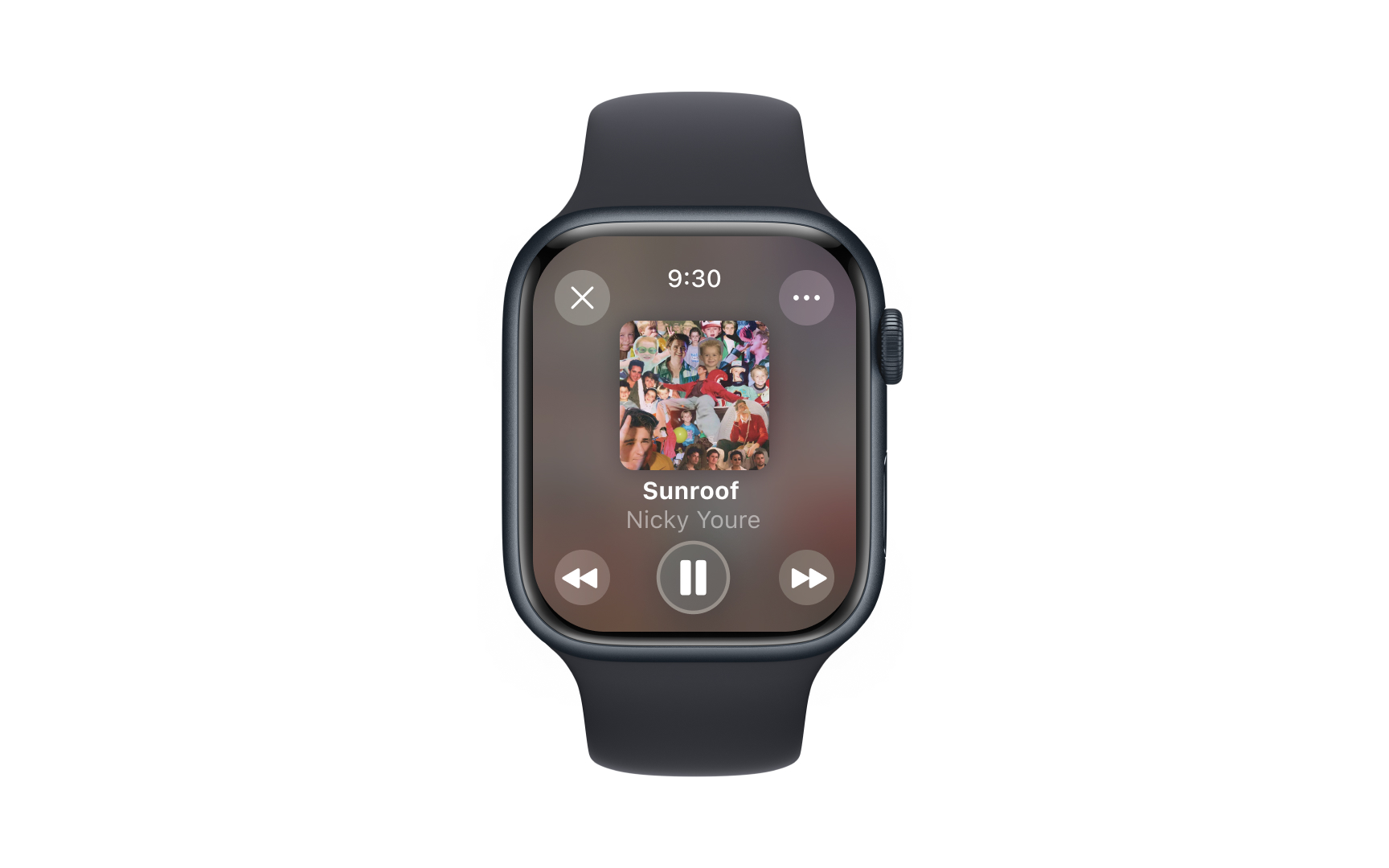
- Watch: Designed for brief glances and essential interactions. Interface elements focus on quick access and clear visibility on a small screen.
- Vision Pro: Responds to eye tracking and hand
gestures in spatial computing.Content maintains visual comfort while supporting natural interactions.
Learn what makes each platform unique. Consider how people hold and interact with different devices, how far they sit from screens, and which features they use most often. Design choices should match these natural behavior patterns.
Different screen sizes and contexts demand smart
Layout approaches by platform:
- iPhone layouts: Keep key actions in thumb reach. Use full-width vertical stacking for
content , with 44pt minimum touch targets and clear spacing. - iPad layouts: Add side panels beyond 768pt width. Use popovers for secondary content and plan for both split view and slide-over contexts.
- Mac layouts: Leverage hover states and compact grouping. Allow flexible window resizing while maintaining content relationships.
Start with the core mobile layout, then enhance as space grows. Identify which elements need constant visibility — like
Pro Tip: Create a quick layout checklist: verify touch sizes, reading distance, and interaction zones for each platform.
Menus transform significantly across Apple platforms to match different
Menu transformations:
- iOS patterns: Uses bottom sheets for actions and context menus through long press. Action sheets slide up from screen bottom, providing large touch targets with clear spacing.
- iPadOS approach: Introduces pointer-friendly context menus and popovers. Bottom sheets remain available but gain keyboard support and hover states when using trackpad.
- macOS implementation: Employs traditional pull-down and contextual menus. Keyboard shortcuts become visible in menus, and hierarchical organization supports complex option sets.
Consider each platform's natural menu patterns. iOS bottom sheets need clear touch targets and cancel options, while Mac menus can handle denser
Different platforms need different
How content priority shifts across platforms:
- watchOS: Surfaces critical, time-sensitive information. Removes optional elements and secondary actions, keeping only what users need for quick decisions.
- iPhone: Balances information density with clear hierarchy. Prioritizes primary tasks while making secondary features accessible through additional taps.
- iPad: Reveals more content layers simultaneously. Uses extra screen space to show related information and context without overwhelming users.
- Mac: Supports complex content organization. Presents multiple information levels through windows, panels, and persistent
navigation while maintaining clear relationships.
Pro Tip: Create a content priority matrix listing what information needs to be immediately visible on each platform.
Visual hierarchy adapts significantly when interfaces transition between different screen sizes and contexts. Understanding these changes helps maintain clear
Key hierarchy transitions:
- watchOS: Emphasizes instant recognition through strong contrast and size differences. Time-sensitive information dominates the display while secondary elements remain minimal or hidden, supporting quick glances and immediate comprehension.
- iPhone to iPad evolution: Content expands from single-column to multi-pane
layouts . Mail demonstrates this through a two-column split view where message list and content live side-by-side, maintaining clear visual connection while maximizing screen space.
Focus on content relationships that must scale coherently. Primary actions should maintain prominence while supporting content adapts to available space. Test how hierarchies translate between compact and expanded states to ensure clear visual flow.
Testing interface adaptations across Apple platforms requires systematic verification of both platform-specific features and cross-device consistency. Understanding key test areas helps identify adaptation issues early.
Critical test scenarios:
- Layout integrity: Verify
content organization across screen sizes and orientations. Test split views, sidebars, andnavigation elements through different states and multitasking scenarios. - Input validation: Confirm interface elements respond appropriately to each platform's
input methods. Check touch targets, hover states, and keyboardinteractions match platform patterns. - Content scaling: Evaluate how typography and visual elements adapt between devices. Test dynamic type sizes, image scaling, and interface density across platform ranges.
Document platform-specific test cases that validate core functionality. Create test matrices covering orientation changes, multitasking states, and accessibility features. Verify that adaptation changes preserve essential user workflows.


