Auto Layout
Auto Layout is a design feature that automatically adjusts and aligns elements within a frame, ensuring responsive and consistent UI across devices.


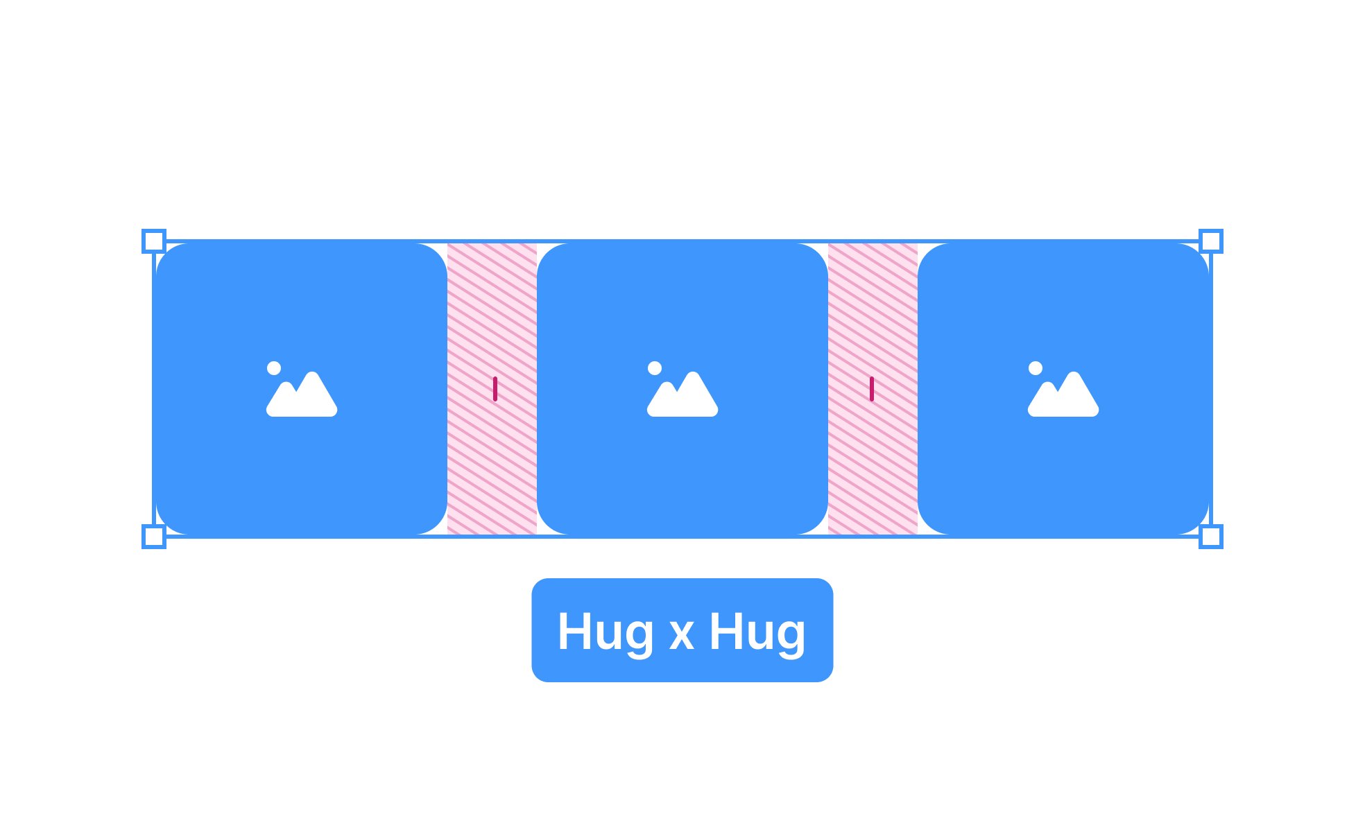
Auto Layout is a feature widely used in design tools like Figma and Sketch to create flexible and dynamic user interfaces. It allows designers to define rules for how elements should behave within a frame, ensuring that components adjust automatically when resized or when content changes. This reduces manual alignment and speeds up workflow while maintaining consistency.
In UX/UI design, Auto Layout plays a critical role in responsiveness. A button, for example, should expand as text length changes or adjust padding automatically to remain visually balanced. Without Auto Layout, designers must manually update elements, which introduces errors and slows production. With Auto Layout, small tweaks cascade across components, preserving uniformity.
Real-world examples show its impact. Designers at companies like Slack and Airbnb rely on Auto Layout to maintain consistent patterns across evolving products. When Slack introduced new features in its sidebar, Auto Layout helped ensure that additional elements fit harmoniously without disrupting the existing design structure. This illustrates how Auto Layout supports both speed and quality.
Collaboration also benefits from Auto Layout. Developers receive more accurate specifications since design components mirror how code behaves in a responsive environment. This reduces miscommunication and shortens the gap between design intent and implementation. Teams working with design systems find Auto Layout indispensable for keeping reusable components aligned and predictable.
From an accessibility standpoint, Auto Layout contributes by keeping designs consistent and predictable. Users with cognitive or visual challenges benefit when buttons, text fields, and icons follow logical alignment and spacing rules. Consistency reduces cognitive load, making products easier to navigate and interact with.
Attention to detail within Auto Layout is essential. Designers must set clear padding, spacing, and alignment rules. Poorly defined constraints can lead to broken layouts or unexpected resizing, which frustrates both users and developers. Mastering Auto Layout requires understanding hierarchy, nesting, and constraints to create systems that scale gracefully.
Learn more about this in the Layout Fundamentals & Spacing Lesson, a part of the Apple HIG Course.
Key Takeaways
- Auto Layout defines responsive rules for elements in design tools.
- Supports scalability across devices, languages, and screen sizes.
- Improves collaboration by aligning design with development behavior.
- Enhances accessibility through predictable, consistent layouts.
- Reduces design debt and speeds up iteration.
Auto Layout saves time by automating alignment, resizing, and spacing adjustments. Instead of manually editing each component, designers set rules once, and elements adapt automatically. This reduces repetitive work, minimizes human error, and speeds up iteration cycles.
It also ensures uniformity. For example, a button component with Auto Layout applied will always maintain correct padding and proportions regardless of text changes. This creates a consistent look across the product.
Design teams gain efficiency not only in initial creation but also in maintenance. As products evolve, updates are easier to implement across multiple screens and states.
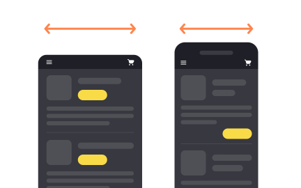
Product managers value Auto Layout because it supports scalability and adaptability. When teams expand into new markets with different languages or need to adapt features for multiple platforms, Auto Layout ensures layouts adjust seamlessly without breaking.
This reduces the need for redesigns, lowering costs and improving speed to market. Managers also benefit from improved collaboration, since Auto Layout makes handoff smoother between designers and developers. It ensures alignment between design systems and product requirements.
In essence, Auto Layout provides confidence that features will scale globally while retaining consistency and usability.
Yes, Auto Layout enhances accessibility by promoting consistency in design. Predictable placement of elements helps users, particularly those with cognitive or visual challenges, navigate interfaces more easily. Logical alignment and spacing reduce cognitive load, ensuring users can process content without unnecessary confusion.
It also supports adaptive resizing, which is useful for users who rely on larger text settings or different screen orientations. By maintaining structural integrity under these conditions, Auto Layout makes products more inclusive.
Teams that integrate accessibility considerations into Auto Layout from the start build products that adapt not only technically but also socially, accommodating diverse user needs.
Recommended resources
Courses

Apple Human Interface Guidelines


UX Design Foundations

UI Components I

Lessons

Layout Fundamentals & Spacing

Image Usage & Asset Design

Platform Adaptivity & Scaling


Tutorials

Master Auto Layout in Figma with This Tutorial


Learn 8 essential techniques to design in Figma like a pro

Create a Bottom Navigation Bar in Figma

Projects

RetroPlum - Skeuomorphic Style Button Kit


Empty State - Education App


Gaming community platform - X8 Guild