Layout Fundamentals & Spacing
Master Apple's core layout principles to create harmonious and balanced interfaces
Layout fundamentals and spacing rules are key elements of Apple's unique design style. They control how all interface elements work together on screen. Good spacing creates room for content to breathe and helps users navigate easily through apps. Apple uses specific rules for margins and padding to keep content clear and easy to read. Their grid system helps designers create consistent layouts that work well on all screen sizes. The balance between empty space and content makes important information stand out naturally. These spacing patterns automatically adjust to fit different devices - from small iPhone screens to large Mac displays.
Learning these basic principles helps designers create interfaces that match Apple's focus on clarity. Every space between elements has a purpose and helps create harmony in the design. With strong layout skills, designers can build interfaces that feel natural to use and meet Apple's high design standards.
Apple's
Standard measurements include 8-point, 16-point, and 32-point increments for core interface elements. Apple's layout hierarchy creates natural paths for users to follow. Primary content takes up more space and uses prominent positioning, while supporting elements stay subtle in the background. This systematic organization of space helps users focus on important content while keeping interfaces clean and intuitive.[1]
Pro Tip: Start your layouts with 8-point spacing increments — this aligns with Apple's measurement system and helps maintain consistent spacing across your design.
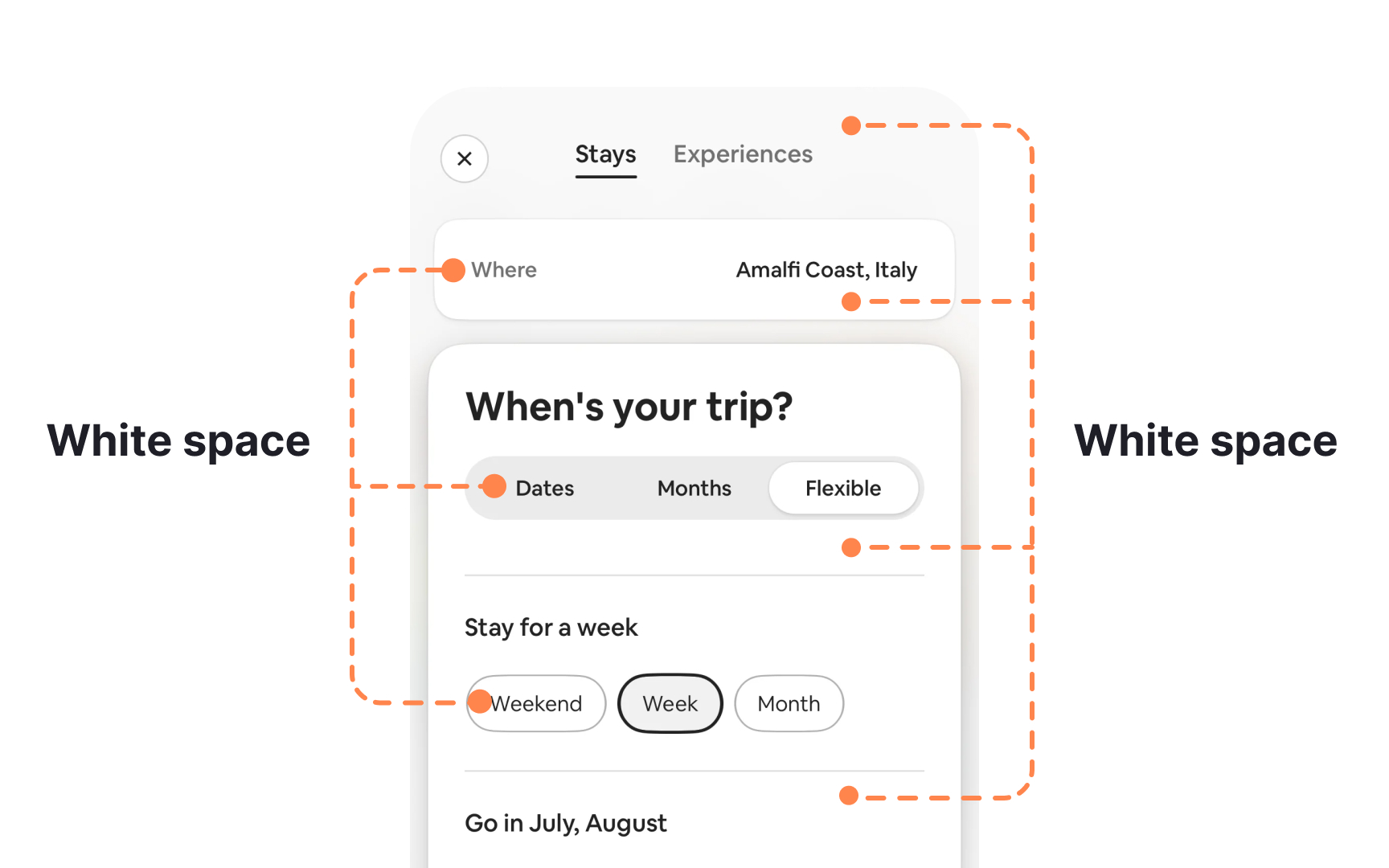
Whitespace in Apple interfaces creates visual breathing room between elements. This space isn't empty — it actively guides users through
These spaces help establish visual hierarchy and maintain consistent spacing patterns across different screen sizes. Carefully planned whitespace distribution prevents cognitive overload and makes interfaces feel organized. Small whitespace plays a crucial role in readability and usability. System-defined
Pro Tip: Double-check spacing between related elements — if they're too far apart, they lose their visual connection; if too close, they compete for attention.
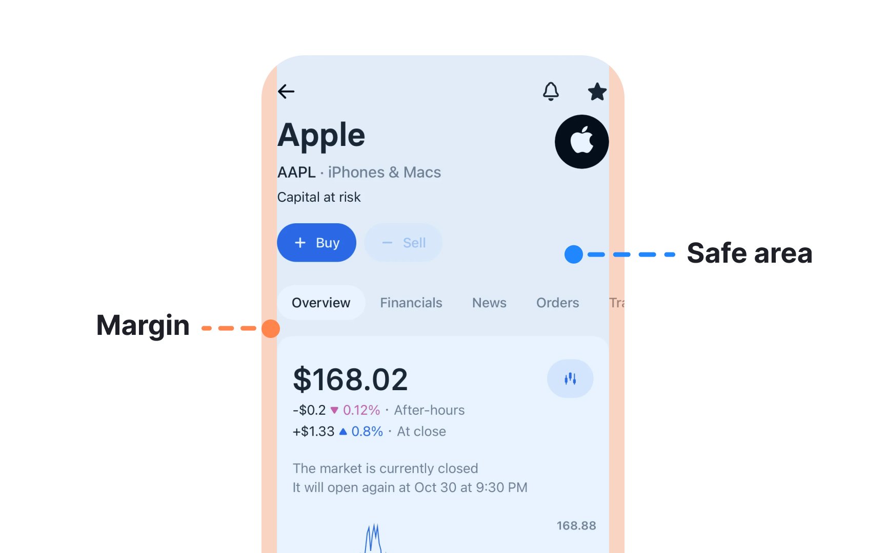
Safe areas and
iOS provides standard margins that work well in most cases, but custom margins can be used when needed. The system offers default margins that developers can adapt. These margins help create balanced layouts that work across devices while respecting safe areas. Understanding this relationship between safe areas and margins helps create interfaces that look great on every Apple device.[2]
Pro Tip: Always test your layouts with default and custom margins in both orientations to ensure content remains readable and accessible.
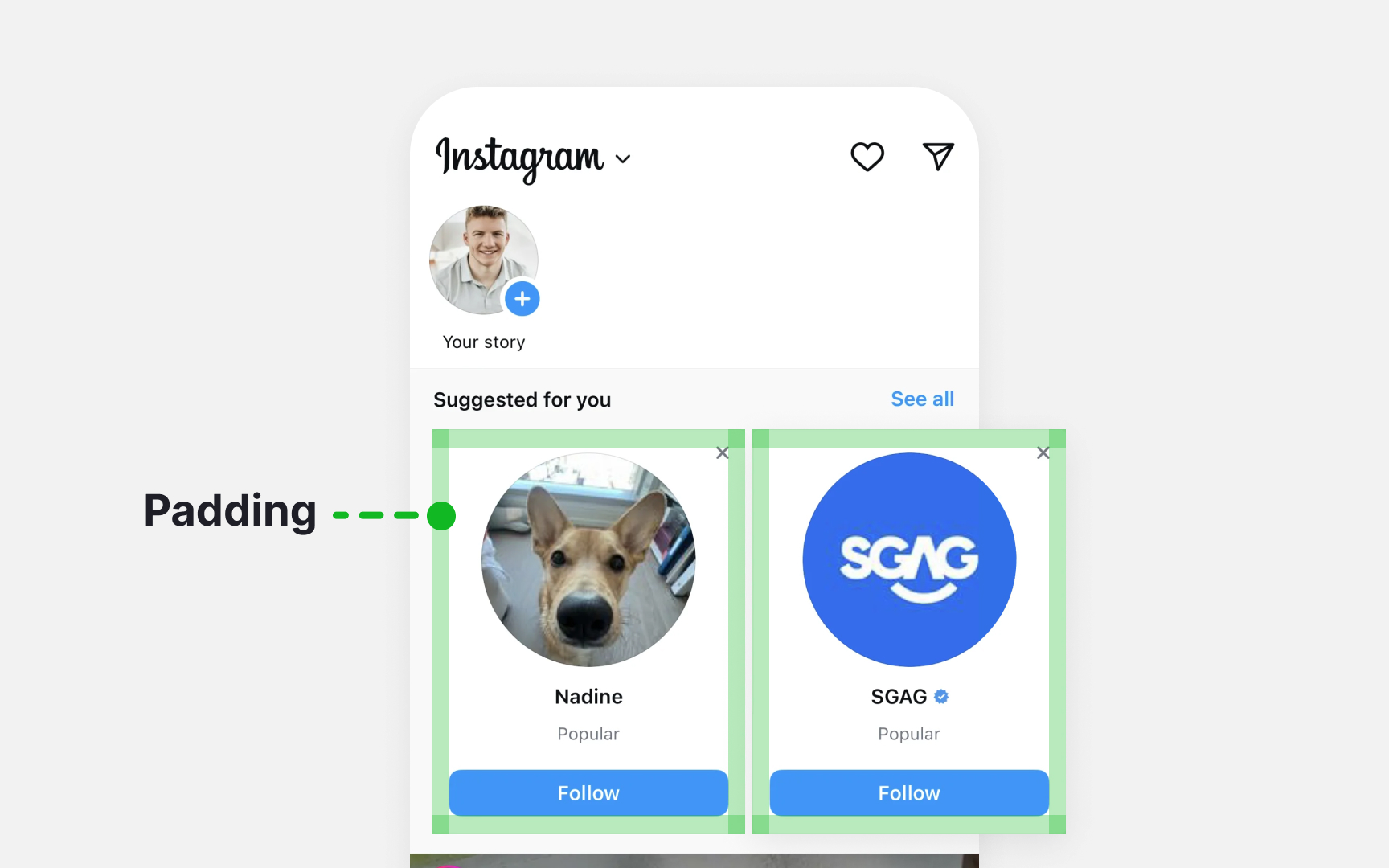
These defaults help maintain consistent spacing while adapting to different text sizes and device orientations. Good padding improves interface scannability and touch interaction. Interactive elements need enough padding to create comfortable touch targets. Content groups use consistent padding to show relationships between elements while keeping them visually separate and easy to distinguish.
Pro Tip: When customizing padding, maintain at least 44x44 points for touchable elements to ensure they're easy to tap accurately.
Grid layouts require careful attention to symmetry and consistency. Content should be spaced evenly to maintain a true grid appearance and make scanning easier. When content extends beyond the screen, partially hidden items should have equal width on both sides to keep the
Pro Tip: Check your grid spacing in both focused and unfocused states to ensure elements don't overlap when users interact with them.
iOS provides built-in spacings that help maintain comfortable content density. These system-defined spaces create consistent breathing room between interface elements. When content density increases, maintaining a clear
Pro Tip: Test your layout's touch targets with different finger sizes — what feels spacious enough for a small finger might be cramped for a larger one.
Interactive elements need sufficient space to be easily discoverable and tappable. When content extends beyond the visible area, partial elements can hint at additional content, helping users understand they can scroll or interact to see more.
Pro Tip: Group related items with consistent spacing but use wider gaps between different content sections to make relationships clear.
Apple interfaces need to work well across many different situations. Designs must adapt smoothly when users rotate devices, resize windows, change text size, or view
Good adaptable design starts with testing. Preview your layouts on both small and large screens, test different orientations, and check how text size changes affect your design. When scaling design elements, maintain their proportions to keep visuals clear and prevent distortion.[4]
Pro Tip: Test your layouts with Dynamic Type's largest and smallest settings to ensure text remains readable and doesn't break your layout.
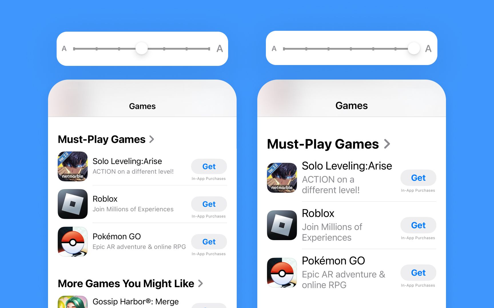
Text size changes affect entire layouts in Apple interfaces. When users adjust text size for better readability, spacing around and between elements needs to adapt accordingly. These adjustments ensure
These automatic adjustments help maintain proper touch targets and prevent text from overlapping.
Pro Tip: When testing Dynamic Type, check both minimum and maximum text sizes to ensure your spacing scales appropriately.
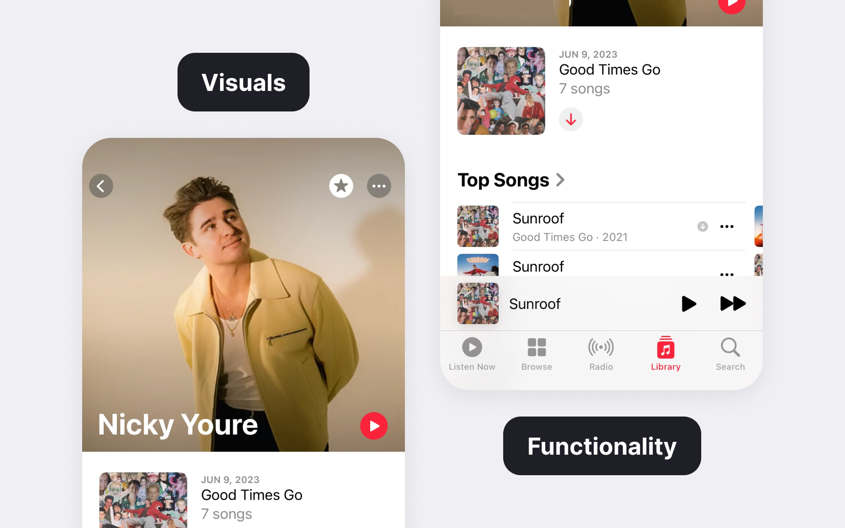
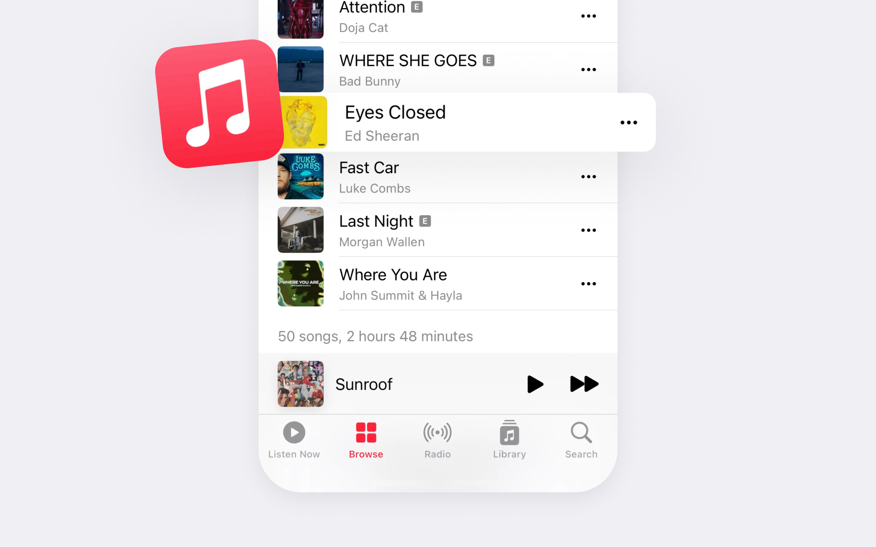
Apple's design system relies on thoughtful visual balance to create clear interfaces. In system apps, every element's size, position, and visual weight work together to guide users' attention naturally through the interface. The careful distribution of these elements creates stable, easy-to-scan
The Apple Music artist page balances strong visuals with functional elements. A prominent hero image leads to smaller album artworks, while navigation controls frame the edges without competing with the main
Different interface types need different balance approaches. Navigation bars balance titles with key actions, while content areas might use asymmetrical layouts to highlight important information. This flexibility in balance helps create interfaces that feel both stable and dynamic.
Pro Tip: Study Apple's built-in apps to understand how they balance different-sized elements while maintaining visual stability.
References
- Layout | Apple Developer Documentation | Apple Developer Documentation
- Layout | Apple Developer Documentation | Apple Developer Documentation
- Layout | Apple Developer Documentation | Apple Developer Documentation
- Layout | Apple Developer Documentation | Apple Developer Documentation
- Typography | Apple Developer Documentation | Apple Developer Documentation
Topics
From Course

Images provided by

Share


Similar lessons

Intro to Design Layouts

Intro to Design Grids
