Hero Image
A hero image is a large, prominent visual placed at the top of a page or screen, designed to capture attention, set context, and reinforce product identity.


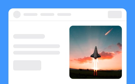
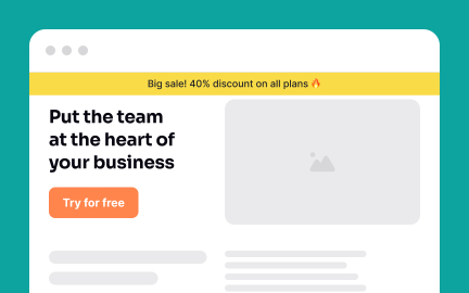
A hero image is the dominant visual element at the top of a webpage, application screen, or landing page. It usually stretches across the viewport and serves as the first thing users see when they arrive. Hero images often include supporting text, such as a headline or tagline, and sometimes feature a call-to-action button that directs users toward a primary goal. Their role is to make an immediate impact, set the tone, and guide users into the experience.
For UX designers, hero images are opportunities to combine aesthetics with clarity. A strong hero image is not only visually striking but also purposeful, reflecting the product’s value and narrative. Designers balance image selection, typography, and layout to create harmony between visuals and messaging. They also consider responsiveness, ensuring that hero images display correctly across desktops, tablets, and mobile devices without losing meaning or impact.
Accessibility is a vital consideration in hero image design. Images must include descriptive alt text for screen readers. Text placed over hero images needs proper contrast and background treatments to remain legible for users with visual impairments. Motion effects, such as autoplaying video heroes, must avoid triggering distractions or accessibility issues, providing users with controls for playback.
Real-world applications show their impact. E-commerce sites often use hero images to showcase seasonal collections or highlight special offers. SaaS companies feature their products in action, showing interfaces or customer outcomes to build credibility. Media platforms like Netflix rotate hero visuals to spotlight trending content, creating variety while reinforcing user engagement.
Hero images also tie closely to brand identity. They set the tone for color palettes, typography, and imagery across the product ecosystem. A well-chosen hero image conveys professionalism and trust, while a poorly chosen one can undermine credibility. Over time, consistent hero visuals help establish recognition and emotional resonance with audiences.
Learn more about this in the Hero Image Exercise, taken from the Image Terminology Lesson, a part of the UX Design Foundations Course.
Key Takeaways
- A hero image is the main visual at the top of a page or screen.
- Designers combine visuals, text, and layout to convey purpose.
- Accessibility requires alt text, contrast, and controls for motion.
- Real-world uses include e-commerce, SaaS, and media platforms.
- Performance optimization is key to effective implementation.
An effective hero image combines visual appeal with clarity of message. It captures attention quickly but also directs users toward a clear action or understanding. Text and calls-to-action should work in harmony with the image, not compete for attention.
The best hero images feel both aligned with brand identity and relevant to user goals. They communicate value in seconds, making users want to explore further.
Accessibility begins with alt text that describes the content and purpose of the image. Text overlays must maintain strong contrast to remain readable, and motion-based hero images should provide controls to pause or disable playback. These steps prevent barriers for users with visual or cognitive challenges.
Accessible hero images benefit all users. Clear contrast, responsive layouts, and thoughtful motion create a more inclusive and polished experience.
Not necessarily. Hero images can be photographs, illustrations, videos, or abstract graphics. The choice depends on the brand’s voice, audience, and goals. For example, SaaS companies often use screenshots or product animations, while e-commerce platforms prefer high-quality photos.
What matters is that the visual supports the page’s purpose. Whether realistic or abstract, the hero image should communicate value clearly and set the right expectations for what follows.
Recommended resources
Courses

UX Design Foundations


UI Components I


Design Terminology

Lessons


Exercises

Projects

#Simple.URL-Shortener (WebApp)


TRE® Workshop Landing Page Design


Case Study - Hero Section