Intro to Design Composition
Explore the fundamentals of design composition, delving into the concepts that govern the arrangement and organization of visual elements
The arrangement of elements within a design has a profound impact on the way users perceive and interact with it. That’s why composition is such an important concept for designers to excel at.
Building a strong foundation for further explorations into design composition is vital. Once you understand the basics, you can expand your expertise to become a master of creating compositions that thrill users and keep them coming back for more.
Design composition refers to the arrangement, alignment, and compilation of text, images, and other UI elements on a page. When composition is done well, designs are both aesthetically pleasing and highly effective. Designers also refer to composition as
As designers, we master composition by applying the principles of design.[1] These include elements such as contrast, balance, white space, hierarchy, repetition, and rhythm, among others.

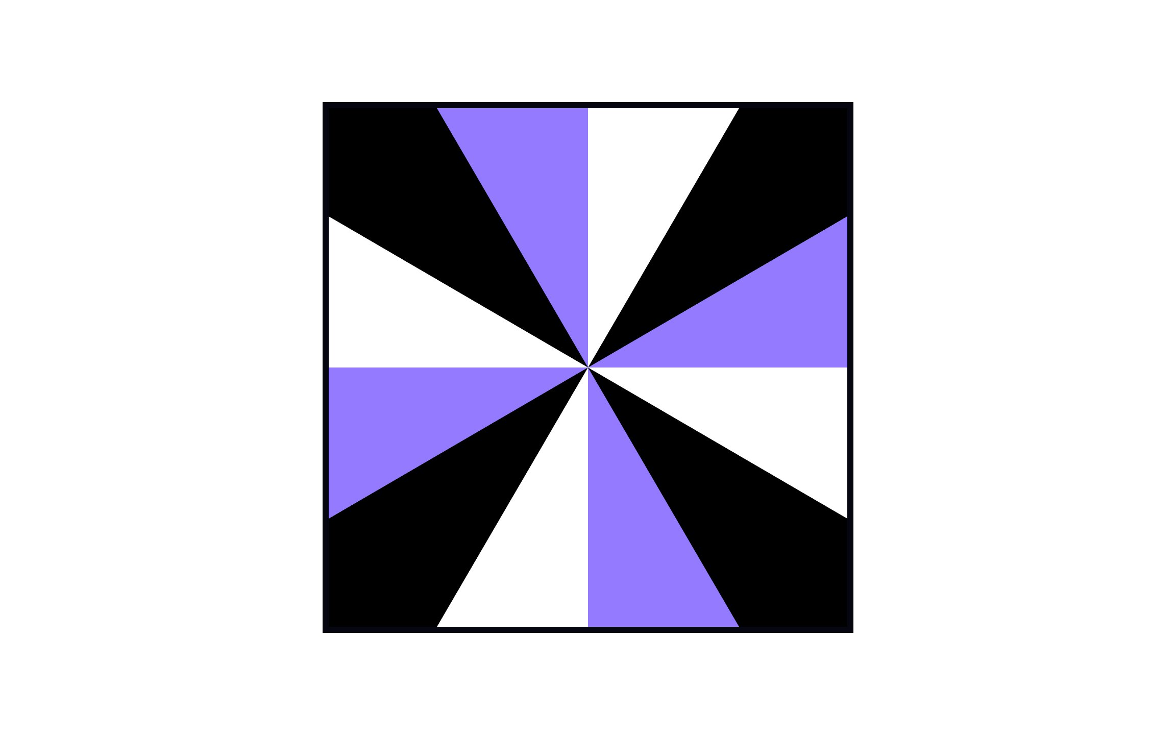
Two-dimensional compositions lay on a single plane — they have a length and width but no depth. They’re viewed from a single angle and don’t require side views. For example, a blueprint of a house would be a 2D
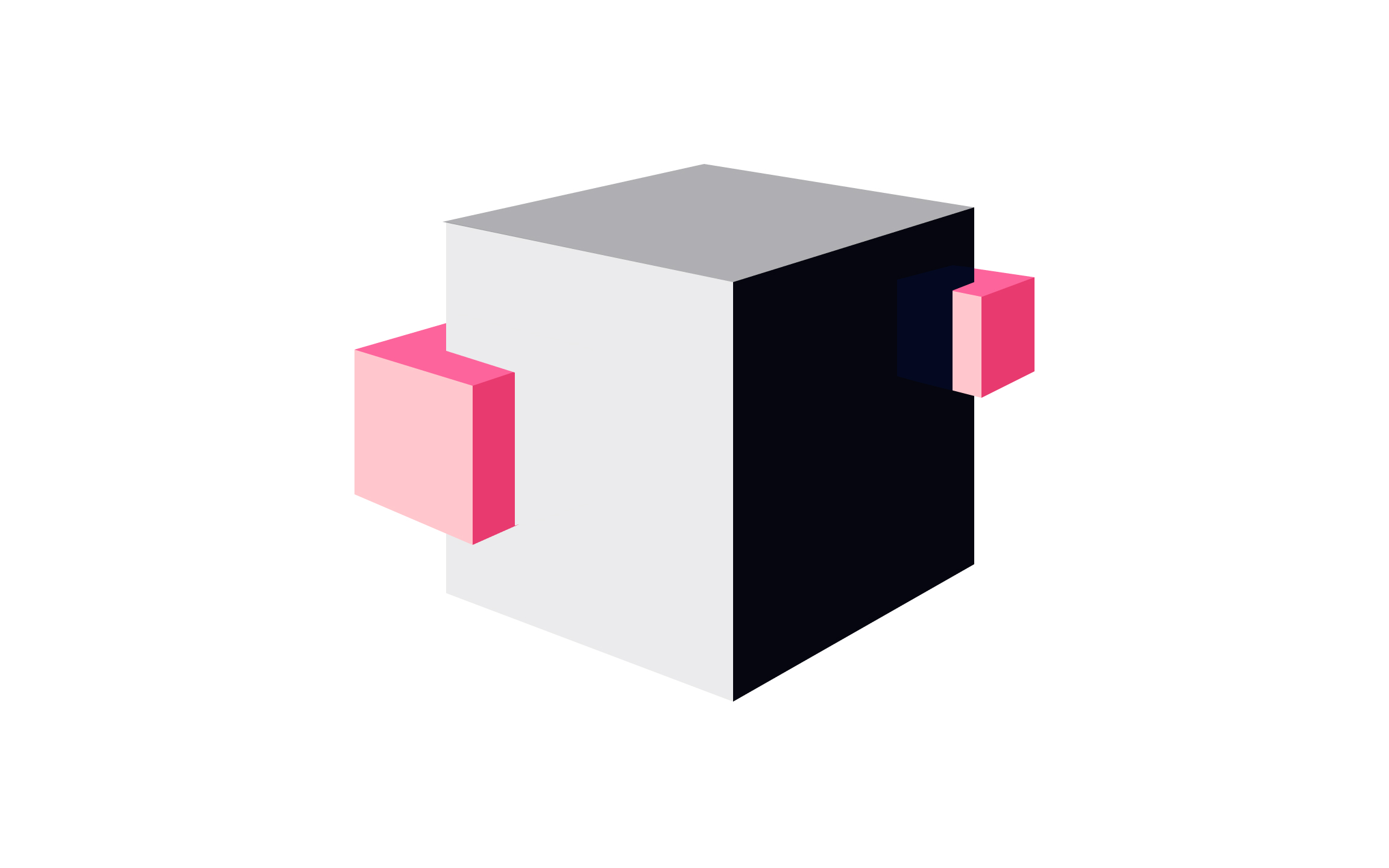
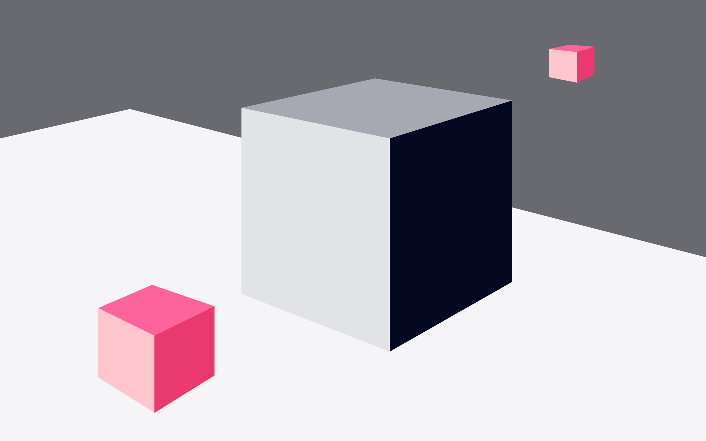
3D objects have, as the name implies, three dimensions: height, width, and depth. They exist in a three-dimensional space, even when depicted on a two-dimensional display. In product design, you’re most likely to see them in 3D product views or in illustrative components.
3D scenes are some of the most complex forms of design
Space is the key element in a 3D composition. When creating a 3D composition, it’s important to consider how objects appear in that space from multiple angles, as well as the positioning of the overall ensemble. Thankfully, we’re surrounded by 3D compositions in the real world, which we can use for inspiration.

Narrative
Every element in a narrative composition is intentional — nothing is random. Each piece is there to add information to the plot and move it forward. It can even include coded references, adding additional depth and interest for those viewing it.
Pro Tip: Rely on images, videos, and shapes to help move users through their journey.

One way of approaching a
Formal
Many great compositions in design, photography, and fine art display a strong sense and understanding of formal composition.
Good
We’ve all come across websites that were poorly composed. Sites where we couldn’t find the information we were looking for and couldn’t wait to leave. Solid composition prevents your design from falling apart, creating a more pleasant experience for users.
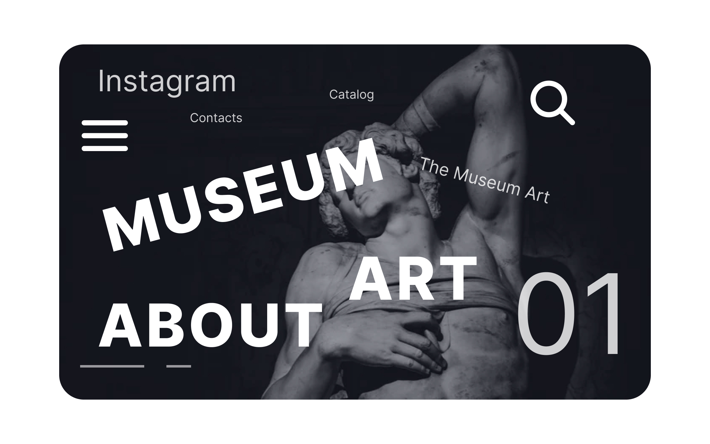
Poorly designed websites appear cluttered, disorganized, confusing, or just not user-friendly. Bad
Here's a simple guide for creating a good composition:
- Pick a format
- Use a grid
- Group elements
- Define the interaction between elements
Pro Tip: Establish a solid hierarchy and a grid before you start worrying about aesthetics.
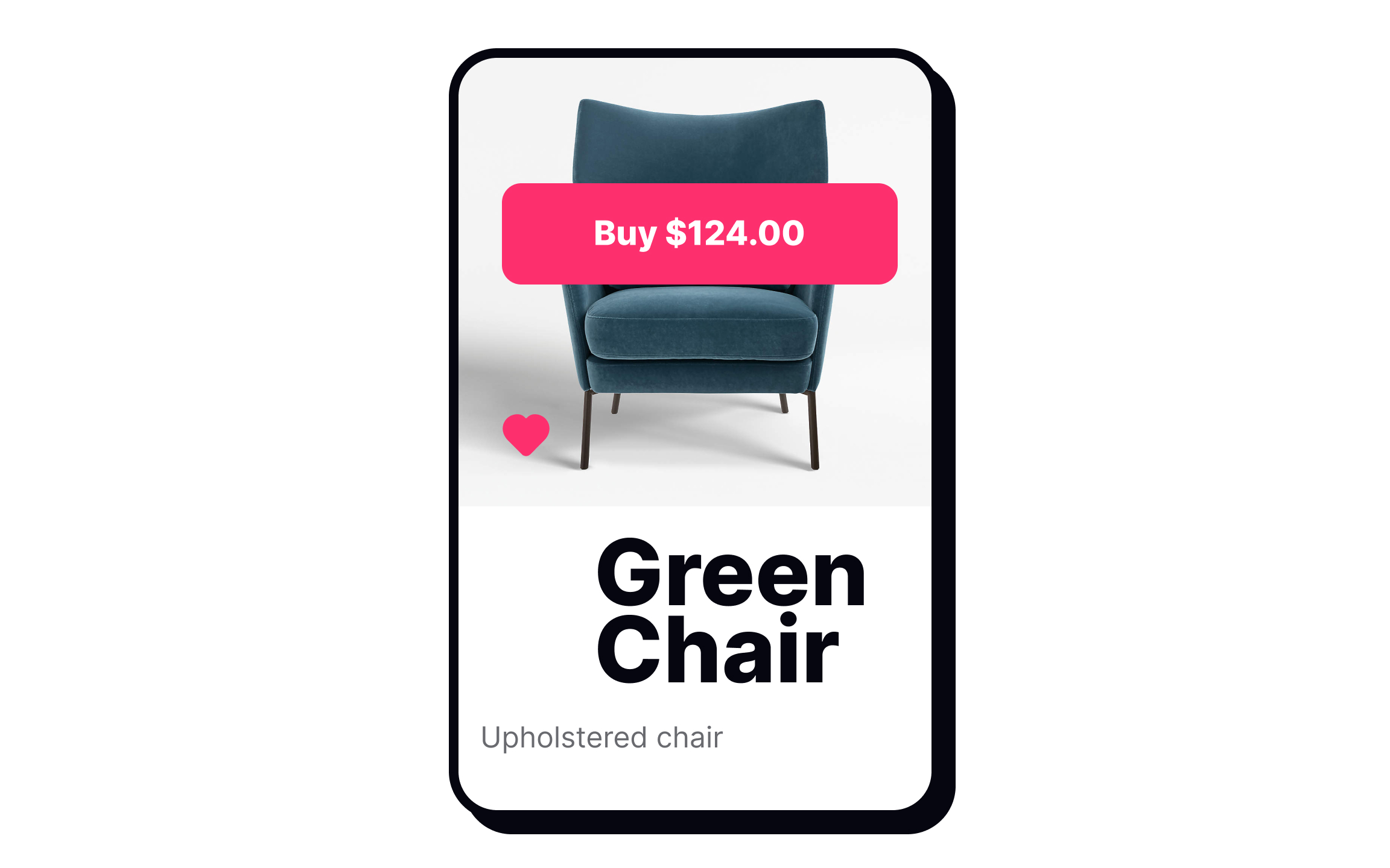
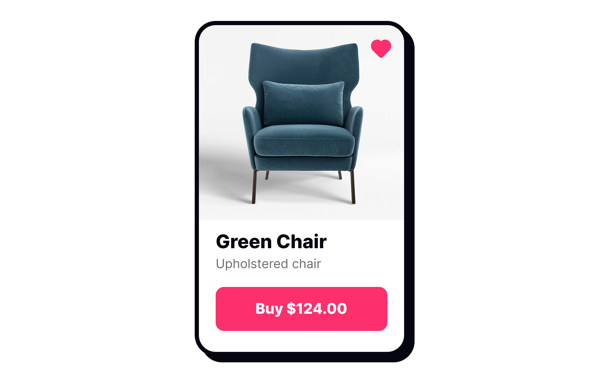
The purpose of
Position elements in ways to naturally lead users to the most important parts, such as the CTA button in the example.


Similar lessons

Intro to Design Layouts

Intro to Design Grids
