Intro to Design Layouts
Acquaint yourself with the building blocks that make up a design's basic architecture
Think of a layout as the architecture of a digital product. There are certain rules and guidelines you should follow when organizing elements within a grid, the same as you would when designing a building. If the elements in your layout present usability problems, it will ruin the whole user experience.
Design principles like alignment, white space, proximity, proportion, etc., help organize content so users can easily navigate it and accomplish their goals.
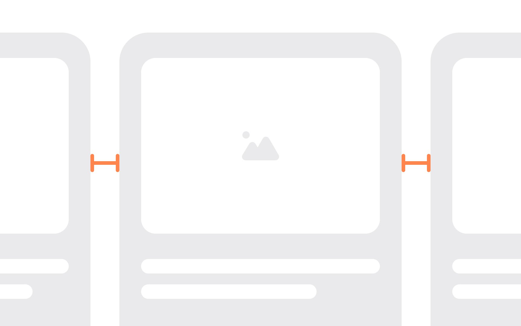
Spacing is a set of rules that clarify how elements in an interface should be arranged. It includes the measurable values that define distances inside and outside of elements. When spacing is consistent, it helps maintain a clean and organized
- Layout spacing: Layout spacing defines the distances between the most significant elements (for example, between a top bar and
content , or the sidebar and content) and the page itself. Material Design guidelines recommend aligning elements to 8dp and sizing them in 8dp increments to ensure a consistent visual rhythm across screens.[1] - Component spacing: Component spacing defines the spatial relationships within a given component, like the distance between a button’s icon and label. If you don't maintain this spacing consistently across all the buttons on your page, it can be subconsciously jarring to users and look sloppy. Maintaining consistency here brings balance to your UI components, so take the time to establish rules for use across the entire product.
Pro Tip: Utilize a 4dp grid to align small elements like icons or typography within components.
Margins are the space between elements. This could be the space around a
Margins also give us
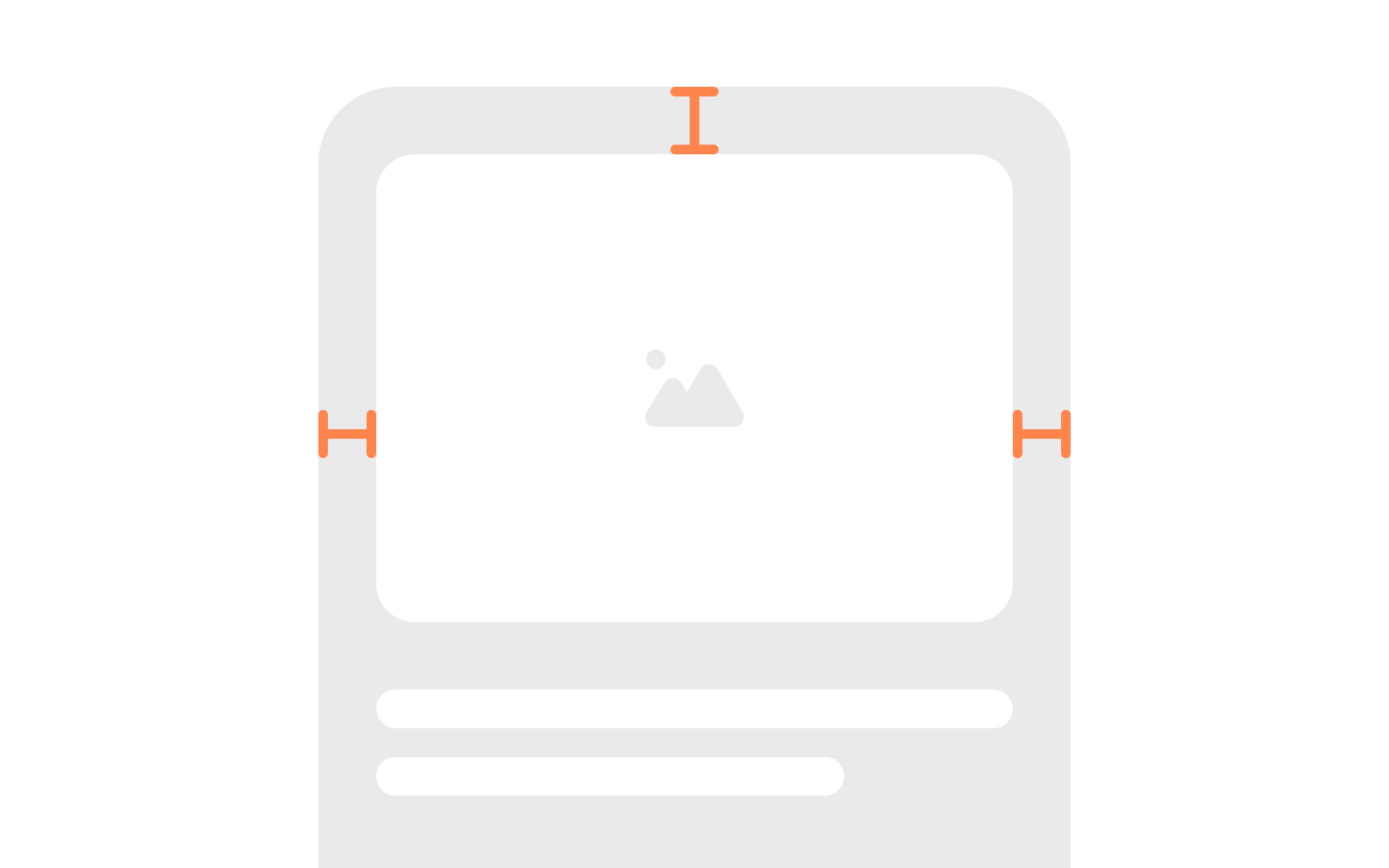
While
Virtually every element has padding. This prevents insufficient space in responsive designs when viewed on smaller screens.
Pro Tip: Always set minimum paddings for elements — we recommend no less than 12px.
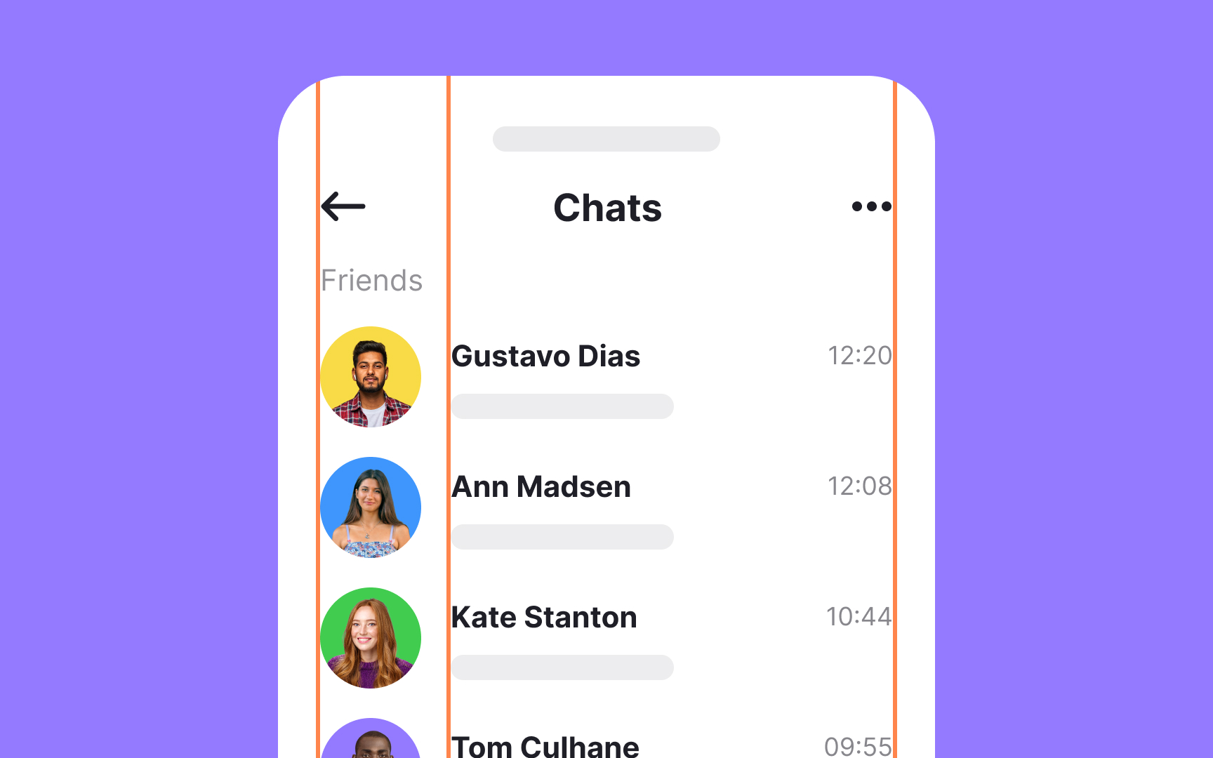
Keylines are imaginary lines that help align elements that are placed outside of the
Keylines are vital for keeping your

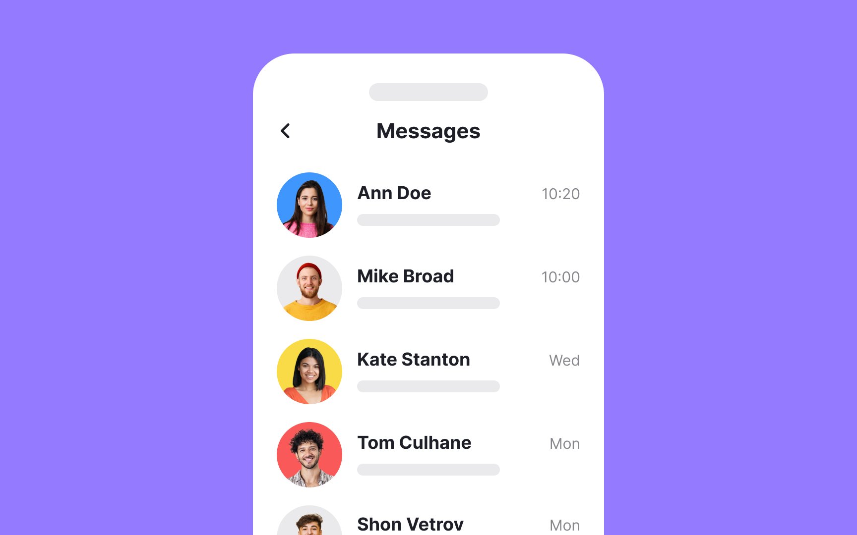
Left alignment means that design elements line up with the left
Whether you're working with text,
Pro Tip: Use left alignment for large blocks of text to increase readability.
Right alignment tucks elements against the right
However, right alignment has its moments—like when you're working with numeric data, side notes, or secondary actions—to make these stand out or fit neatly in specific

Center alignment can refer to both horizontal and vertical alignment. In center alignment, elements are aligned along an imaginary central line. It’s commonly applied to things like headers or
Center alignment on the horizontal plane isn’t particularly useful for large blocks of text (those that include more than three lines), as the varying starting point for each line can make reading more difficult.
Top alignment means lining up the top edges of elements along an invisible horizontal axis. This style of vertical alignment is particularly useful when you're working with elements that vary greatly in height. By aligning items at the top, you provide a consistent starting point for users' eyes, which simplifies the scanning process and enhances comprehension.
For instance, it's common in web navigation menus or multimedia blog posts. In a navigation menu,
Bottom-aligned elements sit flush against an invisible horizontal line, creating a grounded and anchored look. This type of alignment is especially effective when you're dealing with elements of varying heights and you want to establish a visual baseline.
For instance, in a photo gallery, you might find
Similarly, in a website footer, the copyright information is often bottom-aligned to signify its less urgent but anchored presence. This method is useful for keeping a clean, organized aesthetic while allowing users to scan
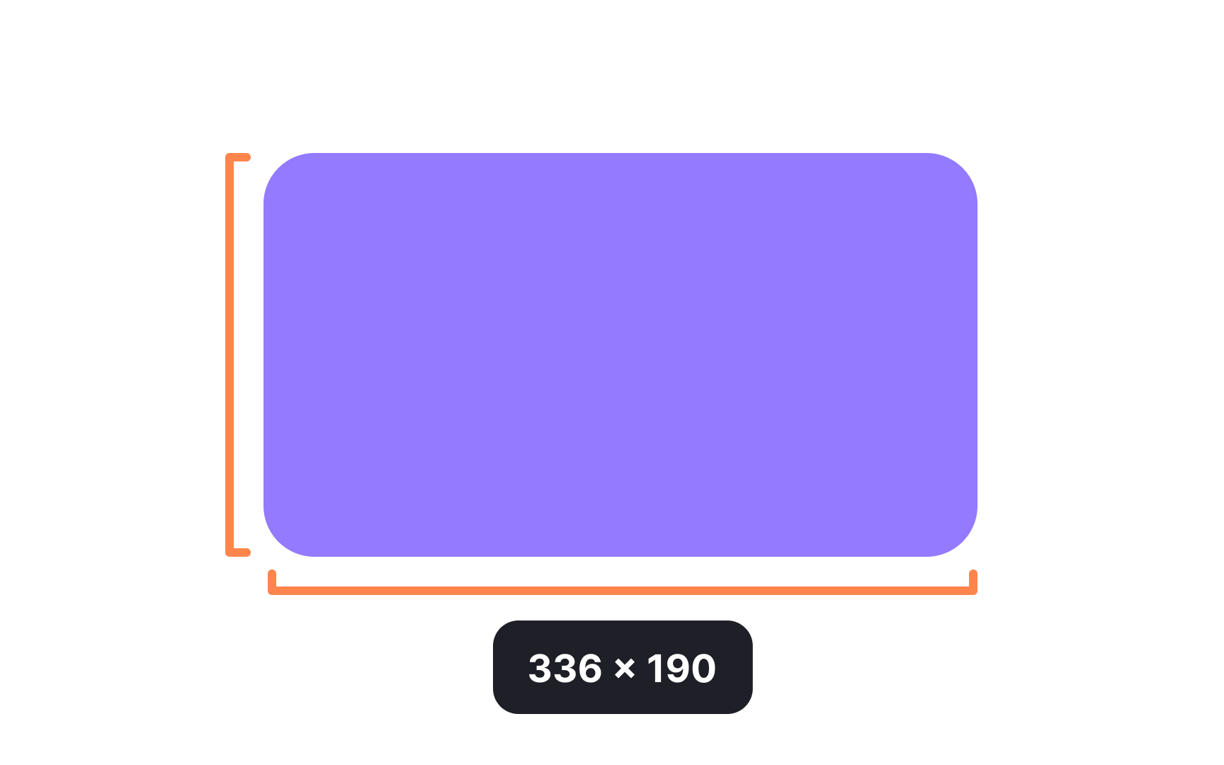
Dimension refers to the size of each element. UI interfaces only deal with two-dimensional shapes with two dimensions (width and height). Three-dimensional shapes are a part of 3D design and can be measured in 3 dimensions (width, height, and depth). Defining dimensions upfront helps ensure consistency in a design.
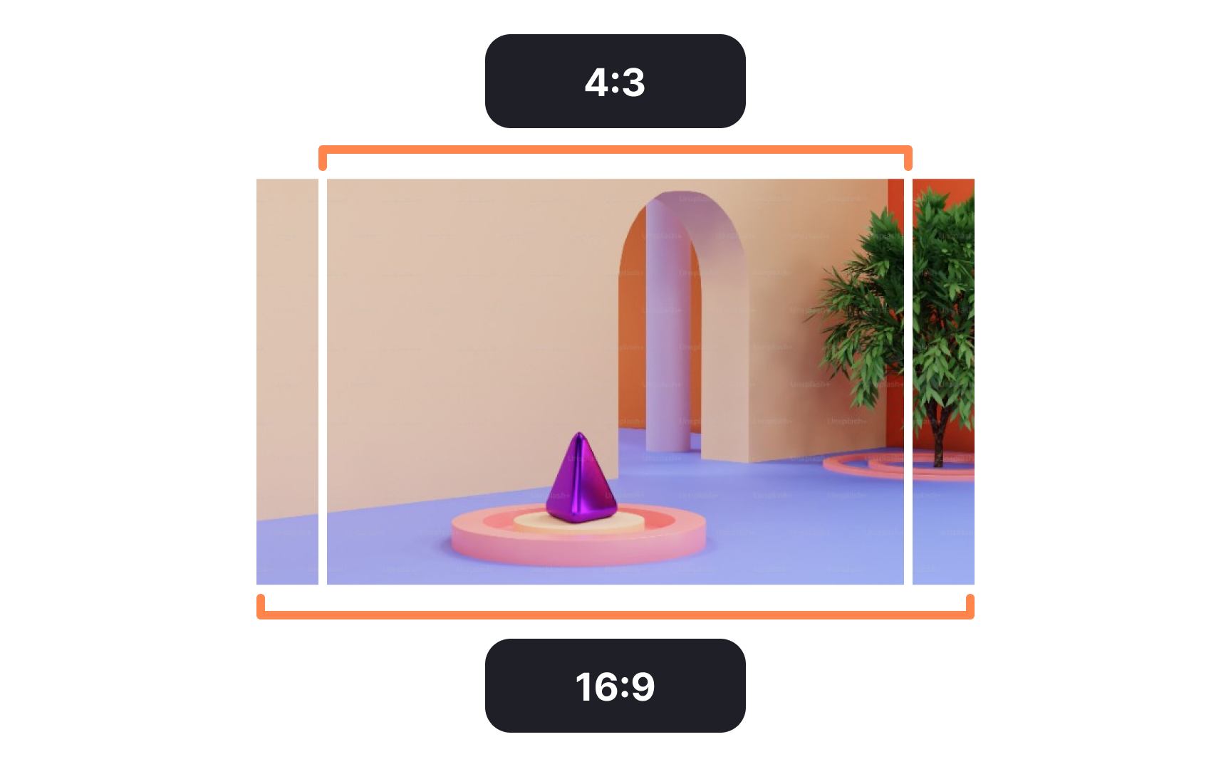
Aspect ratio is the proportion between the width and height dimensions of an element. This is particularly important with user-generated
The most common aspect ratios for images are 16:9 and 4:3, although 1:1 square images have grown in popularity thanks to sites like Instagram.
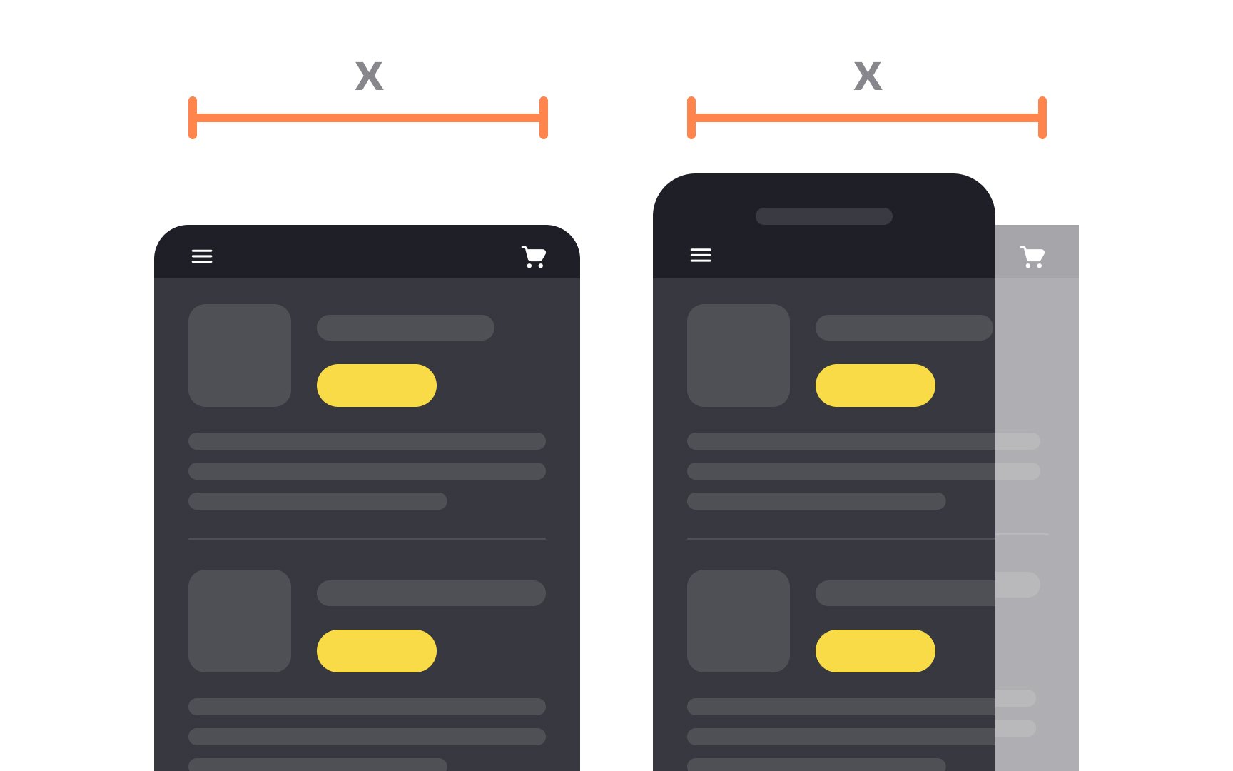
Fixed
They often cause usability issues because:
- Users on smaller screens may need to scroll horizontally.
- Users on larger screens may see large empty spaces on the sides.[2]
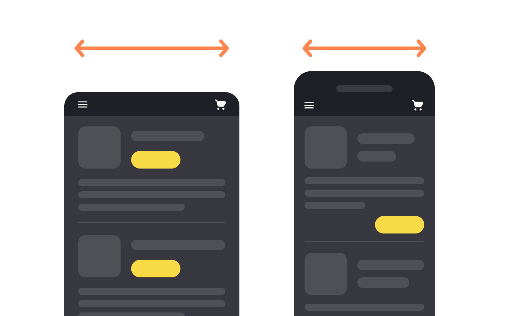
Fluid or liquid layouts naturally shrink or stretch as the browser resizes. Regardless of whether the width is assigned or not, the
With fluid layouts, users are more likely to see all available
The best practices for creating fluid layouts include:
- Using percentage or relative units instead of
pixels to adjust elements more flexibly - Setting minimum and maximum widths to prevent undesired layout changes
- Using SVG images that scale smoothly without quality loss[3]


Similar lessons

Intro to Design Grids

Intro to Design Composition
