Footers
Footers are interface sections at the bottom of pages that provide navigation, legal information, and contextual links to support usability and brand consistency.

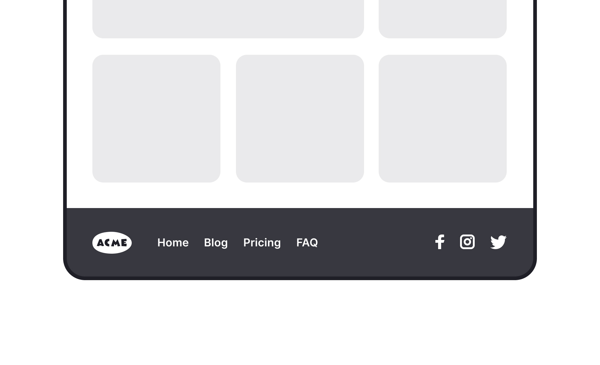
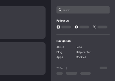
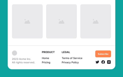
A footer is the section of a website or application interface that appears at the bottom of the screen or page. While often overlooked, footers play an important role in structuring navigation, reinforcing brand identity, and delivering essential information such as legal disclaimers, copyright notices, or contact details. In digital products, they serve as anchors, offering predictable access to links that support but do not distract from primary content.
For UX designers, footers are an opportunity to improve usability by providing quick access to frequently needed secondary content. These may include links to help centers, FAQs, careers pages, or privacy policies. Since footers are consistent across multiple pages, they create familiarity and save users time by offering a stable reference point. Poorly structured footers, by contrast, lead to confusion and force users to search for basic information that should be easily accessible.
Accessibility is essential in footer design. Content must be legible, with sufficient contrast and spacing, and links should be easy to navigate using keyboards or screen readers. Cluttered or overstuffed footers can overwhelm users, while sparse footers may omit necessary context. Striking the right balance ensures that footers serve their purpose for all audiences, including those relying on assistive technologies.
Real-world examples highlight how footers vary by product type. E-commerce sites often include quick links to shipping policies, returns, and customer service. SaaS platforms use footers to direct users to documentation, support communities, or pricing details. News and media sites may include editorial policies, contributor information, or subscription links. Each type of footer reflects the priorities of the product and the needs of its audience.
Footers also provide space for secondary engagement. Many companies include newsletter sign-up forms or social media links in their footers. While these do not drive primary user actions, they create opportunities for extended engagement without interfering with the main flow of the page.
Learn more about this in the Intro to Footers in UI Lesson, a part of the UI Components II Course.
Key Takeaways
- Footers appear at the bottom of interfaces, providing secondary navigation.
- Designers use them for usability, legal links, and brand consistency.
- Accessibility requires clarity, spacing, and screen reader support.
- Examples include e-commerce, SaaS, and media footers tailored to audience needs.
- Footers can support marketing via newsletter sign-ups and social links.
Footers provide consistency and access to secondary but essential content. While many users interact primarily with top navigation, the footer acts as a safety net for those who scroll to the end of a page looking for information. Links to contact, careers, or policies are traditionally expected in footers, and their absence can frustrate users.
By offering predictable access to this content, footers improve overall usability. They ensure that every page includes a reliable anchor for users seeking context, policies, or next steps.
Accessibility in footers involves clear text labels, sufficient color contrast, and logical grouping of links. Links must be accessible via keyboard navigation, and semantic HTML tags (such as <footer>) ensure that screen readers identify the section correctly. Overly dense footers can overwhelm users, so organizing content into categories helps maintain clarity.
When footers are designed inclusively, they serve all users equally well. They provide a straightforward, reliable way to access secondary content without barriers.
Different industries prioritize different footer content. An e-commerce site emphasizes shipping, returns, and account links. A SaaS platform focuses on documentation, pricing, and technical support. Media outlets often highlight editorial standards, subscription options, and contributor links.
By aligning footer design with audience needs, companies make sure that this consistent section supports their specific goals. While the structure may vary, the principle remains the same: footers house important secondary content that users expect to find at the bottom of every page.
Recommended resources
Courses

UX Design Foundations

UI Components I

Design Terminology
Lessons

Intro to Footers in UI

Best Practices for Designing Footers

Types of Navigation Systems
Exercises
Projects

Footer Design for SyncR


