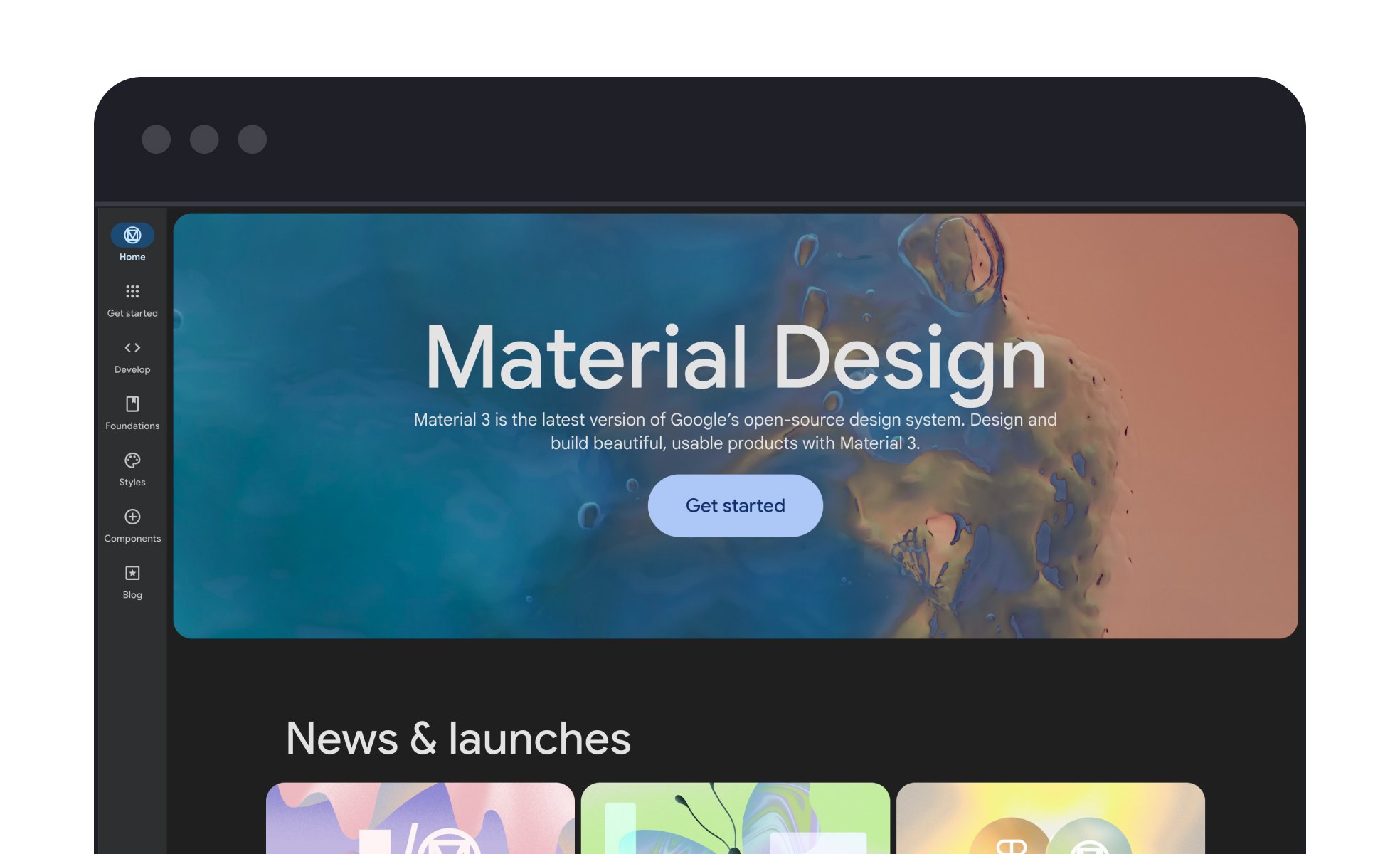
Material Design
Material Design is Google’s design system that combines visual, motion, and interaction principles to create consistent and intuitive digital experiences.


TL;DR
- Google’s design framework for digital products.
- Provides rules for layout, color, and components.
- Ensures consistency across devices and platforms.
- Shapes interaction with clear hierarchy and motion.
Definition
Material Design is a design system developed by Google that defines guidelines for visual styles, components, motion, and interactions to create unified and user-friendly digital experiences.
Detailed Overview
Material Design was introduced by Google in 2014 as a comprehensive design system aimed at standardizing experiences across Android, web, and other digital platforms. Its core philosophy draws inspiration from physical materials, using concepts like layering, shadows, and motion to create interfaces that feel tangible and intuitive.
A frequent question is why Material Design is so widely adopted. The answer lies in its clarity and depth. By offering a full set of rules for typography, spacing, color systems, and component behavior, it gives teams a ready-made framework for building consistent products. This helps organizations reduce design fragmentation while accelerating development cycles.
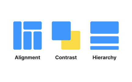
Another question concerns how Material Design influences hierarchy. Through consistent use of elevation, shadows, and color contrasts, it directs attention to primary actions while reducing noise from secondary ones. Motion principles reinforce this by smoothly guiding users between states, making interactions feel natural and predictable.
Many product teams ask how Material Design impacts developers. Google provides libraries, components, and open-source resources that make implementation straightforward. Developers can use prebuilt Material components to ensure alignment with guidelines, reducing the need for extensive custom code while preserving visual consistency.
Accessibility is often discussed in the context of Material Design. The system includes built-in rules for color contrast, touch target sizes, and typography scales, ensuring that products meet usability standards across diverse audiences. By embedding accessibility into the framework, it lowers barriers for inclusive design practices.
Finally, questions often arise about flexibility. While Material Design provides comprehensive rules, it is not intended to suppress creativity. Many brands use the system as a foundation, customizing components, colors, and motion to reflect their own identity while maintaining usability. This balance of structure and flexibility has made it one of the most enduring design systems in digital product development.
Google created Material Design to unify experiences across its products and the broader Android ecosystem. Before its introduction, many apps looked inconsistent, making navigation harder for users.
The framework solved this by providing a clear set of guidelines for typography, color, layout, and interaction, ensuring products felt coherent across platforms.
Motion is not just decorative in Material Design; it explains transitions and builds continuity. For example, buttons expand into new screens, helping users understand how interactions connect.
Smooth animations reduce confusion by showing cause-and-effect relationships. This use of motion makes digital environments feel more intuitive and grounded.
Accessibility is built into its rules. Guidelines for color contrast, text scaling, and touch-friendly controls ensure that products remain usable for people with varied abilities. By embedding these principles, Material Design lowers the risk of exclusion.
This makes accessibility less of an afterthought and more of a natural part of design practice.
Yes. Material Design provides a foundation, but teams can adapt it to fit their brand identity. Colors, typography, and component shapes can be customized while keeping core usability intact.
This flexibility allows teams to benefit from a proven system without losing individuality.
Its popularity stems from accessibility, detailed documentation, and developer resources. Teams outside Google adopted it because it offered a complete framework for consistent design, reducing fragmentation and improving user experience.
As a result, Material Design became a standard reference point for design systems across industries.
Recommended resources
Courses

UX Design Foundations


Design Terminology


Common UX/UI Design Patterns & Flows
Lessons


Projects

Onboarding flow of Coinzo | Crypto Wallet Mobile App


Flame - Mobile Web - Signup/Login


Website + Lead-Gen System