Device
A device is any hardware used to interact with digital products, including smartphones, laptops, wearables, and specialized tools like smart TVs or VR headsets.


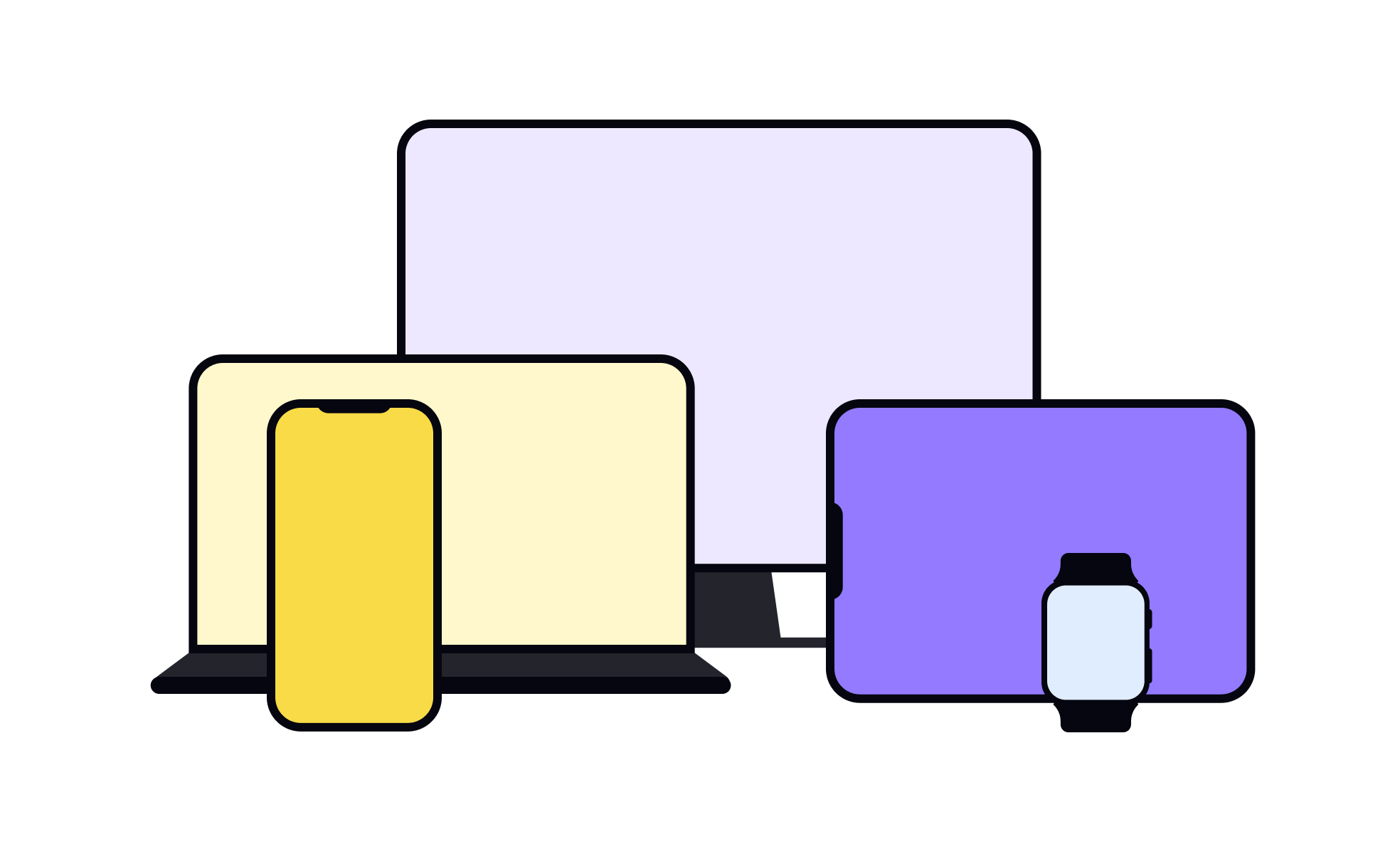
In design and product development, a device refers to the hardware through which users access and interact with a product. Smartphones, desktops, laptops, and tablets are the most common examples, but devices now also include wearables, voice assistants, and augmented or virtual reality headsets. For UX and product teams, the type of device shapes every decision about layout, functionality, and performance.
Different devices introduce unique constraints and opportunities. Mobile screens limit available space, pushing designers to prioritize simplicity and efficiency. Desktop devices allow more complex layouts but must account for multitasking behaviors. Wearables often rely on glanceable information and quick interactions, while voice-enabled devices demand strong conversational design. Understanding these distinctions ensures that experiences are optimized for the context in which they are used.
Product managers consider devices when defining user segments, since preferences often differ by platform. A productivity app may find its strongest adoption on desktop, while a social platform thrives on mobile. Strategic planning includes allocating resources to prioritize which devices deserve the most focus, balancing user expectations with development capacity.
Cross-device consistency is a central challenge. Users expect to begin a task on one device and complete it on another without disruption. Streaming services like Netflix and Spotify have set high standards for this seamless continuity, forcing other digital products to adopt similar expectations. This requires close collaboration between design, engineering, and product strategy to unify experiences across devices.
Testing across devices is equally critical. A flow that works smoothly on a desktop may become confusing on mobile or unusable on a smartwatch. Teams invest in responsive design, adaptive layouts, and device labs to validate user experiences. Accessibility also varies by device; small screens or voice-only interactions demand inclusive thinking so all users can engage comfortably.
Learn more about this in the Devices and Display Terminology Lesson, a part of the Design Terminology Course.
Key Takeaways
- Devices shape how users interact with products.
- Mobile, desktop, wearables, and voice interfaces require distinct strategies.
- Cross-device consistency is vital for modern experiences.
- Product adoption often depends on device prioritization.
- Responsive and adaptive design ensure usability across contexts.
- Testing on multiple devices prevents critical usability gaps.
Device context shapes constraints, like screen size, input methods, and connectivity. Designing without considering these limits risks frustrating users and reducing engagement. For example, a desktop-heavy navigation structure may overwhelm a mobile user who only has a few seconds to complete a task.
Designers adapt layouts, interaction models, and information density to the specific device environment. This ensures usability, accessibility, and satisfaction remain high across all user touchpoints.
Product managers analyze user data, market trends, and competitive benchmarks to decide which devices deserve focus. If analytics show that 80% of users access a product via mobile, the roadmap may prioritize mobile-first updates while still maintaining a reliable desktop experience.
This prioritization is dynamic. Emerging devices like VR or wearables may represent new opportunities, and managers weigh these against existing investments. The balance between maintaining current platforms and exploring new ones is a core part of product strategy.
Designing for different devices significantly impacts the user experience. Each device has its unique characteristics and limitations that designers need to consider. Designing responsive or adaptive interfaces that can adapt and adjust to different screen sizes and orientations is important for ensuring usability and accessibility across devices.
Additionally, designing intuitive navigation, optimizing content layout, and considering touch interactions or keyboard inputs are essential to create a seamless and engaging user experience on different devices.
Recommended resources
Courses

UX Design Foundations


Design Terminology


Common Design Patterns
Lessons

Designing for Mobile Interfaces

Devices and Display Terminology

Designing for Tablets
Exercises
Projects

Push Notification Design for E-Commerce Platform


Signup form for a Plant App


Flame - Mobile Web - Signup/Login