Devices and Display Terminology
Decode the terminology you'll encounter when designing for different devices and screens
The devices people use to access websites, apps, and other digital products are an important aspect of designing great user experiences. Understanding how each one creates a different kind of interaction for users allows designers to create optimal UIs.
The first step in understanding devices is to understand the terminology that surrounds them. What is a device, anyway? And what about all of the terms surrounding the different kinds of design? Mobile, adaptive, responsive — what's the difference? This knowledge can help you create the best possible experience for all users, regardless of how they're accessing a product.
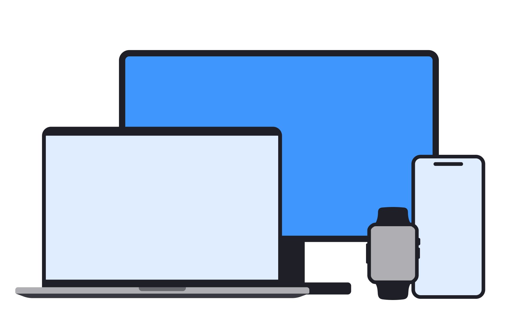
In the design context, devices are the equipment you use to access a digital product. Examples include smartphones, desktops, tablets, laptops, smartwatches, and even things like smart fridges or other smart home gadgets. Each device has a different screen size and way of being used, which is important to think about when making a digital product easy to use and look good on all these different tools.
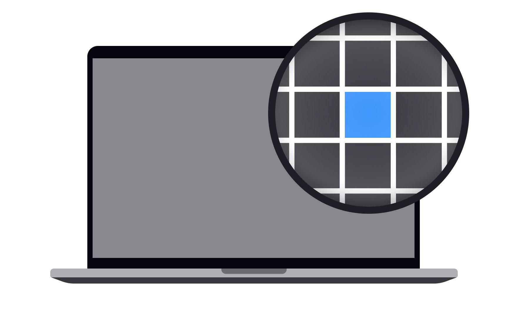
A pixel is the smallest unit of a digital image. It's like a tiny dot on a screen, and when many of these dots come together, they create the images, text, and everything else you see on your devices.
The more pixels you have, the clearer and more detailed the picture will be. Low pixel density results in blurry and less sharp images, creating a "pixelated" image in extreme cases.
A software pixel (also called a CSS pixel) is a unit of measurement. The device manufacturer determines how many hardware pixels equals one software pixel, a concept known as the device pixel ratio. So, if a device has a high-resolution screen, it might have several physical pixels for every one CSS pixel.
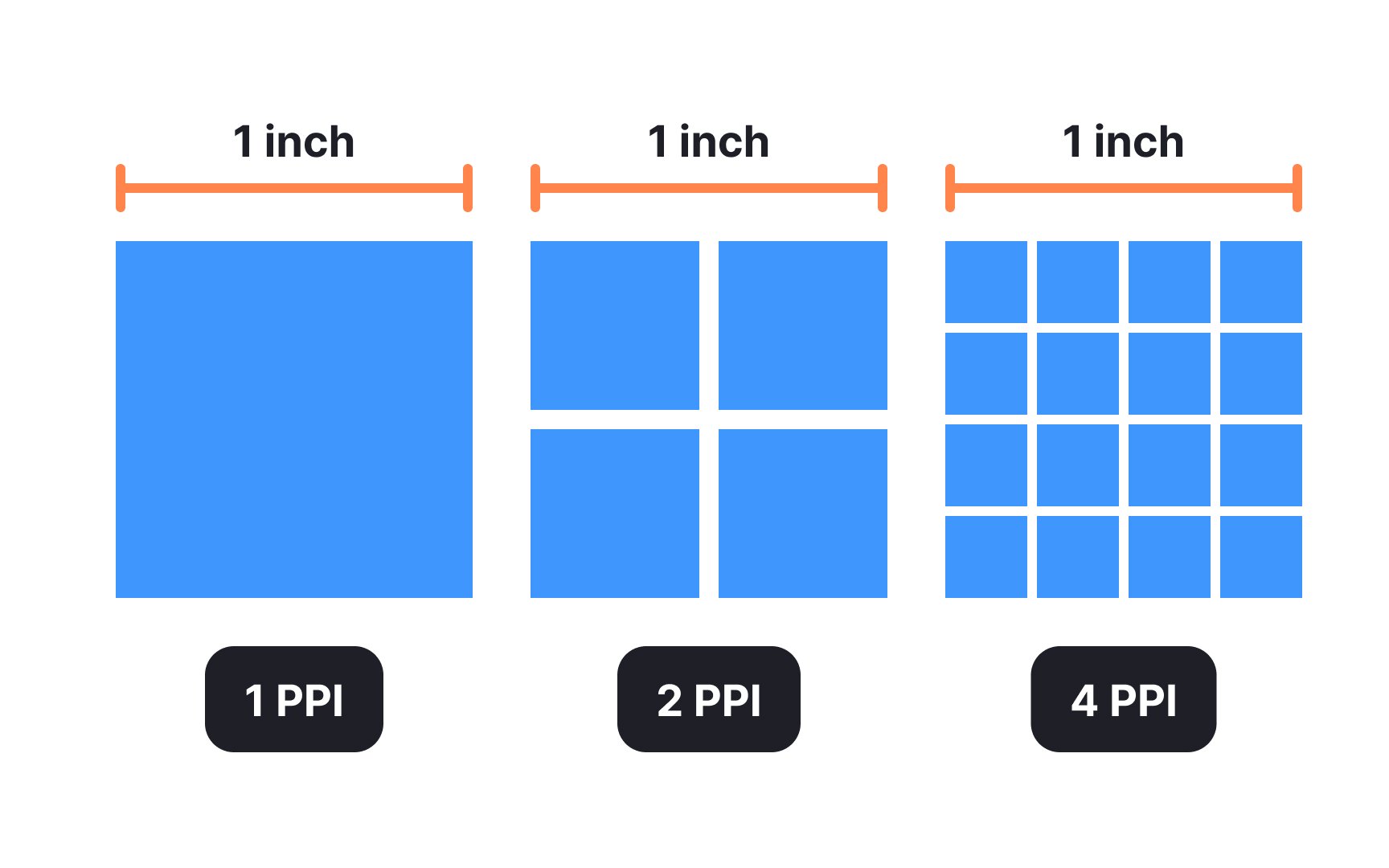
PPI refers to the pixel density of an electronic
Most modern digital displays have a PPI of 300 or higher. You can calculate the number of pixels per inch yourself using the online PPI Calculator.[1]
Understanding screen density and ratio is essential for designers to deliver enjoyable user experiences across devices.
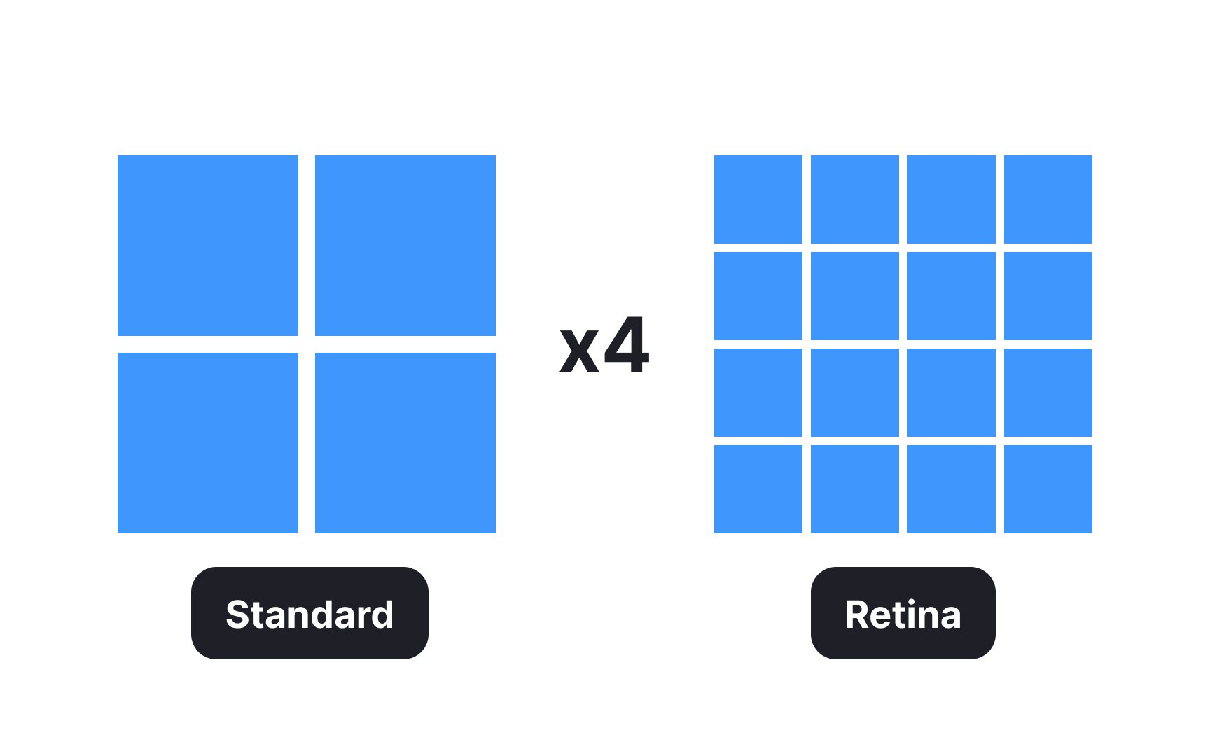
Retina displays are high-resolution displays with a pixel density higher than the human eye can detect. Generally, their resolution is at least 300
Retina displays create a highly realistic
Mobile design involves designing for hand-held and wearable devices with touch interfaces: smartphones,
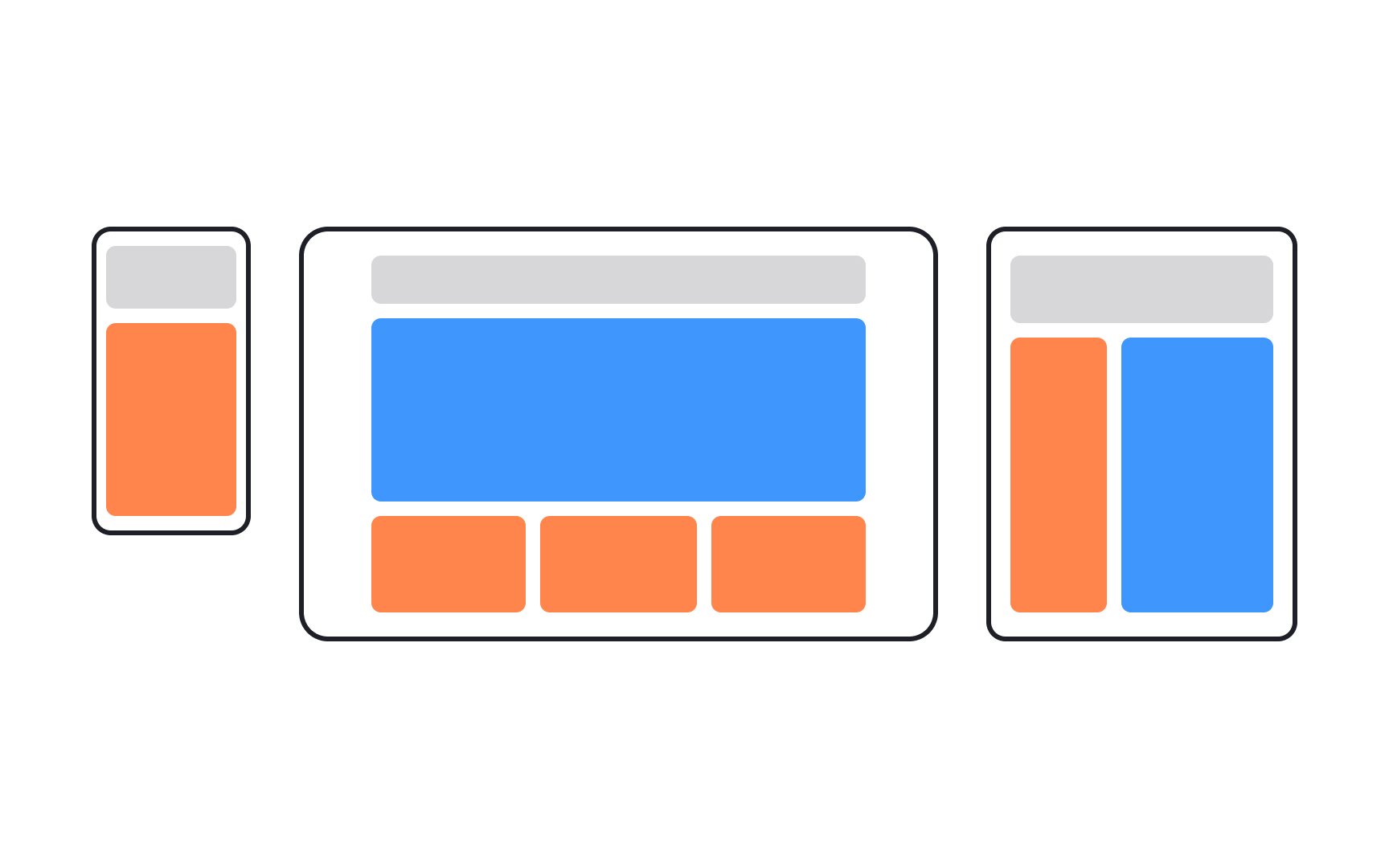
Adaptive design is a web design approach that involves creating multiple versions of a website, each tailored to specific device types or screen sizes. When a user accesses a website, the server detects the device's characteristics and serves the corresponding version of the site. This ensures a tailored and optimized user experience.
Adaptive design usually handles the 6 most common screen widths: 320px, 480px, 760px, 960px, 1200px, or 1600px.
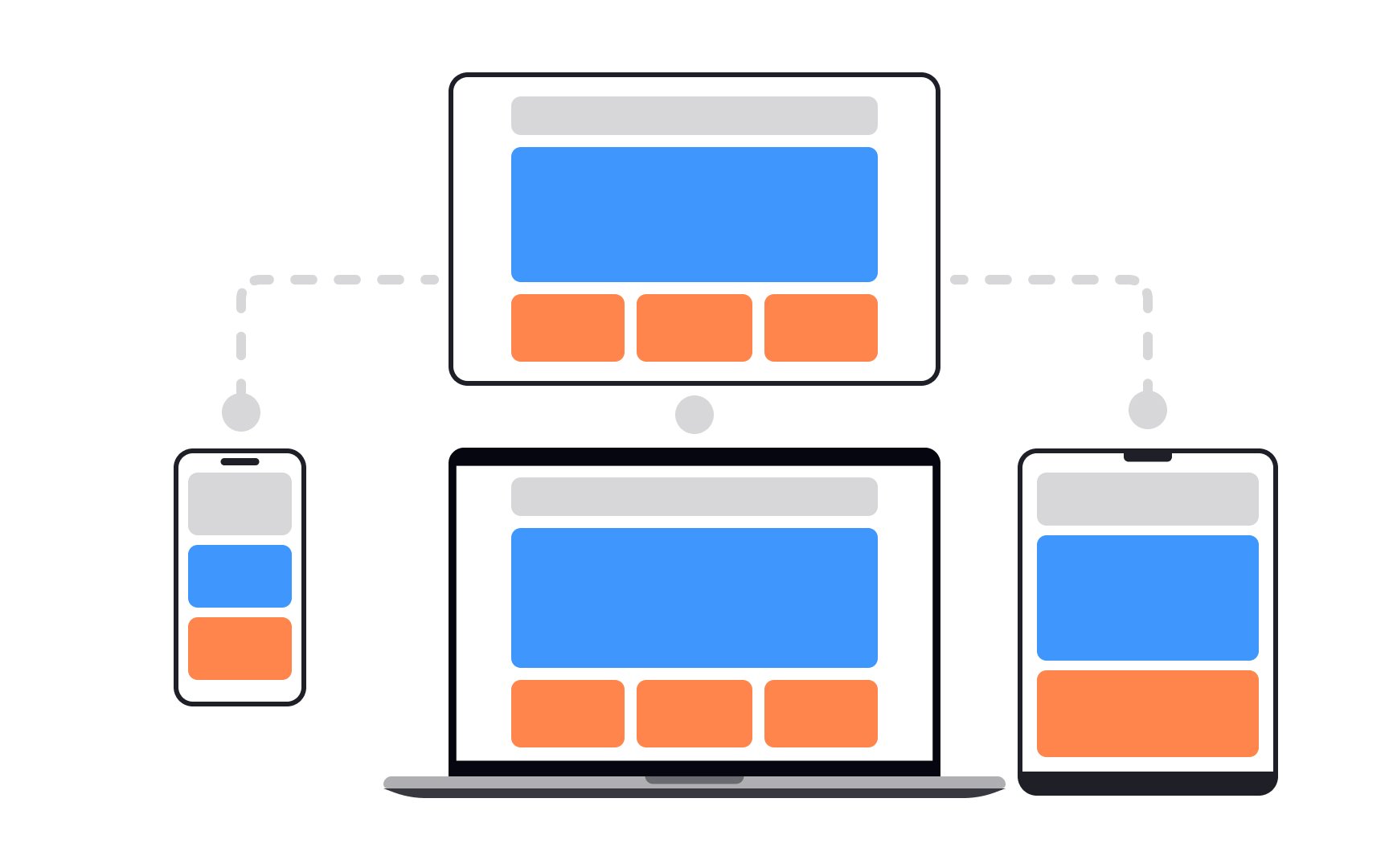
Responsive design uses
Responsive design is used to create mobile-friendly websites that look good on various devices. While it doesn't offer tailor-made solutions like
References
- Pixels Per Inch PPI Calculator | CalculatorSoup
- Responsive Web Design | A List Apart
Top contributors


Topics
From Course

Share


Similar lessons

Common Designer Roles

Technical UI Terms
