<?xml version="1.0" encoding="utf-8"?>

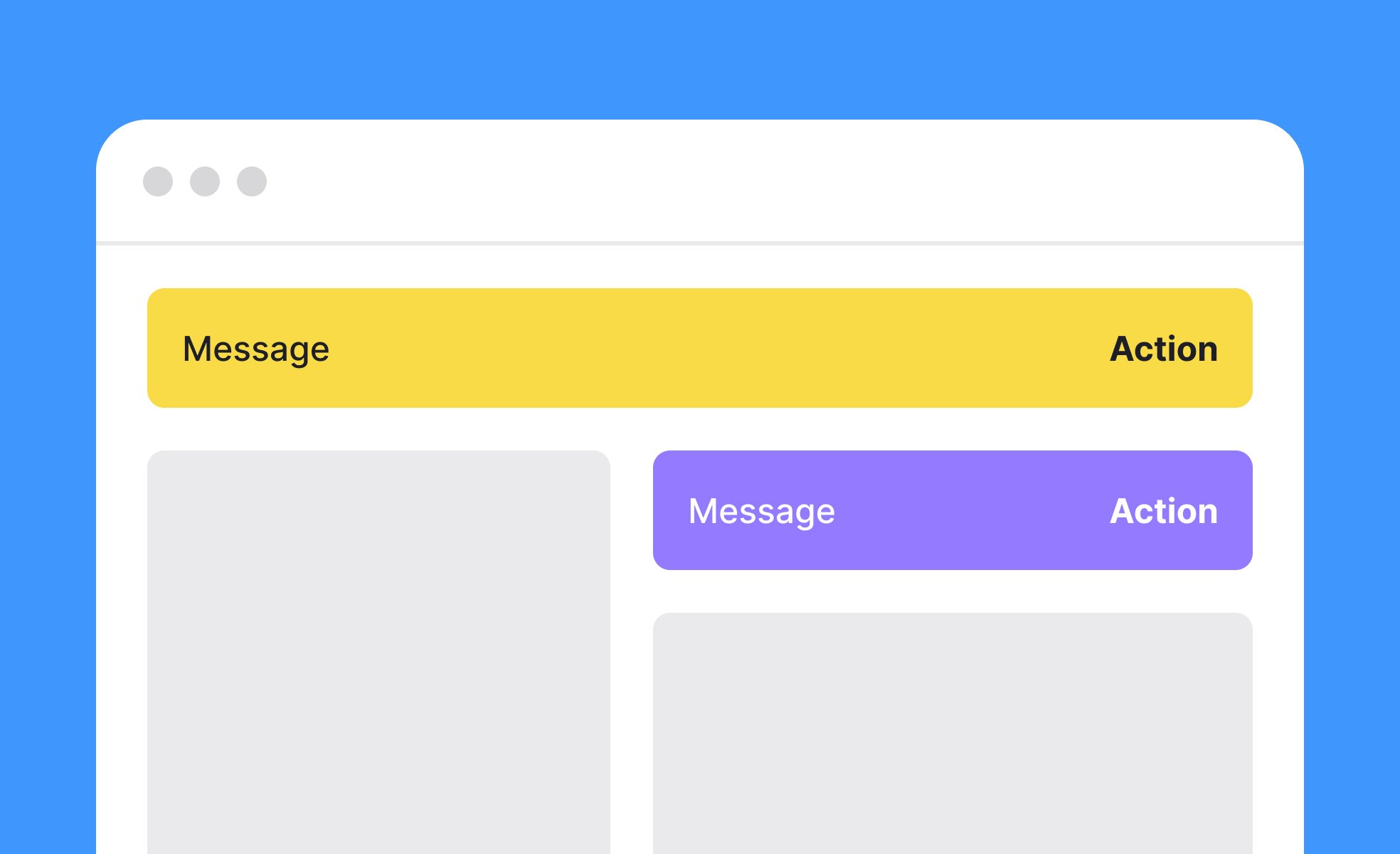
Banners are a common design element in digital products, appearing as horizontal or vertical sections that display important messages. They often sit at the top or bottom of an interface, but they can also appear inline, depending on context. Their purpose is to grab attention and communicate something users need to know without disrupting the overall flow.

In UX/UI design, banners are tools for communication and guidance. They might display a new feature announcement, provide system alerts, or offer promotional discounts. For example, an e-commerce site might use a top banner to highlight free shipping, while a financial app may display a banner warning about scheduled maintenance. These uses demonstrate how banners balance marketing and functional messaging

.

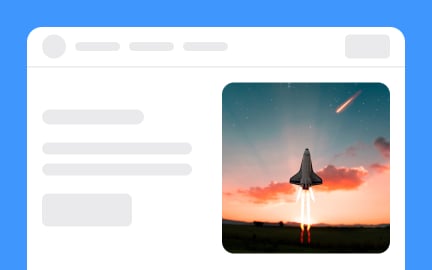
Real-world examples showcase their effectiveness. Spotify often uses banners to promote premium trials, while Google Workspace surfaces banners to alert users about new features or upcoming service changes. These examples illustrate how banners can drive adoption, boost engagement, and provide clarity when transitions or updates occur.

Designing banners requires thoughtful attention to clarity and hierarchy. They should communicate messages concisely while maintaining a visual style that fits the product’s identity. Color, typography, and placement are critical factors: too subtle and the banner is missed, too bold and it overwhelms the main content. For accessibility, banners should maintain strong contrast and avoid relying solely on color to signal importance.

Technically, banners may be persistent until dismissed, timed to disappear, or context-specific, depending on user interaction. Development teams need to ensure that banners adapt to different screen sizes and devices, from desktop layouts to mobile views. For instance, a responsive banner should resize gracefully without covering essential functions.

A common challenge with banners is overuse. Too many banners, or ones that appear repeatedly, can cause "banner blindness," where users begin to ignore them altogether.

Learn more about this in the Ad banner Exercise, from the Design in Marketing Lesson, a part of the Design Terminology Course.

Key Takeaways

  • Banners deliver important messages directly in digital products.
  • Effective for announcements, promotions, or alerts.
  • Require a balance between visibility and subtlety.
  • Must be responsive and accessible across devices.
  • Overuse can cause users to ignore them entirely.

Recommended resources

Courses

UX Design Foundations Course
Popular
Course

UX Design Foundations

Gene Kamenez
Gene Kamenez
Learn the essentials of UX design to build a strong foundation in core principles. Gain practical skills to support product development and create better user experiences.
Design Terminology Course
Course

Design Terminology

Alesya Dzenga
Alesya Dzenga
Learn UX terminology and key UX/UI terms that boost collaboration between designers, developers, and stakeholders for smoother, clearer communication.
UI Components I Course
Course

UI Components I

Colin Michael Pace
Colin Michael Pace
Learn to create user-friendly interfaces using core UI components, building a solid foundation for designing intuitive and efficient digital products.
Color Psychology Course
Course

Color Psychology

Cameron Chapman
Cameron Chapman
Learn how color influences perception, emotion, and behavior. Discover how to apply color psychology to design more impactful and engaging experiences.
Common Design Patterns Course
Course

Common Design Patterns

Gene Kamenez
Gene Kamenez
Learn design patterns most valued in product development to create intuitive, visually compelling experiences that seamlessly blend form and function.
Accessibility Foundations Course
Course

Accessibility Foundations

Ljubisa Kukulj
Ljubisa Kukulj
Learn the fundamentals of digital accessibility and how to create inclusive experiences for all users. Explore key principles, tools, and best practices.
Wireframing Course
Course

Wireframing

Colin Michael Pace
Colin Michael Pace
Learn to create effective wireframes that seamlessly integrate into your design workflows, improving communication and driving better design outcomes.
UI Components II Course
Course

UI Components II

Colin Michael Pace
Colin Michael Pace
Learn advanced techniques to design dynamic, scalable interfaces using optimized UI components and streamlined navigation for better user experiences.
Design Composition Course
Course

Design Composition

Gene Kamenez
Gene Kamenez
Learn the fundamental principles of visual layout, balance, and structure to create compelling and effective design compositions that engage and intrigue users.
Mobile Design Course
Course

Mobile Design

Denis Jeliazkov
Denis Jeliazkov
Learn mobile UI/UX patterns, workflows, and platform-specific strategies to create exceptional, user-friendly mobile experiences across different devices.
Typography Course
Course

Typography

Cameron Chapman
Cameron Chapman
Learn typography fundamentals, from typeface and font selection to layout and spatial arrangement, to create captivating designs that communicate powerfully.
UX Design Patterns with Checklist Design Course
Course

UX Design Patterns with Checklist Design

George Hatzis
George Hatzis
Learn common UX design patterns and how to apply them with practical checklists, ensuring the creation of intuitive, user-friendly, and exceptional interfaces.
HTML Foundations Course
Course

HTML Foundations

Yan Sokalau
Yan Sokalau
Learn the fundamentals of HTML, from basic formatting and structure to advanced elements and best practices, to create accessible and responsive web pages.
Enhancing UX Workflow with AI Course
Course

Enhancing UX Workflow with AI

Colin Michael Pace
Colin Michael Pace
Learn how to integrate AI into UX design to create smarter, more personalized user experiences. Explore tools, trends, and best practices in AI-driven design.
CSS Foundations Course
Course

CSS Foundations

Yan Sokalau
Yan Sokalau
Learn the basics of CSS, including the box model, element style, and content positioning, to improve communication, design handoff, and web decision-making.
Introduction to Figma Course
Course

Introduction to Figma

Gene Kamenez
Gene Kamenez
Learn essential Figma tools like layers, styling, typography, and images. Master the basics to create clean, user-friendly designs
3D Design Foundations Course
Course

3D Design Foundations

Learn essential 3D design principles, from spatial thinking and dimensional relationships to form, lighting, and texture, for a solid foundation in the field.
Information Architecture Course
Course

Information Architecture

Colin Michael Pace
Colin Michael Pace
Learn the basics of organizing, structuring, and labeling content to design clear, user-friendly information systems that enhance usability and navigation.
Apple Human Interface Guidelines Course
Course

Apple Human Interface Guidelines

Denis Jeliazkov
Denis Jeliazkov
Learn Apple’s Human Interface Guidelines to design modern, high-performing apps, focusing on UI principles and best practices for creating effective interfaces.
Introduction to Design Audits Course
Course

Introduction to Design Audits

Romina Kavcic
Romina Kavcic
Learn the art of systematic design evaluation to improve consistency, effectiveness, and create more user-centered products that meet user expectations.
Improve your UX & Product skills with interactive courses that actually work

FAQs

What makes a banner effective in UX design?

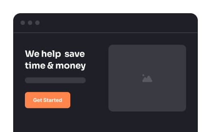
An effective banner communicates its message clearly and concisely, using visual hierarchy to capture attention without overwhelming the interface. The design should align with the product’s visual identity while maintaining accessibility standards. By focusing on clarity and timing, banners can inform users while keeping the experience smooth.

For example, a well-placed promotional banner can drive engagement without feeling intrusive if it is aligned with user needs and timed appropriately. The key is balancing attention-grabbing design with respect for the user’s workflow.


How can banners be used for product communication?

Banners are valuable because they reach users directly inside the product. Product teams use them for feature announcements, compliance updates, or time-sensitive promotions. This contextual delivery increases the chances that users will read and act on the information.

Unlike external channels, banners ensure visibility at the exact moment users interact with the product. For instance, a banner introducing a new dashboard feature inside a productivity app provides immediate awareness and encourages exploration.


What are common mistakes in using banners?

The most frequent mistake is overuse, which can cause users to ignore banners altogether. Repetitive or irrelevant banners clutter the interface and reduce trust in their importance. Another issue is poor placement, where banners block core functionality or create frustration.

To avoid these mistakes, teams should prioritize relevance, timing, and clarity. Each banner should serve a clear purpose, add value, and be tested across devices to ensure it supports rather than hinders the user experience.