Resizing
Resizing is the process of adjusting the dimensions of digital elements or layouts, ensuring adaptability across devices, screen sizes, and user preferences.

TL;DR
- Adjusts dimensions of elements or layouts.
- Supports responsive and adaptive design.
- Maintains usability across different screens.
- Impacts readability, accessibility, and visual balance.
Definition
Resizing refers to the modification of an element’s width, height, or scale in a design or interface, ensuring proper appearance and usability across varying devices, resolutions, and user contexts.
Detailed Overview
Resizing is one of the most important aspects of digital design and development. As users access products on devices ranging from large desktop monitors to small mobile screens, ensuring that content adapts without losing clarity or function is critical. Resizing handles this adaptation, maintaining balance, usability, and consistency across platforms.
A frequent question is why resizing is tied so closely to responsive design. Responsive design relies on elements that resize fluidly as screen dimensions change. Text blocks adjust line length, images scale proportionally, and grids adapt to maintain usability. Without resizing, users would face awkward scrollbars, distorted images, or unreadable content on smaller devices.
Another common query is how resizing affects text. Typography must adapt to maintain readability. Line length, font size, and spacing often scale according to device width. Designers use relative units like percentages or em in CSS to ensure text remains clear across contexts. Poorly implemented resizing can cause text to shrink too much on mobile or overflow on smaller viewports.
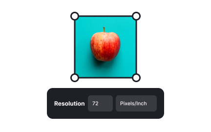
Teams also ask about images and media. Images that fail to resize proportionally may become distorted, cut off, or pixelated. Proper resizing involves maintaining aspect ratios, using responsive image formats, and sometimes serving different image versions depending on the device. This approach balances performance with clarity.
Another important aspect is accessibility. Resizing should accommodate user adjustments such as zooming or increasing font size without breaking layouts. Interfaces that fail to support flexible resizing can exclude users with low vision or those needing larger text.
Performance is also a key factor. Resizing large assets inefficiently can harm load times and responsiveness. For example, serving oversized images that are scaled down in the browser wastes bandwidth. Properly optimized resizing strategies reduce strain on both devices and networks, improving the user experience.
Learn more about this in the Auto Resizing of Frames Exercise, taken from the Frames in Figma Lesson, a part of the Introduction to Figma Course.
Resizing is central to responsive design because it allows elements to adapt fluidly to different screen sizes. Without it, layouts would break or require separate versions for every device.
By combining resizing rules with flexible grids and media queries, designers create experiences that work seamlessly across platforms.
If not handled carefully, resizing text can compromise readability. Text may become too small on mobile or overflow its container. Using relative units and scalable typography systems ensures clarity across contexts.
Testing with different devices and accessibility settings helps catch these issues before release.
Images should resize proportionally to preserve aspect ratios, and designers should use responsive image formats like srcset to serve appropriate sizes for different devices.
This prevents distortion while optimizing load speed, balancing visual quality with performance.
Resizing supports users who need larger fonts or zoomed layouts. If a design breaks when scaled, users with vision impairments are excluded. Designing with fluid layouts and testing zoom ensures inclusivity.
Accessibility laws and guidelines increasingly require proper support for resizing, making it both an ethical and legal consideration.
Design systems define resizing rules for components, such as minimum and maximum sizes or flexible grid behavior. This consistency ensures components adapt predictably across contexts.
By standardizing resizing behavior, design systems reduce fragmentation and speed up collaboration between teams.
Recommended resources
Courses

UX Design Foundations

UI Components I

Design Terminology
Lessons

Designing for Mobile Interfaces

Image Properties


