Responsive Grids
Responsive grids are flexible layout systems that adapt content to different screen sizes and devices, ensuring consistency, and usability across contexts.


TL;DR
- Flexible grid systems for adaptive layouts.
- Scale across mobile, tablet, and desktop screens.
- Maintain balance, hierarchy, and consistency.
- Core to responsive web and app design.
Definition
Responsive grids are layout frameworks that use flexible columns, rows, and spacing to adjust designs fluidly across screen sizes, supporting readability and usability on any device.
Detailed Overview
Responsive grids are the backbone of modern digital design. They provide a structural framework that allows content to adapt seamlessly to varying screen sizes, from large desktop monitors to compact mobile devices. By defining proportions instead of fixed measurements, responsive grids ensure that layouts remain consistent without forcing users to zoom, scroll awkwardly, or lose context.
A frequent question is why grids matter when flexible layouts exist. Grids introduce order and alignment, giving designers predictable anchors for organizing elements. Without them, layouts risk becoming inconsistent or chaotic as they scale. By using proportional columns, gutters, and margins, grids create visual rhythm that guides the eye and improves comprehension.
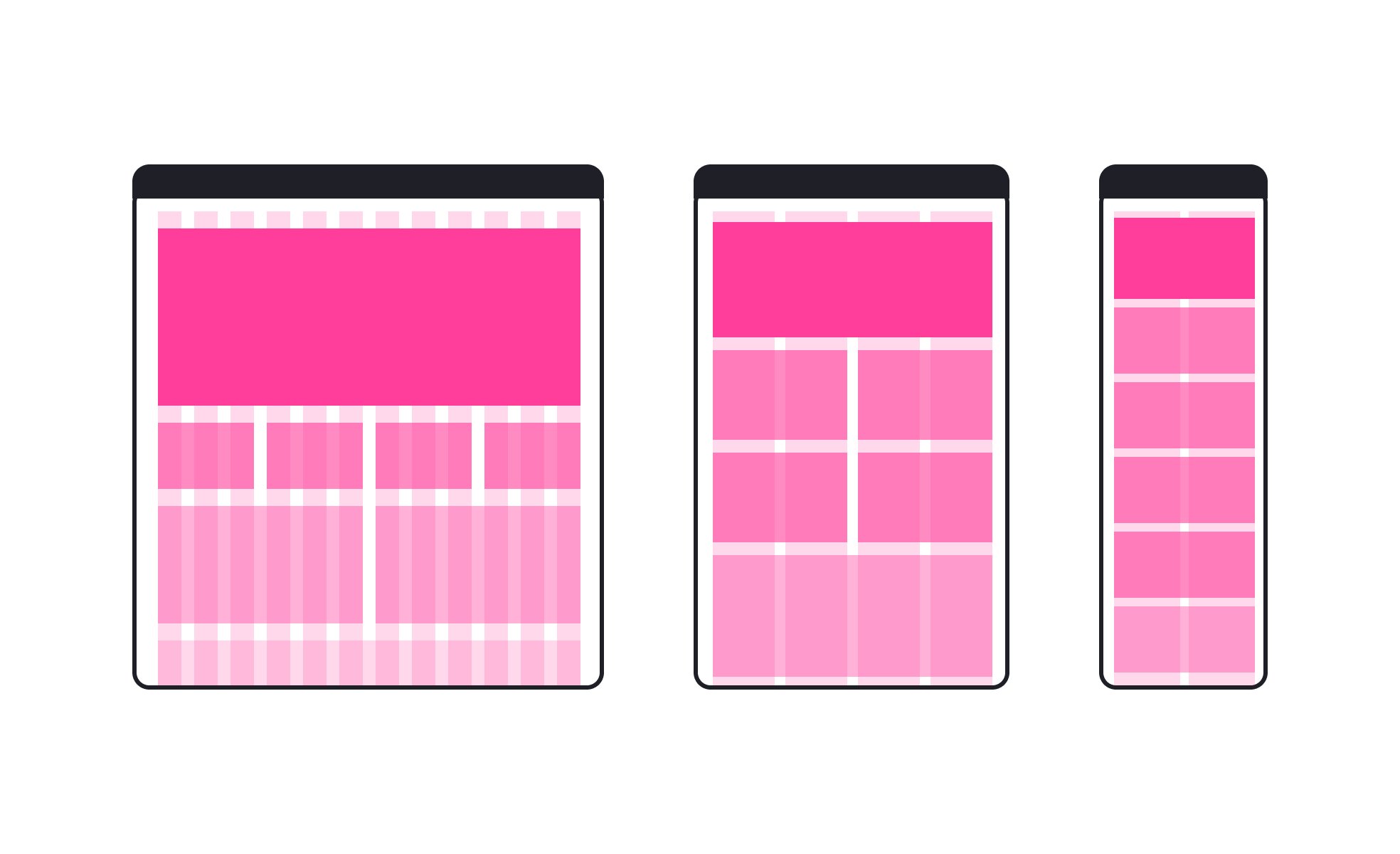
Another common query is how responsive grids differ from static grids. Static grids have fixed dimensions and only work well at specific screen sizes. Responsive grids, by contrast, are fluid and adapt automatically through percentages, flexible units, or breakpoints. For example, a three-column layout on desktop may collapse to a single column on mobile while still maintaining balance.
Teams also ask about implementation. Frameworks like Bootstrap and CSS Grid simplify responsive grid systems by offering pre-defined structures that adapt at set breakpoints. Designers working in tools like Figma or Sketch often use grid overlays to ensure consistency across screen sizes. This shared framework improves collaboration between design and development.
Another important aspect is hierarchy. Responsive grids do more than adjust widths; they preserve relationships between elements. Headings, images, and text scale proportionally while maintaining their relative importance. This ensures that meaning and usability remain intact regardless of device.
Performance is also a frequent topic. Properly implemented grids reduce the need for separate designs or excessive media queries, making code cleaner and more efficient. This speeds up development and reduces maintenance burdens while ensuring a consistent experience across contexts.
Learn more about this in the Responsive Grid Exercise, taken from the Intro to Design Grids Lesson, a part of the Introduction to Figma Course.
The purpose is to ensure layouts adapt to different screen sizes while maintaining order, hierarchy, and readability. Without a grid, content might appear inconsistent or disorganized.
Grids create predictable alignment, helping users navigate interfaces smoothly.
Static grids use fixed dimensions and work well only at specific screen sizes. Responsive grids use proportional units or breakpoints to adapt layouts across devices. For example, a multi-column layout on desktop may collapse to one column on mobile.
This flexibility ensures consistent usability without redesigning layouts for each device.
Frameworks like Bootstrap, Foundation, and CSS Grid provide built-in responsive grid structures. Design tools like Figma and Sketch allow designers to overlay grids, ensuring alignment before handoff to development.
These tools align design and code, reducing inconsistencies and speeding up workflows.
Grids provide predictable structure and flow, making content easier to navigate for users relying on assistive technologies. Consistent spacing and alignment improve readability and scanning.
By ensuring that elements adapt without breaking, grids create inclusive experiences across devices.
Responsive grids streamline code by reducing the need for device-specific layouts. Cleaner structure lowers maintenance costs and speeds up development.
They also reduce redundancy by providing a single adaptable framework instead of multiple fixed layouts.
Recommended resources
Courses

UX Design Foundations


Core UI Components


Design Terminology

Lessons

Intro to Design Grids

Applying Composition Grids in Design

Layout Grids

Projects

Responsive Landing Page - petcare clinic


SunTrips - Website Redesign