Device Exercises
Explore hands-on “Device” exercises to sharpen your skills and level up your craft. Want more? Browse all search results
Exercise
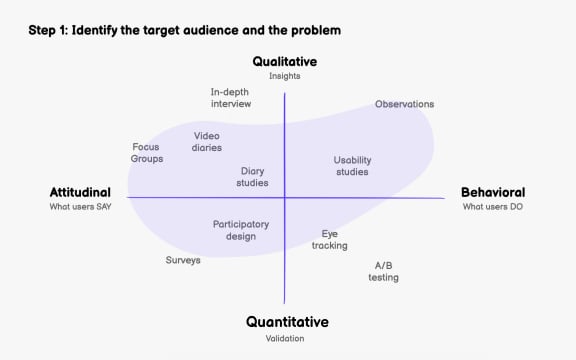
Step 1: Identify the target audience and the problem
Exercise
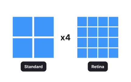
Retina
Exercise
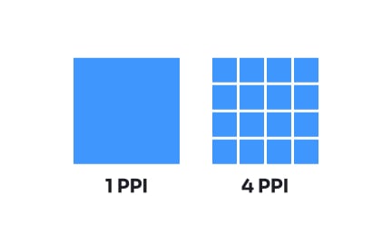
Pixel density
Exercise
Fullscreen mobile modal
Exercise
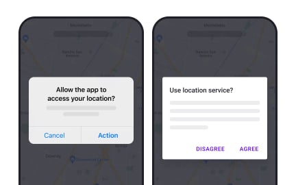
iOS vs. Android modals
Exercise
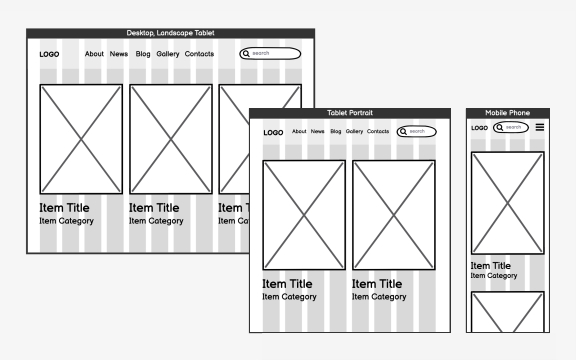
Choose the grid
Exercise
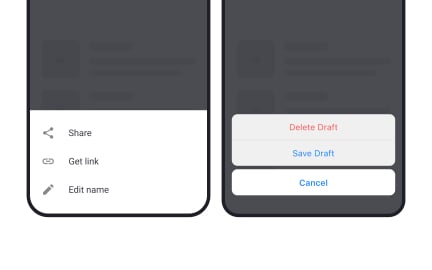
iOS vs. Android bottom sheets
Exercise
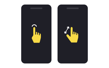
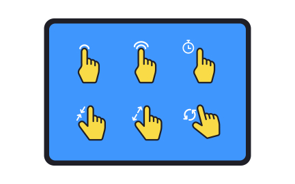
Gestures
Exercise
Mobile use vs desktop use
Exercise
Identify content zones
Exercise
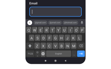
Keyboard types
Exercise
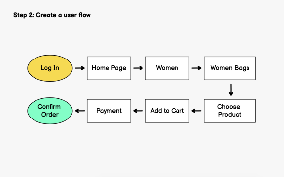
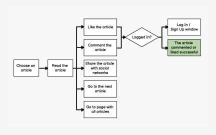
Step 2: Create a user flow
Exercise
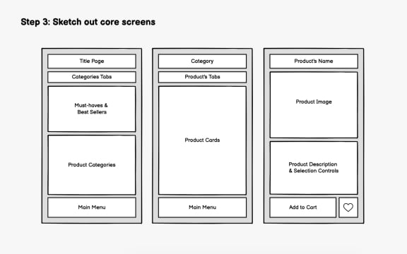
Step 3: Sketch out core screens
Exercise
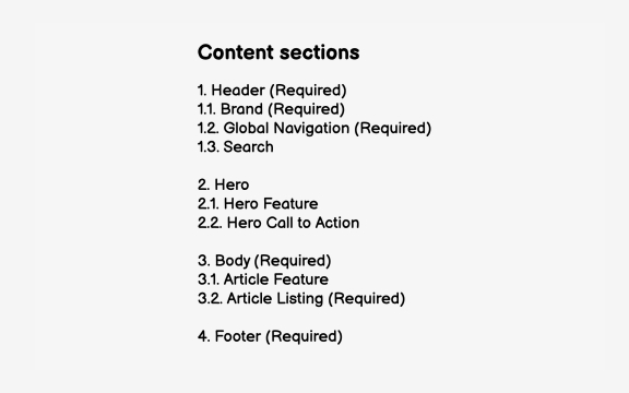
Identify your content
Exercise
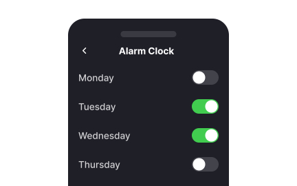
Mobile toggle switch alignment
Exercise
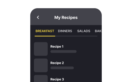
Scrollable tabs

Exercise
Fullscreen desktop modal
Exercise
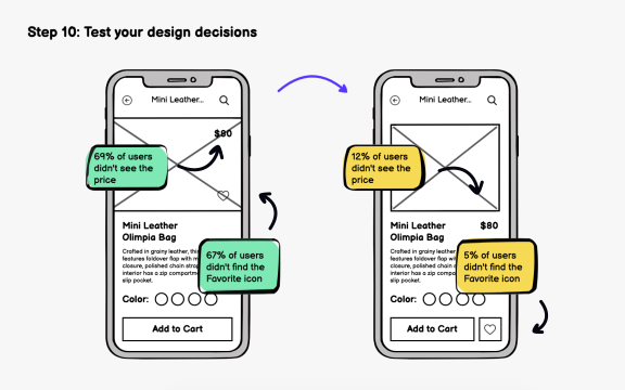
Step 10: Test your design decisions
Exercise
Define user flows
Exercise
Wireframe only key screens
Exercise
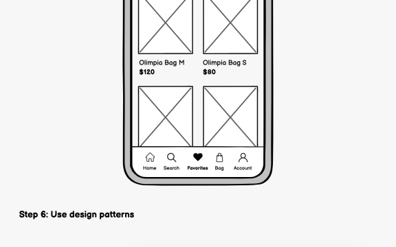
Step 6: Use design patterns
Exercise
Decide on your target screens & layouts
Exercise
Typing inputs
Exercise
Add content and UI elements
Exercise
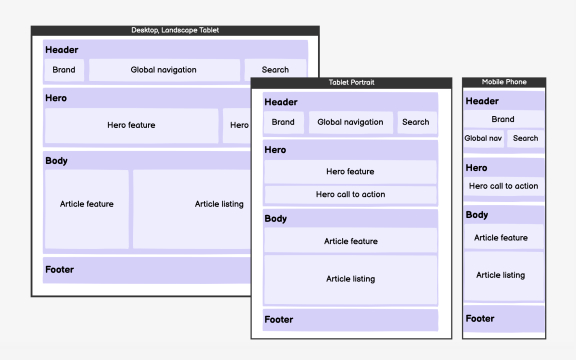
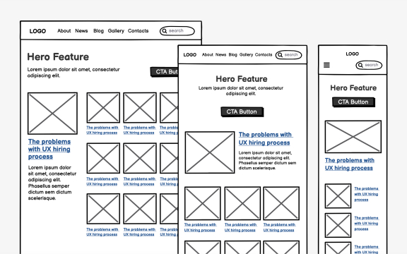
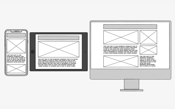
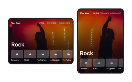
What is responsive design

Exercise
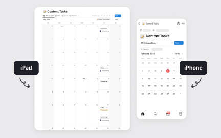
Types of mobile devices
Exercise
Orientations
Exercise
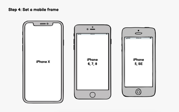
Step 4: Set up a mobile frame
Exercise
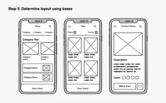
Step 5: Determine layout using boxes
Exercise
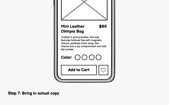
Step 7: Bring in actual copy

Exercise
Pixel
Exercise
Leverage multi-tasking features
Exercise
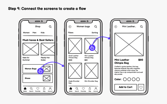
Step 9: Connect the screens to create a flow
Exercise
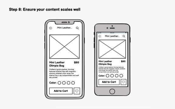
Step 8: Ensure your content scales well
Exercise
Gestures
Exercise
Keep navigation consistent

Exercise
Device
Exercise
Tablet-specific app versions
Exercise
Take advantage of larger screens
Exercise
Share your wireframes with the team and clients

Exercise
Device orientation
Exercise
Tablet usage
Exercise
What is a mobile device
Exercise