Take advantage of larger screens
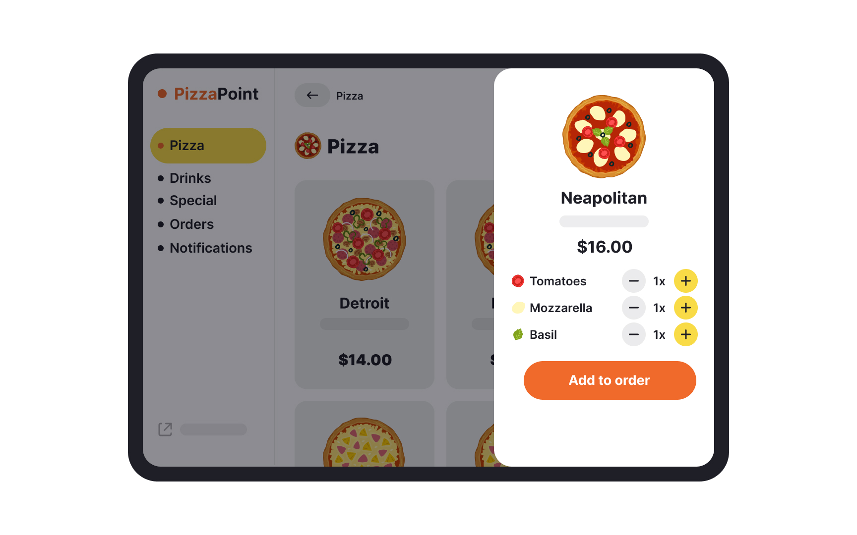
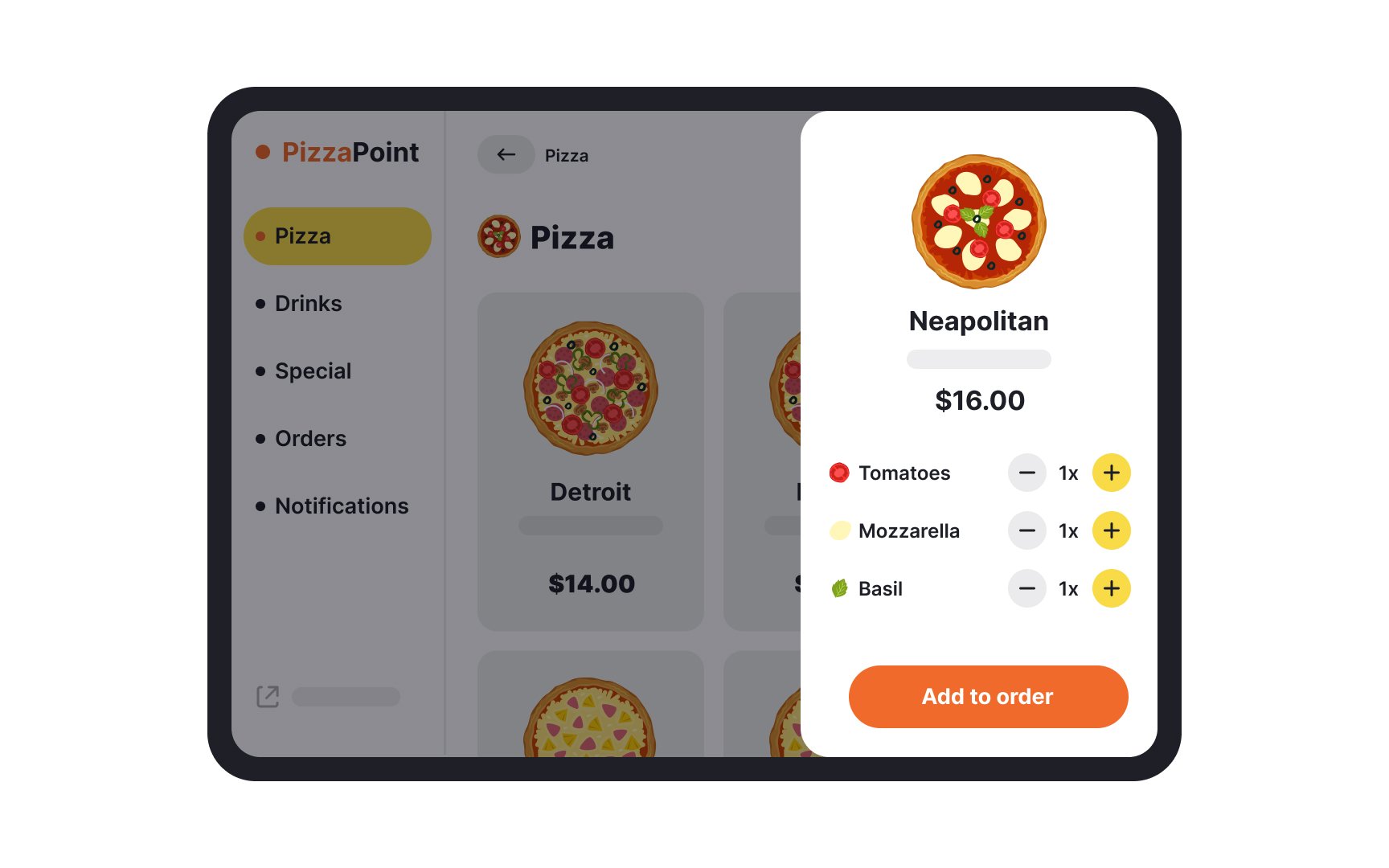
Tablets come in many sizes today, with some as large as laptop screens. It is this screen size that makes so many of the same functions that can be performed on mobile phones much more convenient on tablets.
When designing for tablets, use the screen size to your advantage:
- Since users often hold tablets with both hands and use their thumbs for interaction, placing primary and secondary content within easy reach is important.
- Designing interfaces that work well in both landscape and portrait orientations ensures a consistent user experience, regardless of how the device is held.
- Implementing scalable typography and high-quality graphics ensures readability and visual appeal across various screen sizes and resolutions.
- Employing the right touch target size for interactive elements. The Nielsen Norman Group recommends a minimum of least 1x1cm(approximately 38px) for a tap target, irrespective of device size.[1]
- Providing adequate spacing between interactive elements helps prevent accidental taps.
- Display information without overcrowding the screen to prevent overwhelming users and maintain clarity.
