Designing for Tablets
Discover the best practices to follow when designing apps for tablets
Tablet design occupies a unique space between mobile and desktop interfaces, demanding thoughtful consideration of touch targets, screen orientations, and user behavior patterns. These hybrid devices transform from productivity tools to entertainment platforms, requiring interfaces that adapt seamlessly across contexts. The larger screen real estate opens possibilities for enhanced content display and multi-touch gestures, while touch interaction patterns establish core principles for navigation and input methods.
Optimal tablet interfaces leverage visual hierarchies and spatial layouts that accommodate both portrait and landscape orientations, considering thumb zones and natural hand positioning. The rise of tablet-first experiences in education, creative work, and enterprise solutions highlights the growing importance of dedicated tablet design strategies. Critical aspects like split-screen multitasking, stylus input support, and adaptive layouts shape the foundation of effective tablet interfaces, elevating them beyond scaled-up mobile designs. By incorporating tablet-specific interaction patterns and environmental considerations, interfaces can deliver sophisticated experiences that harness the full potential of these versatile devices.
In professional settings, tablets are typically placed on stands or flat surfaces, allowing for precise
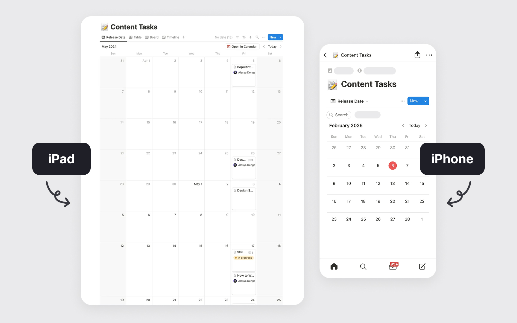
Tablet users also switch between touch, keyboard, and stylus input methods depending on the task. This flexibility requires interfaces that support all input methods seamlessly without forcing users to adjust settings. Features like Apple’s Handoff and Android’s shared clipboards enable smooth transitions between phones, tablets, and laptops, making it easy for users to continue tasks across devices.
When designing for tablets, use the screen size to your advantage:
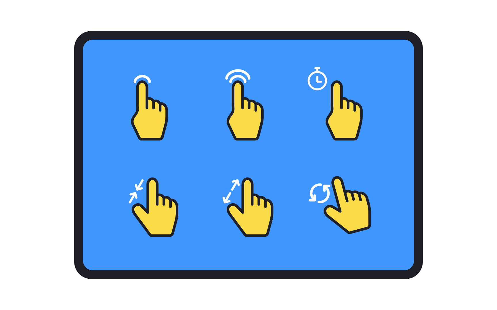
- Since users often hold tablets with both hands and use their thumbs for
interaction , placing primary and secondarycontent within easy reach is important. - Designing interfaces that work well in both landscape and portrait orientations ensures a consistent user experience, regardless of how the device is held.
- Implementing scalable typography and high-quality graphics ensures readability and visual appeal across various screen sizes and resolutions.
- Employing the right touch target size for interactive elements. The Nielsen Norman Group recommends a minimum of least 1x1cm(approximately 38px) for a tap target, irrespective of device size.[1]
- Providing adequate spacing between interactive elements helps prevent accidental taps.
- Display information without overcrowding the screen to prevent overwhelming users and maintain clarity.
In a world that is digitizing at an exponential speed,
When designing for
Pro Tip: Avoid assigning different meanings to gestures in different parts of your app. For example, do not use the drag gesture to move an object on one page and to reveal a navigation menu on another page.
Every app has a default orientation. Usually, apps designed for Apple's iPad devices tend to have landscape orientation as the default, while
Identify the orientation in which your app is intended to be used — i.e., the default state — by your target audience by keeping your app goals and the target device’s OS in mind. From there, build on the design for the opposite orientation. For example, if your app is best suited for viewing in portrait mode, try to replicate the
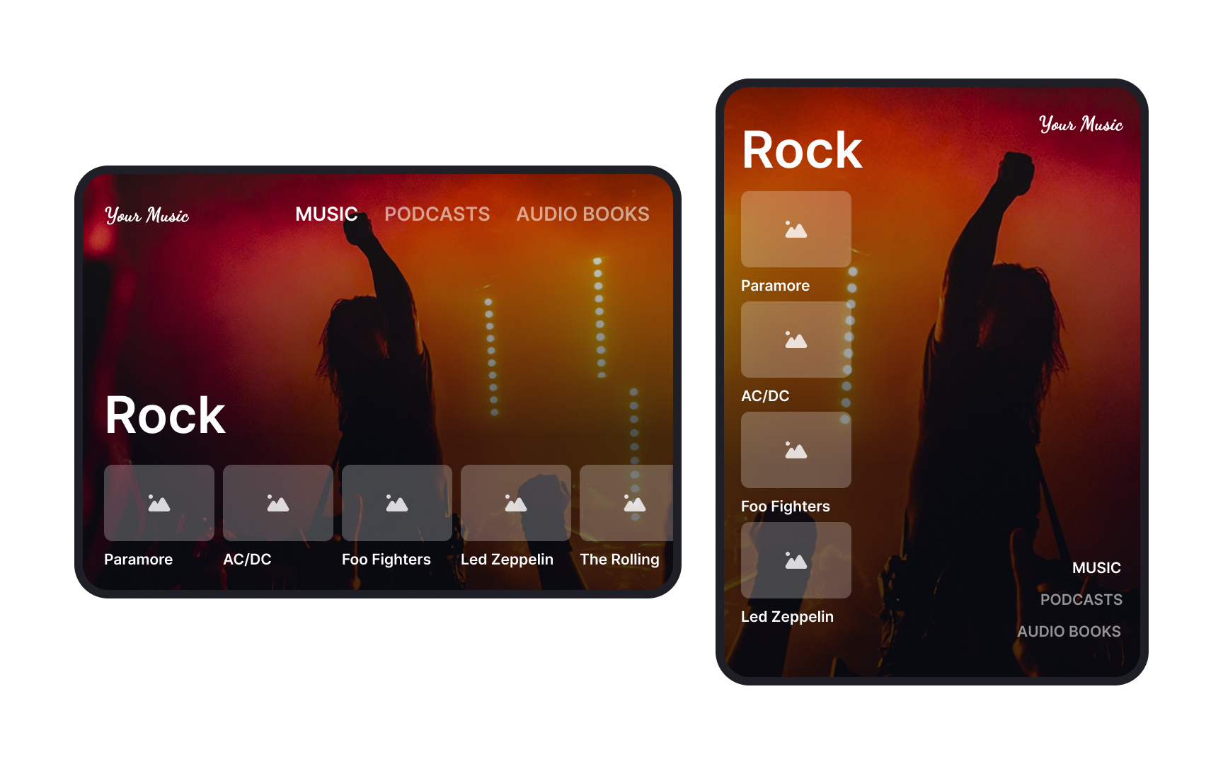
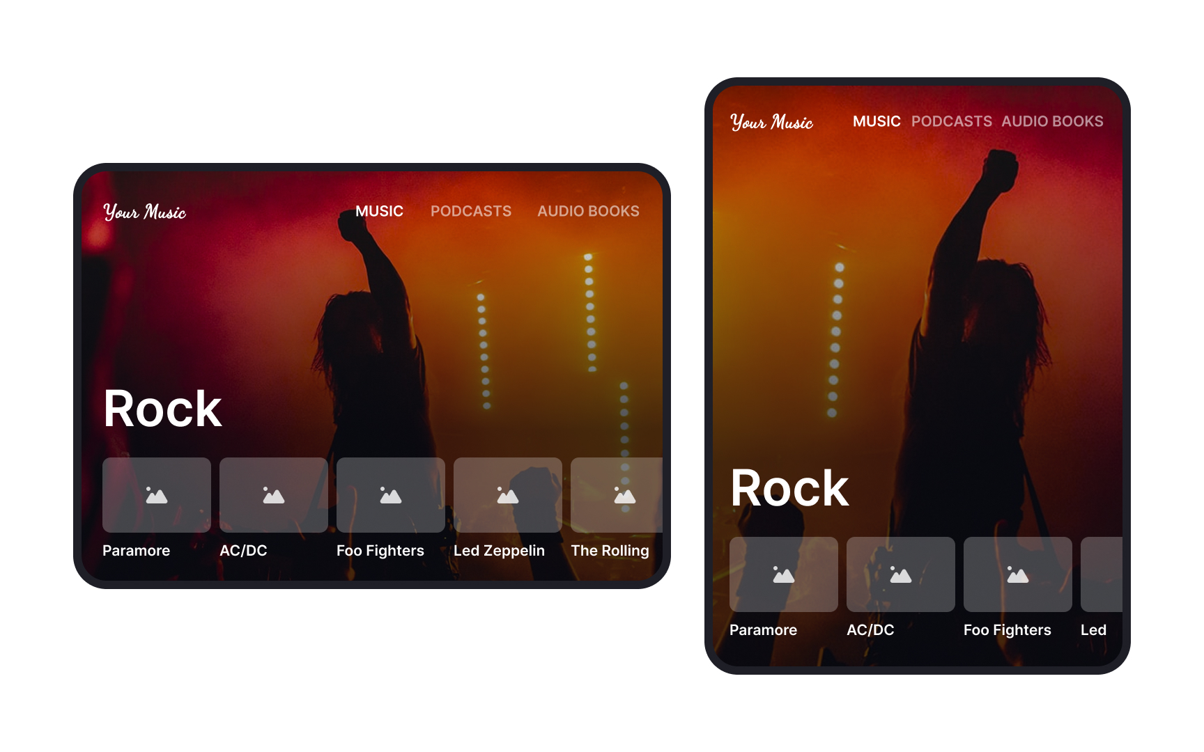
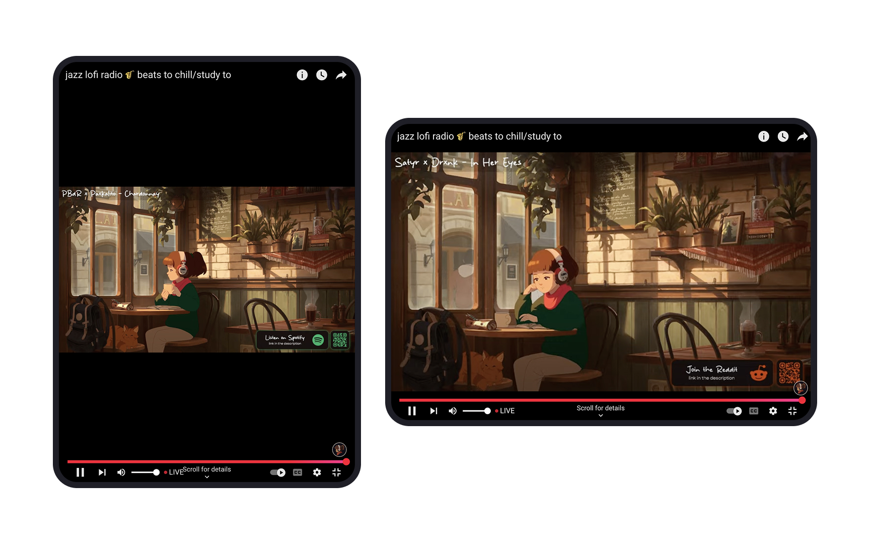
Users switch between portrait and landscape modes depending on their needs. For example, someone reading an article might hold their
If
Bear in mind that despite the similarities
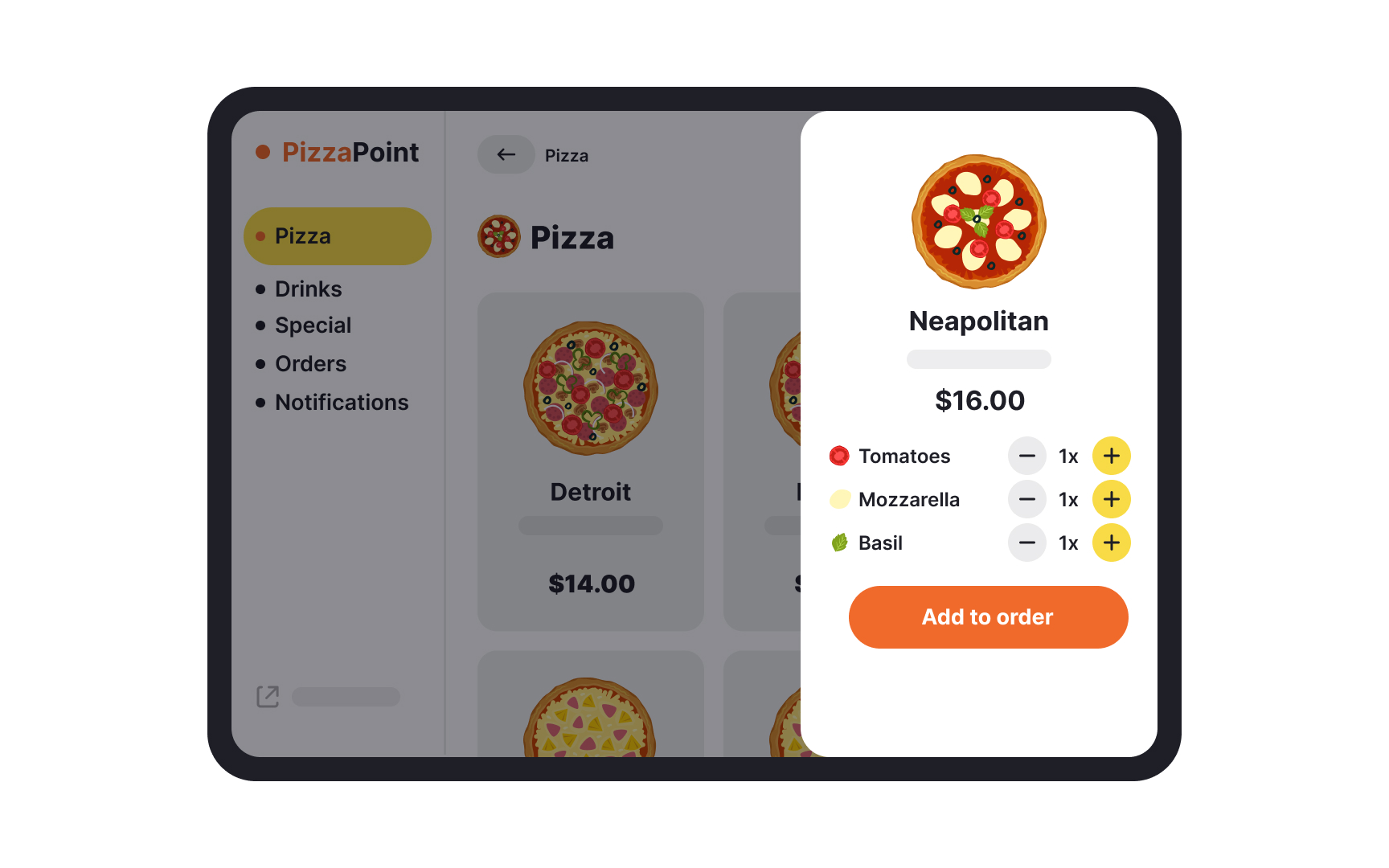
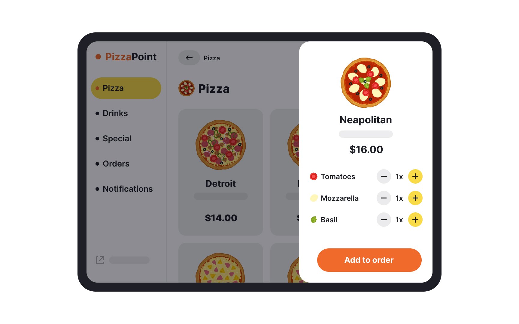
The first step is to decide if you really need a separate tablet app and what range of functionality such an app will offer. In general, users tend to expect more in-depth functionality from tablets than from mobile phones. Users also tend to appreciate tablet apps that focus on a single function of the app such as video streaming or reading.
If you can’t find a way to add more value for users through your tablet app, at least make sure it does not lack any of the regular features available on your mobile app or website as it can cause users to abandon your tablet app entirely.[3]
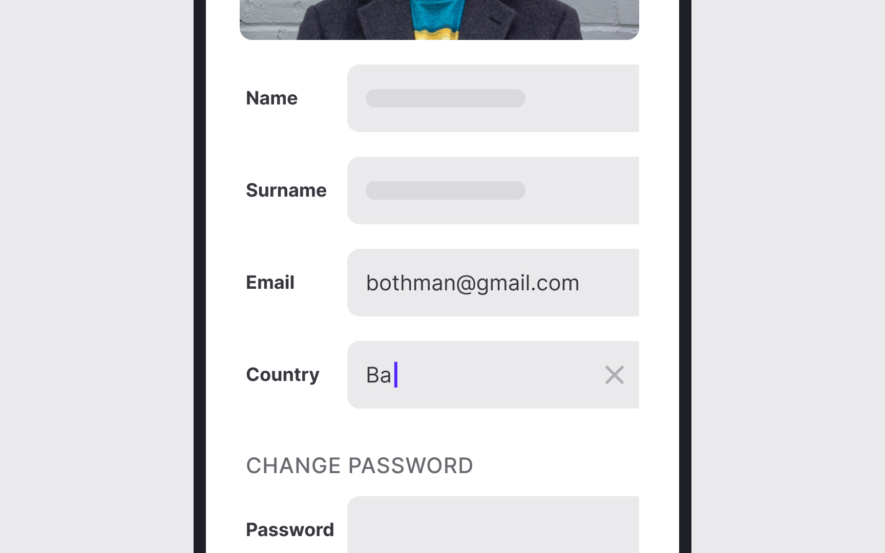
Text input on
Here are some guidelines to mitigate this issue:
- Allow users to save searches and other
inputs that they fill into form fields. - Offer autosuggestions and autocorrect.
- Accept alternative forms of input through cameras, QR codes, microphones, or GPS.
- Auto-fill information wherever possible instead of asking users to type them in manually. For example, the card type can be easily identified by the system when a user enters the card number.
- Auto-format form fields.
- Provide default options based on user research insights.
- Enable copying and pasting.
- Avoid making input fields small to prevent the added hassle of scrolling within the box.
- Automatically provide numeric, character, or alphabet keyboards according to the type of input required.[4]
Modern
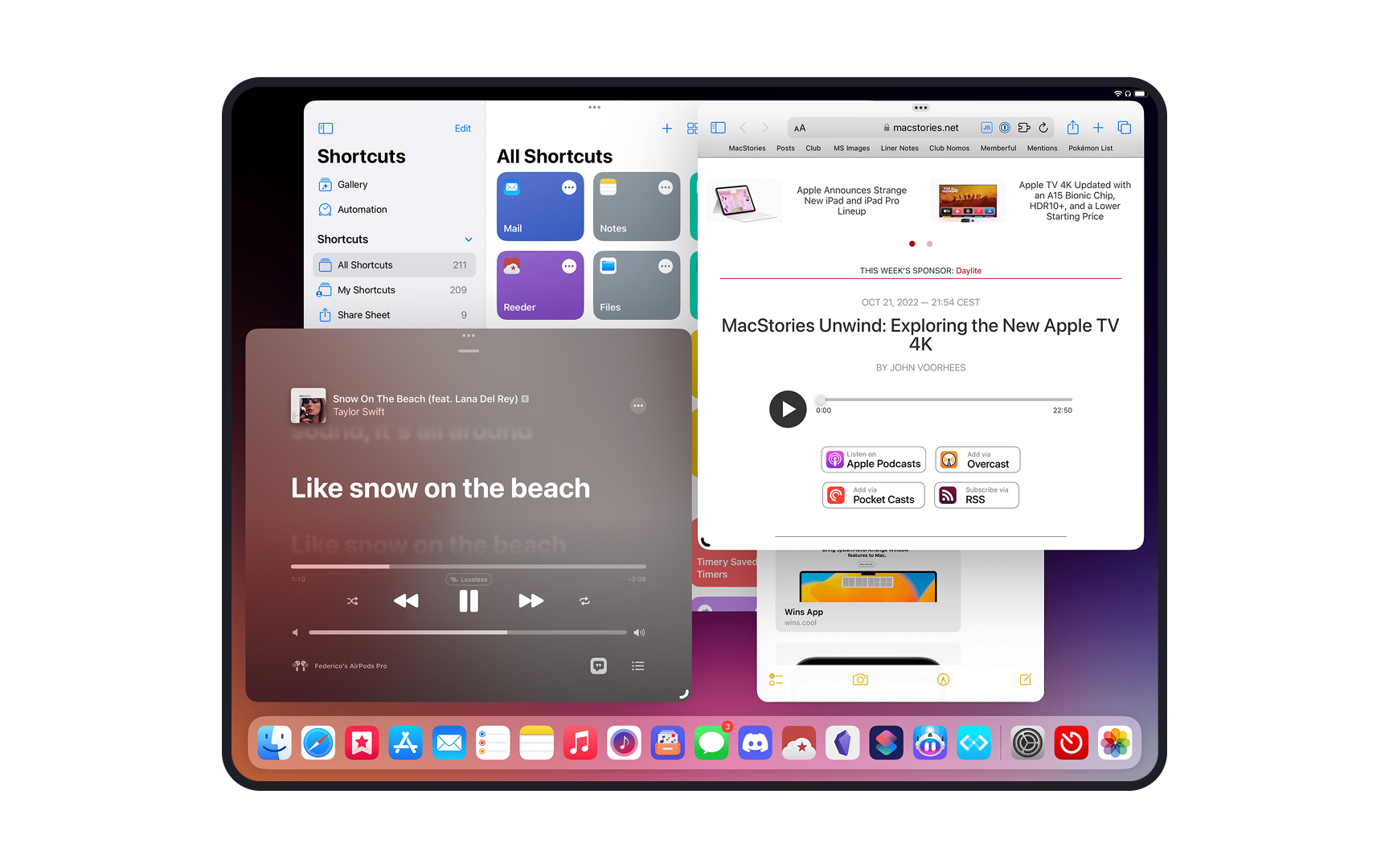
Content prioritization becomes crucial in multi-tasking scenarios. When an app enters split-view mode, it should automatically adjust its
Video playback, data synchronization, and real-time updates need to function seamlessly regardless of the app's current multi-tasking state. Also consider how your app's audio, notifications, and system interactions behave when users are actively engaging with multiple apps.
References
- Touch Targets on Touchscreens | Nielsen Norman Group
Top contributors


Topics
From Course

Share


Similar lessons

Designing for Mobile Interfaces

Responsive vs. Adaptive Design
