Step 5: Determine layout using boxes
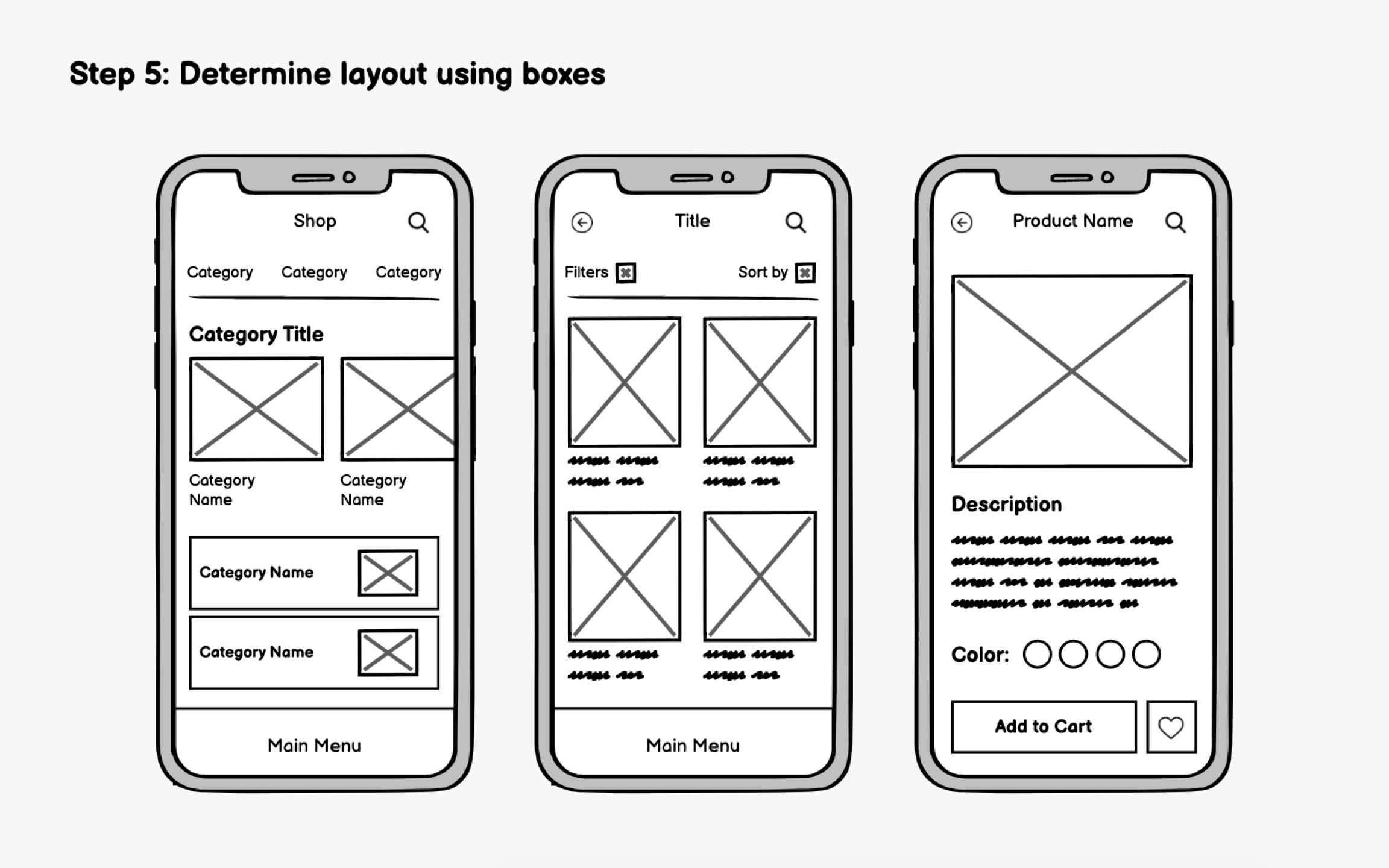
In early wireframing, focus on visual hierarchy rather than specific content. Use simple boxes to represent content areas and arrange them based on priority and importance. Think about how users will scan the screen and in what order they should absorb information. While the F-pattern applies to some mobile content, apps increasingly use a more vertical, scrolling-focused hierarchy where top placement equals highest priority.
The thumb zone matters significantly for mobile. Users hold phones in various ways, but one-handed use with the thumb is extremely common. Place critical interactive elements (buttons, navigation, primary actions) within comfortable thumb reach, typically the bottom two-thirds of the screen. This is why bottom navigation bars have become the dominant pattern in modern apps.
Reserve the top of the screen for information display (titles, status indicators) rather than frequent interactions. Content that users view but don't tap can live higher up, while actions they perform repeatedly should stay accessible.